
How to Size and Position the Angular Material Snackbar
Angular Material has a Snackbar component that is easy to pop open. However, customizing the size and position requires an exploration of the DOM and Snackbar default styling. In this demo we will position a Snackbar anywhere on the screen and also make a full width Snackbar.
Here’s an example of the Snackbar with a fixed position of 200px from the top:
I also attempted to create a Snackbar with a custom template and pass in a reference to the Button’s y-coordinates. My goal was to relatively position the Snackbar above the button. I was able to get the Button’s top position but I was unable to pass that value to the Snackbar even when I used the openFromTemplate function:
this._snackBar.openFromTemplate(mySnackbarTemplate, { panelClass: 'positioned-snackbar', verticalPosition: 'top'});There may be a way to accomplish this, but it is challenging. Now let’s explore the size and position customizations I was successful with.
How to Vertically Center the Angular Material Snackbar
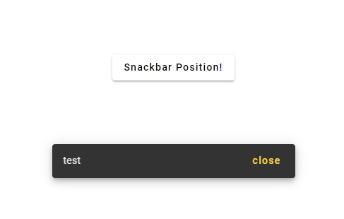
The simplest way to create and open a Snackbar is to add a Snackbar constructor and then call the Snackbar open function:
this._snackBar.open('test', 'close', { panelClass: 'positioned-snackbar', verticalPosition: 'top'});You can see in this example I have given the Snackbar text of “test”, close button text of “close”, a custom class that doesn’t have any styling yet ( but can be used to set values like background color), and vertical position of “top” (which is the default). We need to take a look at the DOM to see how the Snackbar default positioning is accomplished:

There are several critical elements here. The first is the div with class cdk-global-overlay-wrapper. This has display: flex on it and controls the vertical positioning of its child, the div with class cdk-overlay-pane. In a later section when we customize the size we will dig into deeper elements, but for positioning we only care about cdk-global-overlay-wrapper.
Notice above that align-items has a value of flex-start when the vertical position was set to "top". When I set verticalPosition: 'bottom' then align-items gets set to flex-end.

Unfortunately, the verticalPosition prop only accepts values of top and bottom. If we want to vertically center the Snackbar, we need to target the Angular Material class of cdk-global-overlay-wrapper.
//positioned-snackbar.scss .cdk-global-overlay-wrapper { align-items: center !important; }Notice also that I had to add !important. This is because Angular Material for some reason applies the flex alignment using inline styling by default. Another important note is that this class can only go in your component's .scss file if you disable encapsulation. This is because the Snackbar exists outside of the root element of the app:
@Component({ selector: "positioned-snackbar", templateUrl: "positioned-snackbar.html", styleUrls: ["positioned-snackbar.scss"], encapsulation: ViewEncapsulation.None }Here’s the centered Snackbar:

If you want to customize the position of the Snackbar even more, you can add target the cdk-overlay-pane and add top or bottom positioning. The position needs to be changed from static to fixed for this to work.
.cdk-overlay-pane { position: fixed !important; top: 200px; }How to Horizontally Position the Angular Material Snackbar
Horizontally aligning the Snackbar is similar to vertically aligning the Snackbar except that the horizontalPosition prop has more options. The TypeScript type file kindly gives us the possible values:

You probably will not need a custom horizontal alignment value beyond what is provided, but we’ll explore how you would do this just to learn how Angular Material works.

We can see that the cdk-global-overlay-wrapper will control our Snackbar's horizontal position just like it controls the vertical position. We can set custom justify-content values in this class, and don't forget to add !important:
//positioned-snackbar.scss .cdk-global-overlay-wrapper { justify-content: center !important; }There’s not really a need to do this since the verticalPosition prop controls styling in the same way. However, you can also apply more precise styling through the cdk-overlay-pane class:
.cdk-overlay-pane { position: fixed !important; left: 150px; }
How to Make the Angular Material Snackbar Full Width
Angular Material’s Snackbar does not have a prop for setting the width. We can pass in a custom class, but we can’t set a full screen width from our class.
Instead, we have to dive deep into the DOM. First I see we have a max-width set on a child element:

We can override that with the following code:
.mat-mdc-snack-bar-container { .mdc-snackbar__surface { max-width: 100%; width: 100%; } }However, that still doesn’t give us a full width Snackbar. There is one more problem that needs to be fixed. The display: flex on the cdk-global-overlay-wrapper is constraining the width of the Snackbar. We need to remove it:
.cdk-global-overlay-wrapper { display: block; }With both of these stylings applied, we now have a full width Snackbar.

This same technique can be used to set a variety of widths on the Snackbar.
Here’s how to show Snackbar on Table cell click.
Considering a Medium subscription?
If this article was helpful and you want to sign up for a Medium subscription, please consider doing so through my referral page. This supports me financially so that I can continue creating excellent dev articles.


