
How to plot large timeseries data very fast with Plotly?
Plot a million points in less than 0.2 seconds.

When charting or plotting a dataset with a million points, we are usually at the mercy of available RAM, or memory, and how much processing power our computing machine has.
We only have a few options for interactive plotting with the capability to zoom in and out a portion of the plot, but my favorite is Plotly.
However, if we need to plot a million points, even plotly lets you down. On my system with the process 11th Gen Intel® Core™ i7 @ 3.00GHz × 4 and 32 GB of RAM, my Jupyter Notebook quickly becomes unresponsive after plotting 1000000 points.
The following code took 2.5 seconds to plot but it made my Jupyter Notebook unresponsive after creating the plot:
x = np.linspace(1, 10, 1000000)
y = np.sin(x)
sin_df = pd.DataFrame()
sin_df['x'] = x
sin_df['y'] = y

fig = make_subplots(rows=1, cols=1)
fig.add_trace(
    go.Scattergl(x=sin_df['x'], y=sin_df['y'],
               mode='lines', line=dict(color='red', width=2),
               name='Simulink'),
    row=1, col=1
)

fig.update_xaxes(title_text='Time', row=1, col=1)
fig.update_yaxes(title_text='Sine Wave', row=1, col=1)


fig.update_layout( showlegend=True,  width=900, height=400)
fig.update_xaxes(showline=True, linewidth=2, linecolor='black', mirror=True)
fig.update_yaxes(showline=True, linewidth=2, linecolor='black', mirror=True)
fig.update_layout(plot_bgcolor = "lightgray")
fig.update_layout(
    xaxis = dict(
        tickmode = 'linear',
        tick0 = 0.0,
        dtick = 0.5
    )
)
fig.show()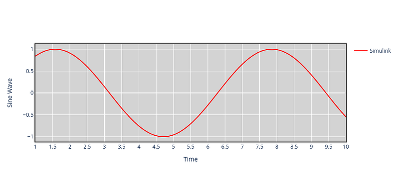
Using Plotly-Resampler to plot faster
The issue we’re encountering here is a common limitation found in many visualization libraries, including Plotly’s Python bindings. The library sends all the data to the front end, which can lead to slow rendering and interaction. However, Plotly-Resampler addresses this problem by dynamically aggregating the data, displaying only a limited number of points on the graph. It then renders additional points as needed after user interactions with the graph. This approach enhances the performance and responsiveness of the visualization.
Installing Plotly-Resampler
We can install Plotly-Resampler using pip:
pip install plotly-resampler
More details about getting started can be found at https://predict-idlab.github.io/plotly-resampler/getting_started.html#installation. Plotly-Resampler was created by the IDLab PreDiCT research group. For visualizing a large dataset, the Plotly-Resampler tool has been very effective.
The previous code snippet can be re-written using Plotly-Resampler as follows which took only 0.2 seconds:
import seaborn as sea
import pandas as pd
import numpy as np
import matplotlib.pyplot as plt
#sea.set_context('poster')

# # Define the font properties
font = {'family': 'Gentium',
         'weight': 'normal'}

plt.rc('font', **font)

import glob
from functools import reduce
import plotly.graph_objects as go; import numpy as np
from plotly_resampler import FigureResampler, FigureWidgetResampler
import plotly.graph_objects as go
from plotly.subplots import make_subplots

x = np.linspace(1, 10, 1000000)
y = np.sin(x)
sin_df = pd.DataFrame()
sin_df['x'] = x
sin_df['y'] = y


fig = FigureResampler(
make_subplots(
    rows=1,
    cols=1,
    print_grid=False
)
)

fig.add_trace(
    go.Scattergl(showlegend=True, mode='lines', line=dict(color='red', width=2), name='Simulink'),
    hf_x=sin_df['x'], hf_y=sin_df['y'],
row=1, col=1
)


fig.update_xaxes(title_text='Time', row=1, col=1)
fig.update_yaxes(title_text='Sine Wave', row=1, col=1)


fig.update_layout( showlegend=True,  width=900, height=400)
fig.update_xaxes(showline=True, linewidth=2, linecolor='black', mirror=True)
fig.update_yaxes(showline=True, linewidth=2, linecolor='black', mirror=True)
fig.update_layout(plot_bgcolor = "lightgray")
fig.update_layout(
    xaxis = dict(
        tickmode = 'linear',
        tick0 = 0.0,
        dtick = 0.5
    )
)
fig.show()
and provided the following plot:

we can hover over the graph to zoom in on a certain region for quick visualization. Jupyter Notebook, even after creating the plot stays responsive and doesn’t become unstable. Some more working examples can be found at https://github.com/predict-idlab/plotly-resampler/tree/main/examples.
Follow me on LinkedIn, and Medium for more content like this.
Did you enjoy this article? Support the effort.
Love my writing? Join my email list.


