
How to name design tokens in a Design System
The shapes of naming taxonomies for scale.

Hundreds of Design Systems have been created over the years. But despite this rich resource, Design System professionals still need a unified naming taxonomy to define design tokens at scale.
This lack of standardization makes every Design System a bespoke product that solves the needs of a single organization, but not necessarily yours. Yet, if design token taxonomies were standardized, everyone could easily leverage components from any Design System to suit our needs.
This article describes a universal design token naming taxonomy to aid designers and engineers in scaling their Design Systems. It is an extension of the CTI taxonomy created by Danny Banks for Style Dictionary.
Inspiration
Shout outs to Nathan Curtis of Eight Shapes and his article, Reimagining a Token Taxonomy. Danny Banks, who invented Style Dictionary and his article, Dark Mode with Style Dictionary. Lukas Opperman, creator of the Design Tokens Figma Plugin, and his article W3C Design Tokens with Style Dictionary. Donnie D’Amato for his article OnDark virus. There are many more!
CTI+ naming convention
Style dictionary uses a custom CTI naming convention to identify and transform design tokens into platform-specific variables. Specifically, Category -> Type -> Item -> Subitem -> State.
The Danny Banks CTI naming convention is an amazing achievement!
Without this foundation, Style Dictionary could not transform JSON into platform-specific code. However, when we use Figma Plugins to export tokens, we soon discover Style Dictionary requires manual editing of the tokens.json output to work.
The CTI+ taxonomy improves CTI by recognizing each variable as a unique dynamic with a specific responsibility area. This allows us to abstract the order of the name so we can align it to a standardized design intent.
CTI+ introduces ‘Domain,’ ‘Variant,’ and ‘Context’ and metadata to be more comprehensive. Each taxonomy is a ‘dynamic.’ To understand how CTI+ is used, it’s helpful to describe the meaning of each dynamic.
Domain
A 2–4 letter prefix that identifies the system the token belongs.
Category
What the token is. (Color, Fonts, Size, Spacing, Shadow)
Type
How the token is used. (Backgrounds, Text, Icons, Borders)
Item
The component it’s used on. (Button, Modal, Banner, Paper)
Variant
The semantic name of the component. (Primary, Secondary, Warning)
Subitem
Defining the behavior of similar kinds of Items. (Solid, Outlined).
State
Density, sizes, and pseudo-states. (800, 600, 400), (Small, Medium, Large) or (Active, Hover, Disabled).
Context
Color behavior relative to a background or the intrinsic size of the item. (onDark, onLight, 8ColumnsWide)
Practical example
When we understand the meaning of each dynamic, naming tokens is easy. Using the CTI+ taxonomy and format, a primary button of medium size would use the following token names.
- — gnm-color-bkg-button-primary
(CTIV•••) - — gnm-color-bkg-button-primary-hover
(CTIV•S•) - — gnm-color-bkg-button-primary-active
(CTIV•S•) - — gnm-color-bkg-button-primary-disabled
(CTIV•S•) - — gnm-color-border-button-primary
(CTIV•S•) - — gnm-color-text-button-primary
(CTIV•••) - — gnm-color-text-button-primary-disabled
(CTIV•S•) - — gnm-color-icon-button-primary
(CTIV•••) - — gnm-size-radius-button-med
(C•I••S•) - — gnm-size-height-button-med
(C•I••S•) - — gnm-font-button-med
(C•I••S•)
Notice that some tokens skip dynamics depending on how specific they need to accomplish design intent. The goal is not to use every dynamic but as few as possible. Populating every dynamic would result in an explosion of token names, making it difficult for designers to consume in Figma.
Challenges
Every system comes with its own set of challenges. One challenge is understanding boundaries, which we all must define and observe. Others are preferences of formatting to serve the usability needs of designers in Figma and engineers in code. We’ll also need to take control of our tokens by custom programming Style Dictionary to get the desired results.
Boundaries
We’ve defined a button with 11 tokens where eight tokens were unique to the Variant: Primary and State: Medium. We could (and should) define more! However, we should understand that adding more Variants such as Secondary, Warning, Info, and Danger will dramatically increase the number of tokens we need to define. Adding States such as Extra-Large, Large, Small, and Extra-Small will increase even more, and that's just the buttons!
Some systems combine dynamics Category, Type, and Item with names such as --ink to indicate the Category is a color, the Type is foreground elements, and the Item is paper.
This combination reduces the number of tokens dramatically but at the cost of design flexibility. The creator of the design system can only determine the balance. Still, we can understand the definitions!
Ordering
Some may prefer a different order for their token names. For instance, an ITC format rather than a CTI, where we put Item at the front of the token name.
- — gnm-button-bkg-color-primary
(ITCV•••) - — gnm-button-border-color-primary
(ITCV•••) - — gnm-button-text-color-primary
(ITCV•••) - — gnm-button-size-radius-med
(ITC••S•) - — gnm-button-font-med
(I•C••S•)
As strange as it may seem, this is still CTI+, but the name is formatted to ITC using Style Dictionary transforms. Because CTI+ abstracts the design intent into discreet dynamics, we can choose any preferred order with a few lines of Style Dictionary code.
Alignment
Designers and engineers are concerned with aligning token names from Figma to code via developer handoff. Meaningfully aligned names are important, but names can be formatted differently if they are easily identifiable. For instance…
- — gnm-color-bkg-button-primary
- — gnm-button-bkg-color-primary
- — gnmColorBkgButtonPrimary
- static GNMColors {buttonBkgPrimary}
The structure that works best for designers in Figma aligns differently from what engineers need, especially when developing on different platforms. What's more, it doesn’t need to. If engineers understand the meaning of the name in the developer handoff, the communication is solid, even when the name order of dynamics is misaligned.
Programming
CTI+ requires knowledge of Style Dictionary. Danny Banks provides a rich library of pre-defined transforms with Style Dictionary, but they depend on observing the CTI structure. As Danny comments in his code…
/*
All pre-defined transforms included use the CTI structure for matching
tokens. If your design tokens are structured differently you will need
to write custom transforms or make sure the proper CTIs are on the
attributes of your design tokens.
*/
When Danny Banks wrote Style Dictionary (first commit in 2016), plugins for Sketch or Figma that exported tokens did not exist. Instead, programmers manually typed the JSON file to the CTI structure as defined.
With plugins that export tokens.json files from Figma libraries, such as Design Tokens from Lukas Opperman and Tokens Studio by Jan Six, the structure of the token output never aligns with Danny Banks CTI. Even today, many organizations choose to manually type the JSON rather than depending on Figma plugins.
To take advantage of the Figma export of tokens.json, we must map the token's name from Figma into a well-formatted structure using a schema. For CTI+ to work and take advantage of existing Style Dictionary transforms, we insert an additional data object into each token.
let $schema = {
    id: "PALETTESPRIMARY400",
    class: "color",
    subclass: "palette",
    mode: null,
    taxonomy: {
        domain: "gnm",
        category: "palette",
        type: null,
        item: null,
        variant: "primary",
        subitem: null,
        state: "400",
        context: null
    }
}
The $schema.taxonomy represents the name we intend to output, which can be ordered in any way we prefer. The other properties are the metadata which we’ll reference in Style Dictionary to organize output. It’s important to separate areas of responsibility and allow name formatting to be handled by the taxonomy.
The $schema.id of CTI+ allows us to identify tokens generated from Figma plugins by the end of their path rather than the full path, as CTI requires. Instead of reading left to right, we’re only concerned with the right side of the node itself. Delimiters are removed so the designer can layer their styles as deeply as they like. Instead of requiring palettes/primary400, the weight can be nested to palettes/primary/400, and both structures are equally recognizable.
The $schema.class variable is a substitute for the Category variable of CTI and is designated identically. The $schema.subclass gives extra definition to Class, allowing us to organize colors by palette, contextual, social, or even dataViz on output.
A future article will dive into the CTI+ schema and how it can be used in Style Dictionary. For now, understanding and creating a standardized design token taxonomy flexible for any need is the goal of this article.
The shape of names
In the world of Biology, every living organism is classified into Domain–Kingdom — Phylum — Class — Order — Family — Genus — Species. The taxonomy is linear, which makes it easy to identify any living organism.
However, naming tokens for design intent isn’t linear. Token names often skip dynamics. Sometimes, a Type dynamic value is unnecessary because it is implicitly declared in the Item.
Using the CTI+ taxonomy and arranging it on a color-coded Compass Rose reveals the shape and intention of the token name. Because Domain and Category dynamics are always populated, they are omitted from the illustration for clarity. Every token must define at least one of the six properties on the rose.
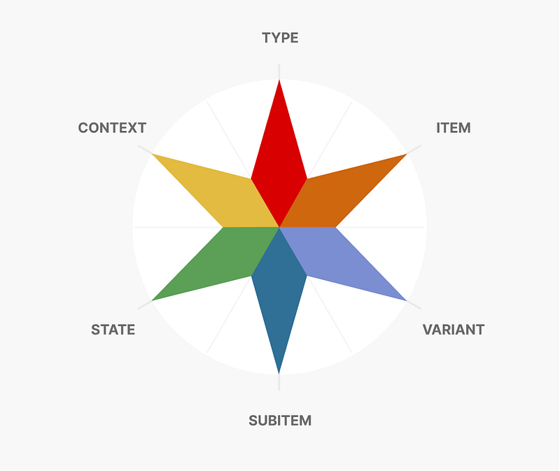
The top three dynamics are the ‘crown’ of the rose. The bottom three are the wings. As mentioned in ‘Boundaries’ above, we do not want to populate all dynamics but as few as possible. What is interesting is how patterns form when creating token names, which indicates their purpose and how they are used.
To express the compass rose into a design token name, we go clockwise around the compass.
Palette color dynamics
The dynamics of Variant and State are populated if the token is semantic+weighted, such as primary-400. This creates a Winged Pattern.
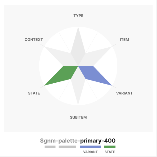
In this system, a Winged Pattern changes the Category of ‘color’ to ‘palette’ to indicate they should not be used directly by a component. This is similar to the convention used by SalesForce Lightning. Instead, palette colors should be referenced by contextual colors (which are used by components). This helps guarantee white-label and mode support works. Also, palette colors should be agnostic to mode. The CTI+ Schema would look like this…
let $schema = {
    id: "PALETTESPRIMARY400",
    class: "color",
    subclass: "palette",
    mode: null,
    taxonomy: {
        domain: "gnm",
        category: "palette",
        type: null,
        item: null,
        variant: "primary",
        subitem: null,
        state: "400",
        context: null
    }
}
A full list of palette names generated by the Genome Color Tool using the Genome optimization.
Contextual color dynamics
The Item and State dynamics are populated if the token describes an element or component on which it is used and has multiple states. This makes a Right Crown/Left Wing Pattern.
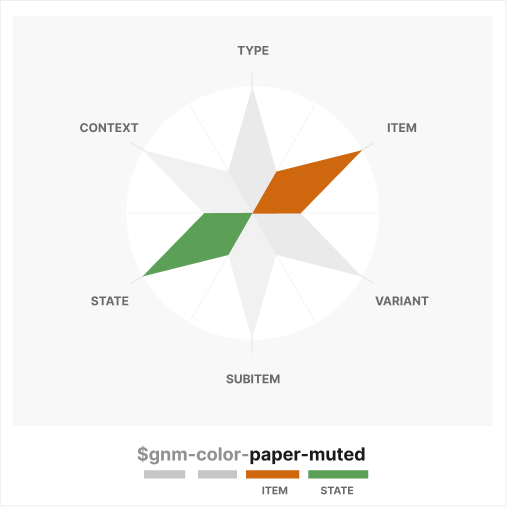
In this system, all crowned colors are of Category ‘Color’ instead of ‘Palette’. They are contextual colors meant to describe the use of a Type or Item and offer support for modes.
let $schema = {
    id: "PAPERMUTED",
    class: "color",
    subclass: "contextual",
    mode: "light", // or "dark"
    taxonomy: {
        domain: "gnm",
        category: "color",
        type: null,
        item: "paper",
        variant: null,
        subitem: null,
        state: "subtle",
        context: null
    }
}
// gnm-color-paper-subtle
Because the Item dynamic of ‘paper’ implies a background, there is no need to define the Type, so it is omitted from the name.
The dynamic of Item: ‘paper’ (Canvas, Surface, etc.) differs fundamentally from other component-specific backgrounds for a number of reasons. Item: ‘paper’ changes most radically when switching from light to dark modes, and elements/components that are placed on paper also change.
When using the genome-optimized palette, paper always uses 000, 015, and 025 State dynamics of palette colors in light mode (default, subtle, hushed) to allow typography to pass a 4.5:1 contrast ratio on all papers where the State dynamic of the palette Category dynamic is >=400
For component-defined contextual color tokens, a Top-Right Crown/Winged pattern shows a fuller representation of the contextual color.
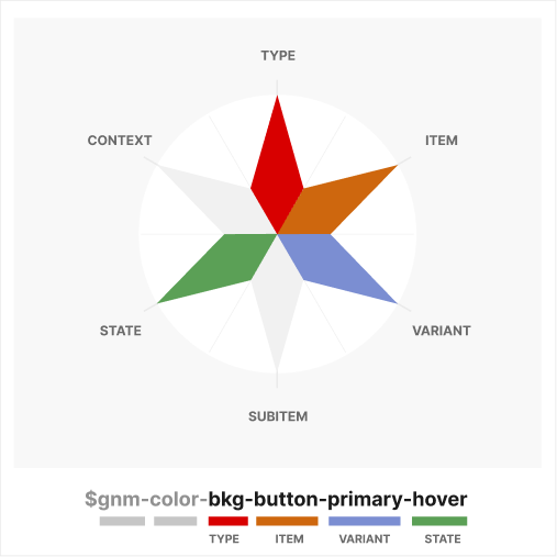
The $schema for this token would look like this…
let $schema = {
    id: "BUTTONBACKGROUNDPRIMARYONHOVER",
    class: "color",
    subclass: "contextual",
    mode: "light", // or "dark"
    taxonomy: {
        domain: "gnm",
        category: "color",
        type: "bkg",
        item: "button",
        variant: "primary",
        subitem: null,
        state: "hover",
        context: null
    }
}
// gnm-color-bkg-button-primary-hover
Duplicating this token and changing the Type from ‘bkg’ to ‘text’ would describe the font color for all primary buttons in the hover state. Once again, we need to consider boundaries and freedom of design choice to properly optimize our design token library.
A sample list of contextual colors can be found below. The names are not comprehensive or prescriptive, but the taxonomy is.
Much like the Genome Color Tool utilizes defined color optimizations to reduce the number of colors available in a ramp, we need to define established optimizations for contextual colors, which we do not have today.
For example, Donnie D’Amato does not recommend onDark/onLight context definitions, and for good reason, as he describes in his article “onDark Virus”!
However, we must understand what we gain and lose with each systemic choice and determine if that’s the right choice for our organization.
Font dynamics
Much like our contextual token color $gnm-color-paper-muted, Typography does not have a Type because it’s implied by the Category of ‘font’.
The shape of $gnm-font-button-med is identical to $gnm-color-paper-muted (Right Crown/Left Wing Pattern), though the State for the ‘font’ Category assumes the quality of size rather than density (medium vs. muted).
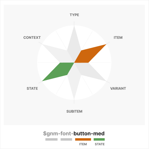
As they say, naming things is hard, but it’s difficult to understand the reason why it's so challenging. The explanation is that language changes according to the subject and context, or in this case, the Category of Font rather than Color.
Because fonts do not have a color property, the state of the font relates to its size, whereas the state of color relates to its density or relative contrast. The color of fonts is defined at the component level, much like we do in design programs.
let $schema = {
    id: "TYPOGRAPHYMEDIUMBUTTON",
    class: "typography",
    subclass: null,
    mode: null,
    taxonomy: {
        domain: "gnm",
        category: "font",
        type: null,
        item: "button",
        variant: null,
        subitem: null,
        state: "med",
        context: null
    }
}
// gnm-font-button-med
A more complex typography example can be seen with a headline. We’ll use the Context dynamic to describe that it spans eight columns in our layout, a concept featured in Sizing typography in design systems; these T-shirts don’t fit. I wrote in early 2023.
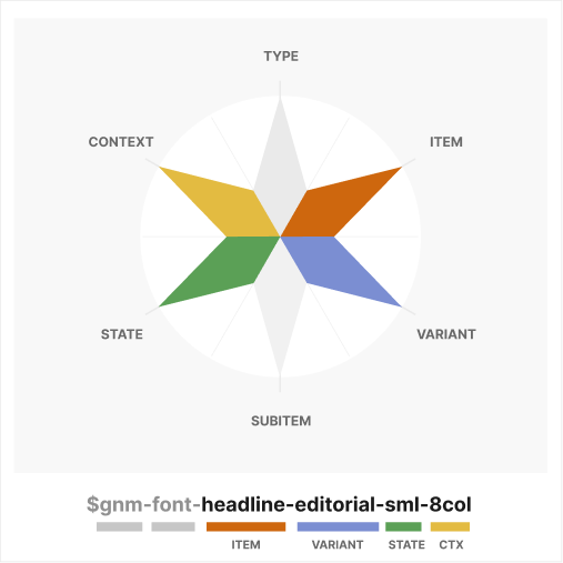
This makes a Full Crown/Winged Pattern. The Type dynamic is not highlighted because it is implicit in the Item and Category dynamics, so I consider it a Full Crown.
let $schema = {
    id: "EDITORIALHEADLINE8COLSMALL",
    class: "typography",
    subclass: null,
    mode: null,
    taxonomy: {
        domain: "gnm",
        category: "font",
        type: null,
        item: "headline",
        variant: "editorial",
        subitem: null,
        state: "sml",
        context: "8col"
    }
}
// gnm-font-headline-editorial-sml-8col
If we needed to express the same typography concept but specific for a magazine treatment, we’d add ‘magazine’ as a Subitem dynamic, which would look like $gnm-font-headline-editorial-magazine-sml-8col. or a “Full Crowned/Full Winged.” Pattern.
Game design
In mid-2021, I wrote Applying game design logic to your design system describing how Mechanics, Interaction, and Experience as the core foundations for the success of any Design System.
Objects and Rules define Mechanics, which inform Interaction and Experience. The reason naming tokens in Design System is important is because that is the process of creating the Objects and Rules of the game.
Objects and Rules
- Define the Domain dynamic of your system as a prefix to indicate it is a recognized token for your system.
- All tokens have a Category dynamic plus a Type, Item, or Variant dynamic. Dynamics of Subitem, State, and Context only serve to give greater specificity to the previous dynamics.
- Where the dynamic of Item, such as ‘paper’, implies the Type of ‘background’, then the Type ‘background’ can be omitted from the name.
- Colors with dynamics of Variant and State but not a Type/Item are a Category ‘palette’. If the color has a Type or Item, then it is a ‘color’ Category which is approved for direct consumption by components.
- All Category ‘color’ should reference a Category ‘palette’ as a variable.
- Colors of Category ‘color’ support modes, but ‘palettes’ do not and are set to null.
- Color classes with State dynamics describe density, whereas Typography, Shadows, and Spacing States define size.
These are just a few rules I’ve created to keep myself organized. Other organizations may add, modify or eliminate.
Thank you!
The CTI+ taxonomy can raise many questions on specific implementation details! However, it’s important to know that each dynamic of CTI+ serves a defined purpose to allow us to create a more holistic naming convention for tokens.
As a Design System community, we’ll want to define practical optimizations for contextual tokens and understand the systemic boundaries we create so we can weigh boundaries against the design flexibility that each organization needs. CTI+ is the beginning of the conversation.
Soon, I’ll post an article demonstrating how CTI+ is implemented to create Figma-to-Code using Figma plugins and Style Dictionary.


