
How To Master Midjourney And Generate Stunning Images
Learn how i create all those stunning photos you love so much
Today, I have 11 useful pointers to help you go from zero to hero in Midjourney. This guide is designed to benefit everyone, from those just starting out to those who are already quite experienced with mid-journey. Now,lets explore these 11 tips and tricks.
Tip #1
Use the “Chaos” Parameter
When you’re setting this parameter, you can choose a value that falls between 0 and 100. The function of the chaos parameter is to control the diversity of the initial four images displayed in the grid. A low value will result in images that are quite similar to each other.
On the other hand, a high value, like 100, will produce images that are significantly different. To input your chosen value for the chaos parameter, use the format “--c” followed by a space and then the value you wish to set.
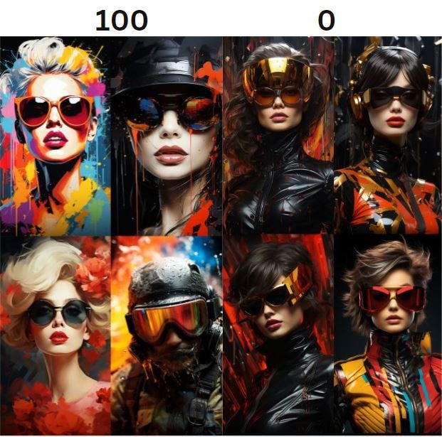
You see the difference? The one with Chaos set to 100 varies extremly while the 0 produces images more similar to each other.
Prompt: Cinematic Portrait, Looking at the camera, Hyper realistic catwoman, vintage abstract, fashion art, colorful, artistic, expressive, in the style of vogue — ar 9:16 — c [put your value here]— s 1000 — v 5.2
Tip #2
Specify your camera and lens
specify desired camera settings, particularly when you’re aiming for a hyper-realistic image that mimics a real-life photograph. Consider detailing elements like focal length, aperture, and the type of camera lens you’d like to emulate. For example, in a recent prompt, I specified using a Fujifilm XF with an 56mm lens and an f-stop of 1.2. The resulting image had a shallow depth of field and appeared high-quality, as if captured with a professional camera. I mean just look at this 😆
But what if you’re going for a vintage look? You can adjust the prompt to indicate that you’d like the image to appear as if taken with a film camera. In this case, I specified using a Kodak Ultra F9 with added film grain.
The change in camera settings led to a noticeably different outcome, giving the image an older, retro feel. Tweaking just a few camera settings can dramatically alter the final look of your art.
Tip #3
Use Multi-Prompt Commands:
To make use of multi-prompt commands for more intricate outputs, let’s switch to a new example. Initially, we have a simple prompt for a “cheesecake painting.”
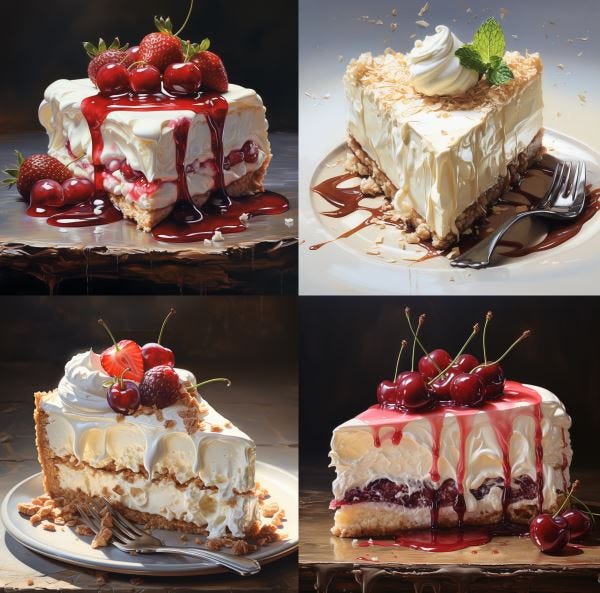
As expected, this will give us a painting of a cheesecake. But what if you want “cheese” and “cake” to be separate elements within the same prompt? You can insert a double colon between “cheese” and “cake”
“cheese:: cake painting”
This tells midjourney to take these 2 words at face value for both “cheese” and “cake,” and it’s likely that you will get a painting of a cake made out of cheese and not a cheesecake.
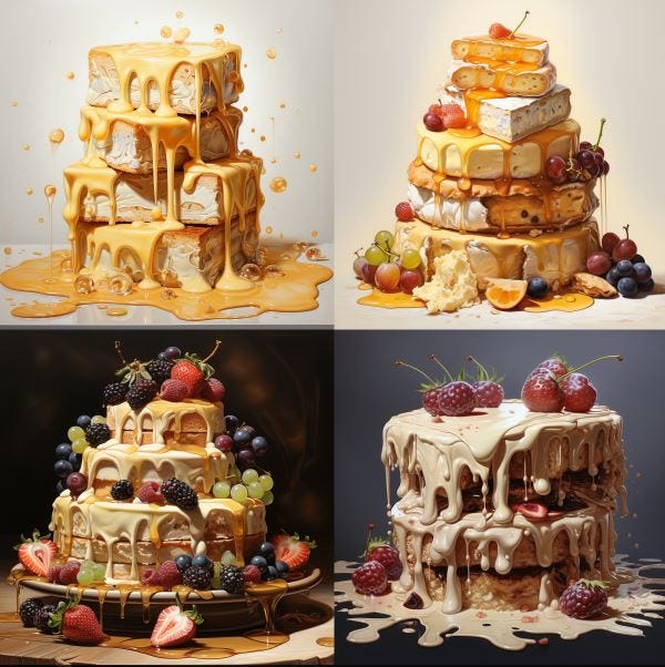
After adding the double colon, the resulting painting is cakes made out of stacks of cheese. This technique can be a bit more advanced but offers a lot of room for creative exploration. Multi-prompt commands are versatile, although they may require some practice to master. I recommend trying it out to discover its potential.
Tip #4
Use the — no parameter
Use the “no” parameter to omit particular elements from your image. For example, let’s say the initial prompt is for a “busy new york street”
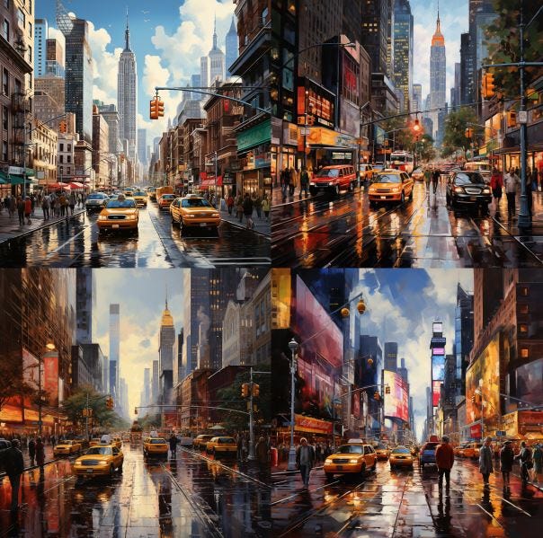
If you want to remove all cars from the scene — no vehicles or even subtle hints of them — you can add “ — no” followed by the element or object you wish to exclude, in this case, “cars.” After submitting the adjusted prompt, the generated image will be devoid of any cars.
While the output may contain other forms of transportation, the “no” parameter effectively removes the specified object. This negative prompting feature isn’t just for objects; it can also be applied to colors or other elements. It’s a useful tool for fine-tuning your artwork to more closely match your desired outcome.
Tip #5
Specify the viewpoint
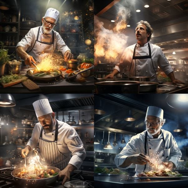
Tip number 5 focuses on defining the viewpoint for your image. For instance, let’s say the initial prompt is “photorealistic chef, cooking in a modern kitchen.” You can specify the perspective you desire, such as “aerial.” When you request this viewpoint, the resulting image will show the scene from above, capturing the chef and the kitchen from that angle.
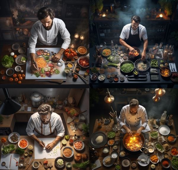
However, if you switch the perspective to “ant’s-eye view,” the image will shift to a low angle, capturing the scene from below. Specifying the perspective is crucial for achieving the precise visual outcome you’re aiming for.
Tip #6
Specify Lighting Conditions
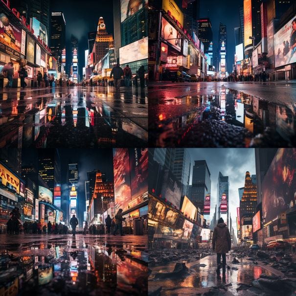
Be explicit about the lighting conditions you desire for your image. For instance, let’s say your initial prompt is “realistic painter in a cozy studio.” From “soft glow” to “harsh shadows.”
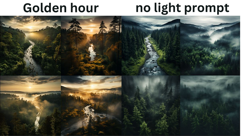
The type of lighting you choose — be it golden hour, cinematic lightning, or silhouettes — can significantly impact the final result. If you want the light to come from a specific direction, it’s essential to specify that to achieve the exact visual effect you’re aiming for. Adding “soft glow” to the end of the prompt, for example, will produce an image that looks quite different from one generated without any lighting specifications. Being explicit about lighting adds another layer of depth to your images.
Tip #7
Specify Color Palette
Picking the color palette you’d like for your image. For instance, let’s say your initial prompt is “vintage car on a desert road.” You can directly add your desired color palette to the prompt. For example, using the same “vintage car on a desert road” prompt, you could generate two distinct images. One might use a “sunset hues” color palette, while the other employs a “black and white” scheme.
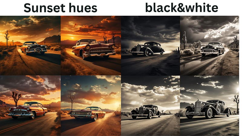
Being specific about your color choices is essential for achieving the particular aesthetic you want in your art.
Tip #8
Specify Mood
Tip number 7 recommends that you define the emotional tone you’d like for your image. We’ve already covered lighting and color palette, but mood is another important factor. For example, let’s say your initial prompt is “musicians in a jazz club.” Initially, no mood is specified, but now you decide to add “lively” to the mood setting. Observe how this changes the final image.
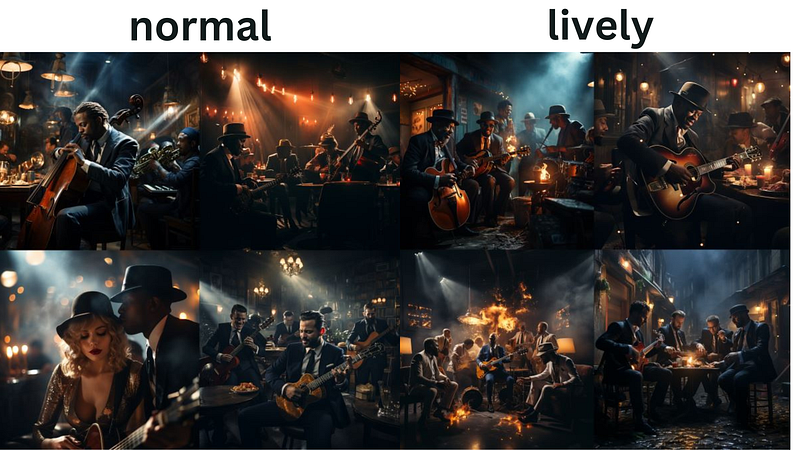
After incorporating the “lively” mood, you’ll notice that the musicians and the atmosphere in the jazz club appear more animated compared to the original. Adding a mood descriptor can significantly influence the emotional undertone of your AI-generated artwork.
Tip #9
composition
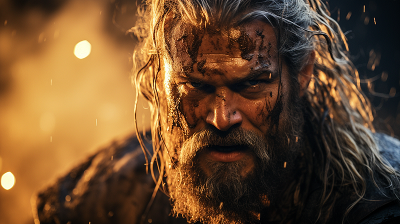
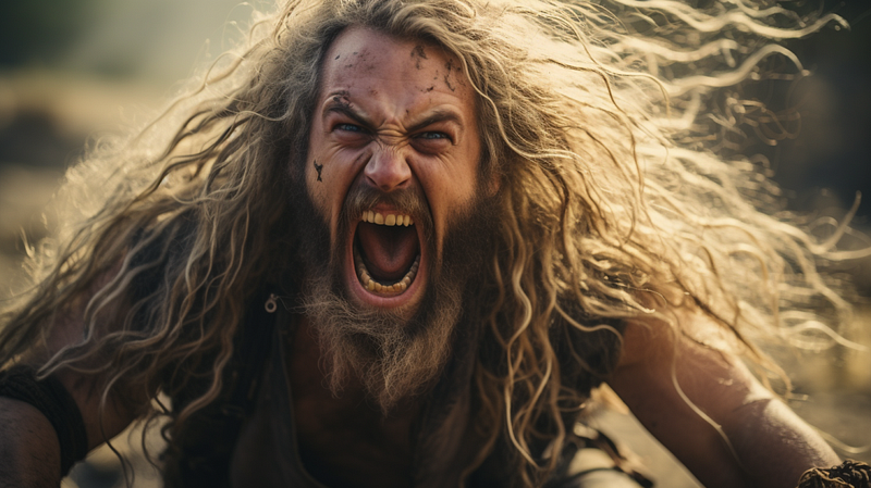
Be specific about the composition you want for your image. For example, let’s say your initial prompt is “Viking in a forest.” The placement of the viking will be random,
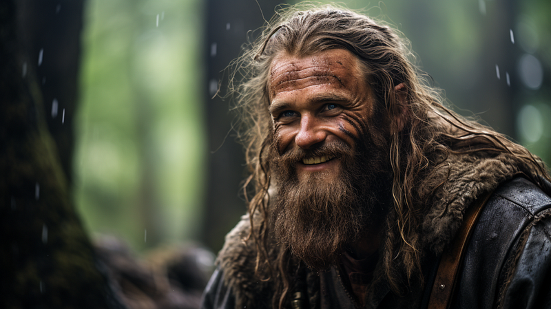
However, when you specify “closeup” in the prompt, observe how the image changes.
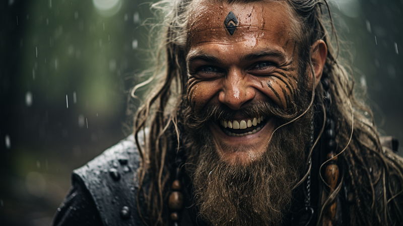
Now, instead of a full or mid-shot of the Viking, you get a detailed closeup, focusing on the facial expression. This closeup can add intensity and emotional depth to the image, capturing details that would otherwise be missed. Being precise about the composition can significantly influence the overall impact of
Tip #10
Collective Nouns
Using collective nouns for more accurate results. For instance, if your initial prompt is “birds flying over a lake,”
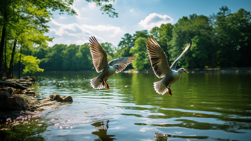
you might consider specifying “a flock of birds” instead. Utilizing collective nouns like “flock” helps the AI better grasp your intent, leading to a more cohesive and realistic image. If you opt for “a flock of birds,” the generated image is likely to be more compelling and closer to what you envisioned compared to simply using the word “birds.”
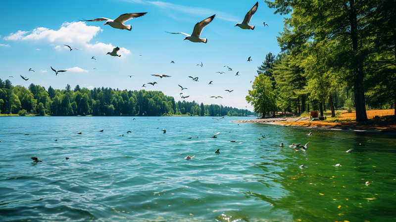
Being specific with your prompts can improve the quality of your pictures
Tip #11
Use the “Stylize” Parameter
The “stylized” parameter allows you to control the intensity of the default styles. To illustrate the impact, consider the example of “A bowl with Apples” with a stylize setting of zero.
Prompt: A bowl with Apples — s 0
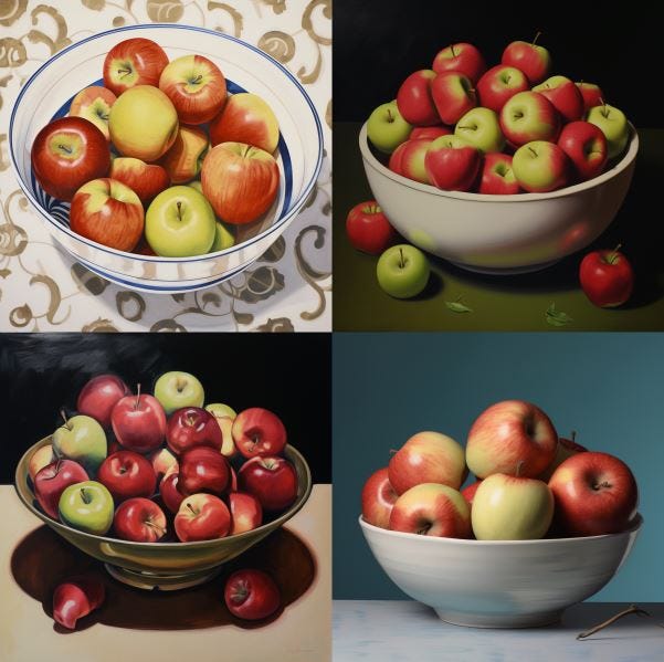
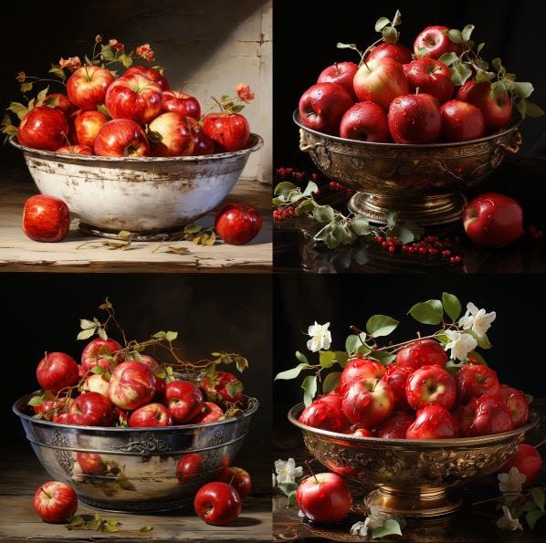
A lower stylize value means that the output will closely adhere to the given prompt, but it will be less inventive. Conversely, a high stylize value, like 1000 , will result in an output that deviates somewhat from the original prompt but will be much more creative and artistic. Here is the same prompt but with the stylish parameter set to 1000
Prompt: A bowl with Apples — s 1000
For instance, an illustration of an apple with a stylize setting of zero is quite straightforward. It simply depicts the apple against a plain background, doing exactly what it’s instructed to do.
When the stylize value is set to 1000, the output becomes even more elaborate. It introduces gradients to the apples, dramatically changes the background, and incorporates various shading techniques. Experimenting with the stylize parameter can be alot of fun.
If you enjoyed this guide i would appreciate a Follow and Clap