

How to make users look right where you want them to?
Some tricks to avoid the Invisible Gorilla effect
Just because something is on the screen doesn’t mean that people will notice it and the best proof of that is the Invisible Gorilla experiment. People’s attention is so selective that they can miss a gorilla playing basketball even if they look right at it. Additionally, they like to take mental shortcuts, oversimplify, and filter out information.
Assuming people will find the most important information themselves, leads to bad dashboard design. A good design is one where the user can’t miss the main message. How to avoid the Invisible Gorillas in your dashboard? Guide your user's attention to look right where you want them to.
Common reading patterns
According to an eye-tracking study conducted by Tableau team, people read dashboards as they do web pages. They start in the upper left corner and follow either F-pattern or Z-pattern.
F-pattern
F-pattern is the most common eye-scanning pattern for dashboards with a big amount of content. The general behavior related to this pattern:
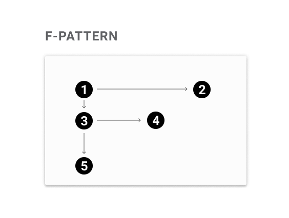
(1) Start in the upper left corner.
(2) Scan the first line.
(3) Scan down the left side of the column until you find something interesting.
(4) Read the interesting thing more carefully.
(5) Continue scanning down.
Z-pattern
Z-pattern is typical for dashboards that are not content-heavy. It such case human eyes follow the natural scanning route:
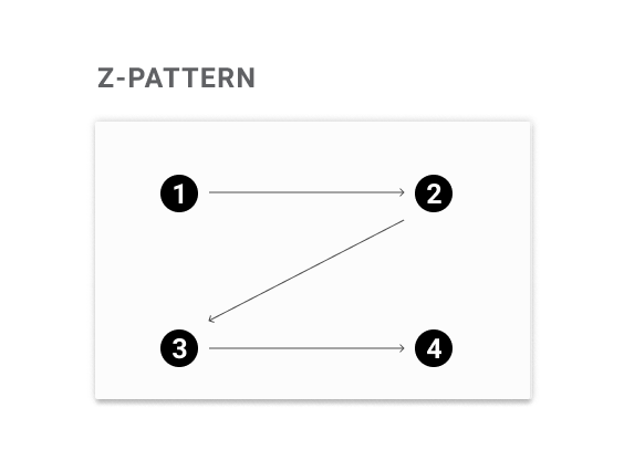
(1) Start in the upper left corner.
(2) Scan from the top-left to the top-right.
(3) Scan scan down and to the left.
(4) Finally landing on the bottom-right side of the page.
How to guide the user’s attention?
The most important thing you have to start with is asking yourself what story you want to tell with your data. Next, check whether your dashboard’s design reflects that goal or not.
There are few tricks that help guide user’s attention — few of them incorporate the reading patterns and few help to break them.
Take advantage of reading pattern
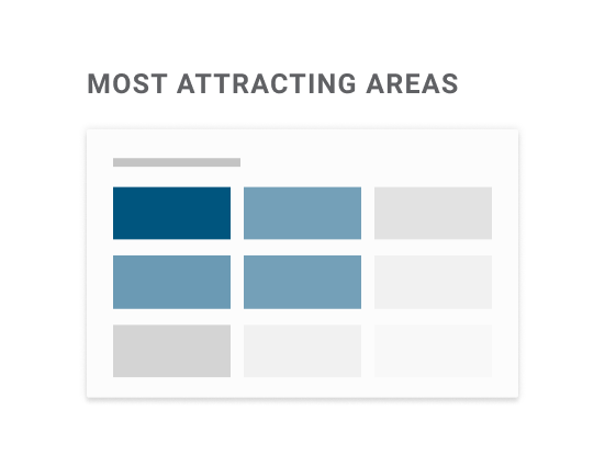
The center of user attention is in the upper left corner of the dashboard. Despite the dashboard's layout, people will always start reading from there*. If there is nothing that interrupts, the user will follow either F-pattern or Z-pattern. In both cases, the bottom right corner is the place most often omitted. So put the most important things in the places that people look the most — at the top, or on the left side of the dashboard.
*The only exception is among users whose cultural reading pattern is right-to-left. In this case, the F-pattern and Z-pattern are mirrored and they start with the upper right corner.
💡 Practical Dataviz Tip
Upper left corner is not a good place to put your logo. Better put it in the upper right corner or at the bottom.
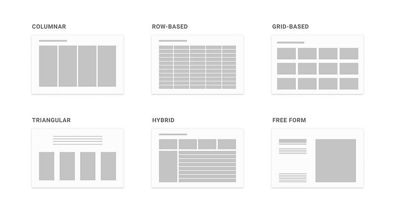
Take advantage of the dashboard form
The same eye-tracking research shows that users are likely to break their reading pattern and follow the dashboard layout. Just remember to make it obvious and easy for users so they know where to look at.
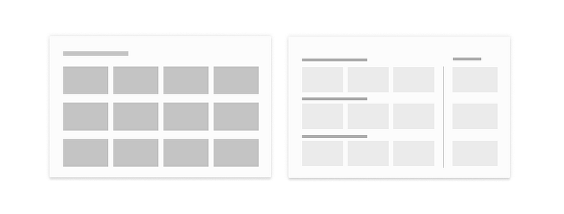
There are a couple of dashboard layouts: columnar, row-based, grid-based, triangular, hybrid, and free form.
Each layout was created based on the Gestalt Laws, especially by incorporating four of them: similarity, proximity, closure, and continuity.
- Similarity — things that are similar are perceived as belonging to the same group. Size, type, color, and shape can be incorporated to differentiate groups.
- Proximity — things that are close to one another belong to the same group. Even if the shapes, sizes, and objects are radically different, they will appear as a group if they are close.
- Closure — mind has a tendency to see complete figures or forms even if a picture is incomplete or partially hidden by other objects.
- Continuity — when there is an intersection between two or more objects, people tend to perceive each object as a single uninterrupted object even when they visually overlap.
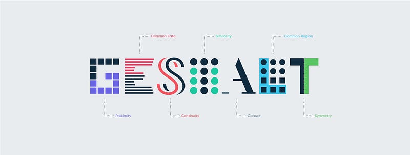
In layouts, these laws were incorporated to show relations, by:
- Keeping the same formatting of colors, shapes, sizes, fonts (similarity)
- Playing with white space to put things closer or further from each other (proximity)
- Adding dividers (proximity, closure, and continuity)
To create the visual hierarchy we need to take advantage of emphasis by making important things bigger and adding more contrast.
💡 Practical Dataviz Tip
Put related information close to each other so the user don’t have to jump back and forth across the dashboard.
Use meaningful and visible titles
Titles are considered the most important element — they not only provide the context but also give a structure to our design. No matter what data visualization you create — exploratory or explanatory*— there are few things you should implement to make the titles better:
- Make them stand out and introduce the visual hierarchy.
- Keep them short and not exceed one line.
- Format them and stress the important part by using punctuation, boldening, capital letters, or color.
*You can check the difference between the exploratory and the explanatory data analysis here
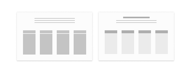
In order to create the structure with the usage of the titles, they should be visible enough to attract attention, placed above the content, and aligned with the content. Consider the following example. The titles are bigger and darker than the rest of the text (hence more contrasted). The additional level of information was added with the red color and capitalized letters (in the dashboard name).
💡 Practical Dataviz Tip
Make sure your title passes the squint test — which means it is still visible when you squint your eyes.
Make important things bigger
If you want to make sure that the user will notice some particular thing, make it big. Remember, for you, it might be even a little too big but for someone who didn’t spend that much time with your visualization — not.
This works especially well with the numbers, which are classified as a separate category called BAN (BIG A** NUMBERS). BANs are the second (after the titles) most attractive element in the data visualization. They work like neon signs and are clear indicators of important information. Thanks to the whitespace around them, they are also one of the most contrasting elements which bring additional pop out.
Consider two examples below — which one attracts your attention better? I guess the second one. In the dashboard on the right not only the visual hierarchy was introduced (bigger titles, less contrasted line chart), but also numbers were enlarged to drag the attention.
💡 Practical Dataviz Tip
If something is important — make sure it passes the squint test.
Put the important things first
The sequence of presentation matters and the most important data should be presented first. Users pay more attention to the things that are located either on top or on the left. If they see a repetitive set — similar chars or rows of data — they will pay less attention over time. They will read the first part and only scan through the rest.
💡 Practical Dataviz Tip
When people see similar things they assume they follow a pattern — that’s why consistency is a key.
Examples of implementation
Below are some practical examples from the eye-tracking study showing which elements dragged the user’s attention.
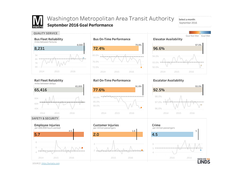
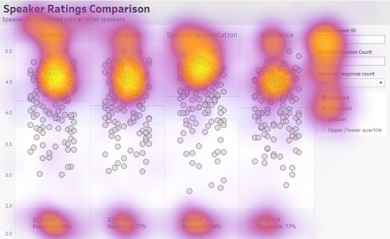
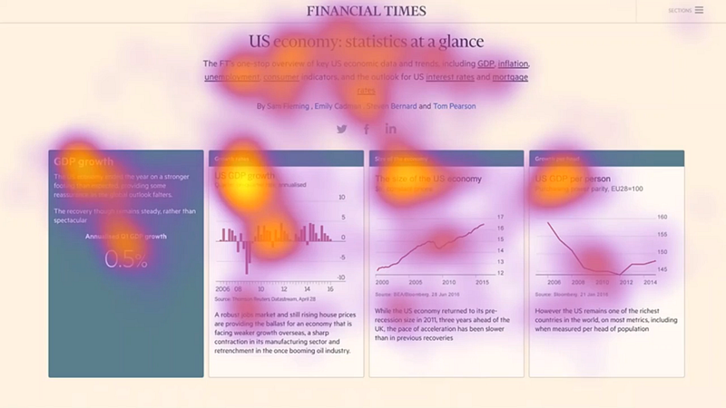
Follow the reading pattern flow
This is an example of a dashboard layout that supports F-pattern reading flow. The highlighted points show areas that dragged the user’s attention. The users started with a top-left corner, scanned the first line with KPIs (big font attracted the attention), then moved to the second line, scanned each chart (colors attracted the attention), and only briefly looked at the last line to focus more on the last chart (colors attracted attention as well).
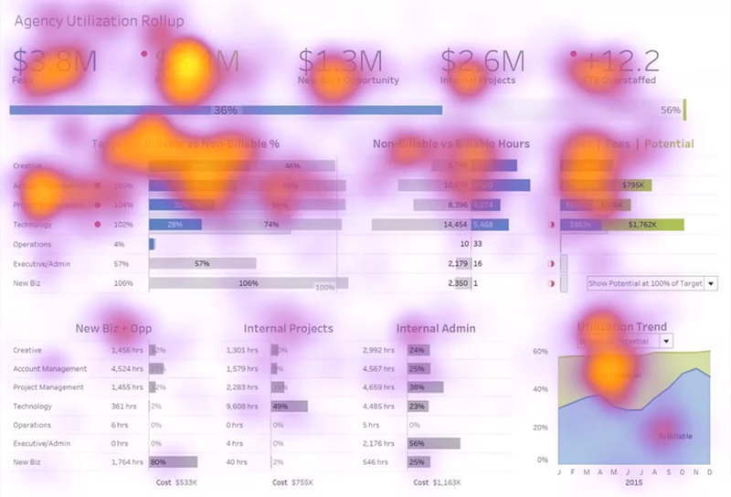
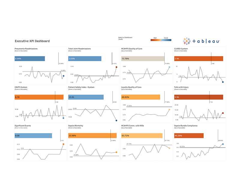
Use BANs
The dashboard below is less content dense and it supports a Z-pattern reading flow in which users start with the top-left corner and zigzag to the bottom. Users only briefly looked at the title — probably because it's short and very big which makes it fast to read. They focused mostly on big KPIs numbers in the top-left corner — BANs attracted the user's attention thanks to their placement (top-left corner is where we start), size, and contrast with the background.
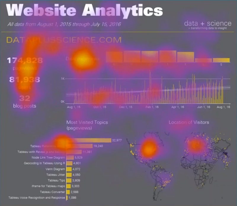
Create a visual hierarchy with contrasting elements
Adding high contrast elements attract attention and create a visual hierarchy. In the example below contrast was added to the dashboard title (by making it bigger and darker) and to the boxes’ headers. Additionally, another level of information was created by making the boxes with the data lighter than the background— which makes the data in them more visible.
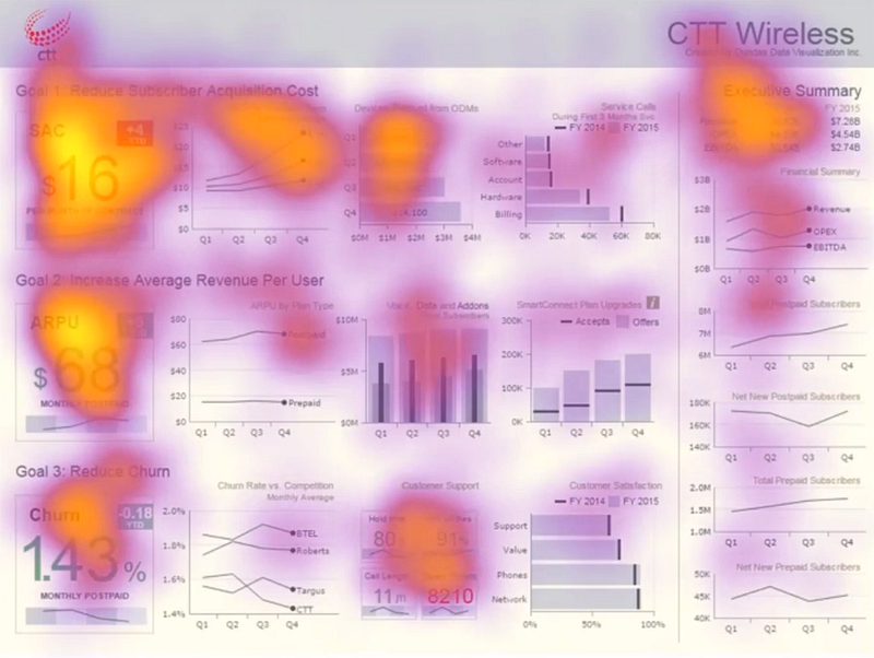
Create visual hierarchy by grouping elements
The example below, thanks to incorporating the Gestalt Laws, breaks the standard grid-based layout. The dashboard was divided into four different sections — 3 rows and one column. Rows were created by adding more horizontal space and stressing information at the beginning (BANs and titles). Adding a vertical line separates the right part of the dashboard and creates a column. It changed the reading pattern — users scanned each row left-to-right and then move to the column and read it top-to-bottom.
And lastly, how you can check if your audience will look where you want them to?
- Ask somebody to look at your dashboard and point the most attractive things.
- Do a “squint test” and check what parts of the dashboard are standing out. To do this squint your eyes so your vision gets blurry.
What are your thoughts on this topic? Did do experience the Invisible Gorilla effect yourself?
If you are looking for some more dashboard tips check the dashboard design guidelines.
Links
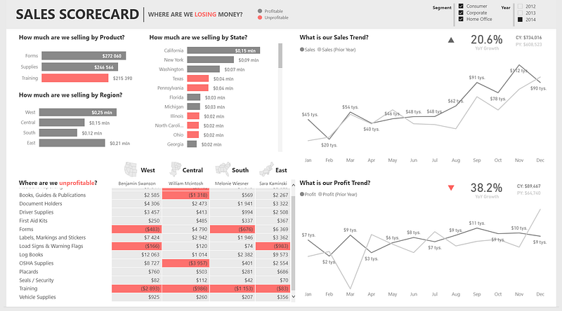
- Dashboard Sales Scorecard: Where are we losing money? by Decisive Data
- Complaints Dashboard from The Big Book of Dashboards
- Article about exploratory vs explanatory analysis
- Tips on transforming slide titles
- Article How design thinking will affect today’s analysts
- Tableau eye-tracking study
- Article Gestalt principles in UI design
- Eye-tracking: What it teaches us about dashboard design webinar on BrightTalk


