
How To Label The Values Of Plots With Matplotlib
Easy to follow guide on labeling your plots
Matplotlib can be a bit tricky to use. I have especially struggled with displaying the values of data points on my plots. Initially I though that this should be a simple task, but I have found out that it is not quite as easy as I had expected. Therefore, in this post I explain how you can do it, and I will make it as simple to understand as possible.
Let’s start out by creating a few random data points to work with.
import numpy as np
import matplotlib.pyplot as plt
x = np.arange(1, 21)
y = np.random.randint(20, size=20)
print(x)
print(y)
>>>[1 2 3 4 5 6 7 8 9 10 11 12 13 14 15 16 17 18 19 20]
>>>[9 13 19 8 13 3 19 17 12 4 7 0 3 9 14 0 11 17 6 10]np.arrange(1, 21) creates a NumPy array with the numbers from 1 to 20. First number is inclusive and the last number is exclusive.
np.random.randint(20, size=20) generates 20 random values between 0 and 20, (0 is included 20 is not). If you run the code yourself you will get different values.
Next, we can simply plot the data. This part is easy with Matplotlib. Just call the plot() function and provide your x and y values. Calling the show() function outputs the plot visually.
plt.plot(x, y)
plt.show()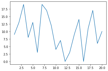
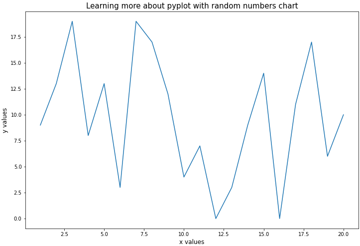
To make it a bit more interesting let’s modify the plot a bit more. I think it would be great to add a main title, a description on the axes, and increase the size.
plt.figure(figsize=(8,8))
plt.plot(x, y)
plt.xlabel("x values", size=12)
plt.ylabel("y values", size=12)
plt.title("Learning more about pyplot with random numbers chart", size=15)
plt.show()
The size of the plot can be set using plt.figure(figsize=(12, 8)). Note that it is important to call figure before you call plot, otherwise you will get an undesired result. Also, note that the size of the plot is measured in inches and not pixels.
The labels on the axes and the title can simply be set using xlabel() ylabel() and title(). The size parameter in these three functions determines the font size of the labels.
The result of the code snippet is as follows.
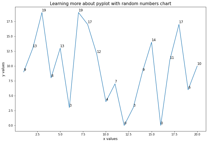
We are still missing the values for the y values on the data points themselves. We can introduce them by adding texts in a loop that represent the y-value for every x coordinate. But before we can do that we first need to add an additional line of code at the beginning. The newly added lines of code are written in bold font.
fig, ax = plt.subplots(figsize=(12,8))
plt.plot(x, y)
plt.xlabel("x values", size=12)
plt.ylabel("y values", size=12)
plt.title("Learning more about pyplot with random numbers chart", size=15)
for index in range(len(x)):
  ax.text(x[index], y[index], y[index], size=12)
plt.show()
The first line makes a call to plt.subplots() which creates two objects for us and stores them in fig and ax. The fig object is used to modify the figure, but we will not explore that further in this post. The ax object is a subplot which we can use to add texts to the plot.
ax.text() allows us to add a text to the plot at a given location. The first two parameters represent the x and y coordinate of the text. The third parameter is the actual value that the text should have, and finally the size parameter decides the font size of the text.
By looping through range(len(x)) we create 20 texts. One for each x coordinate in our data. We see the result of the above code snippet below.
Tip: If you think that the values on the plot are hard to read because they are directly on top of the plotted line you can simply add a small amount to the y position parameter in
ax.text().
I think that the readability of the plot could be improved further by increasing the frequency of the x and y ticks to match the actual values of x and the possible values of y. This can be done by adding the x values as parameter to plt.xticks() and the values 0 to 19 in a list as a parameter for plt.yticks() . Also, as a final touch to the plot I would like to add grid lines as well. This is achieved by calling plt.grid() as seen below.
fig, ax = plt.subplots(figsize=(12,8))
plt.plot(x, y)
plt.xlabel("x values", size=12)
plt.ylabel("y values", size=12)
plt.title("Learning more about pyplot with random numbers chart", size=15)
for index in range(len(x)):
  ax.text(x[index], y[index], y[index], size=12)
plt.xticks(x, size=12)
plt.yticks([i for i in range(20)], size=12)
plt.grid()
plt.show()
That’s it! You now know how to make your plots more readable by adding explanatory labels to them.
Matplotlib allows you to do a lot with your plots, much more than I have touched upon here. In this article I covered some of the small things that I have struggled with getting to work correctly. I hope you found it useful.
Thanks for reading.


