avatarAlan Jones

Free AI web copilot to create summaries, insights and extended knowledge, download it at here

5582

Abstract

pre></div><div id="74d8"><pre><span class="hljs-built_in">ggplot</span>(weather,aes(Month, Tmax)) + <span class="hljs-built_in">geom_line</span>() + <span class="hljs-built_in">ggtitle</span>("Temperature")</pre></div><figure id="5667"><img src="https://cdn-images-1.readmedium.com/v2/resize:fit:800/1*x-CdfxeCnPsH1iFntp1grA.png"><figcaption>Simple line graph — image by author</figcaption></figure><p id="b71a">The default plot is not ideal because the x ticks really ought to be from 1 to 12 and it could be a bit prettier. Let’s fix that.</p><div id="19b6"><pre>%%R -i weather -w <span class="hljs-number">15</span> -h <span class="hljs-number">10</span> <span class="hljs-comment">--units cm </span>

<span class="hljs-keyword">import</span> df <span class="hljs-keyword">from</span> Python <span class="hljs-keyword">and</span> <span class="hljs-keyword">set</span> figure size <span class="hljs-number">15</span> <span class="hljs-keyword">by</span> <span class="hljs-number">10</span>cm</pre></div><div id="7b65"><pre><span class="hljs-function"><span class="hljs-title">library</span><span class="hljs-params">(<span class="hljs-string">"ggplot2"</span>)</span></span></pre></div><div id="3303"><pre><span class="hljs-function"><span class="hljs-title">ggplot</span><span class="hljs-params">(weather)</span></span> +

<span class="hljs-built_in">geom_line</span>(<span class="hljs-built_in">aes</span>(Month, Tmax),<span class="hljs-attribute">color</span>=<span class="hljs-string">"Red"</span>,size=<span class="hljs-number">1.25</span>) +
<span class="hljs-built_in">scale_x_continuous</span>(breaks=<span class="hljs-built_in">seq</span>(<span class="hljs-number">1</span>, <span class="hljs-number">12</span>, <span class="hljs-number">1</span>))+
<span class="hljs-built_in">scale_y_continuous</span>(breaks=<span class="hljs-built_in">seq</span>(-<span class="hljs-number">10</span>, <span class="hljs-number">40</span>, <span class="hljs-number">5</span>))+
<span class="hljs-built_in">labs</span>(y=<span class="hljs-string">"Temperature"</span>, x=<span class="hljs-string">"Month"</span>, 
     title=<span class="hljs-string">"London Monthly Temperatures 2018"</span>) +
<span class="hljs-built_in">theme_light</span>() +
<span class="hljs-built_in">theme</span>(panel<span class="hljs-selector-class">.grid</span>.minor=<span class="hljs-built_in">element_blank</span>())</pre></div><figure id="c741"><img src="https://cdn-images-1.readmedium.com/v2/resize:fit:800/1*V2lT0HzzEO_GQslOS0U5hw.png"><figcaption>A nicer line graph<b> </b>— image by author</figcaption></figure><p id="b4ba">There we see the neat way that we can build a chart, layer by layer, in R’s <i>ggplot2</i>.</p><p id="249a">But what if we want to plot both <code>Tmax</code> and <code>Tmin</code>on the same chart. We need to transform the data so that the the two values are in the same column. We can do this in Python by opening a new cell and entering the following Python code.</p><div id="931c"><pre><span class="hljs-attr">weather2</span>=pd.melt(weather, id_vars=[<span class="hljs-string">'Month'</span>], 
             <span class="hljs-attr">value_vars</span>=[<span class="hljs-string">'Tmax'</span>, <span class="hljs-string">'Tmin'</span>],var_name=<span class="hljs-string">"Temp"</span>)</pre></div><p id="6d3d">This creates a new dataframe <code>weather2</code> that looks like this.</p><figure id="44bc"><img src="https://cdn-images-1.readmedium.com/v2/resize:fit:800/1*bnx227_67vanz0jHHQMekw.png"><figcaption>Weather2 dataframe — image by author</figcaption></figure><p id="2e87">I’m sure that you can do this is R, too, but the idea here is to show how the two languages can be mixed.</p><p id="aa73">Now we can plot a chart with ggplot2 that plots both values by creating a new R cell like this one.</p><div id="a67e"><pre>%%R -i weather2 -w <span class="hljs-number">15</span> -h <span class="hljs-number">10</span> <span class="hljs-comment">--units cm </span>

<span class="hljs-keyword">import</span> df <span class="hljs-keyword">from</span> Python <span class="hljs-keyword">and</span> <span class="hljs-keyword">set</span> figure size <span class="hljs-number">15</span> <span class="hljs-keyword">by</span> <span class="hljs-number">10</span>cm</pre></div><div id="89f0"><pre><span class="hljs-function"><span class="hljs-title">library</span><span class="hljs-params">(<span class="hljs-string">"ggplot2"</span>)</span></span></pre></div><div id="f837"><pre><span class="hljs-function"><span class="hljs-title">ggplot</span><span class="hljs-params">(weather2,aes(Month, value)</span></span>) +

<span class="hljs-built_in">geom_line</span>(<span class="hljs-built_in">aes</span>(<span class="hljs-attribute">color</span>=Temp),size=<span class="hljs-number">1.25</span>)+
<span class="hljs-built_in">scale_x_continuous</span>(breaks=<span class="hljs-built_in">seq</span>(<span class="hljs-number">1</span>, <span class="hljs-number">12</span>, <span class="hljs-number">1</span>))+
<span class="hljs-built_in">scale_y_continuous</span>(breaks=<span class="hljs-built_in">seq</span>(-<span class="hljs-number">10</span>, <span class="hljs-number">40</span>, <span class="hljs-number">5</span>))+
<span class="hljs-built_in">labs</span>(y=<span class="hljs-string">"Temperature"</span>, x=<span class="hljs-string">"Month"</span>, 
     title=<span class="hljs-string">"London Monthly Temperatures 2018"</span>) +
<span class="hljs-built_in">theme_light</span>() +
<span class="hljs-built_in

Options

">theme</span>(panel<span class="hljs-selector-class">.grid</span>.minor=<span class="hljs-built_in">element_blank</span>())</pre></div><p id="ee11">That gives us the following chart:</p><figure id="e1d4"><img src="https://cdn-images-1.readmedium.com/v2/resize:fit:800/1*JIPT6Ra-IGVzAsHOBBa_sA.png"><figcaption>Line graph with two plots — image by author</figcaption></figure><p id="38b7">Now, at this point you might be thinking that this is all very well but I can do that with Plotnine without messing up my Python Notebook with a new language.</p><div id="70c8"><pre><span class="hljs-keyword">from</span> plotnine <span class="hljs-keyword">import</span> *</pre></div><div id="db34"><pre>(ggplot(weather2,aes(<span class="hljs-string">"Month"</span>, <span class="hljs-string">"value"</span>)) + geom_line(aes(<span class="hljs-attribute">color</span>=<span class="hljs-string">"Temp"</span>),size=1.25)+ scale_x_continuous(<span class="hljs-attribute">breaks</span>=range(1,13,1))+ scale_y_continuous(<span class="hljs-attribute">breaks</span>=range(-10, 40, 5))+ labs(<span class="hljs-attribute">y</span>=<span class="hljs-string">"Temperature"</span>, <span class="hljs-attribute">x</span>=<span class="hljs-string">"Month"</span>, <span class="hljs-attribute">title</span>=<span class="hljs-string">"London Monthly Temperatures 2018"</span>) + theme_light() + theme(<span class="hljs-attribute">panel_grid_minor</span>=element_blank()) )</pre></div><figure id="f4cb"><img src="https://cdn-images-1.readmedium.com/v2/resize:fit:800/1*-FZ_dt_iSO9DV-KjzrrkQQ.png"><figcaption>Plotnine plot — image by author</figcaption></figure><p id="1c79">And, of course that is true, as you can see from the code above. Plotnine is a fine package as <a href="https://towardsdatascience.com/ggplot-grammar-of-graphics-in-python-with-plotnine-2e97edd4dacf">I have described here</a> but it is not a complete clone of <i>ggplot </i>as it is restrained in what it can achieve by Matplotlib, on which it is based.</p><p id="af69">For example, what if I wanted to create a dumbell chart of the monthly temperatures like this one.</p><figure id="dc3e"><img src="https://cdn-images-1.readmedium.com/v2/resize:fit:800/1*5EzJINgpMfC-AlQcD7Gq6A.png"><figcaption>A dumbell plot — image by author</figcaption></figure><p id="e9eb">This neat chart shows the range of temperatures for each month and, or course, with a bit of effort and ingenuity we could create that in Plotnine (or, indeed, in Matplotlib). But maybe it’s easier like this:</p><div id="ab2a"><pre>%%R -i weather -w <span class="hljs-number">15</span> -h <span class="hljs-number">10</span> <span class="hljs-comment">--units cm </span>

<span class="hljs-keyword">import</span> df <span class="hljs-keyword">from</span> Python <span class="hljs-keyword">and</span> <span class="hljs-keyword">set</span> figure size <span class="hljs-number">15</span> <span class="hljs-keyword">by</span> <span class="hljs-number">10</span>cm</pre></div><div id="b4b2"><pre><span class="hljs-function"><span class="hljs-title">library</span><span class="hljs-params">(ggplot2)</span></span>

<span class="hljs-function"><span class="hljs-title">library</span><span class="hljs-params">(ggalt)</span></span></pre></div><div id="126f"><pre>ggplot(weather, aes(<span class="hljs-attribute">y</span>=Month, <span class="hljs-attribute">x</span>=Tmin, <span class="hljs-attribute">xend</span>=Tmax)) + geom_dumbbell(<span class="hljs-attribute">size</span>=1.25, <span class="hljs-attribute">color</span>=<span class="hljs-string">"Gray"</span>, colour_x = <span class="hljs-string">"Blue"</span>, colour_xend = <span class="hljs-string">"Red"</span>, <span class="hljs-attribute">size_x</span>=4, <span class="hljs-attribute">size_xend</span>=4) + labs(<span class="hljs-attribute">x</span>=<span class="hljs-string">"Temperature"</span>, <span class="hljs-attribute">y</span>=<span class="hljs-string">"Month"</span>, <span class="hljs-attribute">title</span>=<span class="hljs-string">"London Monthly Temperatures 2018"</span>) + scale_y_continuous(<span class="hljs-attribute">breaks</span>=seq(1, 12, 1))+ scale_x_continuous(<span class="hljs-attribute">breaks</span>=seq(-10, 40, 5))+ theme_light()</pre></div><p id="a5c0">The library <i>ggalt</i> extends <i>ggplot2 </i>with additional plot types which makes plotting a dumbell chart quite simple.</p><p id="f1dd">As well as <code>%%R</code> there is also the magic command <code>%R</code> that lets you use individual lines of R coding in a Python cell but, frankly, I think mixing cells in different languages makes a Notebook messy enough, so I’ll stop at that.</p><p id="72e0">So, R and Python in the same Notebook — good idea? Well, maybe. I like that I can use <i>ggplot2</i> directly but then I also like Plotnine which allows me to use Python exclusively.</p><p id="d973">There is more to <i>rpy2 </i>than I have covered here. Take a look at their <a href="https://rpy2.github.io/">website </a>for more details.</p><p id="1957">As always, thanks for reading. If you would like to know when I publish new articles, please consider signing up for an email alert <a href="https://alan-jones.medium.com/subscribe">here</a>.</p><p id="9e59">If you are not a Medium subscriber, how about signing up so you can read as many articles as you like for $5 a month. Sign up <a href="https://alan-jones.medium.com/membership">here </a>and I’ll earn a small commision.</p></article></body>

How to Include R and ggplot in a Python Notebook

You can mix an match Python and R in the same Jupyter Notebook — here’s how
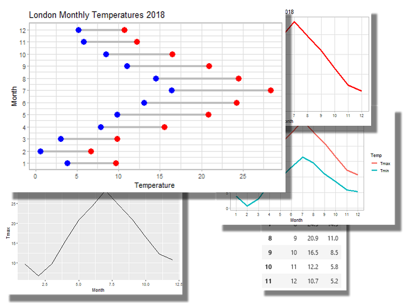
Images from R’s ggplot2 in a Python notebook-image by author

You are either an R person or a Python person, right? Unless, of course, you like some aspects of Python and others of R.

So why not mix and match? For example, R’s ggplot2 is a great visualization package, so wouldn’t it be good to be able to use that in a Python program?

We are going to see how we can achieve this — it’s quite easy — and then you can decide whether it is worth the effort.

I’m going to approach this from a Python user’s point of view, so I’ll assume that you already have Python and Jupyter installed on your computer. That means you need two more things: R and a Python package called rpy2. R needs to be installed because we are going to run R scripts (albeit in a Python context) and rpy2 is the bridge between the two languages.

So, of you go to the R website and download the version for your operating system and then follow the instructons to install R.

Done that? OK, next we are going to open the R console which will look something like this:
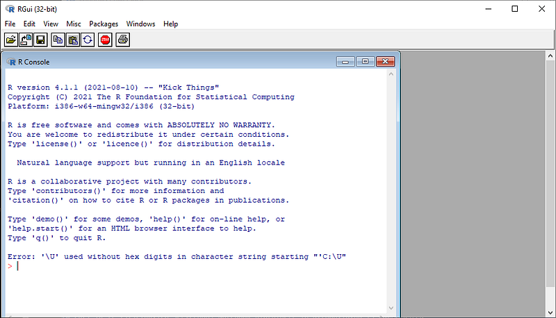
R console — image by author

We are going to use the ggplot2 visualization package, so that needs to be installed. Type this in the console:

packages.install("tidyverse")

The tidyverse package includes ggplot2. (If you want to follow all of the code here you will also need to install the package ggalt.) Now you can close the R console.

Next we install the rpy2 package with pip:

pip install rpy2

We are now ready to write a Python Jupyter Notebook that can run cells written in R. Let’s open a Notebook and enter the following:

%load_ext rpy2.ipython

This loads the rpy2 package and enables the rmagic commands (as we will soon see). But first let’s import Pandas and create a dataframe.

import pandas as pd

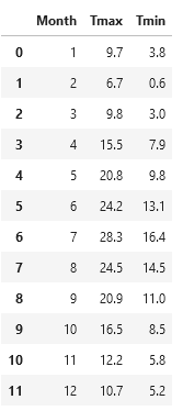
And here is a dataframe that represents the monthly temperature that were recorded in London in 2018.

w = {
  "Month":[1,2,3,4,5,6,7,8,9,10,11,12],
  "Tmax":[9.7,6.7,9.8,15.5,20.8,24.2,28.3,24.5,20.9,16.5,12.2,10.7],
  "Tmin":[3.8,0.6,3.0,7.9,9.8,13.1,16.4,14.5,11.0,8.5,5.8,5.2]
  }
weather=pd.DataFrame(w)

That gives us a dataframe like this:

Weather dataframe — image by author

Now we are going to plot a graph using ggplot2 in R. So we open a new cell and the first line that we need to enter is something this:

%%R -i weather -w 15 -h 10 --units cm

The %%R identifies the cell as R code and following this a a few parameters that determine how the cell will work. -i weather imports the previously created Python variable into the R cell, -w 15, -h 10, and — units cm, make any figure created 15 cm wide, and 10 cm high.

Here is a complete cell that inludes the %%R magic, imports the ggplot2 library and then plots a line graph from the weather dataframe.

%%R -i weather -w 15 -h 10 --units cm 
# import df from Python and set figure size 15 by 10cm
library("ggplot2")
ggplot(weather,aes(Month, Tmax)) + 
    geom_line() +
    ggtitle("Temperature")
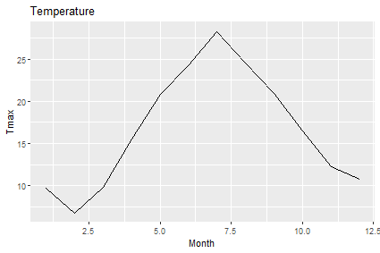
Simple line graph — image by author

The default plot is not ideal because the x ticks really ought to be from 1 to 12 and it could be a bit prettier. Let’s fix that.

%%R -i weather -w 15 -h 10 --units cm 
# import df from Python and set figure size 15 by 10cm
library("ggplot2")
ggplot(weather) + 
    geom_line(aes(Month, Tmax),color="Red",size=1.25) +
    scale_x_continuous(breaks=seq(1, 12, 1))+
    scale_y_continuous(breaks=seq(-10, 40, 5))+
    labs(y="Temperature", x="Month", 
         title="London Monthly Temperatures 2018") +
    theme_light() +
    theme(panel.grid.minor=element_blank())
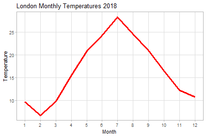
A nicer line graph — image by author

There we see the neat way that we can build a chart, layer by layer, in R’s ggplot2.

But what if we want to plot both Tmax and Tminon the same chart. We need to transform the data so that the the two values are in the same column. We can do this in Python by opening a new cell and entering the following Python code.

weather2=pd.melt(weather, id_vars=['Month'], 
                 value_vars=['Tmax', 'Tmin'],var_name="Temp")

This creates a new dataframe weather2 that looks like this.
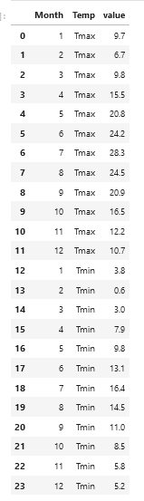
Weather2 dataframe — image by author

I’m sure that you can do this is R, too, but the idea here is to show how the two languages can be mixed.

Now we can plot a chart with ggplot2 that plots both values by creating a new R cell like this one.

%%R -i weather2 -w 15 -h 10 --units cm 
# import df from Python and set figure size 15 by 10cm
library("ggplot2")
ggplot(weather2,aes(Month, value)) + 
    geom_line(aes(color=Temp),size=1.25)+
    scale_x_continuous(breaks=seq(1, 12, 1))+
    scale_y_continuous(breaks=seq(-10, 40, 5))+
    labs(y="Temperature", x="Month", 
         title="London Monthly Temperatures 2018") +
    theme_light() +
    theme(panel.grid.minor=element_blank())

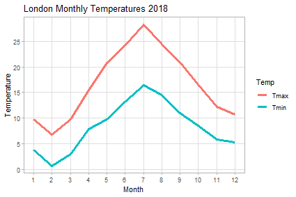
That gives us the following chart:

Line graph with two plots — image by author

Now, at this point you might be thinking that this is all very well but I can do that with Plotnine without messing up my Python Notebook with a new language.

from plotnine import *
(ggplot(weather2,aes("Month", "value")) + 
    geom_line(aes(color="Temp"),size=1.25)+
    scale_x_continuous(breaks=range(1,13,1))+
    scale_y_continuous(breaks=range(-10, 40, 5))+
    labs(y="Temperature", x="Month", 
         title="London Monthly Temperatures 2018") +
    theme_light() +
    theme(panel_grid_minor=element_blank())
)
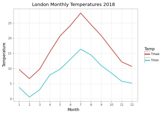
Plotnine plot — image by author

And, of course that is true, as you can see from the code above. Plotnine is a fine package as I have described here but it is not a complete clone of ggplot as it is restrained in what it can achieve by Matplotlib, on which it is based.

For example, what if I wanted to create a dumbell chart of the monthly temperatures like this one.
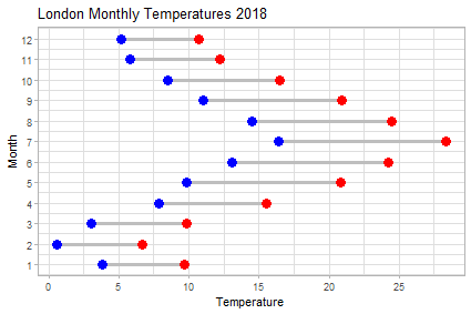
A dumbell plot — image by author

This neat chart shows the range of temperatures for each month and, or course, with a bit of effort and ingenuity we could create that in Plotnine (or, indeed, in Matplotlib). But maybe it’s easier like this:

%%R -i weather -w 15 -h 10 --units cm 
# import df from Python and set figure size 15 by 10cm
library(ggplot2)
library(ggalt)
ggplot(weather, aes(y=Month, x=Tmin, xend=Tmax)) +
  geom_dumbbell(size=1.25, color="Gray",
                colour_x = "Blue", 
                colour_xend = "Red",
                size_x=4,
                size_xend=4) +
  labs(x="Temperature", y="Month", 
       title="London Monthly Temperatures 2018") +
  scale_y_continuous(breaks=seq(1, 12, 1))+
  scale_x_continuous(breaks=seq(-10, 40, 5))+
  theme_light()

The library ggalt extends ggplot2 with additional plot types which makes plotting a dumbell chart quite simple.

As well as %%R there is also the magic command %R that lets you use individual lines of R coding in a Python cell but, frankly, I think mixing cells in different languages makes a Notebook messy enough, so I’ll stop at that.

So, R and Python in the same Notebook — good idea? Well, maybe. I like that I can use ggplot2 directly but then I also like Plotnine which allows me to use Python exclusively.

There is more to rpy2 than I have covered here. Take a look at their website for more details.

As always, thanks for reading. If you would like to know when I publish new articles, please consider signing up for an email alert here.

If you are not a Medium subscriber, how about signing up so you can read as many articles as you like for $5 a month. Sign up here and I’ll earn a small commision.

Python Programming
Jupyter Notebook
R
Ggplot2
Data Visualization
Recommended from ReadMedium