
How to highlight UX research and gaps in knowledge by storytelling with timelines
Create a shared understanding of your user’s workflow by visualizing their timeline

The timeline is one of the most potent design stories you can tell around user research.
Highlighting what users are doing to complete tasks, especially where they’re struggling, allows you to point to where improvements need to be made (and the value you can offer once you do so).
This is where we can draw on a unique resource, customer journey maps, to provide us with the ability to visualize timelines with our user research.
This is because we do not measure against data but against the emotional impact.
What is a customer journey map, anyways?
This is typically done by creating a series of user goals and actions, creating a timeline around it, and adding thoughts and emotions to create a narrative arc.
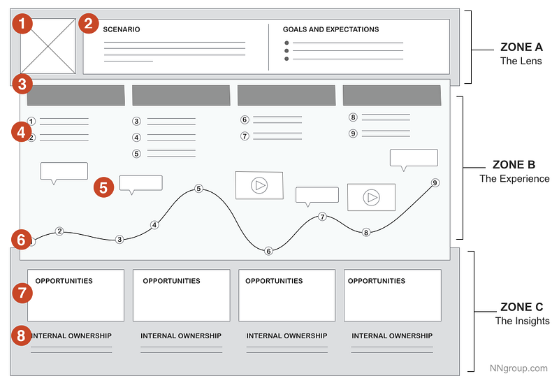
Rather than having the business base their understanding on metrics like KPIs, this provides a shared understanding through storytelling to get them to align on where might occur or how to address them.
However, these two tools, storytelling, and visualization, can also help get your team to understand where users have issues and drive your user research. This is because you can adapt your journey map to highlight our gaps in knowledge in a visual way to get your team on board with specific user research to conduct.
Showing your team visually where problems exist
One of the things that is sometimes a struggle is the idea of explaining what we’re trying to learn through user research.
I know I’m not alone in this problem. Tomer Sharon, Chief Experience Officer at Anywell, designed 1-page research plans to help your team understand what your user research is about.
This visualization won’t replace your research plan, but it is often a crucial way to add visual context to where users are having problems.
One thing I’ve learned since I started learning Data Visualization as a Designer is how much more powerful our visual system is than the verbal system for recognition.
According to Cole Nussbaumer Knaflic, author of Storytelling with Data, creating a timeline graph within a presentation can guide narratives and provide a ton of context.
Our timeline would exist for some types of presentations as nothing more than a line chart with some context.
However, we as Designers often do not work with quantitative data early on to create this type of chart. Adapting your journey map can help to serve as an alternative solution.
Highlighting your issues visually like this can map user actions against their emotional state and highlight what we’re trying to learn through user research.
Here’s how to do that.
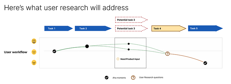
The power of the dotted lines
Dotted lines are one of the most precise indicators of uncertainty and one of the main ways to convey a necessary decision or action.
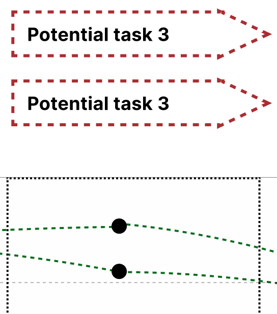
As a result, they’re one of the main ways to show that you might be missing information or that this is a knowledge gap. In my case, there wasn’t a clear ‘next step’ once our users got partially through the process. Users could either:
- Continue to another page, where there is a guided tour
- Stay on the same page and do more setup, or
- Return to the home page and see real-time data of their first tour
All of these were good choices, yet none was the front-runner for what we would recommend users to do. This was a decision that the business needed to make (What do we recommend) and a user research question (what do users prefer), so it worked doubly well with dotted lines.
If you’re unsure of the next step in the process, showcase several dotted lines going from one point to the next that can show where you’re uncertain (or which one you suggest).
However, this isn’t the only thing you should highlight.
Highlight value (and questions) through different icons
One of the most things I’ve learned since working on a Product-Led Growth team is designing for value instead of simply a good user experience.
Not all steps of the process are created equal: some steps are often very likely to result in users seeing value in your product (and thus engaging with it further). As a result, many Product teams prioritize getting your users to these steps quickly, with as little friction as possible.
This is why it may be helpful to identify these points and the specific user research questions we’re trying to address along the timeline. We can do both things by using specific icons, like “!” and “?”.
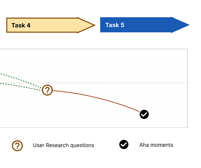
Highlight decision points through statuses
While showing a high-level overview of the process may provide context, we want to drive your team to act. One of the quickest ways to do this is through status tags like “Need Product Input.”
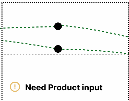
This is the easiest way to point out what needs to be addressed, although you will need to provide some more context around the options to result in a final decision.
For example, if you recommend that we move to the next page (and the next guided tour), you might highlight a line with a specific color and provide your reasons why on another slide.
This allows your team to quickly see, at a glance, where the issues are and what things need to be solved. This also provides a way to highlight changes over time to the process, along with updates that the team can address.
The power of visualizing your user research questions
I went to graduate school for Human-Centered Design, so I’m aware that this is not how you should use customer journey maps.
However, after working for over a decade in fields where it can be hard to access users, I’ve learned that persuading your team is often the first and hardest step.
I’ve also learned that visualization and storytelling can be the most potent ways to persuade your team as a designer.
So if you’re struggling to deliver the value of your user research (and what it will be about) to your team, consider visualizing a timeline of where the gaps in your knowledge may be to help your team understand where you’re coming from.
Doing so provides enough context (and reasoning) to get your user research approved and championed.
Kai Wong is a Senior Product Designer, Data-Informed Design Author, and Data and Design newsletter author. His new free book, The Resilient UX Professional, provides real-world advice to get your first UX job and advance your UX career.


