
How To Grow Your Email List: This Framework Is Based on 25+ Years of Email Marketing Experience
Building a list of qualified email addresses is the foundation of successful email marketing. Based on 25 years of experience, I have developed the ‘5 Levels of Subscription’ framework to help you systematically grow your email list.
In this article, you will learn how you can optimise your address acquisition step by step in order to gain significantly more addresses — without having to increase your marketing budget.
To design the framework, I analysed the lessons learned from over 25 years of email marketing and systematically divided them into five areas:
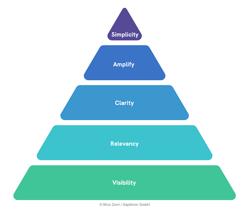
Level 1: Visibility
How can we increase the visibility of the newsletter?
If we do not create visibility for the newsletter, we will not generate any addresses. In the first level, we therefore pursue the goal of directing as much traffic as possible to the registration page and displaying opt-in elements to as many people as possible.
How to increase visibility
- Website, live chat, social media, etc.: Use all touchpoints to draw attention to your newsletter.
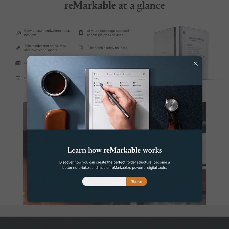
- Exit intent layers are displayed immediately before leaving the website. The layers achieve high attention values without impairing usability too much and are therefore ideal for address acquisition.
- We have also had good experiences with opt-in boxes that interrupt an editorial article and ideally refer to the content, which brings us to the second level.
Level 2: Relevancy
How can we increase relevance for subscribers?
Nobody gets up in the morning with the aim of subscribing to a newsletter. So think about what your target group is currently interested in: What topics are being discussed? What problems, fears or wishes do visitors to your website have?
The level of relevance therefore focuses on showing subscribers that your newsletter enriches their lives.
How to ensure higher relevance
- Create a convincing communication of benefits: “Stay up to date” is not enough — formulate very specific benefits to convince recipients to register.
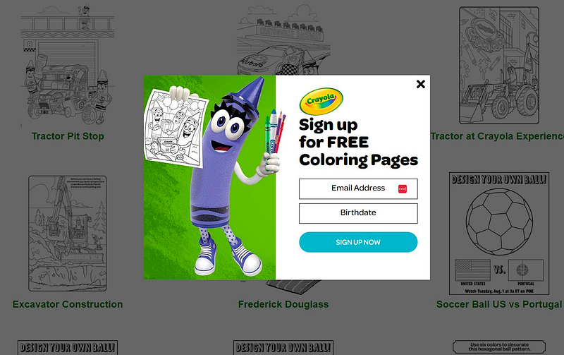
- Create an incentive that solves your target group’s most pressing problem. Depending on the target group (and business model), this could be a checklist, coloring pictures for the children, an e-book or a classic voucher. Important: Check regularly whether your incentive is still relevant for your target group.
- Control the opt-in elements in a context-sensitive manner based on the content currently being consumed: Is the visitor clicking through 20 cute cat photos? Then inform them that there are many more cute cats in your newsletter (this tactic doesn’t just work with cat content, by the way).
Level 3: Clarity
How can we simplify and guide perception?
A clear understanding of what it is about and what needs to be done is of great importance in the Clarity level. We therefore create a clear visual hierarchy to simplify newsletter sign-up and minimise the cognitive effort required by recipients.
How to create clarity
- Establish a clear visual hierarchy on your sign-up page: The headline should be seen first, followed by a short description of the newsletter and your benefit communication, followed by the registration form and the button.
- Make sure the typography is easy to read and use as few words as possible (but the right ones).
- Remove unnecessary elements that could distract from the sign-up process: Duplicate content, advertising banners and redundant design elements can cost you conversions and therefore addresses.
Level 4: Amplify
Which response amplifiers can we use?
Amplify stands for a response amplifier: We show the recipient why he or she should sign up for the newsletter right now.
How to use your response amplifier
- Use an activating, visually appealing copy: “Benefit from delicious recipe ideas” instead of “With our newsletter you will receive recipe ideas”.
- Work with behaviour patterns, such as Fear of Missing Out (“Don’t miss out…”) or Social Proof (“Already over 31,243 subscribers”).
- Testimonials can also be used as an amplifier on the sign-up page: Let satisfied readers have their say or integrate logos of successful companies whose employees read your newsletter (both of course only after appropriate approval).
Level 5: Simplicity
How can we make the sign-up process as simple as possible?
Every additional click and every unnecessary scroll means more effort for the user and therefore increases the likelihood that users will decide not to sign up after all.
The last level, Simplicity, focuses on simple and convenient registration: How can we further reduce the effort for interested parties and remove unnecessary barriers?
How to simplify the sign-up process
- The headline, the benefit communication and the form should be placed in the directly visible screen area (above-the-fold).
- Captchas are typical conversion killers — nobody wants to solve a puzzle before signing up for a newsletter. Instead, we can work with a honeypot, for example, to (largely) prevent automated registrations.
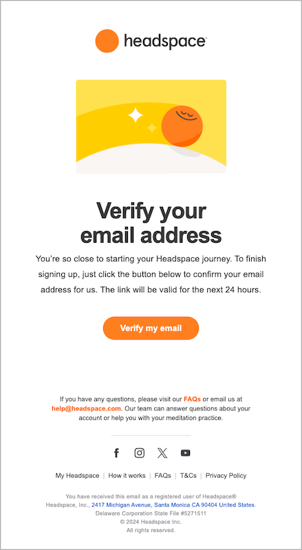
- Check whether your double opt-in process is optimised — in practice, a significant proportion of subscribers are often lost because the opt-in email ends up in the spam folder, is sent too late or is not structured in a targeted manner.
Summary: 5 levels for more email addresses
The “5 Levels of Subscription” framework can serve as a blueprint for optimising email address acquisition. By systematically applying the framework, you can continuously improve your address acquisition strategies and tactics.
As a result, you will acquire more qualified email addresses every day with the same number of visitors and thus create the basis for sustainably successful email marketing.
Thank you for reading this article! Your support makes my writing possible. You can sign up for emails when I publish on Medium.