
How to explore the golden ratio in design and typography
The secret lies in 1.61803398875
Looking at designs, typography, and works of art based on the golden ratio always makes me smile and cheer.
A lot has been written and explained about the golden ratio since antiquity. Mathematicians, theorists, architects, artists, and designers believe it to be aesthetically pleasing, delightful, and visually recognizable in natural forms, such as in sea shells, flower petals, and even spiraling galaxies.
While mathematicians dig deep into the golden ratio number theory, which is basically a relationship of a/b = a+b/a = 1.618, for designers, the important relationship is between two squares, plus their sum of 2 sides squared, to form a new rectangle of squares that, when 1.618 times larger, will have the same short side value as the long side value of the originating squares.
In other words, it’s a little complicated, and it’s easier to visualize it than to do the math. The relationship of the proportional 1.618 value can be illustrated like this:
Example 1: The relationship of the long- and short sides of the sum of the squares
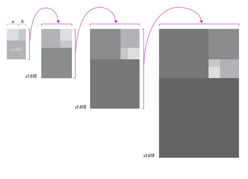
This example can be shown as an ever growing square consisting of many squares enlarged by 161.8%.
We now have a compositional grid structure that can be of great value for designing in harmony and aesthetically pleasing.
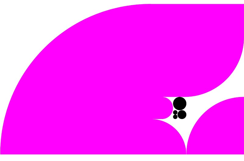
Example 2: The golden ratio grid colored

Example 2 shows us the eye-pleasing nature of the golden ratio, the relationship of 1.618, as shown in example 1.
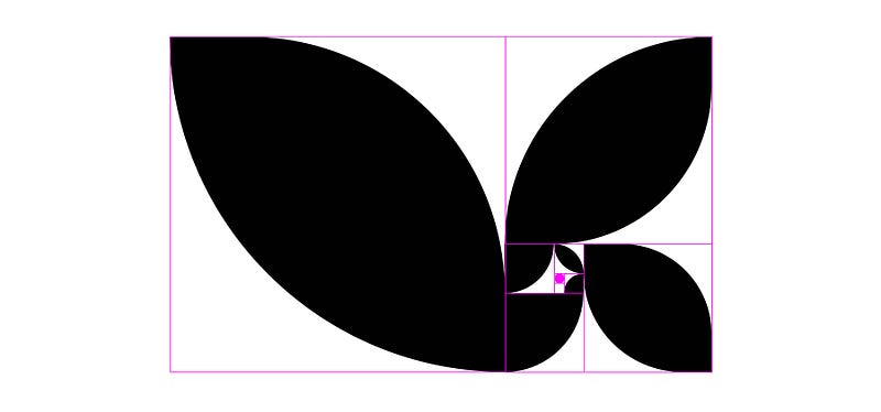
When we look at the relationship of the golden ratio in nature, we can see it succinctly in the spiral form that emerges when diagonally connecting the even squares.
Example 3: The often-seen spiral based on the golden ratio grid
The golden ratio spiral is drawn connecting the diagonally-opposed points on every square with a Bézier curve. As an infinite line, the curves form a beautiful spiral, often also seen in nature in sea shells, ferns, or petals.

Example 4: Simple design composition using different golden ratio elements
Based on these compositional golden ratio elements, we can use the proportions of the page to design column and grid layouts.
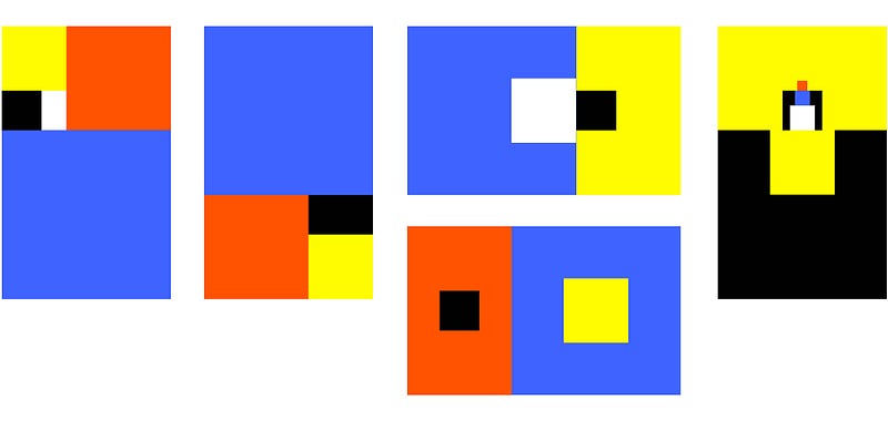
Examples 5: The square shapes can take on any forms
As long as the originating square is based on the golden grid proportions, we can make element-specific corners round, oe squares can become full circles..
Playing around with the shapes and colors, we can get a number of aesthetically pleasing compositions that are also illustrative and innovative.

Thus, the golden ratio, or the multiplier 1.618, the magic number really, can provide us with a perfect set-up when composing page layouts, illustrations, or graphic renderings.
The golden ratio in design system typography
Design systems require typographic scales. We need to scale type strategically and modularly.[1]
One strategy is to scale type up or down by 2, 4, and 8 pixels, with the base text copy at 16 px. Or we can scale up/down by x1.125, x1.25, or x1.309, or we can scale based on the golden ratio.
Figma has several plug-ins for scale type. My favorite plug-in is the Typescales, which quickly let’s designers establish a design system typographic scale.[2]
Example 6: The golden ratio in the Figma TypeScale plugin
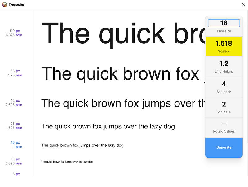
Figma’s TypeScale plugin does all the math to scale a basesize type up and/or down, based on the scale chosen. The golden ratio scale provides dramatic type harmonies.
See how artists have been drawn to the aesthetics of the golden ratio for ages
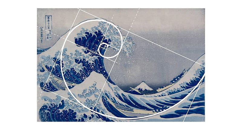
Hokusai’s Great Wave
Whether Katsushika Hokusai, the artist who drew and designed the woodblock for the world-famous The Great Wave off Kanagawa (c. 1829–1832) was aware of the golden ratio or simply found the same aesthetically pleasing proportions by heart is unknown. What we do see now is that the wave follows the principle of the golden ratio, and therewith captivates our attention.[3]
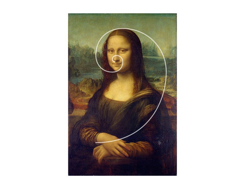
Da Vinci’s Mona Lisa
Leonardo da Vinci’s portrait of Lisa del Giocondo is probably the world’s most famous painting. Da Vinci painted it in the years 1452–1519. We’ve seen thousand of pictures of the Mona Lisa and are smitten by its beauty every day and every time we look at it.[4]
But did we ever look at it in the context for the golden ratio? Undoubtedly, da Vinci had the perfect eye for the perfect proportions.
Thank you and enjoy.
Interested in learning more about UI and UX design, trends, tools, design insights and techniques? Join Medium with this link, and support my future writing endeavors on UI/UX design.
Thank you! ✍️🧡
All illustrations ©Eva Schicker 2023, unless otherwise noted. Art works by Hokusai and da Vinci are public domain assets, as indicated.
References:
[1] The complexity of design systems: https://evaschicker2012.medium.com/the-complexity-of-ux-design-systems-699479cde0b9?sk=c13e1b44f5b5c9b57a198df3cf7f4e47
[2] Figma plug-in for Typescales: https://www.figma.com/community/plugin/739825414752646970/Typescales
[3] Katsushika Hokusai: https://en.wikipedia.org/wiki/Hokusai
[4] Leonardo da Vinci: https://en.wikipedia.org/wiki/Leonardo_da_Vinci