

How to embed Bootstrap CSS & JS in your Python Dash app
Build a COVID-19 infection forecaster app with Dash Bootstrap Components
Summary
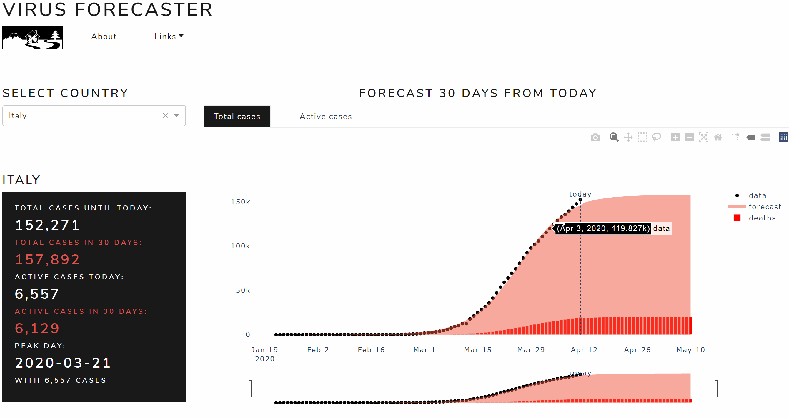
In this article I will show how to build a web app that forecasts the spread of covid-19 virus within any infected countries using Python, Dash and Bootstrap, that looks like this:
Let me start with this: coding a Dash app is messy… I don’t mean any harm with this, I like Dash and I think it is the future of web development for Python. Dash is a Python (and R) framework for building web applications. It’s built on top of Flask, Plotly.js and React js. It is open source, its apps run on the web browser. Dash is super convenient if you are better in Python than Javascript because allows you to build dashboards using pure Python.
I don’t know if you’ve ever seen a dash application code. It’s a mess: the code comes out really long as you need to write every html Div with contents and properties, just like an html page before that Bootstrap was invented. Bootstrap is an open source toolkit for developing with HTML, CSS, and JS. It is the most used library for web development thanks to its extensive prebuilt components and powerful plugins built on jQuery.
I love Boostrap, not only because the output is always pretty good looking, but especially because it saves you lines and lines of HTML, CSS and JS code. What if I tell you that it is possible also for Dash applications? You like the sound of that, don’t you?
Through this tutorial I will explain step by step how Bootstrap can be easily integrated in Dash and how to build and deploy a web application, using my Covid-19 infection forecaster app as an example (link below, it might take 30 seconds to load).
I will present some useful Python code that can be easily used in other similar cases (just copy, paste, run) and walk through every line of code with comments, so that you can easily replicate this example (link to the full code below).
I’ll use the most popular dataset in these days of quarantine: CSSE COVID-19 dataset. It presents the time series of the number of confirmed cases of contagion reported by each country every day since the pandemic started. This dataset is freely available on the GitHub of the Johns Hopkins University (link below).
In particular, I will go through:
- Setup of the environment
- Back-end: Write the model to get, process and plot the data
- Front-end: Build the app with Dash and Bootstrap
- Deploy the app
Setup
First of all, I will install the following libraries through the terminal:
pip install dashpip install dash-bootstrap-componentspip install pandasThe command to install dash will also download useful packages like dash-core-components, dash-html-components and plotly. Similarly, pandas installation includes numpy and scipy that I will use later as well. I assume you already know those, therefore I shall take a moment to introduce Dash Bootstrap Components: basically it’s what does the trick to integrate Bootstrap in Dash and makes easier to build consistently styled apps with complex and responsive layouts. I’m a fan of this library because it saves a huge number of lines of dash code, you’ll see later.
After installing all you need, I would recommend running the following command on the terminal to save the requirements on the appropriate text file:
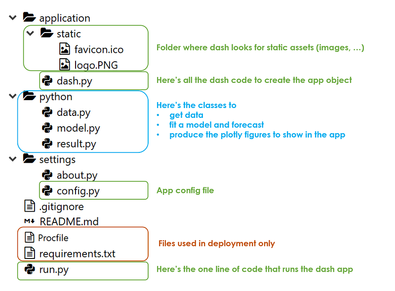
pip freeze > requirements.txtIn regard to the folder structure, I put 4 fundamental elements on root level:
- application folder: where all the dash code is going to be, in dash.py file
- python folder: where I place the logic of the model
- settings folder: where there are all the configurations
- run.py file: that runs the whole thing if executed on the terminal with the following command
python run.pyThose mentioned so far are all I need to make the app work, however, there are some other useful but unnecessary things that I added like static images (in application folder), comments (in settings folder), Procfile and requirements.txt used in deployment (on root level).
To summarize, the app shall have the following structure:
Now that it’s all set, I will go through each python file and show the code in it. Let’s get started, shall we?
Back-end: get data, process, plot
Firstly, I will write the class to get Covid-19 infection data, then I will build the model that learns from past observation and forecast the future trend of the time series.
In data.py (inside the python folder) I’ll define the “Data” class with a method that shall be executed when the app starts, meaning that every time the page of the browser where the app runs is loaded, the back-end gets fresh data directly from the source (“get_data” function in the code below). It’s important to save the list of countries because it will be shown to users on the dashboard for selecting a specific country. The Data class has also the task to receive the input from the front-end, the country selected by the user, filter and process data (“process_data” function in the code below). Before filtering for a specific country, I’d create an aggregated time series called “World” which shall be the default selected country when the app starts.
In python terms, the data.py file looks like this:
import pandas as pd
class Data():

    def get_data(self):
        self.dtf_cases = pd.read_csv("https://raw.githubusercontent.com/CSSEGISandData/COVID-19/master/csse_covid_19_data/csse_covid_19_time_series/time_series_covid19_confirmed_global.csv", sep=",")
        self.countrylist = ["World"] + self.dtf_cases["Country/Region"].unique().tolist()
    @staticmethod
    def group_by_country(dtf, country):
        dtf = dtf.drop(['Province/State','Lat','Long'], axis=1).groupby("Country/Region").sum().T
        dtf["World"] = dtf.sum(axis=1)
        dtf = dtf[country]
        dtf.index = pd.to_datetime(dtf.index, infer_datetime_format=True)
        ts = pd.DataFrame(index=dtf.index, data=dtf.values, columns=["data"])
        return ts


    def process_data(self, country):
        self.dtf = self.group_by_country(self.dtf_cases, country)
Now, I’ll build the model to fit data and forecast. The purpose of this article is not to dig in what is the most appropriate model for this dataset, therefore I’ll keep it simple: I am going to use a parametric curve fitting approach, optimizing the parameters of a logistic function for each country time series. If you are interested in this basic modelling approach you can find it explained here.
In model.py (inside the python folder) I’ll define the “Model” class with a method (“forecast” function in the code below) that shall be executed on the World time series when the app starts and each time that a specific country is selected from the front-end. This class has the job to fit the best logistic function on the selected country data (with scipy) and produce a pandas dataframe with:
- the actual data and the fitted logistic model, which shall be used to plot the total cases
- the daily change of the actual data and the fitted logistic model (delta t = y t — y t-1), which shall be used to plot the active cases.
To give an illustration, the model.py file contains the following code:
import pandas as pd
import numpy as np
from scipy import optimize
class Model():

    def __init__(self, dtf):
        self.dtf = dtf


    @staticmethod
    def f(X, c, k, m):
        y = c / (1 + np.exp(-k*(X-m)))
        return y


    @staticmethod
    def fit_parametric(X, y, f, p0):
        model, cov = optimize.curve_fit(f, X, y, maxfev=10000, p0=p0)
        return model


    @staticmethod
    def forecast_parametric(model, f, X):
        preds = f(X, model[0], model[1], model[2])
        return preds


    @staticmethod
    def generate_indexdate(start):
        index = pd.date_range(start=start, periods=30, freq="D")
        index = index[1:]
        return index


    @staticmethod
    def add_diff(dtf):
        ## create delta columns
        dtf["delta_data"] = dtf["data"] - dtf["data"].shift(1)
        dtf["delta_forecast"] = dtf["forecast"] - dtf["forecast"].shift(1)
        ## fill Nas
        dtf["delta_data"] = dtf["delta_data"].fillna(method='bfill')
        dtf["delta_forecast"] = dtf["delta_forecast"].fillna(method='bfill')
        ## interpolate outlier
        idx = dtf[pd.isnull(dtf["data"])]["delta_forecast"].index[0]
        posx = dtf.index.tolist().index(idx)
        posx_a = posx - 1
        posx_b = posx + 1
        dtf["delta_forecast"].iloc[posx] = (dtf["delta_forecast"].iloc[posx_a] + dtf["delta_forecast"].iloc[posx_b])/2
        return dtf
     def forecast(self):
        ## fit
        y = self.dtf["data"].values
        t = np.arange(len(y))
        model = self.fit_parametric(t, y, self.f, p0=[np.max(y),1,1])
        fitted = self.f(t, model[0], model[1], model[2])
        self.dtf["forecast"] = fitted
        ## forecast
        t_ahead = np.arange(len(y)+1, len(y)+30)
        forecast = self.forecast_parametric(model, self.f, t_ahead)
        ## create dtf
        self.today = self.dtf.index[-1]
        idxdates = self.generate_indexdate(start=self.today)
        preds = pd.DataFrame(data=forecast, index=idxdates, columns=["forecast"])
        self.dtf = self.dtf.append(preds)
        ## add diff
        self.dtf = self.add_diff(self.dtf)
It’s time to make some cool plots and the best tool for the job is Plotly as Dash is built on top of it. I will put in result.py (inside the python folder) the class that is going to take care of this with
- the method to plot the total cases time series and its forecast (“plot_total” function in the code below):
- the method to plot the active cases time series and its forecast (“plot_active” function in the code below):
- the method to retrieve some statistics to show on the front-end (“get_panel” function in the code below):
Here’s the code full code in result.py:
import pandas as pd
import plotly.graph_objects as go
class Result():
def __init__(self, dtf):
self.dtf = dtf
@staticmethod
def calculate_peak(dtf):
data_max = dtf["delta_data"].max()
forecast_max = dtf["delta_forecast"].max()
if data_max >= forecast_max:
peak_day = dtf[dtf["delta_data"]==data_max].index[0]
return peak_day, data_max
else:
peak_day = dtf[dtf["delta_forecast"]==forecast_max].index[0]
return peak_day, forecast_max
@staticmethod
def calculate_max(dtf):
total_cases_until_today = dtf["data"].max()
total_cases_in_30days = dtf["forecast"].max()
active_cases_today = dtf["delta_data"].max()
active_cases_in_30days = dtf["delta_forecast"].max()
return total_cases_until_today, total_cases_in_30days, active_cases_today, active_cases_in_30days
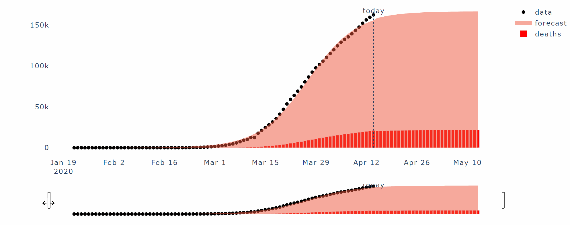
def plot_total(self, today):
## main plots
fig = go.Figure()
fig.add_trace(go.Scatter(x=self.dtf.index, y=self.dtf["data"], mode='markers', name='data', line={"color":"black"}))
fig.add_trace(go.Scatter(x=self.dtf.index, y=self.dtf["forecast"], mode='none', name='forecast', fill='tozeroy'))
## add slider
fig.update_xaxes(rangeslider_visible=True)
## set background color
fig.update_layout(plot_bgcolor='white', autosize=False, width=1000, height=550)
## add vline
fig.add_shape({"x0":today, "x1":today, "y0":0, "y1":self.dtf["forecast"].max(),
"type":"line", "line":{"width":2,"dash":"dot"} })
fig.add_trace(go.Scatter(x=[today], y=[self.dtf["forecast"].max()], text=["today"], mode="text", line={"color":"green"}, showlegend=False))
return fig
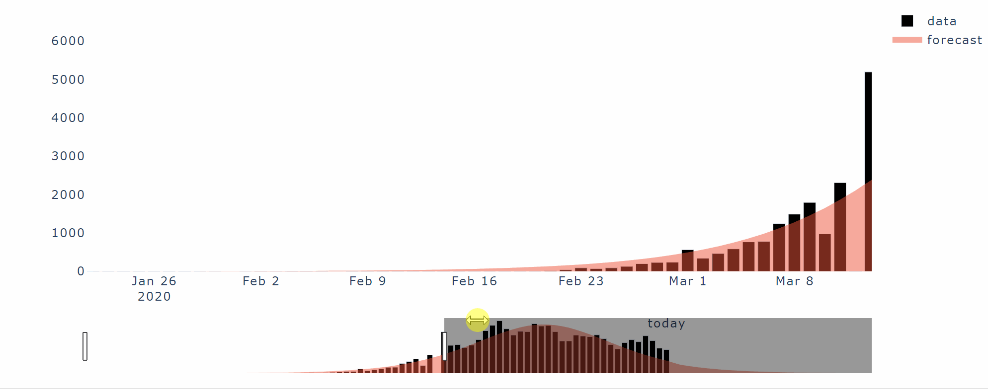
def plot_active(self, today):
## main plots
fig = go.Figure()
fig.add_trace(go.Bar(x=self.dtf.index, y=self.dtf["delta_data"], name='data', marker_color='black'))
fig.add_trace(go.Scatter(x=self.dtf.index, y=self.dtf["delta_forecast"], mode='none', name='forecast', fill='tozeroy'))
## add slider
fig.update_xaxes(rangeslider_visible=True)
## set background color
fig.update_layout(plot_bgcolor='white', autosize=False, width=1000, height=550)
## add vline
fig.add_shape({"x0":today, "x1":today, "y0":0, "y1":self.dtf["delta_forecast"].max(),
"type":"line", "line":{"width":2,"dash":"dot"} })
fig.add_trace(go.Scatter(x=[today], y=[self.dtf["delta_forecast"].max()], text=["today"], mode="text", line={"color":"green"}, showlegend=False))
return fig
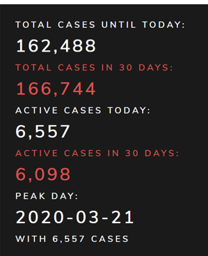
def get_panel(self):
peak_day, num_max = self.calculate_peak(self.dtf)
total_cases_until_today, total_cases_in_30days, active_cases_today, active_cases_in_30days = self.calculate_max(self.dtf)
return peak_day, num_max, total_cases_until_today, total_cases_in_30days, active_cases_today, active_cases_in_30daysFront-end: Build the app with Dash and Bootstrap
Finally, here we are, about to code the app using Dash and Dash Bootstrap Components (henceforth as “dbc”), I am going to explain it step by step and also provide the full code of dash.py (inside the application folder).
For this we need the following imports:
import dash
from dash.dependencies import Input, Output, State
import dash_core_components as dcc
import dash_html_components as html
import dash_bootstrap_components as dbc
As start, I need to define the app instance and in doing this dbc already provides a great feature in choosing a Bootstrap CSS theme:
app = dash.Dash(external_stylesheets=[dbc.themes.LUX])Following a visual order, I shall now approach the top navbar. I want something cool and reactive on click, with pop-ups and a drop-down menu, but I’d like to not waste too much time on writing CSS and JS code. To put it another way, I want to use Bootstrap like this:
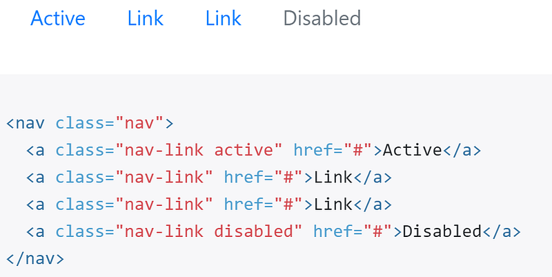
Similarly to this html, we can use dbc to crate the navbar and its items:
dbc.Nav([
    dbc.NavItem(),
    dbc.NavItem(),
    dbc.DropdownMenu()
])
You got the gimmick, right? Dash and Dbc replicate the same structure and logic of the html syntax. With this in mind, inside each item we can add whatever we want:

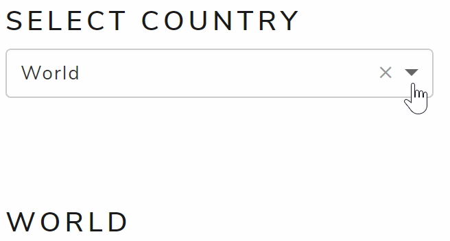
Moving on with the input form, I‘d like to get a simple drop-down menu with all the possible countries as options and the “World” as default selection. In order to do this, it’s necessary to read the data before coding the drop-down menu object. Do you remember the Data class written before in data.py (python folder)? Well, now it’s the right time to use it:
from python.data import Datadata = Data()
data.get_data()Now that we have the country list in the Data object, we can write the drop-down menu and set the options in it with a simple for loop:
dcc.Dropdown(id="country", options=[{"label":x,"value":x} for x in
data.countrylist], value="World")])In Dash, if not specifically programmed, the output will be put in rows, one below the other. However, I’d like to have all contained in the screen size, so users do not need to scroll down. That’s why I am going to use tabs and each one will show one of the 2 plots I coded before in result.py (in python folder) with plotly. With dbc this is super easy:
dbc.Tabs([
dbc.Tab(dcc.Graph(id="plot-total"), label="Total cases"),
dbc.Tab(dcc.Graph(id="plot-active"), label="Active cases")
])I bet you’re wondering “how does the app know that in the first tab it has to put the first plot and in the second the other?”. Well, you’re not wrong, the app needs a link between the html and the Python code output. In Dash this is done with callbacks. A callback is nothing more than a decorator, a function that takes another function and extends the behavior of the latter function without explicitly modifying it.
Let’s take the plot of total cases as an example: I need a function that takes the country selected from the front-end as input and returns the plot as output using the Model and Result classes I coded before (in python folder). Something like this:
def plot_total_cases(country):
data.process_data(country)
model = Model(data.dtf)
model.forecast()
model.add_deaths(data.mortality)
result = Result(model.dtf)
return result.plot_total(model.today)As you surely noticed, in the previous code where I defined the tabs, I put an id in the first one (id=”plot-total”). So I need to add, on top of this function, a callback decorator to tell the app that the figure the back-end will plot refers to that id and that the input is the country value.
@app.callback(output=Output("plot-total","figure"),
inputs=[Input("country","value")]) 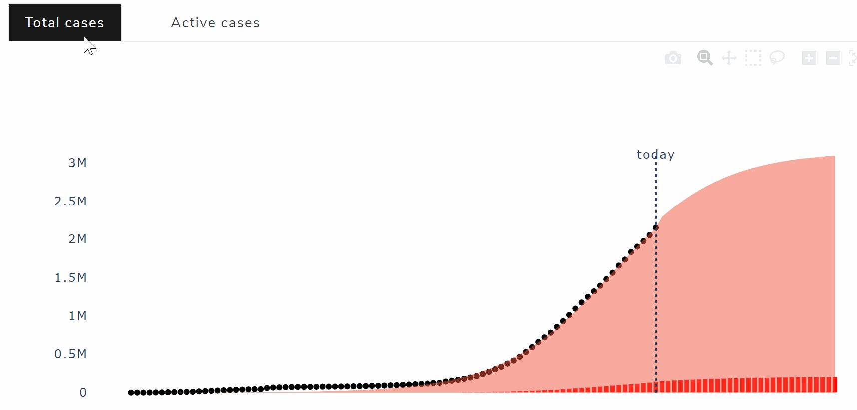
Ultimately, the panel on the right with some statistics is a little different because the python function doesn’t return a plot like before but an entire html div. In fact, the dash code this time is going to be inside the callback function that calculate those numbers. I’m talking about this:
This covers pretty much all the elements of the front-end layout, it’s a very basic application with one single input and few outputs (plots and numbers).
Full code of dash.py:
# Setup
import dash
from dash.dependencies import Input, Output, State
import dash_core_components as dcc
import dash_html_components as html
import dash_bootstrap_components as dbcfrom settings import config, about
from python.data import Data
from python.model import Model
from python.result import Result# Read data
data = Data()
data.get_data()# App Instance
app = dash.Dash(name=config.name, assets_folder=config.root+"/application/static", external_stylesheets=[dbc.themes.LUX, config.fontawesome])
app.title = config.name# Navbar
navbar = dbc.Nav(className="nav nav-pills", children=[
## logo/home
dbc.NavItem(html.Img(src=app.get_asset_url("logo.PNG"), height="40px")),
## about
dbc.NavItem(html.Div([
dbc.NavLink("About", href="/", id="about-popover", active=False),
dbc.Popover(id="about", is_open=False, target="about-popover", children=[
dbc.PopoverHeader("How it works"), dbc.PopoverBody(about.txt)
])
])),
## links
dbc.DropdownMenu(label="Links", nav=True, children=[
dbc.DropdownMenuItem([html.I(className="fa fa-linkedin"), " Contacts"], href=config.contacts, target="_blank"),
dbc.DropdownMenuItem([html.I(className="fa fa-github"), " Code"], href=config.code, target="_blank")
])
])# Input
inputs = dbc.FormGroup([
html.H4("Select Country"),
dcc.Dropdown(id="country", options=[{"label":x,"value":x} for x in data.countrylist], value="World")
])# App Layout
app.layout = dbc.Container(fluid=True, children=[
## Top
html.H1(config.name, id="nav-pills"),
navbar,
html.Br(),html.Br(),html.Br(), ## Body
dbc.Row([
### input + panel
dbc.Col(md=3, children=[
inputs,
html.Br(),html.Br(),html.Br(),
html.Div(id="output-panel")
]),
### plots
dbc.Col(md=9, children=[
dbc.Col(html.H4("Forecast 30 days from today"), width={"size":6,"offset":3}),
dbc.Tabs(className="nav nav-pills", children=[
dbc.Tab(dcc.Graph(id="plot-total"), label="Total cases"),
dbc.Tab(dcc.Graph(id="plot-active"), label="Active cases")
])
])
])
])# Python functions for about navitem-popover
@app.callback(output=Output("about","is_open"), inputs=[Input("about-popover","n_clicks")], state=[State("about","is_open")])
def about_popover(n, is_open):
if n:
return not is_open
return is_open@app.callback(output=Output("about-popover","active"), inputs=[Input("about-popover","n_clicks")], state=[State("about-popover","active")])
def about_active(n, active):
if n:
return not active
return active# Python function to plot total cases
@app.callback(output=Output("plot-total","figure"), inputs=[Input("country","value")])
def plot_total_cases(country):
    data.process_data(country)
    model = Model(data.dtf)
    model.forecast()
    model.add_deaths(data.mortality)
    result = Result(model.dtf)
return result.plot_total(model.today)# Python function to plot active cases
@app.callback(output=Output("plot-active","figure"), inputs=[Input("country","value")])
def plot_active_cases(country):
data.process_data(country)
model = Model(data.dtf)
model.forecast()
model.add_deaths(data.mortality)
result = Result(model.dtf)
return result.plot_active(model.today)# Python function to render output panel
@app.callback(output=Output("output-panel","children"), inputs=[Input("country","value")])
def render_output_panel(country):
data.process_data(country)
model = Model(data.dtf)
model.forecast()
model.add_deaths(data.mortality)
result = Result(model.dtf)
peak_day, num_max, total_cases_until_today, total_cases_in_30days, active_cases_today, active_cases_in_30days = result.get_panel()
peak_color = "white" if model.today > peak_day else "red"
panel = html.Div([
html.H4(country),
dbc.Card(body=True, className="text-white bg-primary", children=[
html.H6("Total cases until today:", style={"color":"white"}),
html.H3("{:,.0f}".format(total_cases_until_today), style={"color":"white"}),
html.H6("Total cases in 30 days:", className="text-danger"),
html.H3("{:,.0f}".format(total_cases_in_30days), className="text-danger"),
html.H6("Active cases today:", style={"color":"white"}),
html.H3("{:,.0f}".format(active_cases_today), style={"color":"white"}),
html.H6("Active cases in 30 days:", className="text-danger"),
html.H3("{:,.0f}".format(active_cases_in_30days), className="text-danger"),
html.H6("Peak day:", style={"color":peak_color}),
html.H3(peak_day.strftime("%Y-%m-%d"), style={"color":peak_color}),
html.H6("with {:,.0f} cases".format(num_max), style={"color":peak_color})
])
])
return panelHow do we find out if we made any errors in the code? We run the application. Only one line of code is necessary to run the whole thing and I shall put it in the run.py file (on root level):
from application.dash import app
from settings import configapp.run_server(debug=config.debug, host=config.host, port=config.port)Run the following command in the terminal:
python run.pyand you should see this:
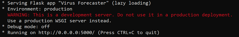
Great job, the application is up and running!
Deploy
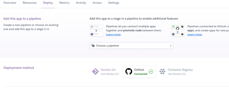
Do you want to make your application available for anyone? Then you have to deploy it somewhere. I usually use Heroku, a cloud platform as a service that allows deploying a PoC app with just a free account.
You can link a Github repo and deploy one of the branches.
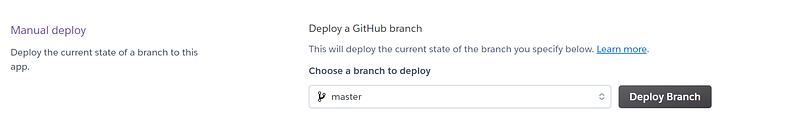
In order for this to work, the app needs a requirements.txt and a Procfile. In the Setup section, I already put the command to create the text file with the required packages. In regard to the Procfile, it’s just the command line to run the app that I put in the previous section. Heroku will run it and there you go:

Conclusion
This article has been a tutorial to show how easy is to build a nice looking web application with Dash and Dash Bootstrap Components that embeds all the CSS and JS of Bootstrap. I used my Covid-19 infection forecaster app as example, going through every step from back-end to front-end and even deployment. Now that you know how it works, you can develop your own forecaster, for example changing the data source (i.e. yahoo finance) and the machine learning model (i.e. lstm neural network) you can build a stock price forecaster.
I hope you enjoyed it! Feel free to contact me for questions and feedback or just to share your interesting projects.
👉 Let’s Connect 👈
This article is part of the series Web Development with Python, see also:


