
How to draw interactive visuals in Python?
Usually plotted by matplotlib is static. In this article, I am going to introduce how to produce the visuals interactively.
- qt backend
#!pip install mpl_interactions
%matplotlib qt  # qt backend
import matplotlib.pyplot as plt
import numpy as np
from matplotlib.widgets import Slider
import mpl_interactions.ipyplot as iplt

plt.style.use('fivethirtyeight')
fig, ax = plt.subplots(dpi=80)
plt.subplots_adjust(bottom=.25)
x = np.linspace(0, 2 * np.pi, 200)


def f(x, freq):
    return np.sin(x * freq)


axfreq = plt.axes([0.25, 0.1, 0.65, 0.03])
slider = Slider(axfreq, label='freq', valmin=.05, valmax=10)
controls = iplt.plot(x, f, freq=slider, ax=ax)
At the bottom you can drag the frequency bar to change the curve.
2. ipympl backend
%matplotlib ipympl
import numpy as np
import pandas as pd
import mpl_interactions.ipyplot as iplt
import matplotlib.pyplot as plt

plt.style.use('fivethirtyeight')

x = np.linspace(0, np.pi, 100)
tau = np.linspace(0.5, 10, 100)


def f1(x, tau, beta):
    return np.sin(x * tau) * x * beta


def f2(x, tau, beta):
    return np.sin(x * beta) * x * tau


fig, ax = plt.subplots(dpi=80)

#iplt.plot
controls = iplt.plot(x, f1, tau=tau, beta=(1, 10, 100), label="f1")
iplt.plot(x, f2, controls=controls, label="f2")


_ = plt.legend()
iplt.title("iplt.plot: tau is {tau:.2f}", controls=controls['tau'])
plt.show()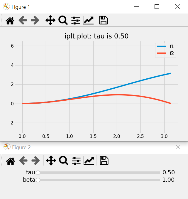
It will pop up 2 figures. You can drag the second one to change the curve.
3. Histogram
%matplotlib ipympl
import ipywidgets as widgets
import matplotlib.pyplot as plt
import numpy as np

from mpl_interactions import interactive_hist


def f(loc, scale):
    return np.random.randn(10000) * scale + loc


fig, ax = plt.subplots(dpi=80)
controls = interactive_hist(f, loc=(0, 10, 100), scale=(0.5, 5))
iplt.title("iplt.interactive_hist: loc is {loc:.2f} ", controls=controls['loc'])
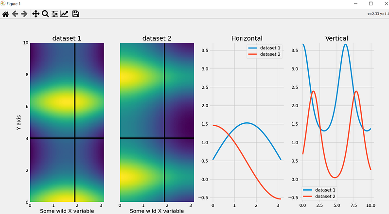
4. Heatmap
%matplotlib widget
import matplotlib.pyplot as plt
import numpy as np

from mpl_interactions import heatmap_slicer

x = np.linspace(0, np.pi, 100)
y = np.linspace(0, 10, 200)
X, Y = np.meshgrid(x, y)
data1 = np.sin(X) + np.exp(np.cos(Y))
data2 = np.cos(X) + np.exp(np.sin(Y))
fig, axes = heatmap_slicer(
    x,
    y,
    (data1, data2),
    slices="both",
    heatmap_names=("dataset 1", "dataset 2"),
    labels=("Some wild X variable", "Y axis"),
    interaction_type="move",
)
Thank you for reading.