
How to draw 3D scatter plots in Python?
A scatter plot is commonly used in data science. It can help compare 2 attributes and display their relationship. What if compare 3?
In this article, I am going to introduce how to draw 3D scatter plots and making some extensions.
Let’s see a simple example:
import numpy as np
import matplotlib.pyplot as plt

np.random.seed(261)
x = np.random.normal(size=150)
y = np.random.normal(size=150)
z = np.random.normal(size=150)

fig = plt.figure()
ax = fig.add_subplot(111, projection='3d')
ax.scatter(x, y, z)

ax.set_xlabel('X')
ax.set_ylabel('Y')
ax.set_zlabel('Z')

plt.show()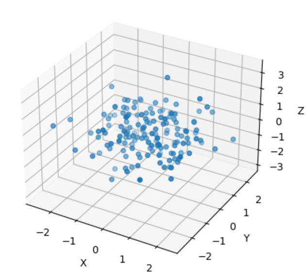
The method is the same as 2D scatter plots. It just adds one more dimension in scatter() function.
Also, it is the same to set up some parameters:
import numpy as np
import matplotlib.pyplot as plt

np.random.seed(261)
x = np.random.normal(size=150)
y = np.random.normal(size=150)
z = np.random.normal(size=150)

fig = plt.figure()
ax = fig.add_subplot(111, projection='3d')

# Set points color, size, transparency and marker type
ax.scatter(x, y, z, c='r', s=10, alpha=0.5, marker='o')

ax.set_xlabel('X')
ax.set_ylabel('Y')
ax.set_zlabel('Z')

plt.show()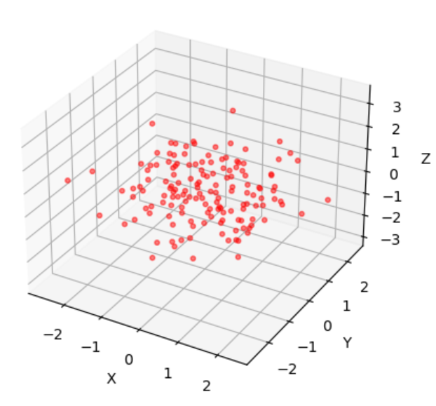
It is possible to produce a dynamical plot:
import numpy as np
import matplotlib.pyplot as plt
from matplotlib.animation import FuncAnimation
from IPython.display import HTML

fig = plt.figure()
ax = fig.add_subplot(111, projection='3d')

N = 100
xs = np.random.randn(N)
ys = np.random.randn(N)
zs = np.random.randn(N)

scatter = ax.scatter(xs, ys, zs, c='b', marker='o')

def update(frame):
    # Change the data randomly
    xs_new = np.random.randn(N)
    ys_new = np.random.randn(N)
    zs_new = np.random.randn(N)

    # Update the plot
    scatter._offsets3d = (xs_new, ys_new, zs_new)

    return scatter,

# Create an animation
animation = FuncAnimation(fig, update, frames=range(50), interval=200, blit=True)

# Display the animation in Jupyter Notebook
HTML(animation.to_jshtml())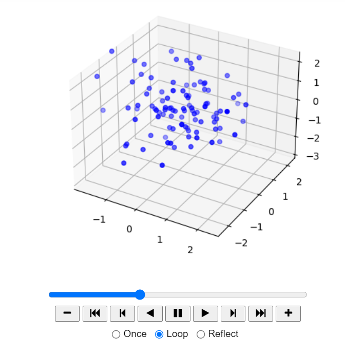
You can click the PLAY button to see it’s change.
The last one, I would like to introduce an interactive plot:
import numpy as np
import plotly.graph_objects as go
from plotly.subplots import make_subplots

np.random.seed(0)
x = np.random.randn(100)
y = np.random.randn(100)
z = np.random.randn(100)

fig = make_subplots(rows=1, cols=1, specs=[[{'type': 'scatter3d'}]])

scatter = go.Scatter3d(
    x=x,
    y=y,
    z=z,
    mode='markers',
    marker=dict(
        size=5,
        color=z,
        colorscale='Viridis',
        opacity=0.8
    )
)

fig.add_trace(scatter)

fig.update_layout(
    scene=dict(
        xaxis=dict(title='X'),
        yaxis=dict(title='Y'),
        zaxis=dict(title='Z'),
    ),
    title='Interactive Scatter Plot',
)

fig.show()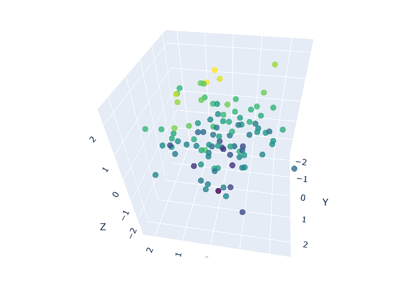
Now you can hover your mouse to see every point’s position. You can drag and move the plot and use your mouse wheel to zoom in or out.
It uses plotly to draw the scatter plot instead of matplotlib. The syntaxs are similar. But plotly is able to produce interactive plots which is the limit of matplotlib.
Thank you for reading.