
How to Display Large Data Tables on Small Screens
The best responsive table design
There’s no better way to display lots of data than to use a table. Viewing tables on desktop screens is easy but difficult when viewing them on mobile screens. A data table expands horizontally and can’t fit in such a confined space.
What’s the best way to display a large data table on small mobile screens? Many designers struggle with solving this problem. They’ve proposed potential solutions, but none offer an optimal user experience. To answer this question, you have to understand the purpose of tables and their information structure.
Carousel Columns
Tables are useful because they allow users to compare different data values. The main data they want to compare is the first column, the key identifier value. The rest of the columns are the attribute values that describe the key ID values.
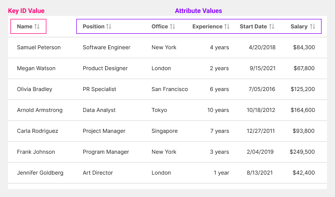
This means that the key ID values should always stay locked in place so users can always see it. Users won’t have a reference point when viewing other values without the key ID. However, the attribute values don’t have to stay visible.
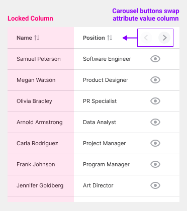
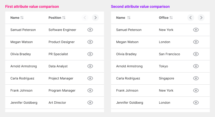
Since it’s impossible to fit every column on the screen, we must swap out attribute values to compare key ID values. For this reason, using carousel buttons to swap the column headers is best.
Only the header for the second column will swap as users click the arrows. Each click allows them to view a new attribute value to compare. As they scroll down the table, the column headers should stay visible to provide context.
The third column is the controls column which will also stay locked in place. It holds the carousel buttons for swapping the headers and buttons to view the details for each record.
Modal Sheet View
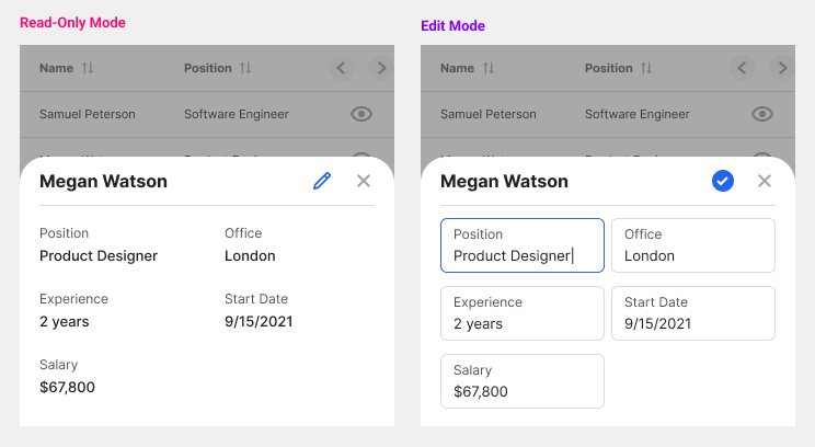
Tables aren’t just for comparing key ID values. They’re also helpful for analyzing the attribute values of a key ID. Since it’s impossible to display all the table columns simultaneously, you should use a modal sheet instead.
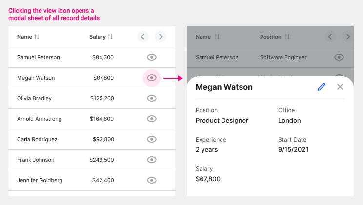
A modal sheet allows users to comfortably view every attribute value when they click to view a key ID. An “eye” icon is used to signify a deep-level view of each key ID value. When users click it, the modal sheet slides up from the bottom of the screen. All attribute values are visible on the modal sheet at the same time.
If users need to edit a particular value, they’ll click the edit icon in the top right. Doing this will activate edit mode, where all the data values will turn into text fields. After they’re done editing, they’ll click the checkmark icon to go back to read-only mode.
Delete, Filter, Search
Not all interface controls have to be on the data table itself. There are other actions you can put around the table if needed.
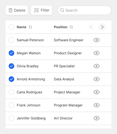
For instance, placing delete, filter, and search above the table allows users to manage the data in additional ways. To delete data, they’ll tick the checkboxes on the left of each row and then click the delete button. This approach allows users to delete data in bulk.
Data Cards
A data table may not be the best way to display your data if you don’t have that many records. Consider using data cards when you have a limited amount.
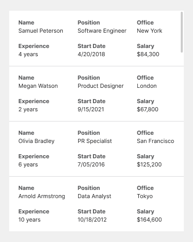
Data cards allow you to compare and view all attribute values simultaneously without clicking a button. However, the downside is losing the top column headers and table layout. Instead, the headers are repeated for each record and stuck to each attribute value.
Be aware that data cards can take up a lot of vertical space. Users will have to scroll more to view the records if there are many. More attribute values will also increase the size of the cards.
If your users need to compare many attribute values simultaneously, use data cards. However, in most cases, comparing one attribute value at a time is more common. Therefore, using the carousel columns approach will work for most.
Conclusion
By understanding the purpose of data tables and their information structure, you can create an optimal design for mobile screens. Users use tables to compare and analyze data. Therefore, the mobile design allows for comparing by locking the key ID column in place. It allows for detailed analysis by displaying records in modal sheets.
A desktop data table has a few advantages over a mobile one, but that’s to be expected. When you’re limited in space, you have to make the most of your screen. You can’t always display everything on one screen, but you can always choose to display what’s most useful and relevant.

For more insightful design articles, get a subscription to the official UX Movement Newsletter on Substack


