
How to determine the best model?

Machine learning models play a critical role in many aspects of today’s business. The use of a predictive model can improve the business bottom line, and a slightly improved model can increase by millions of dollars. Although you may not know all the popular algorithms (and more powerful algorithms in the future), it is far more important to know how to select the best model. Are there any common metrics to compare the predictability of competing models? What are the differences between these metrics? This post covers the Gains table/chart, Lift curves, Kolmogorov-Smirnov (K-S), Confusion matrix, ROC, AUC, Gini Index, and Dual Lift Chart, and then discuss the differences between these metrics. In the end, I also provide the Python code that generates a Gains table.
I have written articles on a variety of data science topics. For ease of use, you can bookmark my summary post “Dataman Learning Paths — Build Your Skills, Drive Your Career” which lists the links to all articles.
Let me use two cases to explain the business applications of machine learning models.
Use Case 1: (Marketing)
Let’s assume a specialty company has 1 million customers and runs an advertising campaign in a particular month. Assume 10% of the customers, or 100,000, will respond and buy the new product. The company can choose to market to all the customers, yet it is not the optimal use of marketing dollars. It is better to target those customers who are more likely to respond to the campaign. This targeted campaign not only can save marketing dollars but also will not disturb those customers who have no interest in the new product. If we have historical data with the reactions of customers to past campaigns, we can use the data to build a model to predict which customer is likely to buy or not to buy. The model assigns a probability of 0 to 1.0 to each customer. The model then sorts the customers into ten equal sub-populations, or deciles, according to the probabilities.
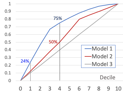
A good predictive model can help the company to target better, therefore increasing revenue and saving marketing expenses. Figure (1) shows the results of three hypothetical models. If the company adopts Model 1, it can get 75,000 (=75%*100,000) responders by only reaching out to 40% of the 1 million customers. Suppose the average order of the responders is $100. The revenue will be $100 * 75,000 =$7.5M. In contrast, Model 2 only gets 50,000 (=50%*100,000) of the responders. The revenue is $100 * 50,000 = $5.0M. The choice for the better model results in an increase of $2.0M. Model 3 is a no-brainer. It shows the model does not perform any better than just marketing randomly to the customers.
Use Case 2: (Loan default risk)
Banks and other financial institutions receive voluminous loan applications every year. Some are good loan applicants and others are not. These institutions would like to differentiate the bad loan applicants from the good loan applicants to avoid financial losses. Because it is impossible to review them manually, automation systems and loan default predictive models are widely used. A machine learning model will rank loan applicants into high-default-risk segments to low-risk segments. Figure (1) illustrates the point. 24% of the applicants in Segment 1, or 2,400 (=24%*10,000), are bad loan applicants. Suppose the average loan size is $10,000. If the bank avoids Segment 1, it can avoid a potential financial loss of 2,400 * $10,000 = $240,000. Such losses cannot be easily justified with a high-interest charge and should be avoided. In general, the bank would like to avoid lending to applicants in Segments 1 through 4 which have 75% of the bad loan applicants.
Note that Use Case 2 is somehow “opposite” to Use Case 1. In Use Case 1, the desirable high-probability buyers are ranked in the top deciles. In Use Case 2, the bad loan applicants are ranked in the top deciles.
The Gains Table/Chart
Figure (1) is called the Cumulative Gains Chart, a visual presentation of a Gains table. Figure (2) shows the Gains Table of Model 1. Each model has its own Gains table. Figure (1) just overlays the curves of Model 1 and Model 2 in the same chart so we can visually compare them.
How does a Gains Chart help your business strategies? It can serve two great purposes: (i) selecting the better-performing model, and (ii) deciding which segments to target. In Use Case (1), if the company plans a small campaign, it can target the top segments only. On the other hand, the company can choose to target Decile 8, if still profitable. In Use Case (2), the bank can choose to underwrite Segments 7–10 and avoid Segments 1 to 4.
Let’s understand the Gains table of Model 1 in more detail. Because the model is built on historical data, the Gains table is based on historical data as well. The model sorts customers by the predictions into deciles to get Column (A). Based on the decile, Columns (B) and (C) summarize the count and cumulative count for each decile. Column (D) is the average probability per decile. We already know the buyers and non-buyers in the historical data, so Column (E) summarizes the number of non-buyers. Columns (F), (G), and (H) show the percentage, cumulative count, and percentage respectively. Likewise, the count statistics for the buyers can be summarized in Columns (I) to (L). Note that Column (L) is visually presented by the blue curve in Figure (1).
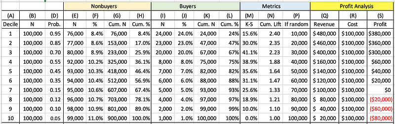
The Profit Analysis section helps to make the decision. Assume the average order per buyer is $20 and the acquisition cost is $1 per mailing. The revenue for each decile is calculated in Column (Q) (=Column (I) * $20). Column (R) shows the cost for each decile. As a result, the profit (=Revenue - Cost), is shown in Column (S). The gains table effectively shows the incremental profit as the company moves down by decile. It appears the company can mail to customers in Deciles 1–6. The profit is optimized at Decile 6, further deciles will incur a loss.
Can you derive the ROI (Return on Investment)? Yes. Because ROI = (Profit from Investment) / Cost of Investment, if the company mails to Decile 1–6, the ROI will be $1,160,000 / $600,000 =1.93.
Lift Chart
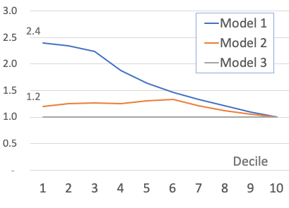
The lift chart, or specifically the cumulative lift chart, shows how much more likely the company will get the buyers than if the company targets customers randomly. Each model has its lift chart. It is calculated in Column (N) as Column (K) / Column (P). Model 1’s lift in Decile 1 is 2.4. It means Decile 1 of Model 1 can get 2.4 times the customers compared to random selection. To Decile 4, Model 1 still gets 1.88 times more than random selection. A higher lift indicates a better model. The least value of a lift is 1.0.
Kolmogorov-Smirnov (K-S) Chart
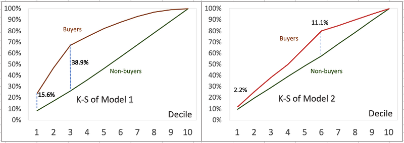
K-S measures the degree of separation between the distributions of the positive and negative responders. In a mathematical expression, K-S = |Cumultative % positive— Cumulative % nagative|. In the marketing use case, K-S = |cumulative % of total non-buyers — cumulative % of total buyers|. In the loan default use case, K-S= |cumulative % of total good loan applicants— cumulative % of total bad loan applicants|. See Column (M) in Figure (2). The higher the value, the better the model is at separating the positive from negative cases. If a model cannot separate positive from negative cases (such as Model 3), the K-S for all deciles will be 0. Figure (4) shows the K-S charts of Model 1 and Model 2. Model 1 outperforms Model 2 for two reasons: (i) the maximum value of Model 1 is 38.9% which is higher than 11.1% of Model 2, and (ii) Decile 1 of Model 1 is 15.6% which is higher than 2.2% of Model 2.
Confusion Matrix
A binary classifier is simply a classification model where the response has just two outcomes(Yes/No, 1/0, True/False, Male/Female, Good/Bad, etc). The model gives a probability from 1.0 to 0.0. One must decide a cutoff to label the predictions as buyer/non-buyer or 1/0.
Let’s see what happens if one chooses 0.50 to be the cutpoint for Model 1. Deciles 1–4 will be classified as buyers and Deciles 5–10, as non-buyers. Not all Deciles 1–4 are actual buyers. When we compare the predicted and the actual buyers or non-buyers, we get the Confusion Matrix for Model 1 in Figure (5). There are four scenarios:
- True positives (TP): actuals are positives and are predicted as positives.
- False positives (FP), actuals are negatives and are predicted as positives.
- False negatives (FN), actuals are positives and are predicted as negatives.
- True negatives (TN), and actuals are negatives and are predicted as positives.
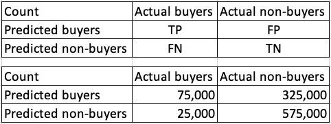
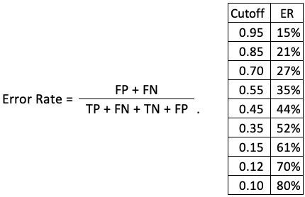
How do we present the misclassification when the cutoff is 0.50? We use a measure called the Error Rate for the ratio of instances misclassified, as shown in Figure (6). It shows when the cutoff is 0.50, the error rate is (325,000 + 25,000) / 1,000,000 = 0.35. But how do we choose the cutoff value? We can get the error rate at every possible cutoff and choose the one that gives the lowest error rate. Figure (6) suggests the cutoff should be higher at 0.95.
ROC (Receiver Operating Characteristic) & AUC (Area Under the Curve)
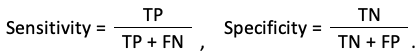
The receiver operating characteristic (ROC) curve is one of the most effective evaluation metrics because it visualizes the accuracy of predictions for a whole range of cutoff values. To get ROC, we just need to derive two ratios from the confusion matrix: True Positive Rate (TPR), or Sensitivity, and True Negative Rate (TNR), or called Specificity:
TPR and FPR change as the cut-off value changes. one can calculate various TPR and FPR for different cutoff values. When we plot the TPR along the y-axis and FPR along the x-axis, we get the ROC curve. The ROC chart is a great visual exhibit to compare models. If we had a perfect model, the ROC curve would pass through the upper left corner — indicating no error. A better model is when the ROC is close to the upper left corner (as pointed out by the green arrow).
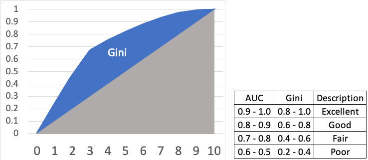
The most important parameter that can be obtained from a ROC curve is the Area Under the Curve (AUC). For a perfect model, the area under the curve would be 1.0. Figure (7) gives general guidance for the AUC values.

Gini Index
Gini Index can be easily obtained from the Gains Chart in Figure (1). It measures the area between the cumulative response curve and the 45-degree line. Gini is equivalent to the AUC but differing by a scale factor — Gini = 2 * AUC -1. Gini ranges from 0–1. Figure (8) shows the relationship with AUC.
How to Code It in Python?
Upon the requests of some readers for the Python code snippet, below I post the code. Target and Predict are the column names of the target and prediction column names respectively. The code generates the cumulative Lift and K-S.
# Sort on prediction (descending)
# Add row ids
# Add decile data= data.sort_values(by=’predict’,ascending=False)
data[‘row_id’] = range(0,0+len(data))
data[‘decile’] = ( data[‘row_id’] / (len(data)/10) ).astype(int)
# Check the count by decile
data.loc[data[‘decile’] == 10]=9
data[‘decile’].value_counts()#create gains table
gains = data.groupby(‘decile’)[‘target’].agg([‘count’,’sum’])
gains.columns = [‘count’,’actual’]
gains#add metrics to the gains table
gains[‘non_actual’] = gains[‘count’] — gains[‘actual’]
gains[‘cum_count’] = gains[‘count’].cumsum()
gains[‘cum_actual’] = gains[‘actual’].cumsum()
gains[‘cum_non_actual’] = gains[‘non_actual’].cumsum()
gains[‘percent_cum_actual’] = (gains[‘cum_actual’] / np.max(gains[‘cum_actual’])).round(2)
gains[‘percent_cum_non_actual’] = (gains[‘cum_non_actual’] / np.max(gains[‘cum_non_actual’])).round(2)
gains[‘if_random’] = np.max(gains[‘cum_actual’]) /10
gains[‘if_random’] = gains[‘if_random’].cumsum()
gains[‘lift’] = (gains[‘cum_actual’] / gains[‘if_random’]).round(2)
gains[‘K_S’] = np.abs( gains[‘percent_cum_actual’] — gains[‘percent_cum_non_actual’] ) * 100
gains[‘gain’]=(gains[‘cum_actual’]/gains[‘cum_count’]*100).round(2)
gains = pd.DataFrame(gains)Conclusion
I hope this article gives you a better understanding of this topic. If you like to have a comprehensive review, the following sequence will help:


