
How to design better DeFi apps, right now

Low bullshit, actionable, advice
I used to go to a lot of UX meetups. It was an easy way to get free beer and pizza on a weekday evening. Looking back, I think that was the main thing I got out of them.
Most of the time, you’d be lectured about how ‘UX is really important,’ without ever learning much. Some people on stage would earnestly spit out a few soundbites, we’d murmur appreciatively, then everyone would stroll back to the drinks table again, none the wiser. Someone once answered a question with the phrase ‘accessibility, not accountability.’ He said it in a profound manner. I still have no idea what he meant.
I feel like the same thing is happening in web3. Lots of people talking about how DeFi needs to be easier (or muh UsE CaSeS), not much actionable advice. Look, I know there are some bigger issues around technology that need to be ironed out. And I know we have a long way to go until this stuff works perfectly. But in the meantime, here are some very specific tips to make better dApps today.
note: This is a rough framework, based on a mixture of user research and competitive analysis. There is always more data to collect, so my thoughts about ‘best practice’ will continue to evolve. Consider this a starting point.
Who is our user, and what do they do?
After going to more meetups and chatting to more people internationally, I’m starting to think many of our preconceptions about ‘degens’ and web3 users are actually wrong… But I’ll save that for another day. So rather than present a persona, I’m just going to sketch out the typical emotions on a primary user journey.
🧠 The mindset
Anxiety tinged with greed. Energized enthusiasm. Money is on the line. Excitement. Pioneer spirit. Risk. A spectrum from obsessively cautious to cavalier YOLO.
🎢 User journey
Connect wallet > assess options > authorize transaction > make transaction > wait and pray > WAGMI / Oh fuck > withdraw
😩 Pain points
- Connect: so many wallets, so many networks!
- Assess: is this a good opportunity, how does it work? Safety?
- Transact: LPs, staking, fees, wtf is happening?
- Accumulate: how much am I making, in real terms?
- Withdraw: triumph if all good, cold sweat if not
OK, what do we do about this?
🛠 A quick breakdown of each
Some pointers on quick and easy fixes that can be implemented and will make a tangible improvement to your app.
Plus, some cognitive principles that might warrant further research and lead to further improvements.
1. Connect
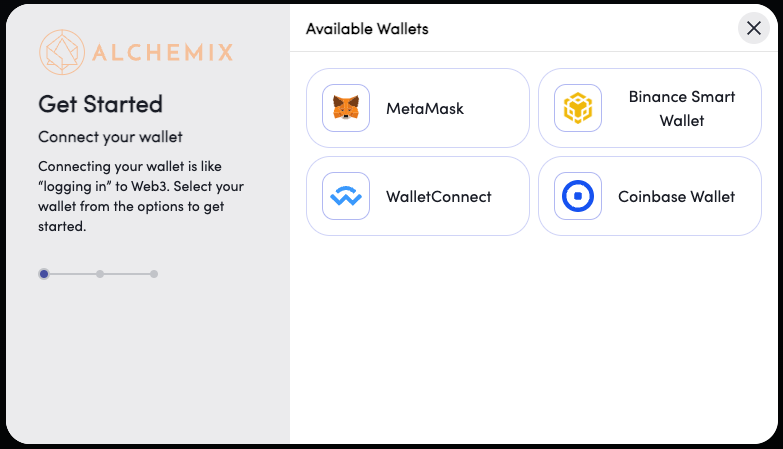
- Explain what wallets are, use a stepper. Ref: Alchemix
- Show as much of the app as possible while disconnected
- Show the connected network prominently
- Show a meaningful signature request the first time the user connects
- Allow user to switch network with a button in the app — don’t make them go to MetaMask to do it
- If multi-chain, consider creating a multi-chain UI, showing all assets regardless of which chain you are connected to. Only make users switch network when they attempt to perform an action.
Relevant cognitive principles and heuristics: User Control and Flexibility, Feedback, Nudge Principle, Selective Attention
2. Assess options
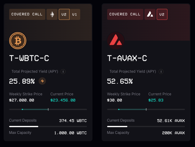
- Display APY prominently
- Display APR in real terms (week / month)
- Avoid mentioning wrapped tokens unless strictly relevant — most users don’t understand them
- Do some minimal user testing to establish the most important information in your vault, strategy etc. Once you know what your user is scanning for, display that info clearly, and remove everything else.
- Use visual contrast to highlight the key info (probably APR or TVL)
- Advertise safety measures: audits etc
- If large number of vaults, have vault pages, not an expanding card
- Make tokens large enough to read
- Follow basic accessibility guidelines: good contrast, large text, readable font
- Include contextual help. There should be some basic instructions in the app, not just in a separate docs page. How does a user learn how to use your app the first time they land on it?
Relevant cognitive principles and heuristics: Hick’s Law, Anchoring Bias, Progressive Disclosure, Visual Hierarchy, Law of Proximity
3. Transactions
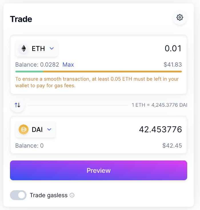
- Show USD equivalent everywhere. Users should know the real value of every transaction they make. I think the discomfort here is a sign of the current gap between the mental model — I am exchanging money — with the conceptual model — I am exchanging tokens in a new web3 economy.
- Use Zappers to facilitate LP creation and staking
- Have a 50% button in the DEX to facilitate providing liquidity
- Make wrapping and unwrapping tokens invisible
- Set a generous default gas amount to ensure the transaction goes through (except on mainnet!)
- Be as clear about fees as possible
- Explain fees in real terms. Ref: Rhino.fi
- Use contrast and visual weight to draw attention to primary actions
- Combine ‘give permission’ and ‘make transaction’ in one. Ref: Beefy
- Give feedback at every stage of transaction: authorise, confirm, in progress, successful
- Use animations, artwork, and friendly language to humanise and reassure the user during this process. Ref: SpookySwap
- Warn users to keep enough native tokens in their wallet to pay for gas fees — this is very important if the user presses the ‘max’ button. Ref: Balancer
- Write good error messages
- For slower transactions, like on bridges, estimate the transaction duration and update in real-time. Ref: Stargate (simple mode)
Relevant cognitive principles and heuristics: Cognitive Load, Signifiers, Contrast, Temptation Bundling
4. Accumulate
- Show ‘Active Positions’ or ‘My Vaults’ in a clear and obvious way
- Active positions should, at the very least, be at the top of the page
- Consider using filters if there are many options. ref. Autofarm + Beefy
- Deposited amounts should be in a different color for recognition when scanning
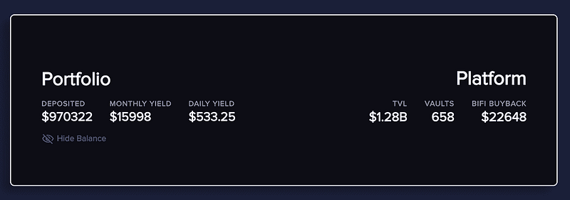
- Show earnings in USD as well as / instead of token values
- Show weekly/monthly earnings
- If manual harvesting is required, put the CTA at the top of the main page
- Allow users to harvest+restake in one go
- Combine complicated or frequent actions e.g. harvest+stake, relock, etc
Relevant cognitive principles and heuristics: Visibility of System Status, Fitt’s Law, Hyperbolic Discounting, Investment Loops, Availability, Efficiency for power users
5. Withdraw
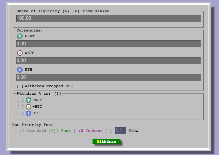
- Follow the same points in transactions, but with an emphasis on safety and feedback (assuring the user that something is happening)
- Give users flexibility in how they withdraw their tokens, e.g. LP tokens, individual tokens, or a single native token, even if you need smart contracts to make the necessary swaps. Ref: Curve (I know mentioning Curve and UX in the same sentence might raise some eyebrows, but the ability to deposit e.g. four tokens to a pool, then withdraw your position in just one is v useful for power users)
- Emphasise an ‘emergency exit’ CTA on anything to do with margin/leverage. Users should be able to nope out of a risky position easily, with little searching.
Relevant cognitive principles and heuristics: Peak-End Rule, Sunk Cost Effect, Signifiers, Contrast, User Freedom
I think these are reasonable first principles to follow when designing a dApp. This probably reads a bit terse, but I wanted to keep it short and actionable. Each section could easily be its own article, so as I continue to develop my own knowledge, I will probably do just that and include direct references for every salient point. This is more like a quick index, not a comprehensive guide. Thanks for the read. Hope you found it useful!
👋 About Me
I am a product designer and UX consultant specialising in web3. I enjoy scaling and leading design teams, and helping web3 companies at all stages of their development.
If you’re after some more insights, you might want to check my competitive analysis on DEXes, my case study for a project I did with Element Finance, or my series on DeFi Design Tips.
https://twitter.com/JonCrabb https://www.linkedin.com/in/jon-crabb/
Check out our new platform 👉 https://thecapital.io/
https://twitter.com/thecapital_io