
How to Create X-days Moving Average Chart in stock market via Python (Plotly & Pandas)
Previously on How to Build stock comparison line chart with dynamic date range via Python (Plotly & Pandas)? we demonstrated how to leverage Plotly and Pandas to do the comparison among stocks based on the dynamic starting date. In this article, we will show you how to build moving average charts based on given days and tickers so that we are able to know the average cost across the market during that period.

Step 0: Install required packages.
!pip install plotly
!pip install pandas
!pip install yfinance
Step 1: Import required packages.
import pandas as pd
import yfinance as yf
import plotly.express as px
import plotly.graph_objects as go
Step 2: Define timeframe and ticker and pull stock price details.
df = yf.download('COST',
                     start='2011-01-01',
                     end='2023-08-18',
                     progress=False,
                     auto_adjust=True)
Step 3: Define X1, X2 and X3 for X-days moving average and calculate them using rolling mean (We are using open quote here).
x1 = 50
x2 = 200
x3 = 500

y =  "-day moving average"

string1 = str(x1) + str(y)
string2 = str(x2) + str(y)
string3 = str(x3) + str(y)

df['MA1'] = df['Open'].rolling(window=x1).mean()
df['MA2'] = df['Open'].rolling(window=x2).mean()
df['MA3'] = df['Open'].rolling(window=x3).mean()
Step 4: Plot the information.
fig = go.Figure(data=[go.Scatter(x=df.index, y=df['Close'], name = 'Stock Price', line = dict(color = 'blue', width =4)),
go.Scatter(x=df.index, y=df.MA1, line=dict(color='green', width=3), name =  string1 ),
go.Scatter(x=df.index, y=df.MA2, line=dict(color='orange', width=3), name = string2),
go.Scatter(x=df.index, y=df.MA3, line=dict(color='red', width=3), name = string3)
                      ])
fig.show()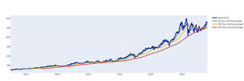
Based on the data from 2011, we can see that it might be a good timing to long COST when the price is below or close to 500-Days MA if there is no much headwinds in terms of company strategy and competitive advantage.
More related articles:
Data Viz
How to Build stock comparison line chart with dynamic date range?

How to Build a Word Collocation Network Graph via Python
Stock Market
How to Import Stock Information for All Tickers in the US and TW Market into SQLite via Python Colab?

How to Calculate PE ratio for ETFs via Python in Colab - QQQ

How to Understand the level of cost (moving average) for each holding of ETF-QQQ?
Thank you! If you want to support Informula, you can buy us a coffee here :)


