
How to create the responsive and swipeable Carousel — Slider component in React

Welcome back to my React series. Today I will show you how to build the Carousel, Slider, or Image Gallery component from scratch.
The carousel is a slideshow for cycling through a series of content, built with CSS 3D transforms and a bit of JavaScript. It works with a series of images, text, or custom markup. It also includes support for previous/next controls and indicators.
If you’re not familiar with the carousel, you can take a look at the Bootstrap Carousel as a reference here.
Here is the few steps we’re working today:
- Understand the structure
- Implement a simple carousel in React
- Add some styling
- Add the Carousel to the App
- Configure the active item
- Implement the indicators
- Carousel/Slider with auto cycle
- Pause/Resume the Carousel/Slider on mouse hover/mouse leave
- A swipeable carousel on mobile devices
Now, let’s get started!!!
Step 1: Understand the structure
Let’s figure out how the carousel works under the hood
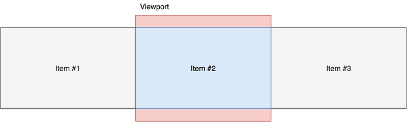
In the picture above, we are having the carousel with only 1 visible item. Let’s transform the picture into a DOM structure
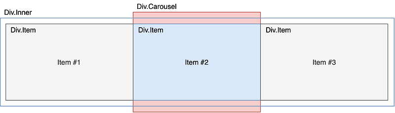
Explain:
- The
Div.Carouselwill be thehidden-overflowcontainer - The
Div.Itemwill be our single items - The
Div.Inneris very important to move our items around
Let’s see how it looks if the first item is active
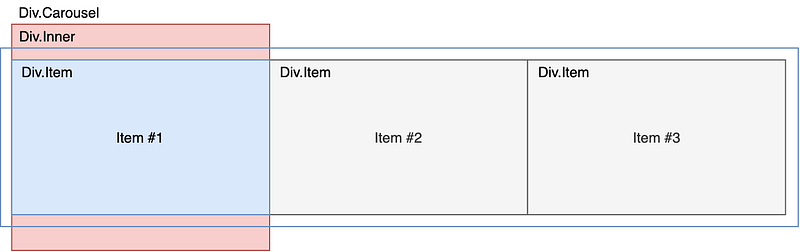
You can see, the Div.Inner will translate to make the Item #1 visible. We can easily use translateX property for Div.Inner to adjust accordingly.
For example:
- If you want to make
Item #1visible, theDiv.Innerwill havetransform: translateX(0%) - If
Item #2visible, theDiv.Innerwill havetransform: translateX(-100%) - And if
Item #3visible, theDiv.Innerwill havetransform: translateX(-200%)
You can check here to see how the CSStransform: translate works here.
Step 2: Implement a simple carousel in React
I’m assuming you’re having a basic understanding of React and how to set up a React app
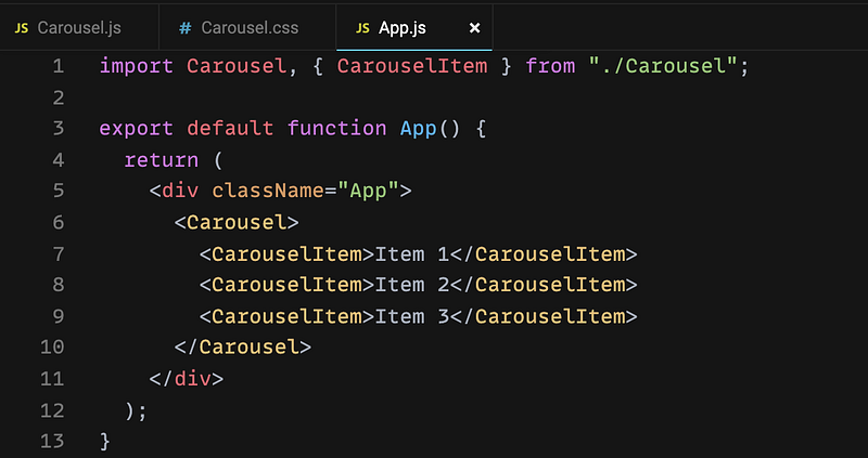
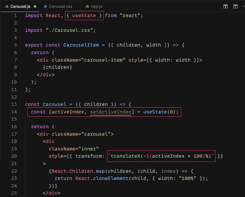
Let’s create the Carousel.js first with the following code:
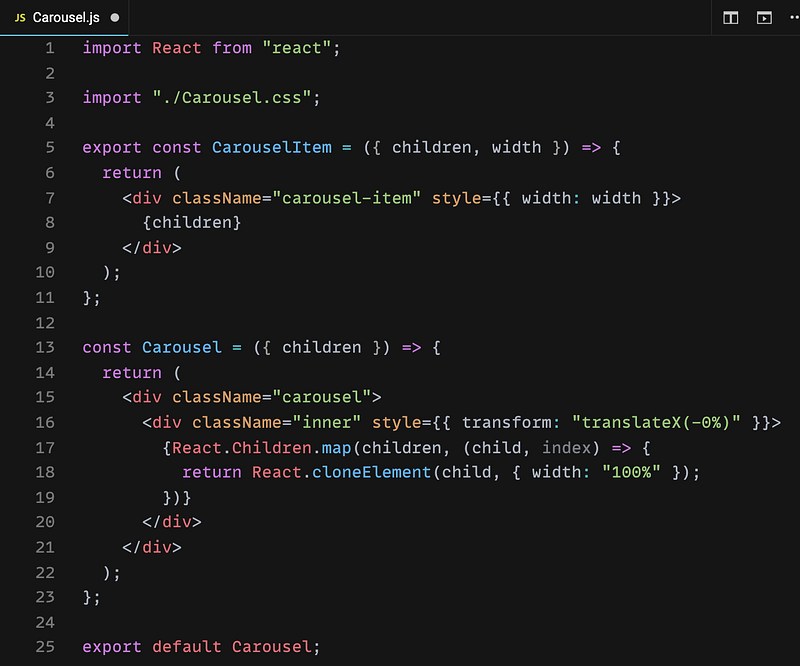
Explain:
- We need to create 2 components: Carousel & CarouselItem
- The Carousel component will be the main controller to control the items
- The CarouselItem component will render the item itself. We just need to pass the
widthproperty to this component for now - Line 3: I will create the
Carousel.cssin the next step - Line 16: As I mentioned in
Step 1, we will control the active item by using thetransform: translateXfor theDiv.Inner - Line 17–19: Iterate all the children (will be the CarouselItem component) and adjust the
widthproperty. We will fix the width to100%at the moment. That means we will only have 1 visible item. This solution will give us the flexibility to control items from theCarouselcomponent later. - You can read more about
React.Children.map andReact.cloneElement to understand
Step 3: Add some styling
Let’s add the Carousel.css with the following code:
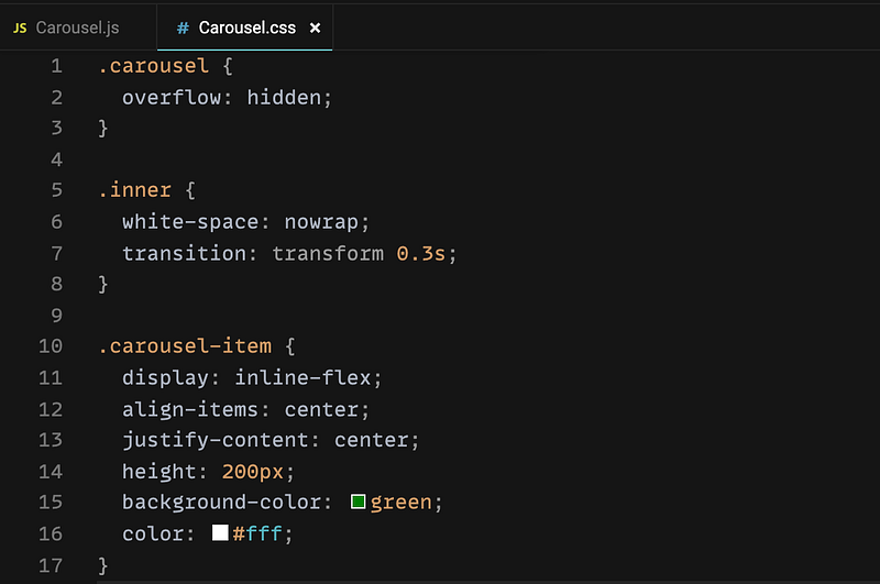
Explain:
- Line 2: We need to hide the overflow content inside in order to show the active item only
- Line 6: This line is really important to keep our items in 1 line otherwise they will break into the new line by default
- Line 7: Add transition for
Div.Innerso that it will be animated when changing the active item - Line 11–16: The styling for the item. You can do whatever you want here but please make sure the
displayisinline-flexorinline-blockto keep them in 1 line
Step 4: Add the Carousel to App.js
We can now check out the first version of our component by adding it to App.js
I think it could be straightforward so I don’t need to explain here. Let’s see how it looks
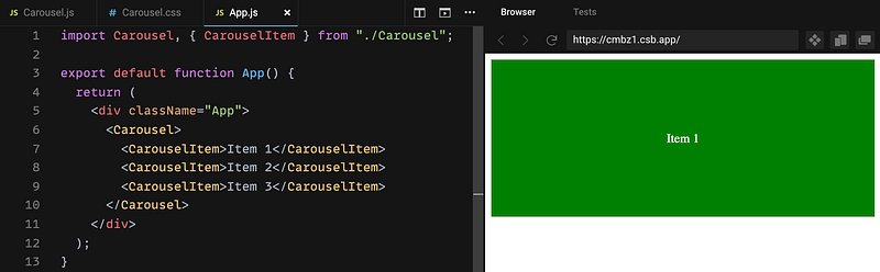
As you can see, we have only Item 1 displayed and the others are invisible
Step 5: Configure the active item
Let’s figure out how we control the active item within the Carousel component. As I mentioned earlier, we will use translateX to move the Div.Inner around to display the active item.
Take a look at how the translateX works inCarousel.js then we can have the solution.
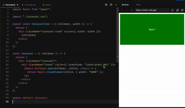
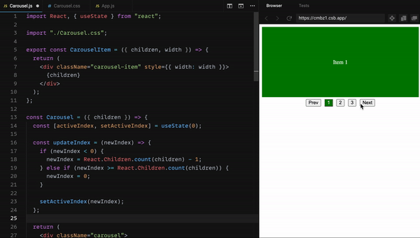
You can see the active item is updated when editing the translateX value so we need to implement the logic to change this value. Let’s update our Carousel.js like this
We need to manage the active state that’s why we are using useState hook here. The important one is line 20 translateX(-${activeIndex * 100}%) . Why we are using 100 ? Because we have 100% width for each item. For example, if we have 2 active items (50% width for each) and we need to slide item by item then the number should be 50 => 50% . Let’s figure out the relationship between them:
- 1 active item, 100% width =>
translateX(-${activeIndex * 100}%) - 2 active items, 50% width & slide 1 by 1 =>
translateX(-${activeIndex * 50}%) - 2 active items, 50% width & slide both 2 =>
translateX(-${activeIndex * 100}%)
Step 6: Implement the indicators
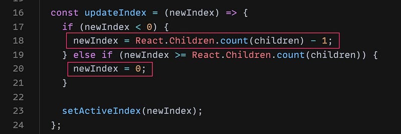
In the previous step, we’re done with the active item logic but it’s not working yet because we need to have a control to trigger the update. We will have a method to update the new active index called updateIndex().
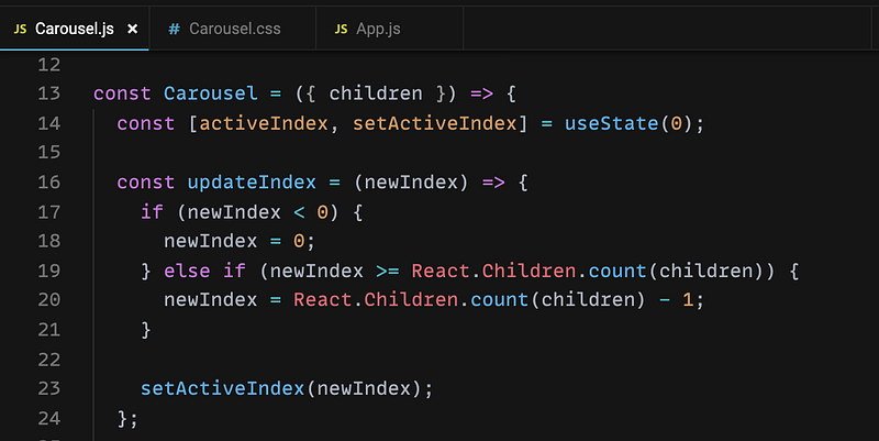
Explain:
- This method will receive a new index and do the check if the active is the first item or the last item
- Line 18: If the new index less than 0, we just reset it to 0
- Line 20: If the new index equal or greater than
number of items, just reset it tonumber of items — 1 - Line 23: Call
setActiveIndexto update the active state
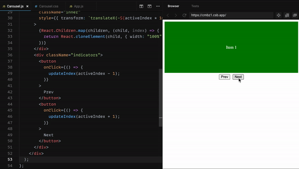
Then we need to implement the Prev & Next button to trigger this method
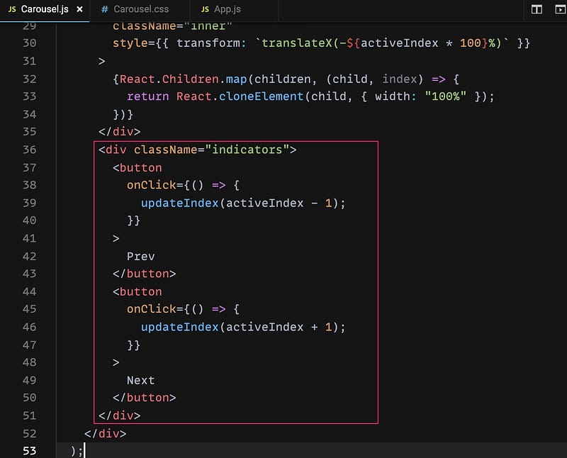
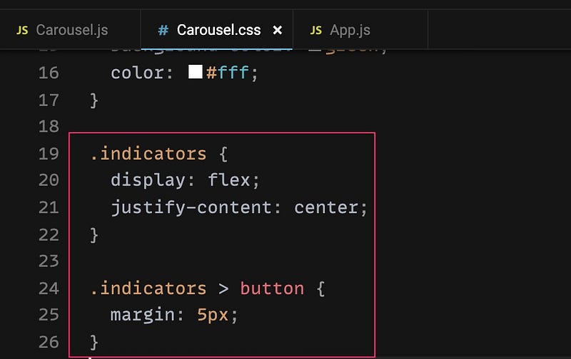
They are just simple button and we use onClick to trigger the updateIndex method. Then we need to add some styling for them in Carousel.css
And then we have this result
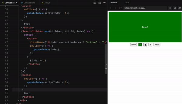
We also need to display the page labels, let’s update the Carousel.js to have them
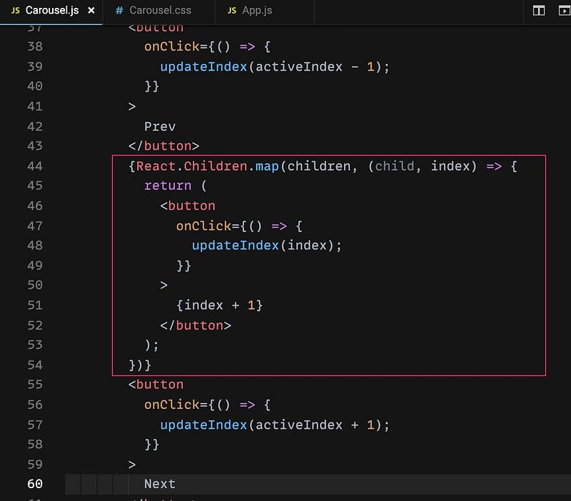
We still using the React.Children.map API to iterate the items to render the page label accordingly.
And here is the result
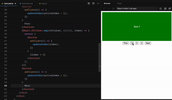
Looking awesome now!
The last step of the indicator is to display the active page number. We need to update Carousel.js once again
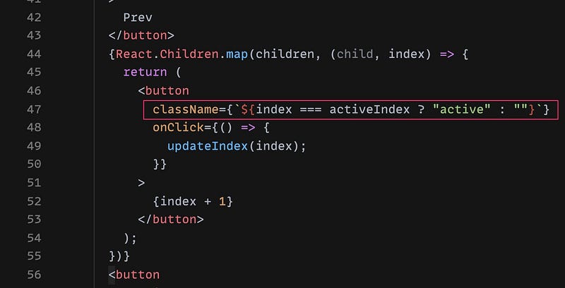
The button which has the same index as activeIndex , will have an extra class active so we need to update the styling in the Carousel.css as well
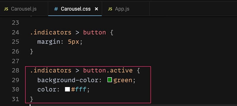
I’m using green background and white text color. You can use whatever you want here and we get this result after this step
Step 7: Carousel/Slider with auto cycle
As you may know, we have some carousel which auto cycle after an amount of time. Our approach will be using the setInterval() , you can check how it works here
Because the carousel is auto cycle so it becomes an Infinite carousel. That means if the active item is the last one, we will move back to the first item when user clicks on the next button. If the active item is the first one, we will move to the last item when user clicks on the prev button. Please read the updateIndex() method once again:
We need to update line 18 & line 20 to have an Infinite carousel like the following code:
Let’s check the result
You can see it’s back to the first item when reaching the last one
We can now apply the auto cycle by using the setInterval() by adding a few lines of code:
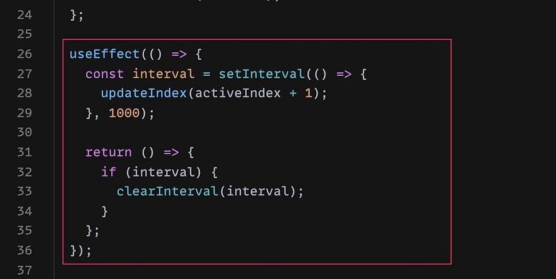
Explain:
- We are using
useEffecthook to init the interval - Line 27–29: we are using an interval of
1000 miliseconds=1 second. That means it will execute theupdateIndex()method every 1 second - Line 31–34: we need to do the clean up to ensure our interval will stop running when our component is unmount
And here is our auto cycle carousel
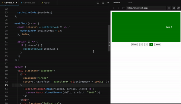
Look! We don’t need to click on the buttons to trigger anymore. It automatically changes to the next item
Step 8: Pause/Resume the Carousel/Slider on mouse hover/mouse leave
Typically, a carousel will allow users hover on to stop moving so they can have more time to read the content. We can have it after this step.
How to pause the setInterval() ? Looks like the API does not support us to do that.
My solution is to keep the interval running but we can have a state to check if users is hovering the carousel, we don’t need to trigger the updateIndex() method. Let’s see the following updates:
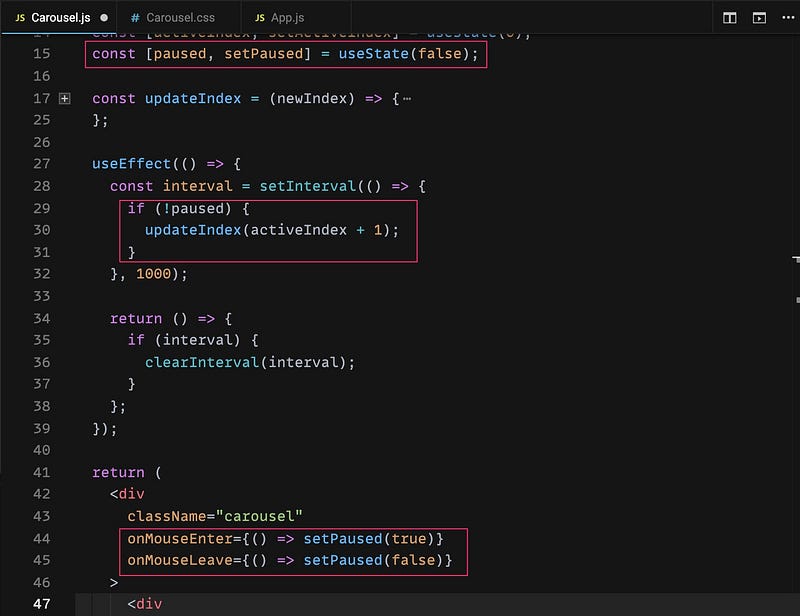
Explain:
- Line 15: We use a state called
pausedto check if user is hovering on the carousel. Setfalseby default - Line 29–31: As I mentioned, the interval will keep running every 1 second, we need to check if the
pausedisfalsewhich means user is not hovering the carousel then we keep update the active index to the next one. - Line 44–45: add the event handlers to check the hover/not hover event
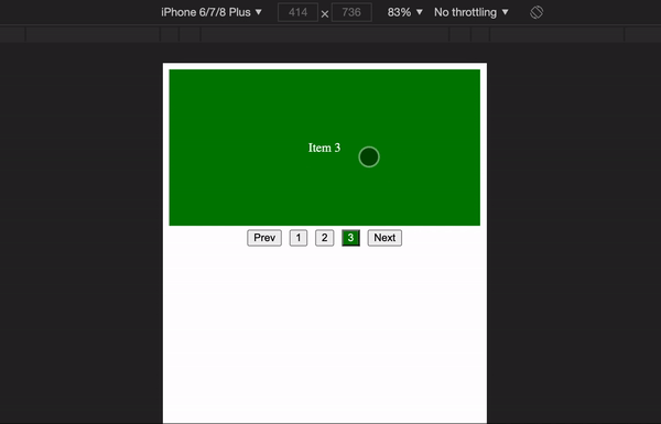
Step 9: A swipeable carousel on mobile devices
Swiping is a must-have feature on the carousel especially on the responsive web application. It could be done easily by this step.
We can do it manually by using the onTouchStart and onTouchEnd but I will use a library to reduce the complexity. I will be using the react-swipeable package which you can find out here https://www.npmjs.com/package/react-swipeable
It will give us some event handlers which is easy to use. Let’s see how I apply to our Carousel.js
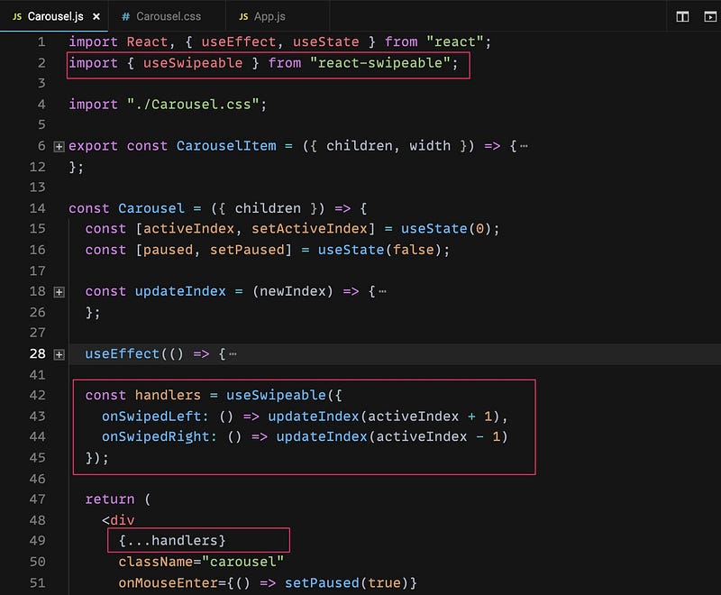
Note: Please ensure you npm i react-swipeable or yarn add react-swipeable to install this package
Explain:
- Line 2: Import the package
- Line 42–45: Init the swipable handlers. We will update to the next item if it’s
onSwipeLeftand the previous item if it’sonSwipeRight - Line 49: Apply swipe handlers to the carousel
And here is the result on mobile devices:
The last step
You may notice that we still have some steps to improve the carousel better but we’re done with the major things so I’ll let you do it by yourself to ensure you understand deeply the solution. Here is the list you can improve:
- Display 2 active items (50% width each item)
- Display number of active items dynamically by passing the prop to
Carouselcomponent - Add the background image for
CarouselItemcomponent - Advance: Display apart of the next item while swiping on mobile device
If you’re interested with any item in the list but you get trouble or anything you don’t understand, just let me know in the comment section.
Here is the full demo:
Thanks for reading my post! Happy coding!!!


