How to Create Storytelling Moving Bubbles Charts in d3js with Python
The MovingBubble chart is one of those mindblowing charts to look at. It is a great way to conceptually better understand how individual items are distributed across states and move across time. Learn how to create them with Python and your own data set.

The moving bubble chart is one of those charts that is mind-blowing to look at. It is a great way for storytelling and to conceptually better understand how individual items are distributed across states and move across time. Despite their attractive appearance, such charts are not frequently seen because of the huge effort needed to create a single chart. Here comes the D3Blocks library into play because the movingbubbles chart is part of D3Blocks. It is open-source, and there is no need to install anything else than Python to create a movingbubbles chart. The output is interactive and standalone for which you don’t need any other technology than a browser. Sharing, publishing, and integrating the chart on websites becomes thus super easy. In this blog, I will introduce the movingbubble chart with a hands-on example.
If you found this article helpful, use my referral link to continue learning without limits and sign up for a Medium membership. Plus, follow me to stay up-to-date with my latest content!
The Movingbubble chart is part of D3Blocks.
D3Blocks is a library that contains various charts for which the visualization part is built on (d3) javascript but configurable using Python. In this manner, the D3Blocks library combines the advantages of d3 javascript such as speed, scalability, flexibility, and unlimited creativity together with Python for fast and easy usage. More information about the D3Blocks library can be found in this blog [1].
The movingbubbles chart is part of D3Blocks and is built in two parts; the Python part and the d3js part. The Python part contains functionalities for data munging, preprocessing, normalization, handling of the colors, labels, etc without worrying about any of the d3 javascript modules. This module can be loaded, parameters can be specified, and the movingbubbles chart will be created based on your input dataset. Behind the scenes, the Python module will integrate the information in the d3js part, such as the data set, colors, adjust positions, set the labels for the number of states, and include the user-defined parameters. Finally, all the files are connected and merged into a single working HTML file. In such a manner, the movingbubbles charts will be automatically adjusted based on your specific data set and parameters.
The input dataset, parameters, and output.
The MovingBubbles chart is visually satisfying with force-directed and colliding nodes. It can help to understand whether and when clusters of samples occur at specific time points and state(s). Before we go through the functionalities of movingbubbles, we first need to install the D3Blocks library:
pip install d3blocksInput Data Frame.
Before making the chart, we need to structure the input data set so that it can be used by the MovingBubbles function. The input data is a data frame containing the following three columns:
- DateTime: describes the DateTime when an event occurs.
- state: describes the particular state for the sample_id at a DateTime.
- sample_id: A sample can be an individual/entity that can have different states at various time points. It can not have two or more states at the same point in time.
An example of the input data frame is shown below. In this example, there are 10.000 rows with 3 columns and the index column. The unique sample_ids represent individuals with a certain lifestyle (the states). As an example, the very first row (index 0) contains an individual with identifier 61 and at timepoint 00:10:36 the state is “Eating”. Not much later this individual is going to the state Sleeping (timepoint 00:11:30). The next day we again see this specific individual (with id 61) at timepoint 23:57:54, with the state “Home”. To summarize, the individual with id 61 did go through three states: Eating > Sleeping > Home. Note that individuals will stay in the particular state until the next state is called.
print(df)
#                 datetime sample_id     state
# 0    2000-01-01 00:10:36        61    Eating
# 1    2000-01-01 00:10:51        83      Sick
# 2    2000-01-01 00:11:30        61  Sleeping
# 3    2000-01-01 00:11:37        66  Sleeping
# 4    2000-01-01 00:11:57        94  Sleeping
#                  ...       ...       ...
# 9995 2000-01-02 23:57:12         6      Home
# 9996 2000-01-02 23:57:23        48      Sick
# 9997 2000-01-02 23:57:54        61      Home
# 9998 2000-01-02 23:58:22         4  Sleeping
# 9999 2000-01-02 23:59:34        88  Sleeping
# [10000 rows x 3 columns]
The input parameters.
The moving bubbles block contains various input parameters and is described in code section 1. The states will automatically be positioned in a circle.
The output file.
The output is a single HTML file that is stored at the specified file path. The HTML contains a full-functioning chart that can be shared and published.
Hands-on example of how data is transformed into movements.
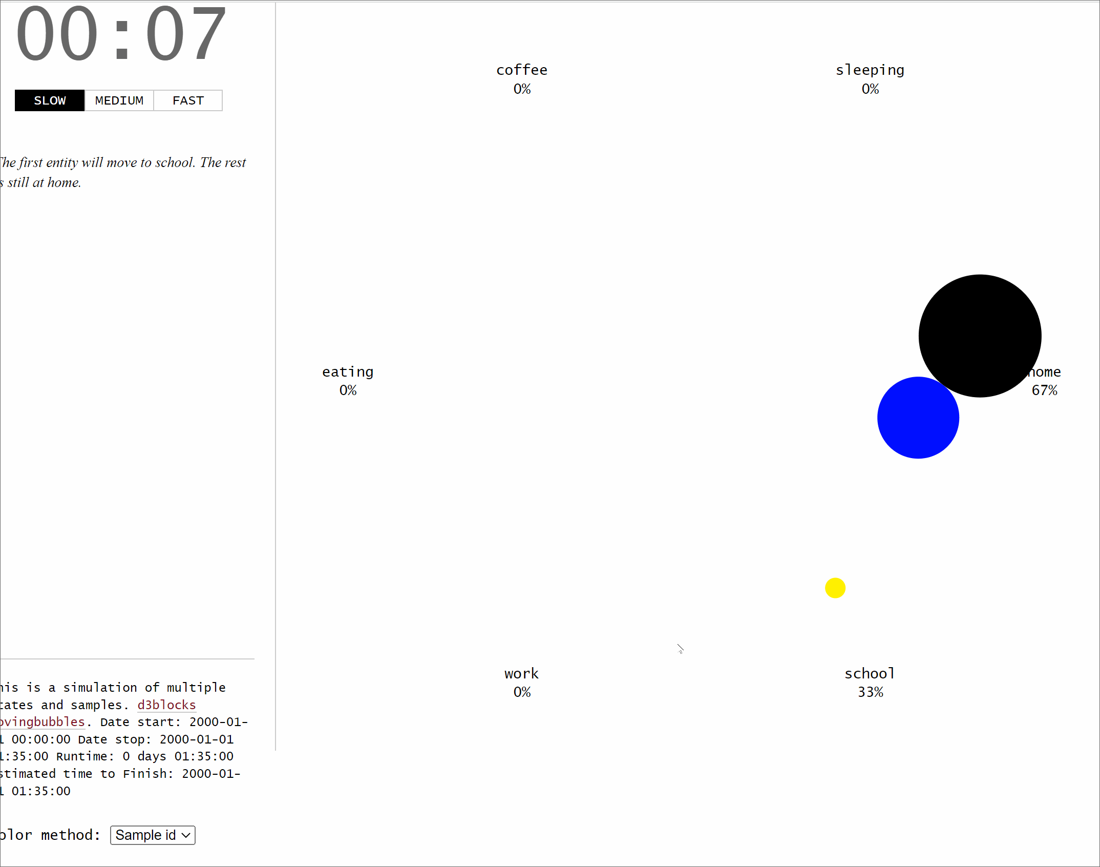
Let’s start with a small example to demonstrate how the input data frame is transformed into movements. We will create three unique samples that will move across six states: home>school>work>eating>coffee>sleeping, each with 5 minutes intervals. For clarity, let's store the movements for the three samples or individuals in three separate DataFrames; df1, df2, and df3. The final DataFrame df is the combined set of three DataFrames. By printing the DataFrame df, as depicted in code section 2, it can be seen that the DateTime has a 5-minute interval and that each sample moves across the six states.
The DataFrame df with the three columns is what you need to create the movingbubble chart. It is possible to specify other input parameters, such as standardization. In this example, the samplewise standardization is used, and the time_notes are specified (optional) that will pop up on the left panel. Other parameters are set to default to keep it as clean as possible.
# Import library
from d3blocks import D3Blocks

# Initialize
d3 = D3Blocks()

# Specify the sample id with the size of the node
size = {1: 60, 2: 40, 3: 10}
# Specify the sample id with the color of the node
color = {1: '#000000', 2: '#000FFF', 3: '#FFF000'}

# Make the moving bubbles
d3.movingbubbles(df,
                 datetime='datetime',
                 state='state',
                 sample_id='sample_id',
                 size=size,
                 color=color,
                 color_method='node',
                 timedelta='minutes',
                 speed={"slow": 1000, "medium": 100, "fast": 10},
                 time_notes=time_notes,
                 filepath=r'c:\temp\movingbubbles.html',
                 cmap='Set2',
                 standardize='samplewise',
                 )
After running these few lines of code, the underneath chart is created. Each dot represents an individual, the color represents the status, and when someone changes the state, the dot moves accordingly. The time of day is shown in the top left panel whereas the time notes are depicted in the middle left panel.
An example with different configurations and more samples.
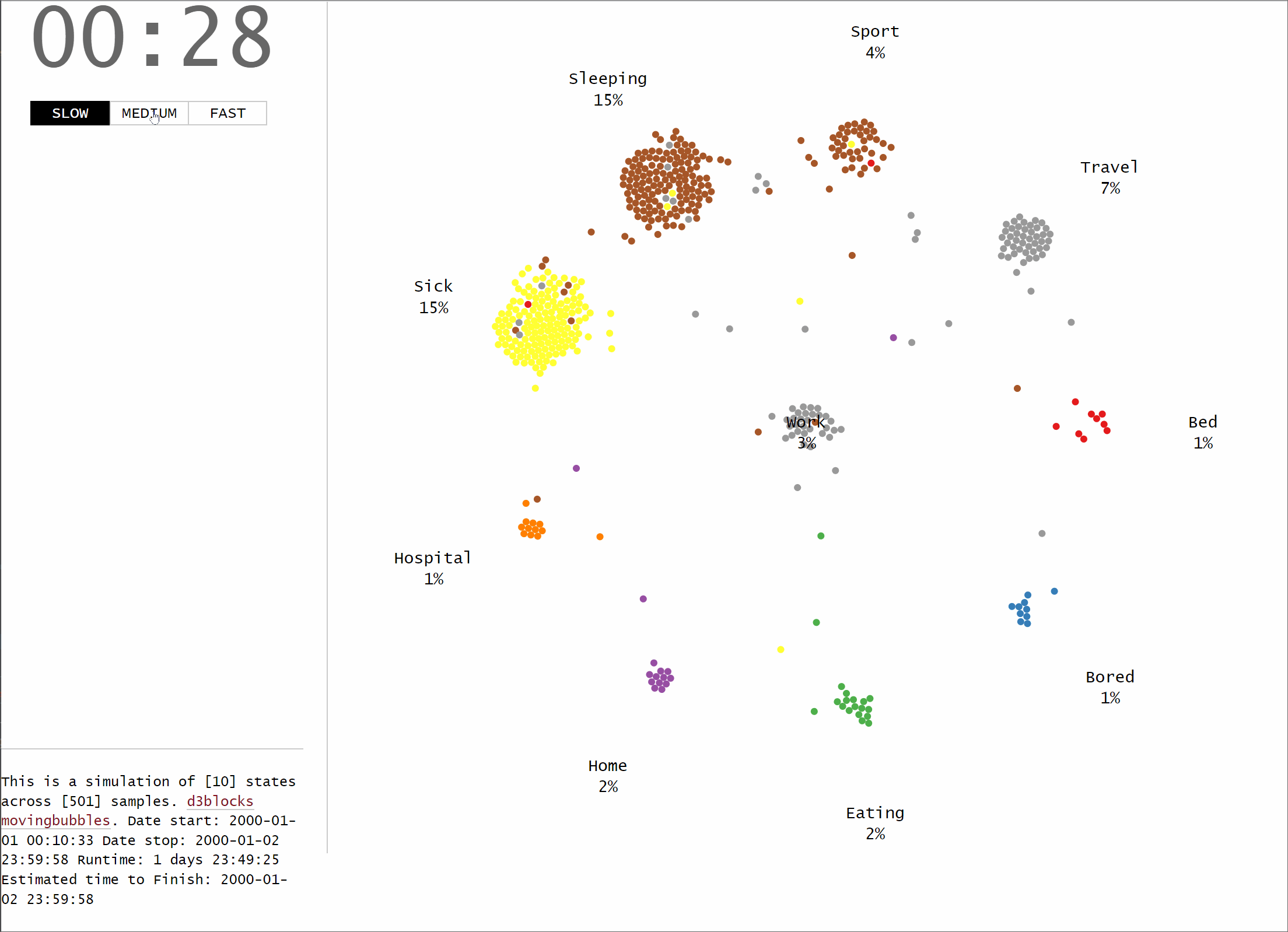
In this example, we will generate a dataset that contains random movements of samples across different states. The idea is the same as the previous example, but now we will use the d3.import_example(graph='random_time'). The input dataset is printed in code section 4 and should contain three columns. The following parameters are set: speed is set to custom, center is set to empty which indicates that no state is shown in the middle of the chart. No standardization is applied (see next section for more details about the standardization).
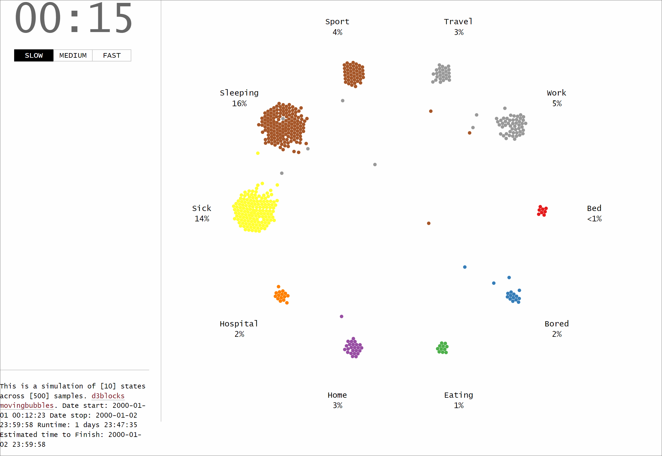
We can now also easily set center=’work’ which will change the ordering and positions of the states automatically.
Samplewise time Standardization.
The standardization function allows the transformation of time points in a samplewise manner. This means that the time is standardized per sample-id, and independent of the other sample ids. Or in other words, the starting point for each sample is aligned, and as a result, the starting DateTime will be the same. To demonstrate the effect of the samplewise standardization, I will load the small data frame as created in code section 1. If we look carefully at the data we can see that sample_id 1 and sample_id 2 have the same starting DateTime whereas sample_id 3 starts almost 1 year later:
- Datetime of sample_id #1: 2000–01–01 00:00:00.
- Datetime of sample_id #2: 2000–01–01 00:00:00.
- Datetime of sample_id #3: 2000–12–12 00:00:00
When we now apply the samplewise standardization, two new columns in the data frame are added. The column datetime_norm (code section 5) contains the aligned DateTime points for which the one-year difference in sample_id 3 is aligned. The delta column depicts the time differences seen in the original data.
No standardization.
In case we do not apply a standardization, the time is modeled as is. The one-year difference (345 days to be exact, line 67 code section 5) can be seen in the time differences (delta). Now you may need to wait for a long time before sample_id 3 will move. It is possible though to change the speed of time using the speed parameter (see also code section 1).
Final Words.
I demonstrated how the create your own MovingBubbles chart using Python. The chart is developed in such a manner that it can handle various states, timeframes, and colors. The MovingBubbles chart is one of the blocks in D3Blocks for which the use of d3js shows its strength, and advantages, such as speed, flexibility, and the possibility to add all your creativity into a chart. Feel free to play around with the library!
Be safe. Stay frosty.
Cheers, E.
If you found this article helpful, use my referral link to continue learning without limits and sign up for a Medium membership. Plus, follow me to stay up-to-date with my latest content!
Software
Let’s connect!
References
- Taskesen, E, D3Blocks: The Python Library to Create Interactive and Standalone D3js Charts. Medium, September 2022


