
How to Create Multiple KPI Donut Charts in Tableau

This tutorial will demonstrate how we can create multiple KPI Donut charts using Tableau. Let’s have a quick introduction of a Donut chart . A Donut chart is simply a Pie chart with an area of the centre cut out.
A Donut chart is very useful in showing the portion of categorical data, with the size of each segment representing the portion of each category. These charts are also reader-friendly and quite easy for non-professionals to understand.
Before we move into how we can create KPI Donut charts, let’s look at the various benefits of using this chart.
Benefits of using Donut Chart in your Project
- The Donut chart is a modified pie chart because it eliminates the need to compare the area or size of the slice.
- With this chart, we can display multiple data sets.
- Users can place additional information about data labels in the hole of the Donut chart, unlike the pie chart.
- Donut charts also make it easier for users to compare individual dimensions.
- Donut charts are also used to display a standalone KPI (Key Performance Indicator), as they are easy to understand.
- They are also used in business to determine progress.
Let’s explore how we can create this chart in Tableau Desktop. We’ll use the Sample Superstore Dataset for demonstration. So, please follow each of the steps .
Step 1:
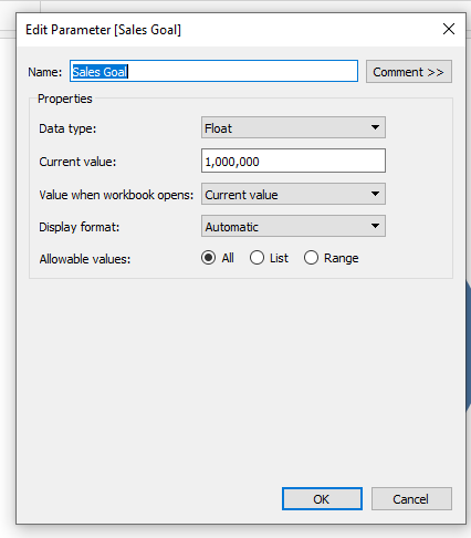
Create a Parameter
The first thing to do here is bringing in our data, and then open a new worksheet. The aim is to calculate Sales to Goal percentage. So, we’ll do that by creating a parameter with a fixed value, and indicate our data type as a float.
Step2:
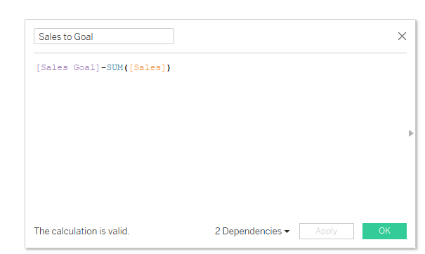
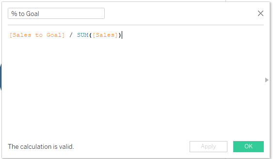
Create a Calculated Field
Here, we will also create two different calculated fields. The first is for the difference between Sales and Sales to Goal.
While the other is calculating the Percentage of these sales.
Step 3:
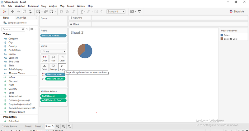
Now what we do here is drop Sales on the Row Pane as well with Sales to Goal calculated field on the axis, which gave us two different charts. We go further to change both charts on the Marks card from Automatic to Pie chart just as we have below.
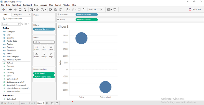
Next, we take our measure names from the column pane to color on the Marks card and the measure values to angle. This gave us the resulting chart below.
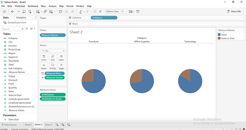
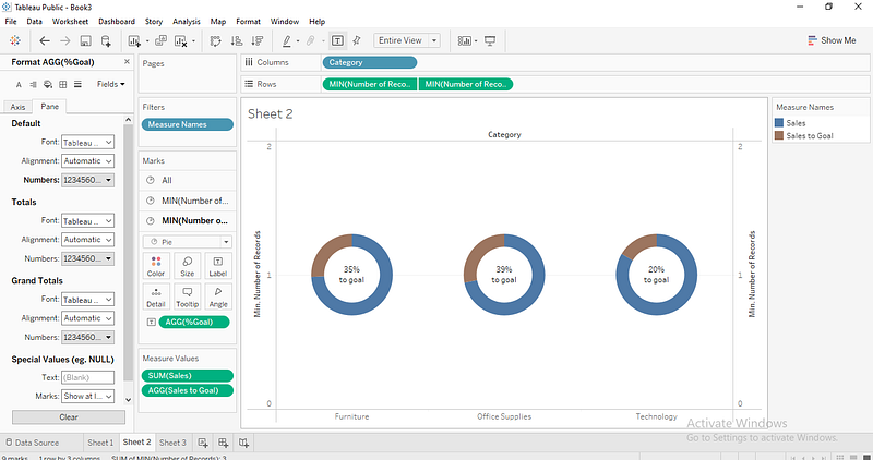
Now, we will drag the category dimension to the Columns Pane so that we can generate multiple charts for our Categories based on Sales to a Goal value.
Step 4:
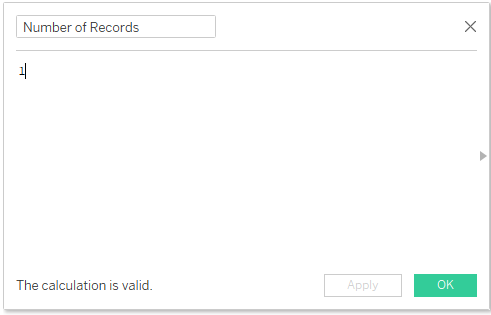
What we will do here is to create a base field as the number of records, which we will indicate as 1 in our calculated field.
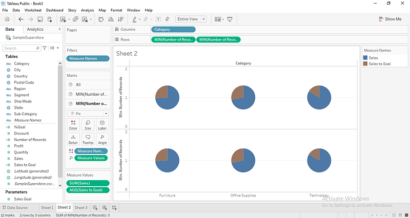
As shown below, we will drag this base field to the Row Pane twice and change the aggregation from the sum to the minimum.
Step5
Next, remove the measure names and values in the second pie chart and combine these charts to a dual axis, then adjust the color and sizes for both charts.
After that, we drop the goal percentage calculated field we did earlier on the Label of the second chart and edit the field format, so we have our Label as the actual Percentage. This gave us the resulting chart below.
Did you find this post helpful? Let’s know in the comments section below.
If you enjoy reading stories like these and want to support our writers, consider signing up to become a Medium member. It’s $5 per month, giving you unlimited access to stories on Medium. If you sign up using our link, we’ll earn a small commission.