
Matplotlib Tutorial
How to Create Hexagon Maps With Matplotlib
Using shapes to represent geographic information
Let’s make some maps! 🗺
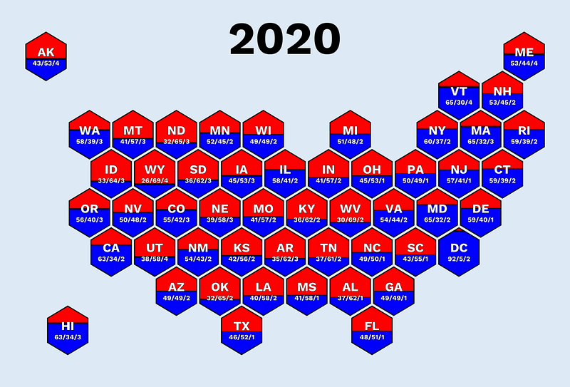
Hi, and welcome to a new matplotlib tutorial. This time, I will teach you how to create insightful Hexagon maps like the one above.
Visualizing geographic information is difficult because areas (such as countries) vary in size and shape.
The result is that some areas are hard to see when you plot your data using regular maps.
It’s also difficult to add information such as country names or values to your visualizations.
An alternative that removes such differences is to use a hexagon map.
The idea is to represent each area as a hexagon and arrange them in a way that resembles the actual map.
Since each hexagon is identical in shape, it’s easy to add information in a structured way and to create a beautiful data visualization.
This tutorial teaches you how to do just that using data from the presidential elections in the United States.
(Don’t forget to look at my other Matplotlib tutorials as well)
Let’s get started. 🚀
Step 1: Import libraries
We start by importing the required libraries.
import pandas as pd
from matplotlib.patches import Polygon
import matplotlib.pyplot as plt
import seaborn as sns

import matplotlib.patheffects as PathEffects
That’s it.
Step 2: Create a seaborn style
Next, we use seaborn to set the background and font family. I’m using Work Sans and #F4EBCD, but feel free to experiment.
font_family = "Work sans"
background_color = "#E0E9F5"

sns.set_style({
    "axes.facecolor": background_color,
    "figure.facecolor": background_color,
    "font.family": font_family,
})
FYI: I often use background_color="#00000000" to get a transparent background if I want to add the chart to an infographic or similar.
Now for the fun stuff.
Step 3: Fetching the data
I’ve prepared a CSV with the number of votes for each state in the US using the following dataset: U.S. President 1976–2020 (public domain license).
Here’s how to access it.
df = pd.read_csv(
    "https://raw.githubusercontent.com/oscarleoo/matplotlib-tutorial-data/main/us_election_2020.csv"
)
Each row represents a state and stores the number of votes on the Democrats, Republicans, and “Other” parties.
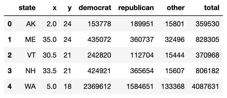
Luckily for you, I’ve prepared two other columns called x and y, which represent the center for each hexagon.
Step 4: Drawing hexagon boundaries
Now that we have the data, we can immediately draw the boundaries of our hexagon using the center defined by each row.
Our first Matplotlib-related function takes a rowtogether with the width and height of the hexagon.
It combines that information to create two lists of coordinates and returns them in the correct format.
def get_hexagon_corners(row, width, height):
    cx, cy = row.x, row.y
    w2, h4 = width / 2, height / 4
    x = [cx, cx+w2, cx+w2, cx, cx-w2, cx-w2]
    y = [cy-2*h4, cy-h4, cy+h4, cy+2*h4, cy+h4, cy-h4]
    return list(zip(x, y))
Now, let’s define draw_hexagon(), which takes a row and uses get_hexagon_corners() to draw a hexagon in the correct location.
def draw_hexagon(ax, row, scale=1):
    width = 3 * scale
    height = 4 * scale

    xy = get_hexagon_corners(row, width, height)
    b_hexagon = Polygon(xy=xy, closed=True, facecolor="#000000", edgecolor="#000", linewidth=4)
    ax.add_artist(b_hexagon)

    # Additional functions
It may look strange that I’m hard-coding width and height, but you never need to change these values, so it doesn’t matter.
I selected width=3 and height=4 because it gives me a good-looking hexagon. I’m using the scale parameter to adjust the space between hexagons.
Now, we can run this function together with our standard Matplotlib code.
fig, ax = plt.subplots(figsize=(20, 20))
ax.set(xlim=(0, 37), ylim=(0, 27))

for i, row in df.iterrows():
    draw_hexagon(ax, row, scale=0.9)

ax.set_aspect(0.9, adjustable='box')
plt.axis("off")
plt.show()
And we get the following figure.

As you can see, I have arranged 51 hexagons in a formation that resembles the United States.
That’s a good start!
Step 5: Adding colors
There are many ways to define the colors of the hexagons.
The most common alternatives are to define colors based on a category or to have a gradient based on values such as GDP, where a lower value leads to, for example, a darker color.
To make things more interesting for you, I decided to take another approach.
Instead of going for something basic, I want to color each hexagon based on the number of votes for each party.
A hexagon should have all three colors but in different proportions depending on the number of votes.
First of all, I created a function that returns the max and min values for a hexagon given the center.
def get_boundries(row, width, height):
x_min = row.x - width / 2
x_max = row.x + width / 2
y_min = row.y - height / 2
y_max = row.y + height / 2
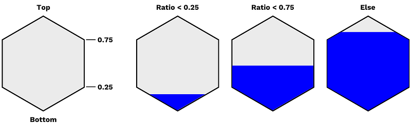
return x_min, x_max, y_min, y_maxNext, we have the fill_hexagon function that defines the area we want to fill with a color.
Two parameters are especially interesting.
ratiodefines how much of the hexagon to fill (in the vertical direction, not by area).topdefines if we fill the hexagon from the top or bottom. It will be different for the Democrats and Republicans, and you can see that we definey,y_start, andh4differently based ontop.
def fill_hexagon(row, width, height, ratio, top=True):
    x_min, x_max, y_min, y_max = get_boundries(row, width, height)

    y = ratio * height
    y = y_max - y if top else y_min + y
    y_start = y_max if top else y_min
    h4 = height / 4 if top else - (height / 4)

    if ratio < 0.25:
        x_shift = 2 * ratio * width
        x = [row.x-x_shift, row.x, row.x+x_shift]
        y = [y, y_start, y]
    elif ratio < 0.75:
        x = [x_min, x_min, row.x, x_max, x_max]
        y = [y, row.y + h4, y_start, row.y + h4, y]
    else:
        x_shift = 2 * (1 - ratio) * width
        x = [row.x-x_shift, x_min, x_min, row.x, x_max, x_max, row.x+x_shift]
        y = [y, row.y - h4, row.y + h4, y_start, row.y + h4, row.y - h4, y]

    return list(zip(x, y))
It isn’t easy to understand the if statements at first glance.
Here’s a drawing explaining that we get different shapes that we need to handle separately for the different thresholds.
Now, we define d_ratio and r_ratio to draw_hexagon() and create Polygons for both the Democrats and the Republicans.
def draw_hexagon(ax, row, edgecolor="#000", scale=1):
    width = 3 * scale
    height = 4 * scale

    xy = get_hexagon_corners(row, width, height)
    b_hexagon = Polygon(xy=xy, closed=True, facecolor="#000000", edgecolor="#000", linewidth=4)
    ax.add_artist(b_hexagon)

    # Additional functions
    d_ratio = row.democrat / row.total
    r_ratio = row.republican / row.total

    d_hexagon = Polygon(xy=fill_hexagon(row, width, height, d_ratio, top=False), closed=True, facecolor="blue")
    r_hexagon = Polygon(xy=fill_hexagon(row, width, height, r_ratio, top=True), closed=True, facecolor="red")

    ax.add_artist(d_hexagon)
    ax.add_artist(r_hexagon)
We get the following chart if we rerun the matplotlib code from the previous section.
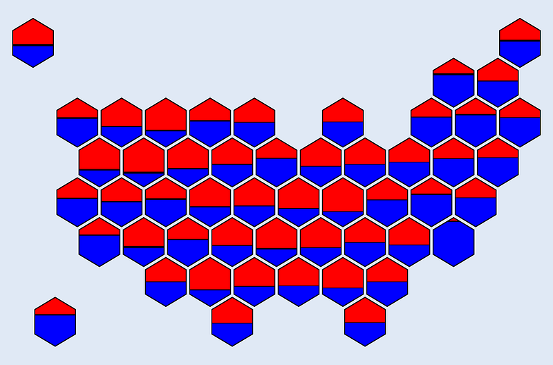
Note that the horizontal black lines have different thicknesses based on the number of votes for “Others”.
Step 6: Adding text
Most data visualizations need some text to make sense. I want to add the state abbreviation and the percentage of votes for each party.
def add_text(row):
    center = (row.x, row.y - 0.2)
    d_ratio = row.democrat / row.total
    r_ratio = row.republican / row.total
    o_ratio = row.other / row.total

    a1 = plt.annotate(row.state, center, ha="center", va="bottom", fontsize=26, fontweight="bold", color="w")
    a2 = plt.annotate("{:.0f}/{:.0f}/{:.0f}".format(100 * d_ratio, 100 * r_ratio, 100 * o_ratio), (center[0], center[1] - 0.12), ha="center", va="top", fontsize=14, fontweight="bold", color="w")
    a1.set_path_effects([PathEffects.withStroke(linewidth=1, foreground="#000000")])
    a2.set_path_effects([PathEffects.withStroke(linewidth=1, foreground="#000000")])
I then add add_text() directly after draw_hexagon(). I’m also adding the year to provide additional information.
fig, ax = plt.subplots(figsize=(20, 20))
ax.set(xlim=(0, 37), ylim=(0, 27))

for i, row in df.iterrows():
    draw_hexagon(ax, row, scale=0.9)
    add_text(row)

plt.annotate("2020", xy=(0.5, 0.93), fontsize=96, xycoords="axes fraction", ha="center", va="center", fontweight="bold", color="#000")

ax.set_aspect(0.9, adjustable='box')
plt.axis("off")
plt.show()
Running the code gives me the following hexagon map.
That’s it; I have the finalized chart we set out to create. I added some padding using KeyNotes, but you can use almost any tool.
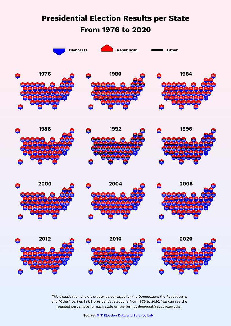
Bonus: Here’s how I use this visualization
I have a free newsletter called Data Wonder, where I share beautiful and insightful data visualizations.
In the edition “Visualizing Election Results From 1976 to 2020”, I defined a transparent background for the chart above. I used Corel Vector to create a grid, gradient, title, and legend.
Pretty cool! 😄
Conclusion
Hexagon charts may look complicated, but they are surprisingly simple to create using Matplotlib.
The biggest challenge is to align the hexagons in a way that resembles the map and still have the order make sense.
This time, we learned how to do that for the United States, and you can change the election data to any other information that you find interesting.
For example, I used the same code when I created a visualization called “The Escalating Crisis: Drug Overdose Deaths Across the U.S”.
Thank you for reading, and see you next time! :)


