
How to Create Eye-Catching Maps With Python and Kepler.gl
Use this intuitive tool to simplify mapping
In this article, we’ll explore Kepler.gl, an open-source solution for geospatial data visualization and exploration. Kepler was developed by Uber to make it easier for users of all levels to design meaningful maps that also look good. The tool can handle large amounts of data and has a friendly, intuitive interface that allows users to build effective maps in an instant.
Available for all to use since 2018, it’s about time we get a closer look at how the tool fits into the data visualization landscape. In this article, we’ll cover the basics of importing data to Kepler using Python’s Pandas and GeoPandas, how to design your visualization, and export the map to an HTML file.
Getting Started
The dataset for this example is NOOA’s Global Significant Earthquakes dataset. [Kaggle]

Pandas
I’m interested in looking at the intensity of the earthquakes and if they generated a tsunami, but those aren’t the only values we’ll need. We also need some Geolocation.
# read csv
df = pd.read_csv('data/Worldwide-Earthquake-database.csv')
In this dataset, our geolocation is stored in two fields, Latitude and Longitude.
Those will be essential for Kepler to draw our data, so we need to make sure all those values are clean and usable.
# lat and lon to numeric, errors converted to nan
df['LONGITUDE'] = pd.to_numeric(df.LONGITUDE, errors='coerce')
df['LATITUDE'] = pd.to_numeric(df.LATITUDE, errors='coerce')
# drop rows with missing lat, lon, and intensity
df.dropna(subset=['LONGITUDE', 'LATITUDE', 'INTENSITY'], inplace=True)# convert tsunami flag from string to int
df['FLAG_TSUNAMI'] = [1 if i=='Yes' else 0 for i in df.FLAG_TSUNAMI.values]After loading the data to Pandas, we can use .numeric to make sure they’re numbers, then use .dropna to remove the empty values.
You can also convert the TSUNAMI_FLAG from yes and no to 1 and 0.
Cleaning and preparation are up to your needs, you may have different requirements or use other tools for that, but once your data is in a Pandas data frame you can map.
Kepler.gl
Kepler is straightforward. It gives you a world map and tools to build the visualization; it expects the data, and the configurations of the map.
Let’s start by defining a map. (I’m using Kepler for Jupyter)
kepler_map = keplergl.KeplerGl(height=400)
kepler_map
Then we add the data frame to it.
kepler_map.add_data(data=df, name="earthquakes")
And the map is updated. Quite easy!
You can load your data to Kepler with Pandas and Geopandas, which support a more comprehensive array of extensions, or directly from a GeoJSON and CSV files.
Design
On the top left of the map, there’s an arrow that opens the settings menu.

On the menu we have:
- Layers — Defines how the variables are encoded to the map
- Filters — For selecting smaller sets of data
- Interactions — Defines interactions such as Tooltips, search boxes, and others
- Basemap — Defines the style of the world map and other elements like labels, roads, styles
Layers
You can select an existing layer or create a new one, then click the ellipsis besides Basic. That’ll open a selection of different encodings for your map, try selecting Hexbin for the next example.

And now our map is empty again.
Relax — that doesn’t mean we made a mistake.
Our data was appearing when we were using points, and hexbin only requires a latitude and longitude, which we have, so the problem is elsewhere.
If we look at the settings for our radius, we can identify the issue. Kepler is using 1km as the default, and the earthquakes in our dataset have way less density than that.

Cool! I recommend that you take some time to experiment with the different types of encoding Kepler offers, check their requirements, default values, and options.
Encodings
My idea is to display points with the intensity encoded in their sizes and their colors representing the tsunamis.

To encode the color, you can click the ellipsis beside Fill Color and select the field you want to encode at Color Based On.
You can also customize the palette by clicking it, in this example I’ll use the first palette, reversed, with three steps.

Then I’ll change the Color Scale, from quantile to quantize. That will give the dots a more diverging effect.

To encode the intensity of the earthquakes in the sizes, we can use the radius, by selecting the field to be encoded, and defining the range of sizes.
By default, it’ll be set to 0–50, but the intensity in our dataset goes from 2–12, so let’s change it.

That’s interesting. I found it fascinating how some of the earthquakes that generated a tsunami were so far from the sea. For example, check out these two cases well off the coast in the United States.

In creating this visualization, I learned that rivers and lakes can have tsunamis too.
Interactions
After defining our Layers, we can go to interactions and select what we want to display in the tooltip.
You can also use other options such as the Geocoder, which is like a search bar for your map.

Basemap
Finally, we can define the general aesthetics of the map at the Basemap tab.
Here we can select a style, set the visibility for labels, borders, and other preloaded metadata, as well as position them over or under the layers.

Once you realize your idea and you’re satisfied with the result, we can move to the next tab: map config.
Map Config
The information at map config is what defines every aspect of our chart, and together with the data, we can use this to load back the map from where we left and to export the map to an HTML file.
To achieve this, you can copy the config directly from its tab, or you can access it with the property .config.
>>> config = kepler_map.config
>>> config{'version': 'v1',
'config': {'visState': {'filters': [],
'layers': [{'id': 'yipp58',
'type': 'point',
'config': {'dataId': 'earthquakes',
...Instead of saving the config in your notebook, you can create a python script and save it as a variable.
When you need to run it, you can use a magic command.
>>> %run myconfig.py
>>> config{'version': 'v1',
'config': {'visState': {'filters': [],
'layers': [{'id': 'yipp58',
'type': 'point',
'config': {'dataId': 'earthquakes',
...Exporting
Now that we know how to build a map, let’s export the HTML file so we can share it.
kepler_map.save_to_html(file_name='earthquake.html',
                        data={"earthquakes": df}, config=config)
Awesome, Kepler created an HTML and saved it in the directory we’re using.
Now we and share it as it is, or host it somewhere. https://thiagobc23.github.io/kepler-maps/earthquake.html
Kepler is a powerful tool for visualizing geolocation data, it removes all the struggle of designing your idea with a user-friendly interface, and you can easily leverage its power with Python.
GeoPandas
Kepler also makes it convenient to use geometrical data types such as polygons, lines, and points from GeoJSON, Shapely, and many other extensions.
The usual suspect, GeoPandas, performs this integration.
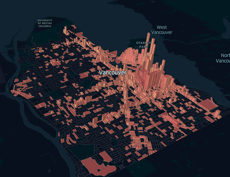
In the next example, I’ll use the Vancouver Open Data; more precisely, two datasets containing data on the outlines of the blocks, and one containing the location of graffiti in the city.

We can start by loading the datasets to GeoPandas,
block = gpd.read_file('data/block-outlines.geojson')
block.dropna(inplace=True)
graffiti = gpd.read_file('data/graffiti.geojson')
graffiti.dropna(inplace=True)Then you can perform your operations on the data. In this case, I want a dataset containing only the polygons with graffitis; I also want it to have the number of graffiti per block.
# join datasets
graf_block = gpd.sjoin(block, graffiti, how='inner', op='contains')
# create new indexes
graf_block.reset_index(inplace=True)
graf_block.head()GeoPandas .sjoin is somewhat similar to a SQL join, but instead of looking at some index, it will look at the geometries — that means, it checks if the points are inside our polygon and return a row for each match.
The rows will contain the polygon geometries, as well as all the data associated with the points.

Then we can dissolve our new data frame; this will group the old indexes and sum the graffiti count.
graf_block = graf_block.dissolve(by='index', aggfunc='sum')The rest is the same as we already did — you can add your new dataset with .add, and design it as you wish.
If you already have the .config for the visualization, you can load the map with the code below.
data_dict = {"graffiti": graf_block, "block": block}graffiti_map = keplergl.KeplerGl(height=500,
data=data_dict,
config=config)
graffiti_mapI loaded two datasets in this example, one with all the polygons, and another with the data we worked on. That’s so I can plot one layer with only the blocks that had a graffiti, and one with all the blocks, just outlining the city.
The same result could be achieved by merging those datasets again and then filtering the data with Kepler; unfortunately, Kepler doesn’t allow layer-specific filters — Once you create a filter, it’ll be enforced in all your layers.

You can check the code for those maps at my GitHub, and visualize the charts with these links: Significant Earthquakes, Graffiti.
Thank you for taking the time to read my article!
My name is Thiago Carvalho. I’m a data analyst with a passion for data visualization and storytelling. I’m also successful Turnip investor and proud owner of a beautiful tropical island in Animal Crossing.
Resources: https://geopandas.org/reference/geopandas.sjoin.html https://shapely.readthedocs.io/en/latest/manual.html#binary-predicates https://geopandas.org/aggregation_with_dissolve.html https://docs.kepler.gl/docs/keplergl-jupyter https://opendata.vancouver.ca/


