
Matplotlib Tutorial
How to Create United States Data Maps With Python and Matplotlib
Creating maps that capture the eye
Hello, and welcome to this tutorial.
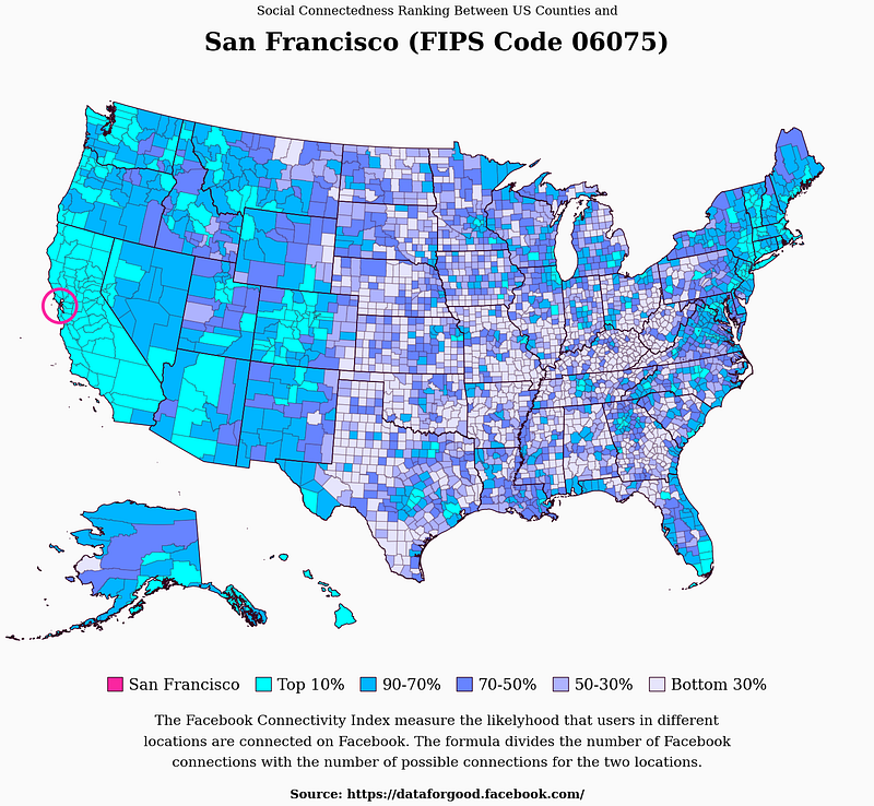
Today, I will teach you to create the data visualization you see above using geo data and the Facebook Connectivity Index (both data sources are public domain and free to use).
Maps like this are great for visualizing geographic information, and if you select suitable colors, they will capture anyone’s interest immediately.
Typical use cases are to compare countries (or US states) by the size of their economies, populations, or other metrics like longevity on a world map.
The maps often reveal patterns based on geographic locations you can’t see in other visualizations.
If that sounds intriguing, you’re in the right place.
Let’s get started with the tutorial.
Step 1: Download data
Before we begin, we need to download a dataset exciting enough for this tutorial and geo-data to draw accurate maps of the United States.
For the maps, I’m using shape files from Cencus.gov. You can use the following links to download both states and counties.
To have a complementary dataset, I’ve selected the Facebook Connectivity Index, which measures the likelihood that two people in different counties are connected on Facebook.
You can download the connectivity data using this link.
Once the downloads have finished, unzip them and put them in a good location. I’m using ./data in the tutorial, but you can do whatever you like.
It should look something like this.

Let’s write some code.
Step 2: Import libraries and prepare Seaborn
The only new library (if you’ve done any of my other Matplotlib Tutorials) is geopandas, which we will use to draw maps.
# Import libraries

import numpy as np
import pandas as pd
import seaborn as sns
import geopandas as gpd
import matplotlib.pyplot as plt

from PIL import Image
from matplotlib.patches import Patch, Circle
Next, let’s define a few features about the style using seaborn.
edge_color = "#30011E"
background_color = "#fafafa"

sns.set_style({
    "font.family": "serif",
    "figure.facecolor": background_color,
    "axes.facecolor": background_color,
})
Now it’s time to learn how to draw a map.
Step 3: Load and prepare geo-data
I use geopandas to load the data and remove “unincorporated territories” such as Guam, Puerto Rico, and American Samoa.
# Load and prepare geo-data
counties = gpd.read_file("./data/cb_2018_us_county_500k/")
counties = counties[~counties.STATEFP.isin(["72", "69", "60", "66", "78"])]
counties = counties.set_index("GEOID")

states = gpd.read_file("./data/cb_2018_us_state_500k/")
states = states[~states.STATEFP.isin(["72", "69", "60", "66", "78"])]
A geopandas data frame has a geometry column that defines the shape of each row. It allows us to draw a map by calling counties.plot() or states.plot() like this.
ax = counties.plot(edgecolor=edge_color + "55", color="None", figsize=(20, 20))
states.plot(ax=ax, edgecolor=edge_color, color="None", linewidth=1)

plt.axis("off")
plt.show()
Here, I start by drawing the counties with transparent borders, and then I reuse ax when I call states.plot() so that I don’t draw separate maps.
This is what I get.
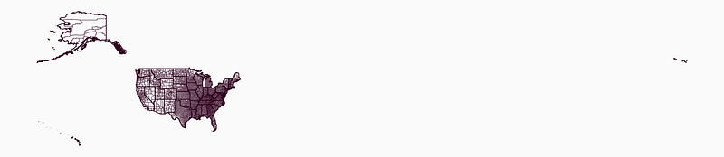
The map doesn’t look great, but I will make a few quick adjustments to get us on the right track.
The first adjustment is to change the map projection to one centered on the United States. You can do that with geopandas by calling to_crs().
# Load and prepare geo-data
...

counties = counties.to_crs("ESRI:102003")
states = states.to_crs("ESRI:102003")
Here’s the difference.
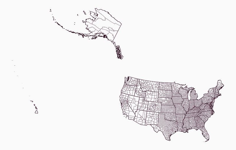
It’s common to draw Alaska and Hawaii underneath the mainland when drawing data maps of the United States, and that’s what we will do as well.
With geopandas, you can translate, scale, and rotate geometries with built-in functions. Here’s a helpful function to do that.
def translate_geometries(df, x, y, scale, rotate):
    df.loc[:, "geometry"] = df.geometry.translate(yoff=y, xoff=x)
    center = df.dissolve().centroid.iloc[0]
    df.loc[:, "geometry"] = df.geometry.scale(xfact=scale, yfact=scale, origin=center)
    df.loc[:, "geometry"] = df.geometry.rotate(rotate, origin=center)
    return df
I calculate a center point for the entire data frame that defines the origin of rotation and scaling. If I don’t, geopandas does that automatically for each row, which makes the map look completely messed up.
This next function takes our current data frames, separates Hawaii and Alaska, calls translate_geometries() to adjust their geometries, and put them back into new data frames.
def adjust_maps(df):
    df_main_land = df[~df.STATEFP.isin(["02", "15"])]
    df_alaska = df[df.STATEFP == "02"]
    df_hawaii = df[df.STATEFP == "15"]

    df_alaska = translate_geometries(df_alaska, 1300000, -4900000, 0.5, 32)
    df_hawaii = translate_geometries(df_hawaii, 5400000, -1500000, 1, 24)

    return pd.concat([df_main_land, df_alaska, df_hawaii])
We add adjust_maps() to our code.
# Load and prepare geo-data
...

counties = adjust_maps(counties)
states = adjust_maps(states)
And our map now looks like this.
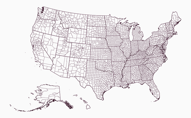
Time for the next step.
Step 4: Adding data
To add data, we start by loading the Facebook connectivity data. I’m turning the user_loc and fr_loc columns into strings and adding leading zeros to make them consistent with the geo data.
# Load facebook data
facebook_df = pd.read_csv("./data/county_county.tsv", sep="\t")
facebook_df.user_loc = ("0" + facebook_df.user_loc.astype(str)).str[-5:]
facebook_df.fr_loc = ("0" + facebook_df.fr_loc.astype(str)).str[-5:]
The user_loc and fr_loc columns define a county pair, and the third column, scaled_sci, is the value we want to display.
There are 3,227 counties in the dataset, which means there are a total of 10,413,529 pairs, but we will show the connectivity indexes for one county at a time.
# Create data map
county_id = "06075" # San Francisco
county_name = counties.loc[county_id].NAME
county_facebook_df = facebook_df[facebook_df.user_loc == county_id]
Next, I define a selected_color and data_breaks which contains percentiles, colors, and legend texts for later.
# Create data map
...

selected_color = "#FA26A0"
data_breaks = [
    (90, "#00ffff", "Top 10%"),
    (70, "#00b5ff", "90-70%"),
    (50, "#6784ff", "70-50%"),
    (30, "#aeb3fe", "50-30%"),
    (0, "#e6e5fc", "Bottom 30%"),
]
The following function defines the color for each row using a county_df and the data_breaks we just defined.
def create_color(county_df, data_breaks):
    colors = []

    for i, row in county_df.iterrows():
        for p, c, _ in data_breaks:
            if row.value >= np.percentile(county_df.value, p):
                colors.append(c)
                break

    return colors
We calculate the correct values and add create_color() like this.
# Create data map
...

counties.loc[:, "value"] = (county_facebook_df.set_index("fr_loc").scaled_sci)
counties.loc[:, "value"] = counties["value"].fillna(0)
counties.loc[:, "color"] = create_color(counties, data_breaks)
counties.loc[county_id, "color"] = selected_color

ax = counties.plot(edgecolor=edge_color + "55", color=counties.color, figsize=(20, 20))
states.plot(ax=ax, edgecolor=edge_color, color="None", linewidth=1)
ax.set(xlim=(-2600000, None)) # Removing some of the padding to the left

plt.axis("off")
plt.show()
Here’s what we get.
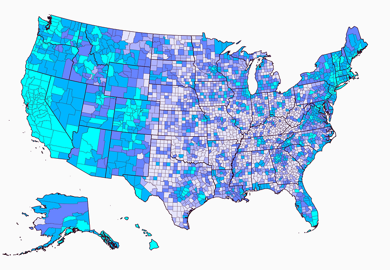
It looks fantastic, but we need to add some information.
Step 5: Adding information
The first piece of information we need is a title to explain what the data visualization is about.
Here’s a function that does that.
def add_title(county_id, county_name):
    plt.annotate(
        text="Social Connectedness Ranking Between US Counties and",
        xy=(0.5, 1.1), xycoords="axes fraction", fontsize=16, ha="center"
    )

    plt.annotate(
        text="{} (FIPS Code {})".format(county_name, county_id),
        xy=(0.5, 1.03), xycoords="axes fraction", fontsize=32, ha="center",
        fontweight="bold"
    )
Next, we need a legend and supporting information that explains the data since it’s a bit complex.
The function for adding a legend uses the data_breaks and the selected_color to create Patch(es) that we add using plt.legend().
def add_legend(data_breaks, selected_color, county_name):
    patches = [Patch(facecolor=c, edgecolor=edge_color, label=t) for _, c, t in data_breaks]
    patches = [Patch(facecolor=selected_color, edgecolor=edge_color, label=county_name)] + patches

    leg = plt.legend(
        handles=patches,
        bbox_to_anchor=(0.5, -0.03), loc='center',
        ncol=10, fontsize=20, columnspacing=1,
        handlelength=1, handleheight=1,
        edgecolor=background_color,
        handletextpad=0.4
    )
I also have a simple function to add some additional information below the legend.
def add_information():
    plt.annotate(
        "The Facebook Connectivity Index measure the likelyhood that users in different\nlocations are connected on Facebook. The formula divides the number of Facebook\nconnections with the number of possible connections for the two locations.",
        xy=(0.5, -0.08), xycoords="axes fraction", ha="center", va="top", fontsize=18, linespacing=1.8
    )

    plt.annotate(
        "Source: https://dataforgood.facebook.com/",
        xy=(0.5, -0.22), xycoords="axes fraction", fontsize=16, ha="center",
        fontweight="bold"
    )
Lastly, I have the add_circle() function to indicate which county we’re looking at by drawing a circle around it.
def add_circle(ax, counties_df, county_id):
    center = counties_df[counties_df.index == county_id].geometry.centroid.iloc[0]
    ax.add_artist(
        Circle(
            radius=100000, xy=(center.x, center.y), facecolor="None", edgecolor=selected_color, linewidth=4
        )
    )
We add all of them below the rest of the code under the # Create data map comment.
# Create data map
...

add_circle(ax, counties, county_id)
add_title(county_id, county_name)
add_legend(data_breaks, selected_color, county_name)
add_information()

plt.axis("off")
plt.show()
Here’s the finished data visualization.
Congratulations, you now know how to create fantastic data maps of the United States in Matplotlib! :)
Conclusion
Data maps are fantastic when you want to visualize geographic information in a way that captures the user’s eye.
This time, we worked with the Social Connectedness Index from Facebook, but you can change that to anything else with geographic information.
I’ve written more about the visualization and dataset in my new free newsletter, Data Wonder.
If you enjoy this tutorial, make sure to take a look at my other ones as well.
See you next time.


