
How to Create Custom Streamlit Components
How to build *everything* with Streamlit

Streamlit is well-loved as a pure Python solution to building web apps. It makes building dynamic, data-centric apps incredibly easy. And the learning curve is practically non-existent.
With just a few lines of code, we can put together clean, interactive apps by simply implementing prebuilt Streamlit components.
There are plenty of prebuilt components designed by Streamlit. If you can't find what you need, there are even community-built components.
The ease of placing these almost ‘lego’ block components together makes Streamlit ideal for ML engineers. Allowing us to focus on ML while still being able to share our apps and tools with the world.
However, sometimes we get stuck and there simply is no component covering what we need. If needed, we can still build our own custom components.
To do this, we need to start playing with the lower-level web technologies that power Streamlit itself. So it isn't as simple as using a prebuilt component. However, it isn't too hard to create a new component, thanks to premade templates.
In this article, we'll learn exactly how to create custom components. We'll focus on designing an interactive card component using Material UI design elements.
Setup and Installation
We will be using Node.js and NPM to develop our card component. They can be installed on Windows/Mac/Linux from here or using homebrew on Mac:
brew install nodeOnce installed, we can confirm that both packages are installed with:
node -vANDnpm -vMake sure Streamlit is installed in your Python environment. If not, just pip install streamlit.
Starting with Templates
We'll start by cloning the streamlit/component-template repo:

In here we'll find a /template directory containing:

The most important files and directories are highlighted. The rest we can completely ignore.
Template Organization
Before we begin building anything, let's organize our template. First, we update all of the default MyComponent references to a slightly more descriptive CardComponent.
- Rename
/my_componentto/st_card_component - Replace
MyComponentwithCardComponentinindex.tsxandmy_componentin__init__.py - Rename
MyComponent.tsxand replaceMyComponentreferences in the code
The final update is to the "name" parameter in package.json , we will name this streamlit_card_component.
Node Packages
Next, we navigate to the /frontend directory in our terminal window and install necessary Node packages specified in package.json with npm install.

And install other dependencies required for the Material UI card:
npm install @mui/material @mui/icons-material @emotion/react @emotion/styledIf you see an upstream dependency conflict error, force the install by adding --legacy-peer-deps to the install command.
Running the Component
Now, we can run the component in its current state by entering npm start in our terminal window.

Heading over to http://localhost:3001 we will see nothing because we're hosting the component, not the Streamlit app. During development, we need to run both. The component is running, so we initialize our app by navigating to the /card_component directory (in a new terminal window) and typing streamlit run __init__.py.

This should open a new browser window that looks like the above, the default Streamlit component template.
Building the Component
We now need to modify this template to create the card format. Most of this is done within the CardComponent.tsx file. If we look at that now, there is a lot in there. We don't need most of that, so let's strip it down first.
These essentials are all we need, the CardComponent class, the HTML we return from the class in render, and the export of our component back to our Streamlit instance.
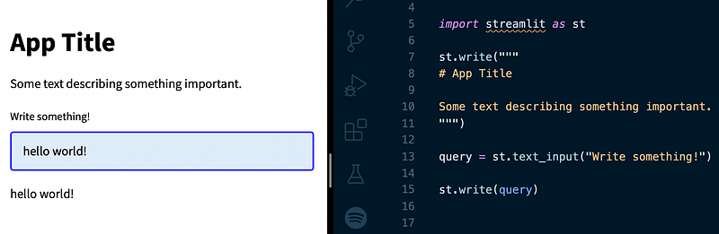
We can modify this to create our card component. First, let's set up the absolute core of our component. A simple display of basic information.

Each card will show a title, subtitle, paragraph, and hyperlink displayed as a Material icon.
We add passable parameters to our component in both CardComponent.tsx and the card_component function within __init__.py.
In CardComponent.tsx we pull in the parameters via this.props.args.
And the card_component function acts as the initialization for our React component, typically called from a frontend Streamlit script. If we take a look at our Streamlit window, we will see an error:

The reason for this is because the code that is calling our card_component is still passing just one value "World", and the new component expects four parameters; title, subtitle, body, and link.
During development, the frontend script is temporarily stored within __init__.py, so we update this script where card_component is called to reflect these changes.
Now we can see the first version of our card component.
It isn't pretty, but the core of the component is there. We have a title, subtitle, body, and link. Let's start working on the styling.
Material UI Styling
We will be using MUI to style and implement card functionality. Fortunately, we can almost copy and paste the code required by finding a card that matches our requirements in the MUI components pages.

We will need to add several imports to the top of our CardComponent.tsx file.
And within the component itself, we add the various card and button tags.
With that, we can refresh our page and see our new card formatted page.

There's one last detail missing. The font being used doesn't align with the MUI examples. For this, we need to install and import the Roboto font. From the /frontend directory we enter npm install @fontsource/roboto in the terminal window. Then add the font to the CardComponent.tsx imports:
Now our component matches the MUI examples.

Perfect, now let's cleanup __init__.py to remove anything not required from our cards component and implement this as an individual component in a Streamlit project.
Publishing the Component
Streamlit components are typically integrated into individual projects via a pip install and import. We will publish our card component to follow the same example.
First, we tell __init__.py to use the release version of the script by setting _RELEASE = True. This tells Streamlit to pull the component from the /frontend/build directory. At the moment, this directory does not exist. We must create it via NPM.
To do that, we navigate to /frontend in terminal and enter npm run build. This command creates the /frontend/build directory that contains the compiled code to be used in the release version of the component.

Next, we navigate to the top-level directory and create a Python /dist folder that will contain the pip package wheel.
Before building the dist folder, we need to modify a few things. First, change the name parameter in setup.py to name="st_card_component".
To include the compiled code in the build directory, we must update the directory in MANIFEST.in to recursive-include st_card_component/frontend/build *.
Finally, we must update the component name in __init__.py to "st_card_component":
We're now ready to create the distribution. With terminal, we execute python setup.py sdist bdist_wheel and in the /dist folder we will see:
- st_card_component-0.0.1.tar.gz
- st_card_component-0.0.1.py3-none-any.whl
Now we move on to uploading to PyPi, where pip install packages are downloaded. First, we install twine with pip install twine , then we upload our package with python -m twine upload --repository pypi dist/* (all from the top directory of component — /st-card-component).
When publishing new versions of our component, we must update the version number in the setup.py file.
Using the Component
We can finally use our Streamlit component as we would any other. The component package is installed with pip install st-card-component.
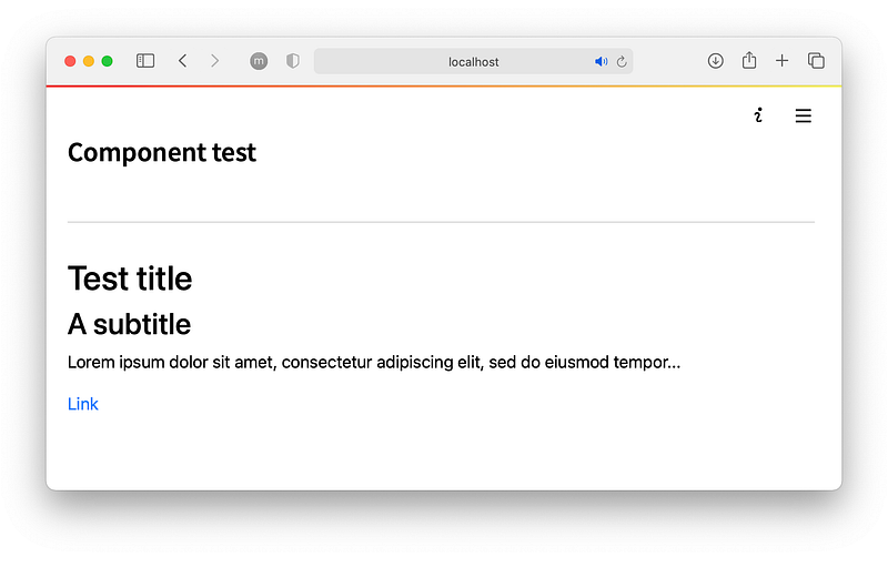
Let's create a 'test' script.

And there is our custom Streamlit card component!
That's it for this guide to building custom and sharable components for Streamlit. We've covered plenty, from the default templates to building components in React and even publishing components on PyPi.
Of course, this is an incredibly simple component. There is much more that we can do and build here. I'll leave that to you.
You can stay updated with the latest ML articles via this link. I also upload weekly ML and NLP videos on YouTube here.
Thanks for reading!
🎁 Free Course on NLP for Semantic Search
🤖 70% Discount on the NLP With Transformers Course
*All images are by the author except where stated otherwise


