
How to Create an Angular Material Table Action Column (Show Snackbar on Click)
The Angular Material table can be customized with clickable rows and cells. It can also have “action” components in its cells. In this tutorial we will explore how to add a clickable button to an Angular Material Table and how to add click events to the rows.
Here is what we will build in this tutorial:
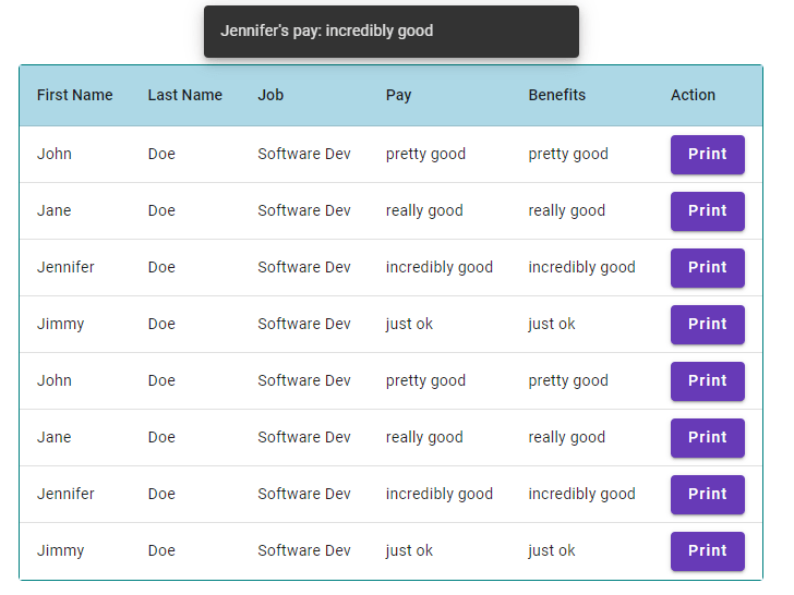
Full code for this tutorial is in the Resources section.
How to Add Click Handler to Angular Material Table Row Click
I started this tutorial with a typical Angular Material Table template just like the one in this Angular Material Table Styling demo. The table has three main parts:
- An ng-container for each header
- A tr header row definition
- A tr body row definition
I customized the table body row by adding a click listener on the row template code:
You can see in the code snippet that we have access to two values here: myRowData and index. I pass the index as i to the onRowClick handler and also pass the event itself.
Then in my ActionColumnTable class, I have the handler code:
onRowClick = (event: Event, rowIndex: number) => { console.log(rowIndex); }We can see the result of a click on row 7 (zero-based index of course):

How to Add an Action Column with Button to an Angular Table
Next I wanted to add a Button component to the table. Our data does not need to have an action field in order to have a column with matColumnDef='action':
<ng-container matColumnDef="action"> <th mat-header-cell *matHeaderCellDef> Action </th> <td mat-cell *matCellDef="let person; let i = index"> <button mat-raised-button [color]="color" (click)="onActionButtonClick($event, person, i)">Print</button> </td> </ng-container>Once again we have matCellDef giving us access to the index. We also have access to the data on the particular object being rendered in this iteration of table row.
We add a button to the action column simply by injecting it instead of text as a child of the td element. We can still use button properties like [color] and event listeners like [click].
My action button has a simple handler like the row click handler:
onActionButtonClick = (event: Event, eventData: Employee, rowIndex: number) => { console.log(eventData); console.log(rowIndex); }I created an Employee interface to Type my table data.
With this code, if I click on my button then both the button click handler and the row click handler fire.

That’s not desirable but it can be fixed with a function on the event object:
event.stopPropagation();Simply add the stopPropogation() call in the onActionButtonClick handler and the event will not bubble up from the button to the row.
Here’s how to add Buttons to Grid Lists and align them.
How to Show a Snackbar on Table Button Click in Angular Material
We can show a Snackbar on Angular Material table click by importing MatSnackBar and calling its open function on button click. Here's the code:
//action-column-table.ts import {MatSnackBar} from '@angular/material/snack-bar'; export class ActionColumnTable { constructor(private _snackBar: MatSnackBar) {} onActionButtonClick = (event: Event, eventData: Employee, rowIndex: number) => { this._snackBar.open(`${eventData.firstName}'s pay: ${eventData.pay}`, '', {verticalPosition: 'top'}); } }Notice that I am the eventData in the Snackbar's open function to construct my text. I am also setting the Snackbar to open at the top of the viewport. The hardest part of using the Snackbar is that I had to directly import it as a class instead of as a module.
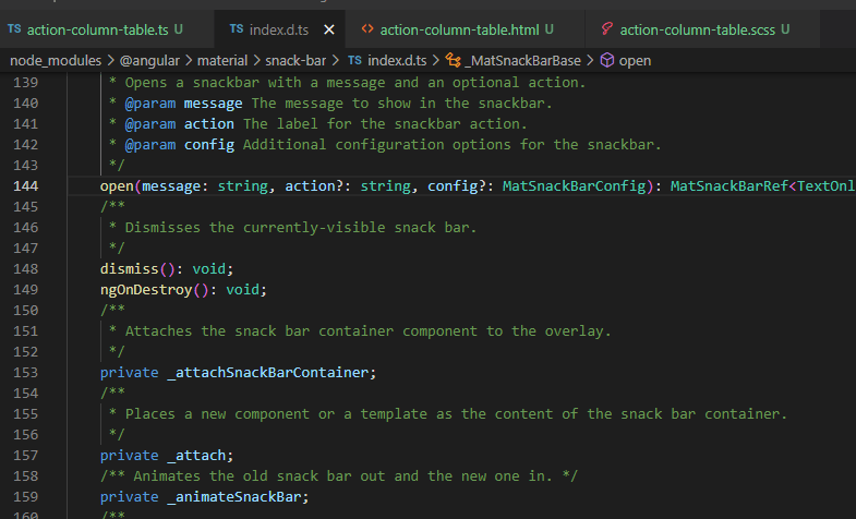
If you are using the Snackbar, I recommend clicking into the open function and seeing the configs that are available. There are lots of great options on the Snackbar for configuring the style, location, and other behavior.
Here’s how to position the Snackbar anywhere on the screen.
Resources
Here is the full Angular code for this tutorial. I did not add a style file, but check out this tutorial on making the first column and header row sticky and this tutorial for cell width.
//action-column-table.ts import { Component } from "@angular/core"; import { DemoMaterialModule } from "../material-module"; import {MatSnackBar} from '@angular/material/snack-bar'; interface Employee { firstName: string, lastName: string, job: string, pay: string, benefits: string } const data : Employee[] = [ {firstName: 'John', lastName: 'Doe', job: 'Software Dev', pay: 'pretty good', benefits: 'pretty good'}, {firstName: 'Jane', lastName: 'Doe', job: 'Software Dev', pay: 'really good', benefits: 'really good'}, {firstName: 'Jennifer', lastName: 'Doe', job: 'Software Dev', pay: 'incredibly good', benefits: 'incredibly good'}, {firstName: 'Jimmy', lastName: 'Doe', job: 'Software Dev', pay: 'just ok', benefits: 'just ok'}, {firstName: 'John', lastName: 'Doe', job: 'Software Dev', pay: 'pretty good', benefits: 'pretty good'}, {firstName: 'Jane', lastName: 'Doe', job: 'Software Dev', pay: 'really good', benefits: 'really good'}, {firstName: 'Jennifer', lastName: 'Doe', job: 'Software Dev', pay: 'incredibly good', benefits: 'incredibly good'}, {firstName: 'Jimmy', lastName: 'Doe', job: 'Software Dev', pay: 'just ok', benefits: 'just ok'} ] @Component({ selector: "action-column-table", templateUrl: "action-column-table.html", styleUrls: ["action-column-table.scss"], standalone: true, imports: [DemoMaterialModule] }) export class ActionColumnTable { constructor(private _snackBar: MatSnackBar) {} columnsToDisplay = ['firstName', 'lastName', 'job', 'pay', 'benefits', 'action']; dataSource = data; onRowClick = (event: Event, rowIndex: number) => { console.log(rowIndex); } onActionButtonClick = (event: Event, eventData: Employee, rowIndex: number) => { console.log(eventData); console.log(rowIndex); event.stopPropagation(); this._snackBar.open(`${eventData.firstName}'s pay: ${eventData.pay}`, '', {verticalPosition: 'top'}); } color="primary"; } //action-column-table.html <div class="table-container"> <table mat-table [dataSource]="dataSource"> <ng-container matColumnDef="firstName"> <th mat-header-cell *matHeaderCellDef class="first-column"> First Name </th> <td mat-cell *matCellDef="let person" class="first-column"> {{person.firstName}} </td> </ng-container> <ng-container matColumnDef="lastName"> <th mat-header-cell *matHeaderCellDef> Last Name </th> <td mat-cell *matCellDef="let person"> {{person.lastName}} </td> </ng-container> <ng-container matColumnDef="job"> <th mat-header-cell *matHeaderCellDef> Job </th> <td mat-cell *matCellDef="let person"> {{person.job}} </td> </ng-container> <ng-container matColumnDef="pay"> <th mat-header-cell *matHeaderCellDef> Pay </th> <td mat-cell *matCellDef="let person"> {{person.pay}} </td> </ng-container> <ng-container matColumnDef="benefits"> <th mat-header-cell *matHeaderCellDef> Benefits </th> <td mat-cell *matCellDef="let person"> {{person.benefits}} </td> </ng-container> <ng-container matColumnDef="action"> <th mat-header-cell *matHeaderCellDef> Action </th> <td mat-cell *matCellDef="let person; let i = index"> <button mat-raised-button [color]="color" (click)="onActionButtonClick($event, person, i)">Print</button> </td> </ng-container> <tr mat-header-row *matHeaderRowDef="columnsToDisplay"></tr> <tr mat-row *matRowDef="let myRowData; let i = index; columns: columnsToDisplay;" (click)="onRowClick($event, i)"></tr> </table> </div>Considering a Medium subscription?
If this article was helpful and you want to sign up for a Medium subscription, please consider doing so through my referral page. This supports me financially so that I can continue creating excellent dev articles.


