
How To Create a Responsive Image Grid Gallery with HTML & CSS — Flexbox
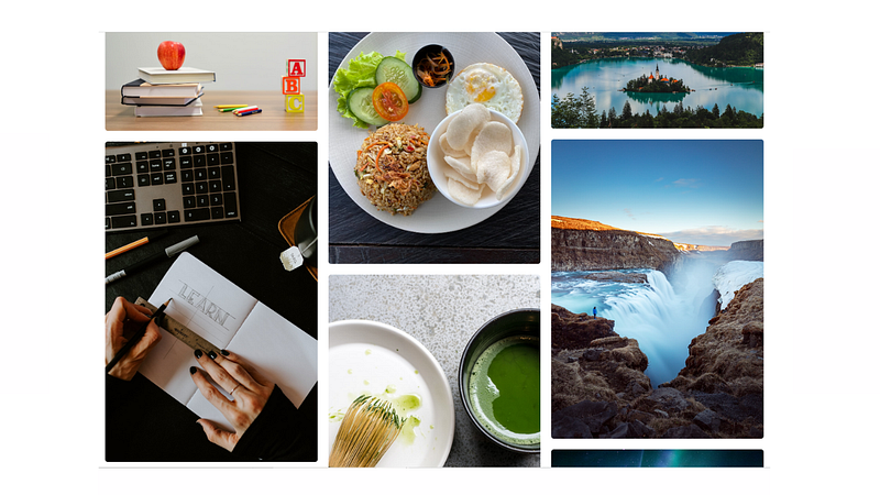
In this tutorial, you’ll learn how to create a responsive image grid like the one above. The general idea is to create one container with three columns inside. Each column will contain its own set of images. The aligning of the images within the column will be achieved with flexbox. So you see, the images aren’t just magically aligning themselves, instead they are strategically created to make it appear that way. Alright, enough talking, let’s get into this tutorial.
HTML:
The first thing we need is a container to place all of our code, so let’s create a class with a name of container. Inside that, add a class with a name of title that will contain a title and a class with the name of photo-gallery that will contain the three columns. We will add those on the next step.
<div class="container">
  <h2 class="title">Responsive Photo Gallery</h2>
  <div class="photo-gallery">
     // YOUR THREE COLUMNS WITH IMAGES WILL GO HERE!
  </div>
</div>
Add the three columns inside the photo-gallery class. Notice each column contains multiple images, each with a class name of photo and an image tag within containing a link to the image source. I used links to random images from the Unsplash API.
<div class="container">
  <h2 class="title">Responsive Photo Gallery</h2>
<div class="photo-gallery"> <div class="column">
<div class="photo">
<img src="https://source.unsplash.com/OyCl7Y4y0Bk" alt="">
</div>
<div class="photo">
<img src="https://source.unsplash.com/Kl1gC0ve620" alt="">
</div>
<div class="photo">
<img src="https://source.unsplash.com/55btQzyDiO8" alt="">
  </div>
</div> <div class="column">
<div class="photo">
<img src="https://source.unsplash.com/g0dBbrGmMe0" alt="">
</div>
<div class="photo">
<img src="https://source.unsplash.com/v1OW17UcR-Q" alt="">
</div>
<div class="photo">
<img src="https://source.unsplash.com/Wpg3Qm0zaGk" alt="">
</div>
</div> <div class="column">
<div class="photo">
<img src="https://source.unsplash.com/W3FC_bCPw8E" alt="">
</div>
<div class="photo">
<img src="https://source.unsplash.com/rBRZLPVLQg0" alt="">
</div>
<div class="photo">
<img src="https://source.unsplash.com/RRksEVVoU8o" alt="">
</div>
</div> </div>
</div>CSS:
Remove the default margin and padding by setting it to zero. This is more of a personal preference and isn’t technically required.
* {
  margin: 0;
  padding: 0;
}
This is a neat little trick to make it responsive on big screen sizes. Set the max-width of the container to a particular width, I used 1224px. This means that our container will never be bigger than 1224px, so if a user has a computer screen that is larger, our images won’t loose their integrity by stretching out to fit their screen. What if a user has a screen size that is smaller than 1224px, you ask? Notice that we also used a width of 90%. This means, our photo gallery will take up 90% of their screen when it’s smaller than 1224px.
.container {
  max-width: 1224px;
  width: 90%;
  margin: auto;
  padding: 40px 0;
}
Create some separation between the title and photo-gallery.
.title {
  margin-bottom: 2rem;
}
As you know, we have a class named photo-gallery with three columns inside. Currently, they appear like one big column but we want them side by side. We can easily achieve this with a flexbox property named display: flex. Gap is used to separate the columns.
.photo-gallery {
  display: flex;
  gap: 20px;
}
The images within our columns currently have no structure but we want them to stack on top of each other with a little bit of padding between them. Once again, this can be achieved easily by combining flexbox properties display:flex and flex-direction:column.
.column {
  display: flex;
  flex-direction: column;
  gap: 20px;
}
Add some basic styling to the images themselves.
.photo img {
  width: 100%;
  border-radius: 5px;
  height: 100%;
  object-fit: cover;
}
Finally, make the photo gallery completely responsive by making it appear like one big column when the screen size is smaller than 768px.
@media(max-width: 768px){
  .photo-gallery {
    flex-direction: column;
  }
}
That’s it!
Not making sense or prefer to hear me explain it? Check out my tutorial video below.


