
How to Create a Multi-Layer Gantt Chart Using Plotly
Create a Gantt Chart to Track Your Project Plan by Planned vs. Actual Completion Dates

A Gantt chart is a very popular and helpful visual for project managers and teams to plan and track project roadmap, schedules, and progress. A basic Gantt chart illustrates a project plan by listing the tasks to be performed on the vertical axis, and a timeline with planned start and finish dates for each task on the horizontal axis.
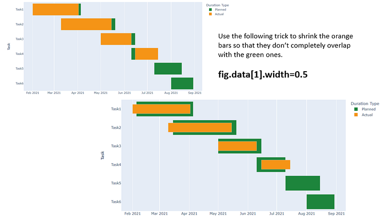
Sometimes in addition to showing the planned schedule for the tasks, we also want to show the actual start and completion dates for all the tasks. The Gantt chart below is a multi-layer Gantt chart that contains two layers for the planned and actual dates: the ‘planned schedule’ bars (green) are the first layer of the Gantt chart, and the ‘actual schedule’ bars (orange) are the second layer. How can we easily create a multi-layer Gantt chart like this using Python?

In this post, I’ll show you how to easily create a multi-layer Gantt chart using Plotly. For those of you who are not familiar with Plotly, the Plotly Python library is an interactive, open-source graphing library that covers a wide range of chart types and data visualization use cases. It has a wrapper called Plotly Express which is a higher-level interface to Plotly and is super easy and quick to use as a starting point for creating some of the most common visualizations.
Plotly also has a lower-level graphing package called Plotly Graph Objectsthat generally requires a bit more coding but is more customizable and flexible compared to Plotly Express. In this post, we’ll use Plotly Express to plot the multi-layer Gantt chart.
If you don’t already have plotly on your computer, you can install it by running the following command:
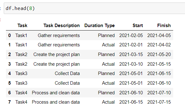
pip install plotlyLet’s first import all the libraries and read our sample data into a Pandas dataframe. Notice that the data is structured in a way that for each task we have two rows of data, one for the planned start and finish dates and the other for the actual start and finish dates.
To create a Gantt chart, we need to use px.timeline() to make a timeline plot where each row of the dataframe is represented as a rectangle/horizontal bar along the x-axis, spanning from the ‘Start’ date to the ‘Finish’ date, and each task is listed along the y-axis.
We also specify the color parameter to assign different colors to the ‘Planned’ and ‘Actual’ schedule bars. You can set your color preferences for the two bars in lines 2 and 3.
Now, this is the trick to make the Gantt chart look two-layered: we need to update the width of the ‘actual schedule’ bars so that they don’t completely overlap with the ‘planned schedule’ bars. We do it in line 16. Without applying this trick, your plot would look like the one on the upper left:
We are almost done! Let’s fine-tune the chart by adding a chart title, moving the x-axis labels to the top, adjusting the position of the legend, removing the legend title, etc.
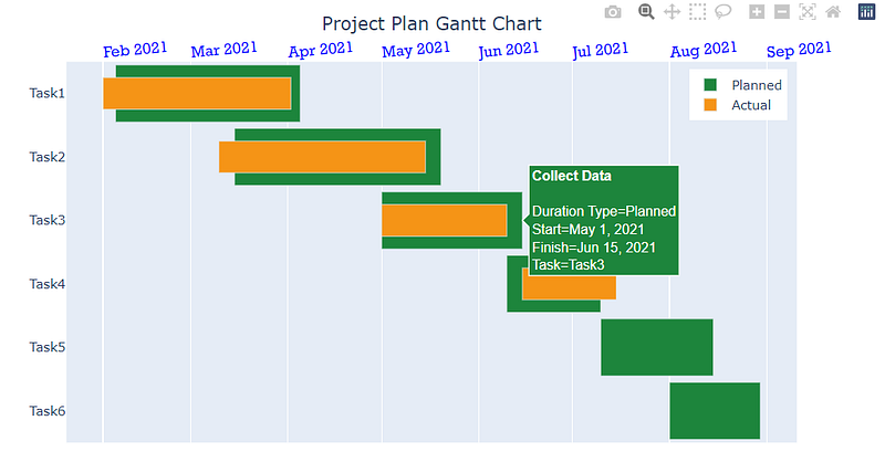
There you go! We have created a multi-layer Gantt chart that shows the project plan by planned and actual schedules using Plotly.Express. Thanks for reading and I hope you enjoyed this short tutorial about Plotly.
Data Source:
The sample dataset used in this post was created by the author for demonstration purposes.
You can unlock full access to my writing and the rest of Medium by signing up for Medium membership ($5 per month) through this referral link. By signing up through this link, I will receive a portion of your membership fee at no additional cost to you. Thank you!