
How to Create a 3D Model of the Solar System Using Plotly in Python
Step by step guide in how to use Plotly 3D graphs
If you enjoy Data Science and Machine Learning, please subscribe to get an email whenever I publish a new story.
There is a large selection of graphing libraries in Python that enables you to plot all the major types of charts so you can visualize your data. However, have you ever considered using them for something a bit more sophisticated? Put Matplolib and Bokeh aside and dive into the wonderful world of 3D and animated graphs that can be created using Plotly.
I have no association with Plotly but I have been using their library in Python for a while now and I find it very useful. Hence, I decided to explore it deeper.
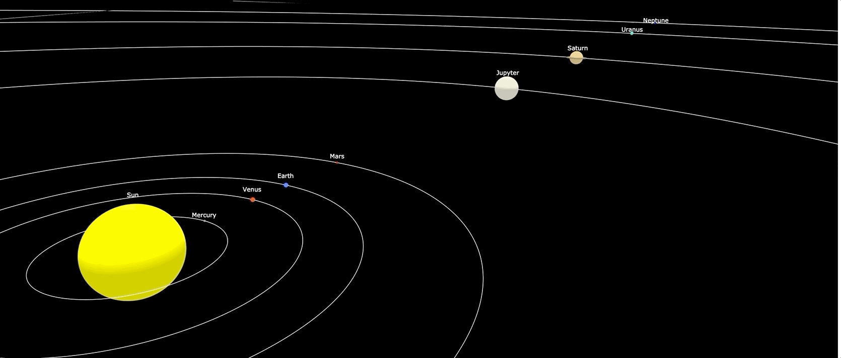
Here, I am using a combination of Plotly Scatter3D and Plotly Surface plots to create an entire Solar system inside one graph. In this story, I will take you through the Python code that will enable you to recreate it yourself.
Choosing the right plot
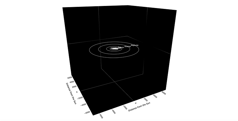
My initial intention was to simply use Scatter3D plot by making custom size markers for the Sun and the planets. However, this was not ideal as the markers remained the same size when zooming in or out. This led to undesired effects such as Saturn’s rings being inside the planet and the Sun engulfing all the rocky inner planets once zoomed out (see picture below).

This meant that I had to find a different solution for displaying the Sun and the planets. Luckily, Plotly also offers 3D Surface plot that I could use for my celestial objects. Although, that required drawing multiple spheres, each different in size and color.

So, in the end, what we needed was Plotly Scatter3D for drawing orbits and Plotly Surface for drawing spheres which would replace markers to make up our planets.
The Sun and the planets
To minimize the amount of coding required, we will define a function that will do the job of creating spheres for us. It is a fairly short one, although it requires some knowledge about the spherical coordinate system. You can read about it on this Wikipedia page. Alternatively, simply accept that we define the coordinates for a sphere in the following way:
x = r cosθ sinφ ; y = r sinθ sinφ; z = r cosφ
So, let us take a look at the code:
def spheres(size, clr, dist=0):

    # Set up 100 points. First, do angles
    theta = np.linspace(0,2*np.pi,100)
    phi = np.linspace(0,np.pi,100)

    # Set up coordinates for points on the sphere
    x0 = dist + size * np.outer(np.cos(theta),np.sin(phi))
    y0 = size * np.outer(np.sin(theta),np.sin(phi))
    z0 = size * np.outer(np.ones(100),np.cos(phi))

    # Set up trace
    trace= go.Surface(x=x0, y=y0, z=z0, colorscale=[[0,clr], [1,clr]])
    trace.update(showscale=False)

    return trace
To draw a sphere, we will need to pass an array for x, y, and z coordinates containing the points in space. Note, it is up to us to choose how many points we want to specify, however, if we choose too few then our sphere will not be as round as we would like it to be. In this case, we create a couple of arrays containing 100 equally spaced points. Note, theta ranges between 0 and 2pi while phi ranges between 0 and pi.
Once we have theta and phi, then we simply calculate the x, y, and z coordinates using the above formulae. Note, I used ‘size’ in place of the radius (r) and also specified ‘dist’ which tells us the distance from the Sun. This is so we can place our spheres in the right locations.
Also, note that Plotly requires 2D array for z coordinates, hence, we populated the first dimension with 1s with the second dimension being as per the formula (cosφ).
Finally, we define a ‘colorscale’ which can be a range of colors (e.g. two-color set up in the sphere picture above). However, in our case, we simply want to have one color for each object, so while we still need to specify at least two arguments we just pass the same color to both.

Orbits
If you look up in the sky, you will not see orbital lines all over it. However, in solar system models, we do like to draw orbits. Here, we define another simple function which we will use for both, orbits as well as drawing rings around Saturn 🪐.
def orbits(dist, offset=0, clr='white', wdth=2):

    # Initialize empty lists for each set of coordinates
    xcrd=[]
    ycrd=[]
    zcrd=[]

    # Calculate coordinates
    for i in range(0,361):
        xcrd=xcrd+[(round(np.cos(math.radians(i)),5)) * dist + offset]
        ycrd=ycrd+[(round(np.sin(math.radians(i)),5)) * dist]
        zcrd=zcrd+[0]

    trace = go.Scatter3d(x=xcrd, y=ycrd, z=zcrd, marker=dict(size=0.1), line=dict(color=clr,width=wdth))
    return trace
The function of drawing orbits is even simpler. It is basically just a flat circle, hence, only some basic trigonometry knowledge is required.
To demonstrate a slightly different way of doing things, here we create an empty list and then add items to that list one at a time by using a ‘for’ loop. Note, we use degrees in the loop which we convert to radians when calculating points on the circle. Again, ‘dist’ is the distance from the sun i.e. radius (r), while ‘offset’ allows us to change the center of the circle. This is so we can draw rings around Saturn, in which case the center point will need to be the location of the Saturn(i.e. 1433.5,0,0), and not the Sun (i.e 0,0,0).
As for the color, we simply make all orbits white so we have a contrast with black space.
Annotations
This a final function that we need to define. It is very basic and it will enable us to add the names of the planets in the location of our chosen coordinates. Note, we use annotations instead of ‘marker text’ because we want the planet names to appear outside of the spheres.
def annot(xcrd, zcrd, txt, xancr='center'):
    strng=dict(showarrow=False, x=xcrd, y=0, z=zcrd, text=txt, xanchor=xancr, font=dict(color='white',size=12))
    return strng
Here, we simply specify the x and z coordinates where we want the text to appear. Note, we can also specify the anchor point which will be the ‘center’ for all planets, and ‘left’ for the Sun. We do a different anchor point for the Sun as this way it looks better due to its large size.
Drawing the Solar system
Now, that we have all the little functions to help us, we can put it all together and create the entire chart. Here is the code:
# Note, true diameter of the Sun is 1,392,700km. Reduced it for better visualization
diameter_km = [200000, 4878, 12104, 12756, 6787, 142796, 120660, 51118, 48600]
# Modify planet sizes making them retative to the Earth size, where Earth in this case = 2
diameter = [((i / 12756) * 2) for i in diameter_km]
# Distance from the sun expressed in millions of km
distance_from_sun = [0, 57.9, 108.2, 149.6, 227.9, 778.6, 1433.5, 2872.5, 4495.1]

# Create spheres for the Sun and planets
trace0=spheres(diameter[0], '#ffff00', distance_from_sun[0]) # Sun
trace1=spheres(diameter[1], '#87877d', distance_from_sun[1]) # Mercury
trace2=spheres(diameter[2], '#d23100', distance_from_sun[2]) # Venus
trace3=spheres(diameter[3], '#325bff', distance_from_sun[3]) # Earth
trace4=spheres(diameter[4], '#b20000', distance_from_sun[4]) # Mars
trace5=spheres(diameter[5], '#ebebd2', distance_from_sun[5]) # Jupyter
trace6=spheres(diameter[6], '#ebcd82', distance_from_sun[6]) # Saturn
trace7=spheres(diameter[7], '#37ffda', distance_from_sun[7]) # Uranus
trace8=spheres(diameter[8], '#2500ab', distance_from_sun[8]) # Neptune

# Set up orbit traces
trace11 = orbits(distance_from_sun[1]) # Mercury
trace12 = orbits(distance_from_sun[2]) # Venus
trace13 = orbits(distance_from_sun[3]) # Earth
trace14 = orbits(distance_from_sun[4]) # Mars
trace15 = orbits(distance_from_sun[5]) # Jupyter
trace16 = orbits(distance_from_sun[6]) # Saturn
trace17 = orbits(distance_from_sun[7]) # Uranus
trace18 = orbits(distance_from_sun[8]) # Neptune

# Use the same to draw a few rings for Saturn
trace21 = orbits(23, distance_from_sun[6], '#827962', 3)
trace22 = orbits(24, distance_from_sun[6], '#827962', 3)
trace23 = orbits(25, distance_from_sun[6], '#827962', 3)
trace24 = orbits(26, distance_from_sun[6], '#827962', 3)
trace25 = orbits(27, distance_from_sun[6], '#827962', 3)
trace26 = orbits(28, distance_from_sun[6], '#827962', 3)

layout=go.Layout(title = 'Solar System', showlegend=False, margin=dict(l=0, r=0, t=0, b=0),
                  #paper_bgcolor = 'black',
                  scene = dict(xaxis=dict(title='Distance from the Sun',
                                          titlefont_color='black',
                                          range=[-7000,7000],
                                          backgroundcolor='black',
                                          color='black',
                                          gridcolor='black'),
                               yaxis=dict(title='Distance from the Sun',
                                          titlefont_color='black',
                                          range=[-7000,7000],
                                          backgroundcolor='black',
                                          color='black',
                                          gridcolor='black'
                                          ),
                               zaxis=dict(title='',
                                          range=[-7000,7000],
                                          backgroundcolor='black',
                                          color='white',
                                          gridcolor='black'
                                         ),
                               annotations=[
                                   annot(distance_from_sun[0], 40, 'Sun', xancr='left'),
                                   annot(distance_from_sun[1], 5, 'Mercury'),
                                   annot(distance_from_sun[2], 9, 'Venus'),
                                   annot(distance_from_sun[3], 9, 'Earth'),
                                   annot(distance_from_sun[4], 7, 'Mars'),
                                   annot(distance_from_sun[5], 30, 'Jupyter'),
                                   annot(distance_from_sun[6], 28, 'Saturn'),
                                   annot(distance_from_sun[7], 20, 'Uranus'),
                                   annot(distance_from_sun[8], 20, 'Neptune'),
                                   ]
                               ))

fig = go.Figure(data = [trace0, trace1, trace2, trace3, trace4, trace5, trace6, trace7, trace8,
                        trace11, trace12, trace13, trace14, trace15, trace16, trace17, trace18,
                        trace21, trace22, trace23, trace24, trace25, trace26],
                layout = layout)

fig.show()
fig.write_html("Solar_system.html")
We start by creating a couple of lists that contain the distance from the Sun and the diameter of the celestial objects. Note, we had to reduce the size of the Sun making it much smaller as otherwise, it would have made it too large for our graph.
While we maintained the scale to ensure the planet sizes are correct relative to each other, it is not the case for the Sun. Also, the distance of the planets is to scale, e.g. Jupyter is 7 times further away from the Sun than Venus. However, we did not maintain scale between the planets and the distance from the Sun as we expressed the diameter in kilometers while the distance was expressed in millions of kilometers.
Then, we simply use the functions defined earlier to create traces for each sphere and orbit, including a few rings around Saturn👏.

Finally, we specify a few options in the layout method such as range and background-color as well as add annotations and create a graph by adding all traces into ‘go.Figure’.
To display the graph in Jupyter Notebook we simply write ‘fig.show()’ and we can also export it as an interactive HTML file using ‘fig.write_html’. You can find the HTML file with the graph on my GitHub repository here.
Final remarks
While this project did not have any practical use for me, it was quite fun to make. Feel free to take the code and make your own adjustments and improvements.
A few areas for inspiration:
- The orbits are drawn as circles while in reality, they should be somewhat elliptical.
- There should be a few degrees tilt in the planetary orbits.
- You can also add an axis tilt for Saturn by making the rings drawn at an angle. (Saturn axis tilt is 27 degrees).
Thank you for reading and I hope you learned something or at least enjoyed seeing the planets align!
Cheers! 👏 Saul Dobilas


