
How To Construct Different Types Of Correlation Heatmap With Seaborn In Python
A correlation heatmap is the the visual graph that show the relationship between the numerical variables within the data set. The correlation values range from -1 to 1 with 1 being the strongest relationship and -1 being the weakest.
In this post, we will focus on how to generate the different types of correlational heatmap using the Seaborn visualization package in Python.
Here are the definition of the Python’s arguments needed to create the correlation heatmap.
- df — name of the data frame
- fmt — format of the text on each cell ( in this example, we set fmt = “.1F” so that one decimal place of scientific notation for the correlation coefficients will be displayed)
- cmap — name of the colormap
- alpha = 0.5 — to adjust the color intensity of the heatmap ( the higher, the brighter, and vice versa)
- annot = True — to add the coefficient values on each cell
- annot_kws = { “size”: 10} — set the size of the text on annotated cell
- linewidth — thickness of the lines between each cell
- linecolor — the color of the lines between each cell
Basic Correlation Heatmap
# Import required Python packages
import numpy as np
import pandas as pd
import seaborn as sns
import matplotlib.pyplot as plt
# Add title and assign size of heatmap
fig, ax = plt.subplots()
fig.set_size_inches(12,11)
plt.title('HeatMap Correlation Matrix', size = 20, color = 'Black', alpha = 0.9)# Correlation
corr = df.corr()# Heatmap
sns.heatmap(corr, cmap="BuGn_r")Now we will see the basic correlation heatmap like below.

We can see briefly that the lighter colors show the stronger correlation than the brighter colors according to the color bar.
Now let’s try out different styles of correlation heatmap.
Annotated Correlation Heatmap
We will add in annot=True to display the correlation numbers on the heatmap.
# Add figure title and size
fig, ax = plt.subplots()
fig.set_size_inches(12,11)
plt.title('HeatMap Correlation Matrix', size = 20, color = 'Black', alpha = 0.9)
# Correlation
corr = df.corr()
sns.heatmap(corr, annot=True, fmt=".1f", cmap="ocean", center=0, ax=ax, alpha = 0.5)
Annotated heatmap is more preferable than the basic one since we can spot the correlation coefficients easily.
Now let’s customize the heatmap a bit with size of the annotated text, linewidth, and linecolors.
# Add figure title and size
fig, ax = plt.subplots()
fig.set_size_inches(12,10)
plt.title('HeatMap Correlation Matrix', size = 20, color = 'Black', alpha = 0.9)
# Correlation
corr = df.corr()
sns.heatmap(corr, annot=True, fmt=".1F", cmap="plasma", alpha = 0.8, annot_kws={"size":12}, linewidths = 2.5, linecolor = 'yellow')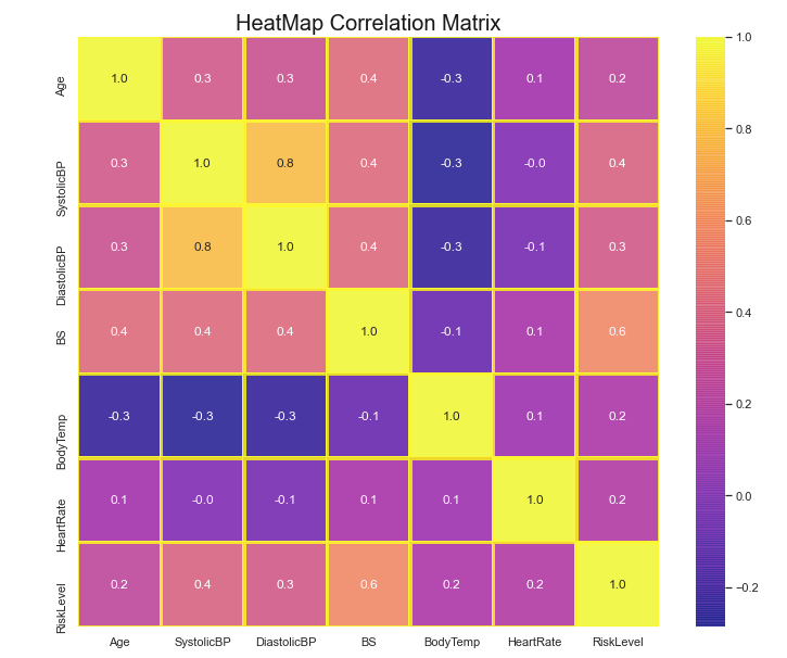
Annotated Correlation Heatmap with Specific Condition
Let’s say we only want to see the correlation pairs in which the correlation coefficients are higher than 0.5.
Notice the use of corr >= 0.5 for selection of the pair that are greater than 0.5
fig, ax = plt.subplots()
fig.set_size_inches(12,11)
plt.title('HeatMap Correlation Matrix with Correlation > 0.5', size = 20, color = 'Black', alpha = 0.9)
# Correlation
corr = df.corr()
corr_modified = corr[corr>=0.5]
sns.heatmap(corr_modified, annot=True, fmt=".1f", cmap="Pastel1_r", center=0, ax=ax)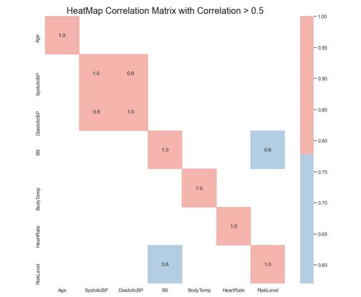
Now we will only see the variable pair that have correlation coefficient greater than 0.5.
fig, ax = plt.subplots()
fig.set_size_inches(12,10)
plt.title('HeatMap Correlation Matrix with Correlation > 0.5', size = 20, color = 'Black', alpha = 0.9)
# Correlation
corr = df.corr()
corr_modified = corr[corr>=0.5]
sns.heatmap(corr_modified, annot=True, fmt=".1f", cmap="rainbow_r", annot_kws = {'size':16}, linewidth = 1.5, linecolor = 'pink')