
How To Choose Right Data Visualization Charts For Your Data?
A crash course on practical Data Visualization …( Part 1)

Welcome back peeps. This post is inspired by the number of questions (~40 questions) I get from my readers/followers/budding data enthusiasts wrt Data Visualization. I think I should have written this post as a part of 60 days of Data Science and ML series ( link below).
Some of the other best Series —
100 days : Your Data Science and Machine Learning Degree Series with projects
Complete Data Visualization and Pre-processing Series with projects
Tech Newsletter —
If you are interested, you can join my newsletter through which I send tech interview tips, techniques, patterns, hacks — Software Development, ML, Data Science, Startups and Technology projects to more than 30K readers. You can subscribe to Tech Brew :
So the question is —
How To Choose Right Data Visualization Charts For Your Data/best represent your data?
Data Visualization is an incredibly important step as it helps to understand how the data is distributed wrt time, lets you visualize your hypothesis about the data, conveys important information through different charts to let leaders take important business decisions, lets you examine the missing values/outliers in the data.
The advantages are many; thus, it’s important to understand how to choose right data visualization charts to best represent your data.
To answer this question, first you need to understand your data i.e what sort of data you are dealing with?
To present your data, there are four basic presentation types :
Composition : To show part-to-whole relationship of the data variables
Distribution : To show the spread of the data values
Relationship : To establish relationship between the different data variables
Comparison : To compare one value with the other ( i.e two or more data variables)
In this post we will first cover the different ( important) charts in the visualization libraries stack —
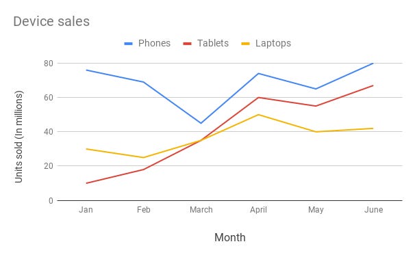
Line Chart —
Line chart are used to show trends over the period time or categories i.e to show changes in one variable value relative to another..
Example :
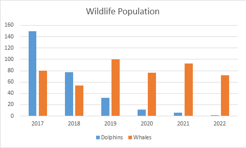
Column Chart —
Column charts are used to show to show comparison between different variables or multiple categories over time. It’s plotted using vertical bars.
Example :
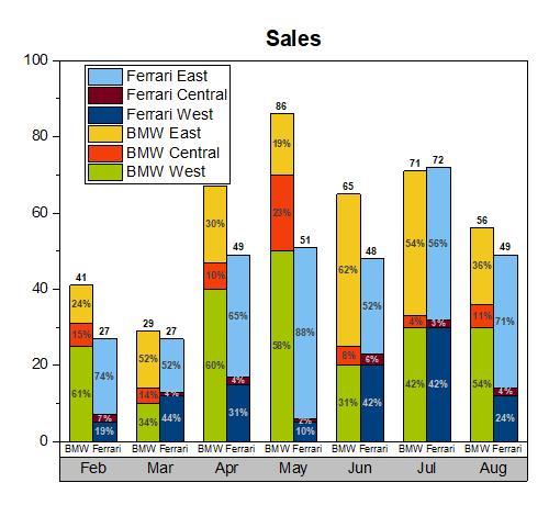
Stacked Column Chart —
Stacked Column Chart is used to show relative percentage of multiple data categories or variables in stacked columns. It’s plotted using vertical bars.
Example :
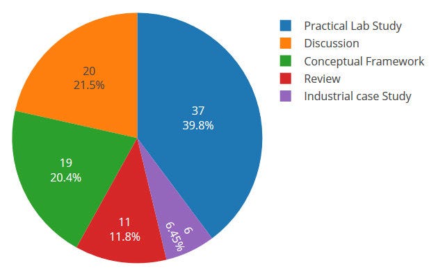
Pie Chart —
Pie charts are used to show data as a percentage of a whole i.e to let user compare the relationship between different categories/dimension in some context.
Example :
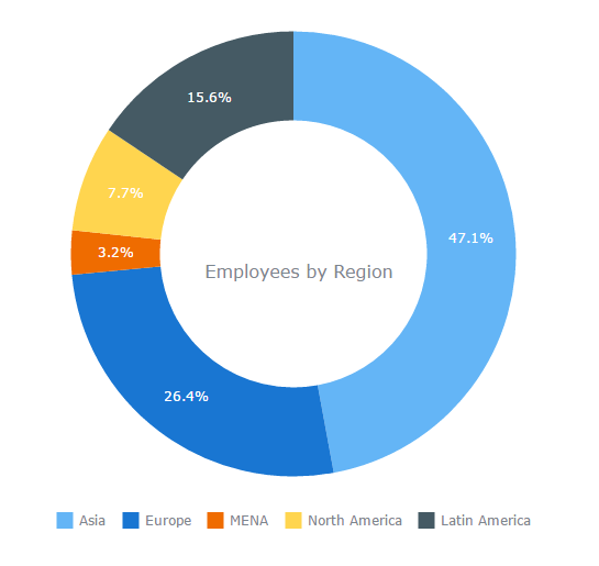
Donut Chart —
Just like pie chart but with a hole in the centre; donut chart is used to visualize the categories as arcs.
Example :
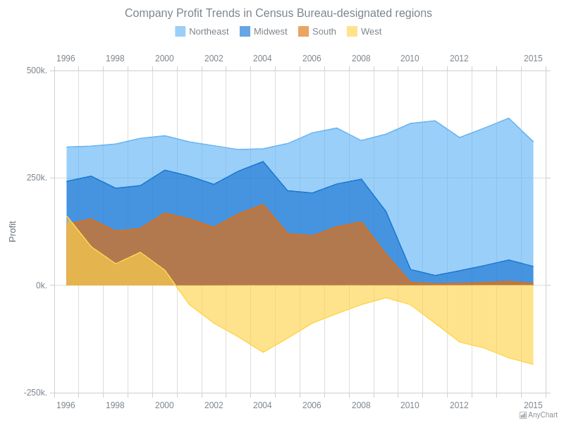
Area Chart —
Area Charts are used to present the accumulative value changes over time.
Example :
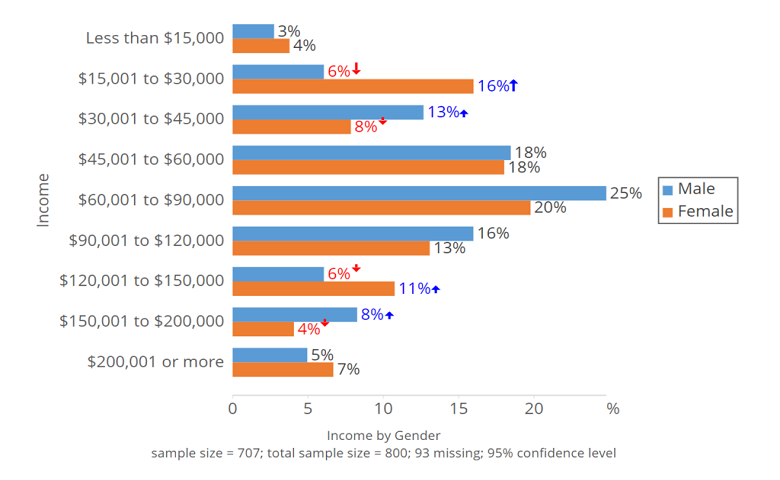
Bar Chart —
Bar charts are used to show to show values across different data variables/categories where values are represented on the x-axis and categories on the y-axis.
Example :
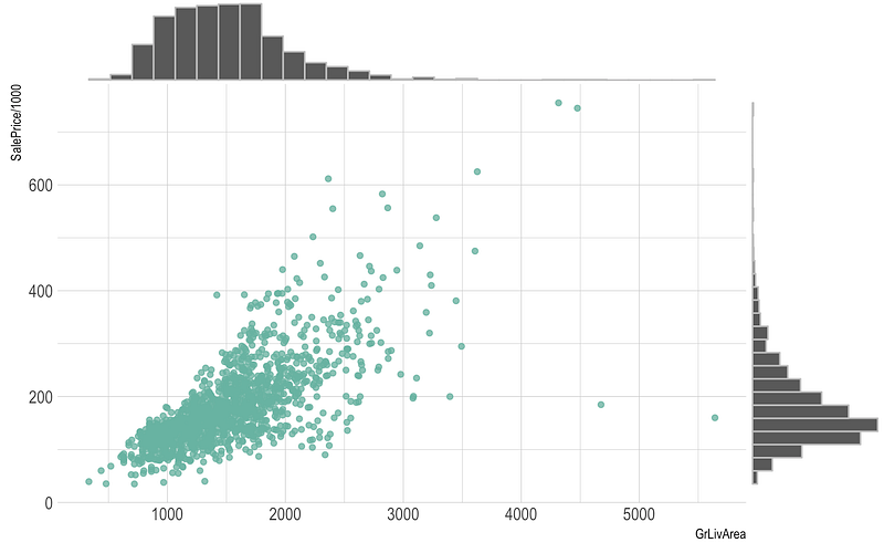
Scatter Plot —
Scatter plot are used to show distribution, correlation analysis and clustering trends.
Example :
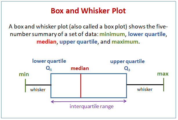
Box plot —
Box plots are used to show data using the median (middle value) of the data and the quartiles, or 25% divisions of the data as shown in the image below.These charts are powerful to spot the outliers and the overall distribution of the data.
The middle line is nothing but the median value of the data.
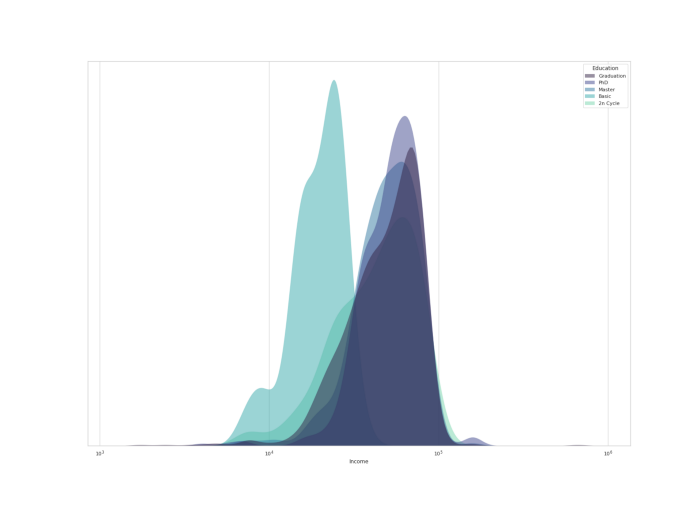
KDE Chart—
Kernel Density Estimation ( KDE) chart is used to show the the distribution of data points/values i.e. project the probability density of a continuous variable in more interpretable format.
Example :
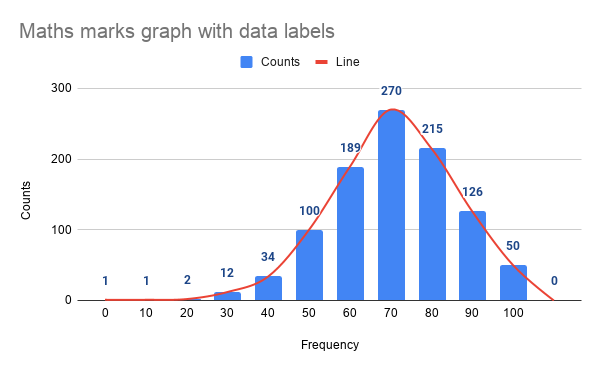
Histograms —
Histogram is one of the most important chart which is largely used to represent analytics and projections. It is used to show frequency over a distribution.
Example :
I hope now you are familiar with the chart types and in the next part ( part 2) of this post we will see how to choose right chart to best represent your data.
Part 2 : Coming soon!
For complete 60 days of Data Science and ML : Day 1 — Day 60 : Quick Recap of 60 days of Data Science and ML
Follow for more updates. Stay tuned and keep coding!
For other projects, tune to —
Build Machine Learning Pipelines( With Code)
Recurrent Neural Network with Keras
Clustering Geolocation Data in Python using DBSCAN and K-Means
Facial Expression Recognition using Keras
Hyperparameter Tuning with Keras Tuner
Custom Layers in Keras


