
How to calculate Pearson, Spearman and Phik correlation between variables using Python
A comparison on the use of different methods that are commonly used to calculate correlation and why we should consider measuring all 3 of them in our data analyses.

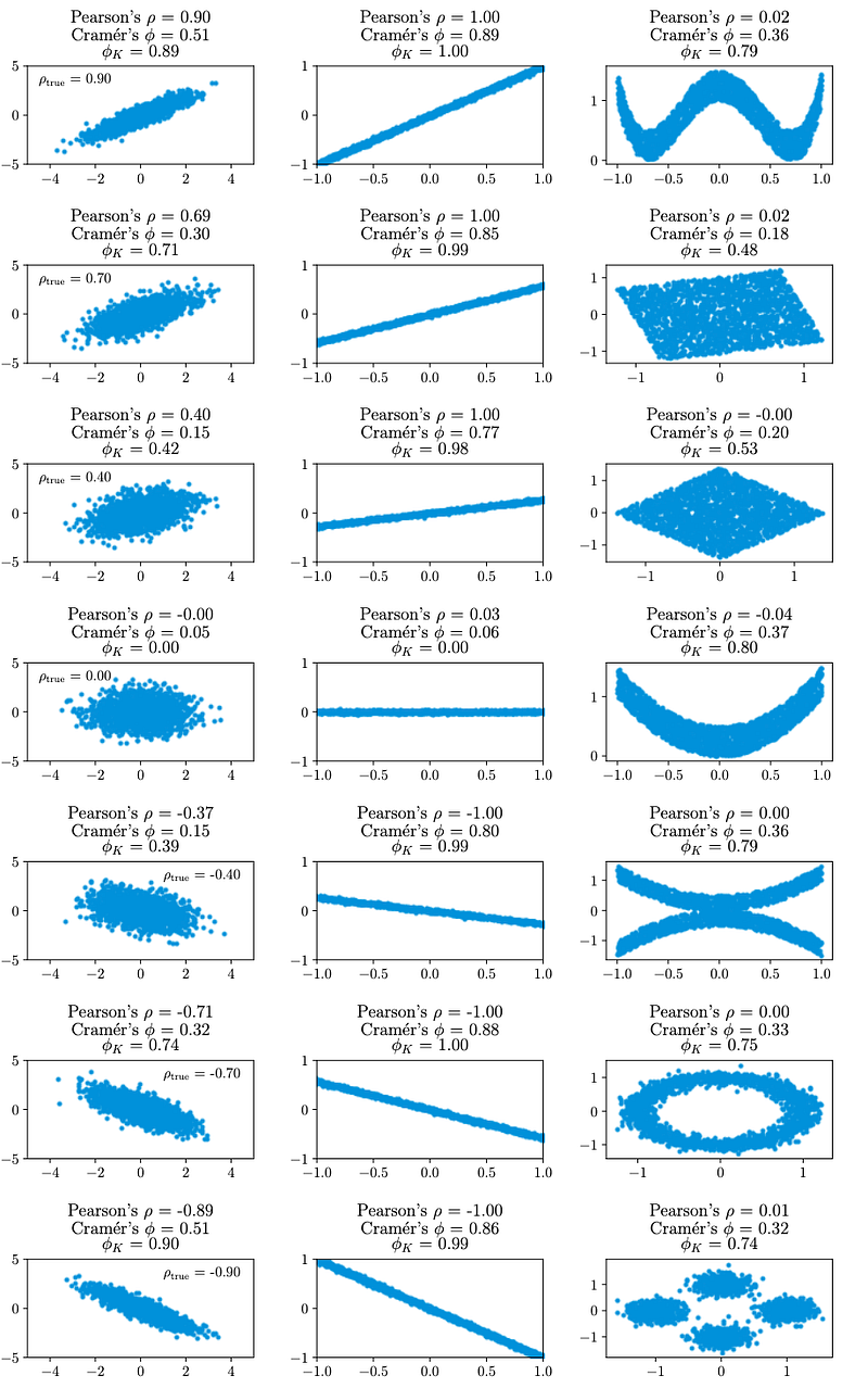
Pairwise comparisons between data variables are commonly used for data analysts. The association between variables is typically measured by the Pearson’s correlation coefficient, which is the measure of strength of the linear relationship between two variables. While useful in most cases, the Pearson’s correlation can fail to capture relationships that are non-linear, or in datasets which have many outliers.
To better capture non-linear relationships and reduce effects from outliers, the Seaborn library allows users to calculate correlations using the Spearman correlation. Instead of calculating correlations by using the numerical raw values, the Spearman method calculates correlations based on rank, where points are ranked in ascending order. The correlation value is high when both variables increase or decrease together.
Finally, we have the Phik (φK) correlation, which is recently developed and has been demonstrated to capture non-linear dependencies efficiently. Phik correlation is obtained by inverting the chi-square contingency test statistics, thereby allowing users to also analyse correlation between numerical, categorical, interval and ordinal variables. For more details on the mathematics involved, readers can read the research article here. From the figure below, you can also quickly appreciate that Phik correlation can detect correlations that would otherwise be missed if you had only analysed using Pearson’s correlation.
Fortunately, these correlations can be easily calculated using the Python programming language. First, we import the required packages (You can use the pip install command if you do not have any of these packages:
import numpy as np
import pandas as pd
import phik
import seaborn as sns
from phik import resources, report
I strongly recommend using JupyterLab or Jupyter Notebook, which is a web-based interactive development environment for storing and executing Python codes. You may visit here for specific instructions on how you can install them on your computer.
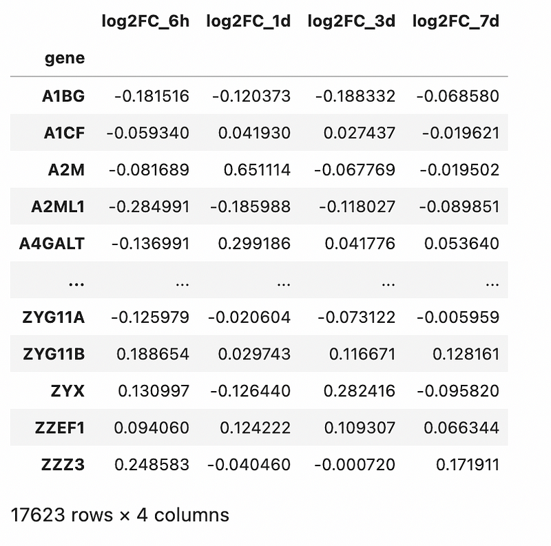
We will analyse a transcriptomics dataset published by Zak et al., PNAS, 2012. In this study, human subjects were given the MRKAd5/HIV vaccine, and the transcriptomic responses in peripheral blood mononuclear cells (PBMC) were measured at 6 hours, 1 day, 3 day and 7 days post-vaccination. I have uploaded the data into GitHub for users to execute the commands directly from a website link.
df = pd.read_csv(‘https://raw.githubusercontent.com/kuanrongchan/vaccine-studies/main/Ad5_seroneg.csv',index_col=0)df[‘log2FC_6h’] = np.log2(df[‘ratio_6h’])
df[‘log2FC_1d’] = np.log2(df[‘ratio_1d’])
df[‘log2FC_3d’] = np.log2(df[‘ratio_3d’])
df[‘log2FC_7d’] = np.log2(df[‘ratio_7d’])df_log2FC = df.filter(items=[‘log2FC_6h’,’log2FC_1d’, ‘log2FC_3d’, ‘log2FC_7d’])
df_log2FCThe commands above loads the data into Jupyter Notebook, followed by a log2-transformation on the fold-change (to normalise the data to a Gaussian distribution). Finally, for the correlation, we will be analysing the log2 fold-change values across various timepoints and dropping all other columns. The rationale is elaborated in my previous blog post.
Output is as follows:
Let’s visualise the correlation matrix with Pearson correlation:
df_log2FC.corr()Output is as follows:
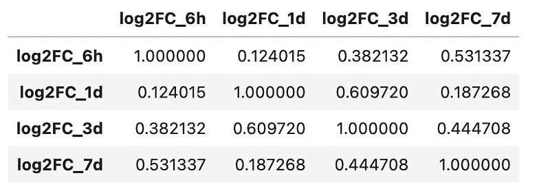
At one glance, it looks like the strongest correlations are seen in day 1 and day 3. The Pearson correlation of the other timepoints seem weak, suggesting the timepoints don’t correlate with each other linearly.
At this point, you may be thinking if there are any outliers that may have caused the correlation to be weaker than expected. We can consider using Spearman correlation to examine if the correlation coefficients can be improved:
sns.heatmap(df_log2FC.corr(method=’spearman’),cmap=”Blues”, annot=True)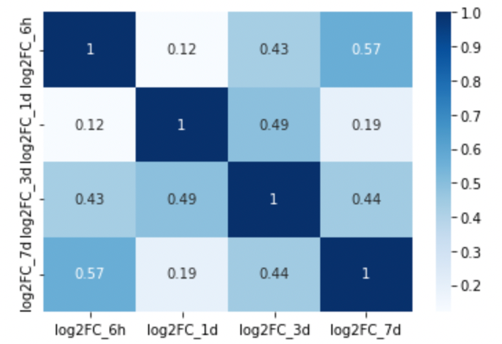
Notice that some correlations are improved (e.g. 6h vs 7d) while others are reduced (e.g. 1d vs 3d). However, on the whole, the correlation coefficient is quite similar to what we observed with Pearson correlation.
Lastly, let’s use Phik correlation to examine if there are possibly non-linear trends that we have missed. The correlation report generates the matrix, significance and maximal global correlation that can be measured with Phik correlation. The command is as follows:
report.correlation_report(df_log2FC, pdf_file_name=’test.pdf’)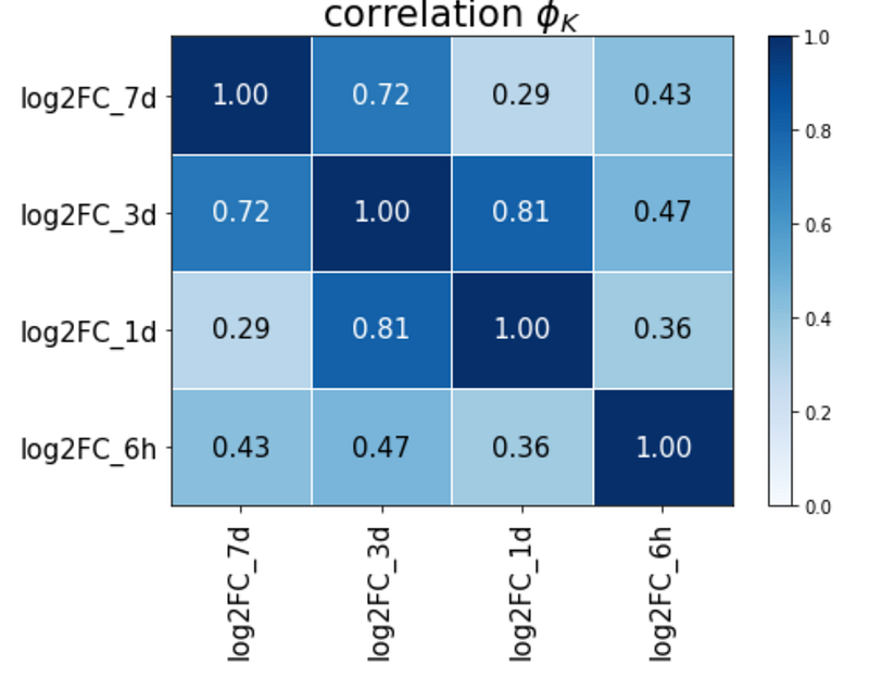
Interestingly, all the correlation coefficients appear to be higher than Pearson and Spearman correlation. These results suggest that there exists association between the variables, but some of them could be non-linear. Thus, Phik correlation provides us additional insights that the correlation between some of these variables are non-linear, and that linear correlation metrics cannot fully capture the trends between variables.
In summary, we have covered the importance of using all 3 methods (Pearson, Spearman and Phik correlation) and how to execute them in Python. Since they provide different critical information and are easily executed in Python, I would generally recommend performing all 3 correlation methods when analysing datasets.
Hope this has provided useful insights on analysing correlations. If you are interested to find out what we do, please check out my official website here. Otherwise, feel free to subscribe to receive any updates on my future articles.


