
How to Build Waterfall Charts with Plotly Graph Objects
Plotly Express doesn’t implement waterfall charts but we can create a helper function that leverages Plotly Graph Objects instead

Plotly gives you two ways of drawing charts: Graph Objects and Plotly Express. The first is a set of low-level functions that provide maximum flexibility for creating charts, while Plotly Express gives us a set of easy-to-use methods that implement the most commonly used charts.
Plotly Express functions are essentially wrappers around Plotly Graph Objects.
But there is no Waterfall Chart method in Plotly Express, so we are going to present a waterfall chart function that is simple to use for what is probably the most common use case and also has the flexibility to address more complex usage.
Waterfall charts
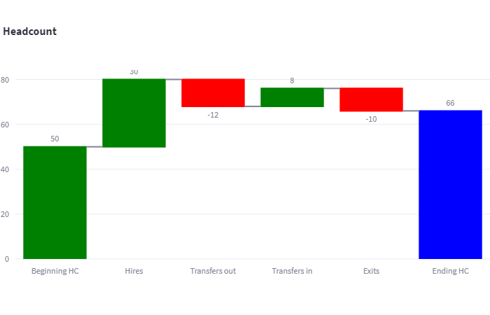
Waterfall charts are a bit like bar charts that have been split over a number of columns. They are often used to show the increase and decrease of a value over time. For example, take the following data.
labels = ["Start balance", "Consulting", "Net revenue",
          "Purchases", "Other expenses", "Profit before tax"]
data = [20, 80, 10, -40, -20, 0 ]
The labels represent amounts of cash in different categories that have either been received or spent and the data are the actual amounts (in dollars, hundreds of dollars, thousands… whatever).
We can usefully represent this data as a waterfall chart where the first column is the starting point, the last column is the endpoint and the columns in between show the cash flow that resulted in the final sum.

Typically, a waterfall chart distinguishes positive and negative amounts by colour — in this case, green for positive and red for negative. The final column is given a third colour as this represents the final result rather than a positive or negative change.
This is a typical use case although more complex charts are possible.
In her book Storytelling with Data[1], Cole Nussbaumer Knaflic (CNK) regards the Waterfall Chart as one of her 12 essential charts and gives an example of how it can be used to describe changes in employment over time. Here is my version of her chart.

You can see that we begin with a headcount of 100 and this is increased and decreased for various reasons until we end up with a final headcount of 116.
CNK prefers a single colour for all of the columns and, strictly speaking, the colours in the previous chart are indeed redundant as it is clear from the labels and the direction of the column (up or down) whether the change is positive or negative.
I understand CNK’s point of view, the chart rendered in her style probably looks better than the colourful one, but I also see that, particularly with a more complex chart, the colours could be helpful. Here’s a variation on the headcount chart where the positive and negative changes are mixed and you might agree that the red/green version is a little clearer (if, perhaps, not as aesthetically pleasing).

The solution that we shall develop will default to the colourful version but will also let you change the colour scheme if you prefer.
Using the function
I’ve implemented the waterfall function in a separate file — plotlyhelper.py— so that it can be used as a library function. After importing the library, simple usage is like this:
fig = ph.waterfall(labels,data, title)
We can use the function in any context where a Plotly chart can be rendered, for example, in a Flask application, a Jupyter Notebook, or a Streamlit app. We’ll look at the implementation later but here is how to use it in a Streamlit app.
import streamlit as st
import plotlyhelper as ph

st.set_page_config(layout='wide')

st.title("Waterfall graphs with Plotly")

col1, col2 = st.columns(2)

labels = ["Beginning HC", "Hires", "Transfers in", "Transfers out",
          "Exits", "Ending HC"]
data = [100, 30, 8, -12, -10, 0 ]
title = "Headcount"

fig = ph.waterfall(labels,data, title)

col1.plotly_chart(fig)

fig = ph.waterfall(labels,data, title, color = 'blue')

col2.plotly_chart(fig)
Which will give you two versions of the ‘headcount’ chart in two columns.
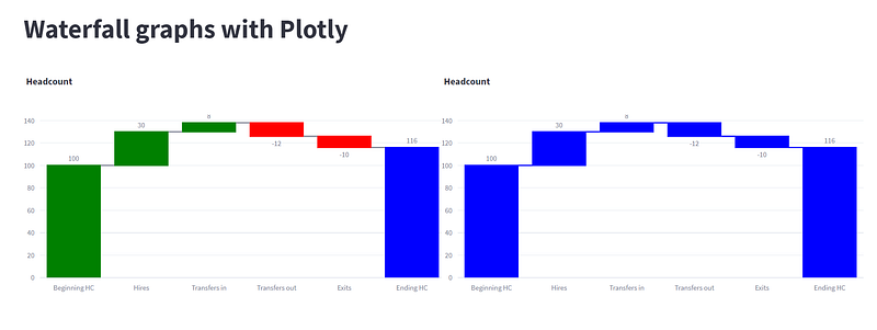
The obligatory parameters are the labels and the data, and in the examples above, we also specify a title (this defaults to an empty string if you don’t set it). Using these parameters we will get the default — colourful — version of the chart.
Changing the colour scheme
In the second example, we also set the parameter color which defines the colour for all of the bars in the chart. This can be any value that is accepted by Plotly as a colour.
We can also change the individual bar colours using the parameters bicolor, dcolor, tcolor, and ccolor which define the colours for an incrementing bar, a decrementing bar, the final bar and the colour of the connecting line between the bars. These default to “Green”, “Red”, “Blue”, and “Dark Grey”, respectively.
If you set the color parameter this overrides any other colour that you may have set.
Here’s an example of how to set the individual colours.
fig = ph.waterfall(labels,data, title, icolor = 'orange',
                                       dcolor = 'pink',
                                       tcolor = 'yellow',
                                       ccolor='red')
st.plotly_chart(fig)
Which draws this.

Maybe we could have competition for the most garish colour scheme.
There are a couple of other parameters that we also can explore.
Annotations
The labels on the individual bars default to the data but can be customised with the annotation parameter. This is an array of labels that can be strings or numeric values and will be displayed on the bars. Here, for example, only the first and last bars are labelled.
annotation = ["Start", "", "", "", "", "End"]

labels = ["Start balance", "Consulting", "Net revenue", "Purchases", "Other expenses", "Profit before tax"]
data = [20, 80, 10, -40, -20, 0 ]
title = "Sales revenue"

fig = ph.waterfall(labels,data, title, annotation=annotation)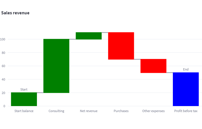
If no labels are required then annotation can be set to an empty list.
Multiple time periods
Sometimes we want to represent a series of time periods with intermediate totals. We can do this by specifying the type of each bar. In the default chart, all the bars except the last one are ‘relative’ meaning that they will be displayed as positive or negative values relative to the current running total. The final bar is of the type ‘total’ which means that it will show the current value of the running total.
To represent multiple time periods we use intermediate ‘total’ bars. Take this example.
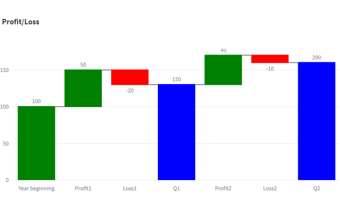
Here we are showing profit and loss amounts for two quarters with an intermediate total for ‘Q1’ and a final total for ‘Q2’.
To achieve this we specify a list of bar types and pass it as the parameter measure.
labels = ["Year beginning", "Profit1", "Loss1", "Q1", "Profit2", "Loss2", "Q2"]
data = [100, 50, -20, 0, 40, -10, 0 ]
annotation = []
measure = ['relative','relative', 'relative','total',
           'relative','relative','total']
title = "Profit/Loss"

fig = ph.waterfall(labels,data, title,
                   annotation = annotation,
                   measure=measure)

st.plotly_chart(fig)
You should note that the data array element that maps onto the intermediate total is given the correct value of 130 but, unlike the other bars, this is not used to calculate the length of the bar; the bar length is calculated automatically from the previous values, and the data value for that bar is only used as an annotation.
The waterfall helper function
All of which brings us to the actual implementation.
While Plotly Express does not implement a Waterfall Chart, Graph Objects (GO) include such a function. It’s just a bit tedious to use — which is why I developed this simple wrapper around it. As you can see from the code below, the GO waterfall function requires you to set many parameters. The helper function eliminates the need for this by setting defaults and/or calculating values — the user only needs to set two or three essential parameters.
import plotly.graph_objects as go

def waterfall(labels, data, title="", annotation=None,
              icolor="Green", dcolor="Red",
              tcolor="Blue", ccolor='Dark Grey',
              color=None, measure=None):
    """
    Create a waterfall chart using Plotly.

    Parameters:
        labels (list): A list of labels for the data points.
        data (list): A list of numerical values representing the data points.
        title (str, optional): The title of the chart. Defaults to an empty string.
        annotation (list, optional): A list of annotations for each data point. Defaults to None.
        icolor (str, optional): Color for increasing values. Defaults to "Green".
        dcolor (str, optional): Color for decreasing values. Defaults to "Red".
        tcolor (str, optional): Color for the total value. Defaults to "Blue".
        ccolor (str, optional): Connector line color. Defaults to 'Dark Grey'.
        color (str, optional): Common color for all elements. Defaults to None.
        measure (list, optional): A list specifying whether each data point is 'relative' or 'total'. Defaults to None.

    Returns:
        plotly.graph_objs._figure.Figure: A Plotly Figure containing the waterfall chart.
    """
    # Set default measure values if not provided
    if measure is None:
        measure = ['relative'] * (len(labels) - 1)
        measure.append('total')

    # Set default annotation values if not provided
    if annotation is None:
        annotation = data[:-1]
        annotation.append(sum(data))

    # Create the waterfall chart figure
    fig = go.Figure(go.Waterfall(
        orientation="v",
        measure=measure,
        textposition="outside",
        text=annotation,
        y=data,
        x=labels,
        connector={"line": {"color": ccolor}},
        decreasing={"marker": {"color": dcolor}},
        increasing={"marker": {"color": icolor}},
        totals={"marker": {"color": tcolor}}
    )).update_layout(
        title=title
    )

    return fig
You can cut and paste this code into your own code or visit my website to download the function and a Streamlit app that implements all of the examples above. As a bonus, the downloadable Streamlit code will also include a version of the Waterfall chart implemented in Matplotlib.
I hope you have found this introduction to Waterfall Charts and their implementation in Plotly Graph Objects useful. The lack of a Waterfall Chart in Plotly Express is unimportant if you include a function like this in a helper library and it can make life much simpler when used across multiple projects.
Thanks for reading and please take a look at my website where you can find links to other articles and code. You can also subscribe to my occasional newsletter where I publish some full articles as well as links to stuff that I have published on Medium.
Notes
- Storytelling with Data, a data visualization guide for business professionals, Cole Nussbaumer Knaflic, Wiley, 2015 (affiliate link)
- English spelling — I am fully aware that I mix English and American spelling in this article but I am being consistent — honestly, I am. I use the English spelling of ‘colour’ in the text because… well, I’m English. But I use the American spelling ‘color’ in my code because I’m a programmer — and I am used to the fact that most programming languages use American English.


