
Data Visualization
How to Build an Interactive Map with the Folium Library in Python and Google Colab
Displaying California counties, along with the total precipitation in 2022 for each county, on an interactive map.

Designing an interactive map that can be opened in any web browser, allowing users to click and explore geospatial information, provides an engaging experience. This story is about building such maps using Python within Google Colab!
Table of Contents
- 🌟 Introduction
- 📌 Center of California Counties on the Map
- 🌧️ Total Precipitation for Each County from Daymet
- 📊 Summary of the Table and Merging
- 🗺️ Create the Map based on the Precipitation Data
- 📝 Conclusion
- 📚 Reference
🌟 Introduction
After going through a lot of information, testing our ideas, and finishing the report, we might have an interesting story to share. However, if we don’t have the right tools or skills to show the results, especially when working with geospatial data, it can be hard to grab the audience’s attention and get our main message across. In these situations, knowing how to visually represent data becomes important.
In this post, I’d like to show how easily you can create an interactive map to display your geospatial data for your story. By saving it as an HTML file, you can share it with others. In particular, I’ll focus on extracting the central locations of California’s counties, retrieving precipitation data from a geospatial database (Daymet) at these locations, and using the Folium library in Python to visualize the information on the map. All these steps will be implemented using Python in the Google Colab environment.
📌 Center of California counties on the Map
Let’s begin by extracting the central geographical locations for all California counties. For this step, we’ll need to install the geopy and folium libraries and create a list of all California counties:
pip install geopy folium
# Read a list of California counties (you might have to adjust this based on your data)
counties = ["Alameda", "Alpine", "Amador", "Butte", "Calaveras", "Colusa", "Contra Costa", "Del Norte", "El Dorado",
            "Fresno", "Glenn", "Humboldt", "Imperial", "Inyo", "Kern", "Kings", "Lake", "Lassen", "Los Angeles",
            "Madera", "Marin", "Mariposa", "Mendocino", "Merced", "Modoc", "Mono", "Monterey", "Napa", "Nevada",
            "Orange", "Placer", "Plumas", "Riverside", "Sacramento", "San Benito", "San Bernardino", "San Diego",
            "San Francisco", "San Joaquin", "San Luis Obispo", "San Mateo", "Santa Barbara", "Santa Clara",
            "Santa Cruz", "Shasta", "Sierra", "Siskiyou", "Solano", "Sonoma", "Stanislaus", "Sutter", "Tehama",
            "Trinity", "Tulare", "Tuolumne", "Ventura", "Yolo", "Yuba"]
Next, we will define a function to extract the center of California counties based on their names:
import pandas as pd
from geopy.geocoders import Nominatim
import folium
from geopy.exc import GeocoderTimedOut

# Function to get latitude and longitude for a given location using geopy, with retries on timeout
def get_lat_long_with_retry(location, max_retries=3):
    geolocator = Nominatim(user_agent="county_locator")
    retries = 0
    while retries < max_retries:
        try:
            location_info = geolocator.geocode(location)
            if location_info:
                return location_info.latitude, location_info.longitude
            else:
                return None
        except GeocoderTimedOut:
            retries += 1
    return None
Now, let’s execute the function, convert the output into a dataframe, and save it as a CSV file:
# Extract latitude and longitude for each county
for county in counties:
    location = f"{county}, California"
    lat, lon = get_lat_long_with_retry(location)
    county_data["Latitude"].append(lat)
    county_data["Longitude"].append(lon)

# Create a DataFrame
county_df = pd.DataFrame(county_data)

# Display the DataFrame (optional)
print(county_df)

# Save it as a CSV file

county_df.to_csv('county_lat_long.csv', index=False)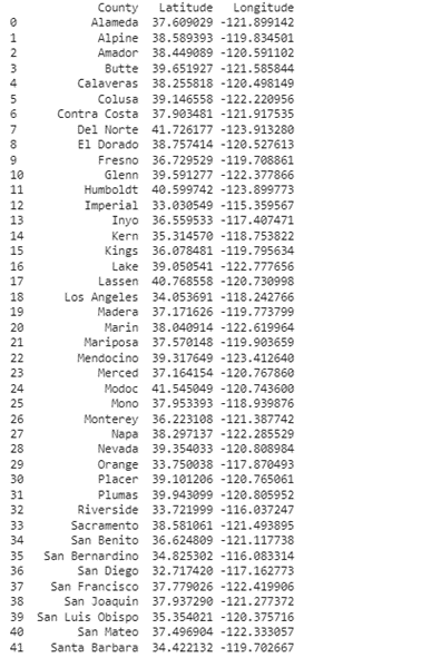
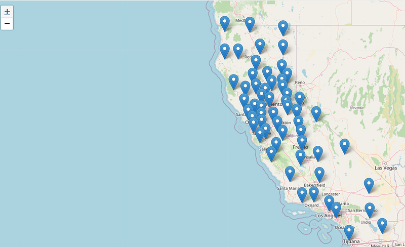
Now that we have a list of counties along with latitude, and longitude in the table, we can map them using the Folium library. Also, we’ll save the map in HTML format to open it in our browser:
# Create a map centered around California
california_map = folium.Map(location=[36.7783, -119.4179], zoom_start=6)

# Add markers for each county
for index, row in county_df.iterrows():
    folium.Marker(location=[row["Latitude"], row["Longitude"]], popup=row["County"]).add_to(california_map)

# Save the map to an HTML file or display it in any browser
california_map.save("california_counties_map.html")
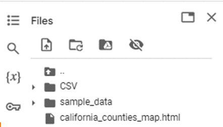
After running the code, you’ll find the HTML file in your content:
Download and open the HTML file in your browser to view the map:
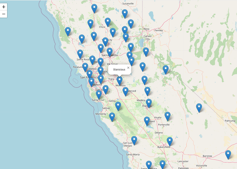
You can zoom in and out on the map and click on each point to view the name of each county:
🌧️ Total Precipitation for each County from Daymet
As I mentioned in the introduction, up to this point, we have just displayed the points (center of each county) on the map. Let’s now assume that each point corresponds to a specific value, and we want to show these points along with other information on the map. To complete this example, I download the precipitation data from the Daymet database for all these locations. If you’re not familiar with Daymet or don't know how to download and work with this database, please take a look at this post:
In this step, I used the similar code that I wrote in this post to download the precipitation values from Daymet for 2022. In the following lines, I’ll read the CSV file that we saved in the last step, download and save the Daymet data in the CSV folder, and finally merge all the CSVs:
import csv
import urllib.request

# Open the CSV file containing latitudes and longitudes
with open('county_lat_long.csv', 'r') as csvfile:
    reader = csv.reader(csvfile)

    # Skip the header row
    next(reader)

    # Loop through each row in the CSV file
    for row in reader:
        ID=row[0]    # County name
        lat = row[1] # Latitude is in the first column
        lon = row[2] # Longitude is in the second column

        # Construct the URL to download data for 2022 for these locations
        url = f'https://daymet.ornl.gov/single-pixel/api/data?lat={lat}&lon={lon}&years=2022'

        # Download the data and save it to a file with the county's name
        urllib.request.urlretrieve(url, '/content/CSV/{}.txt'.format(ID))
You should see these TXT files in your CSV folder (/content/CSV):
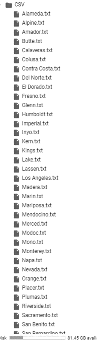
Then run the following script to combine these text files and save the merged table in a CSV format:
import os
import pandas as pd

# Get a list of all text files in the folder
folder_path = '/content/CSV'
text_files = [os.path.join(folder_path, file) for file in os.listdir(folder_path) if file.endswith('.txt')]

# Initialize an empty list to store all the DataFrames
dfs = []
i=1

# Loop through each text file
for text_file in text_files:
    # Read the text file into a list of strings
    with open(text_file, 'r') as f:
        data = f.read().splitlines()

    # Extract the latitude, longitude, and elevation from the first line
    lat, lon = data[0].split()[1], data[0].split()[3]
    elevation = data[3].split()[1]

    # Create a DataFrame from the remaining lines
    county_daymet_df = pd.DataFrame([line.split(',') for line in data[8:]], columns=['year', 'yday', 'dayl (s)', 'prcp (mm/day)',
                                                                       'srad (W/m^2)', 'swe (kg/m^2)', 'tmax (deg c)',
                                                                       'tmin (deg c)', 'vp (Pa)'])

    # Add columns for latitude, longitude, and elevation
    county_daymet_df['latitude'] = lat
    county_daymet_df['longitude'] = lon
    county_daymet_df['elevation'] = elevation
    file_name = os.path.basename(text_file)  # get the base name of the file
    file_name_without_ext = os.path.splitext(file_name)[0]  # get the filename without extension
    county_daymet_df['ID']= os.path.splitext(file_name_without_ext)[0]

    # Append the DataFrame to the list of DataFrames
    if i ==1:
      county_daymet_dfs=county_daymet_df
      i=i+1
    else:
      county_daymet_dfs = pd.concat([county_daymet_df,county_daymet_dfs], ignore_index=True)

# Save the big DataFrame to a CSV file
county_daymet_dfs.to_csv('county_daymet.csv', index=False)
By opening the county_daymet.csv file, you’ll find daily precipitation values of the year 2022 reported for each county:
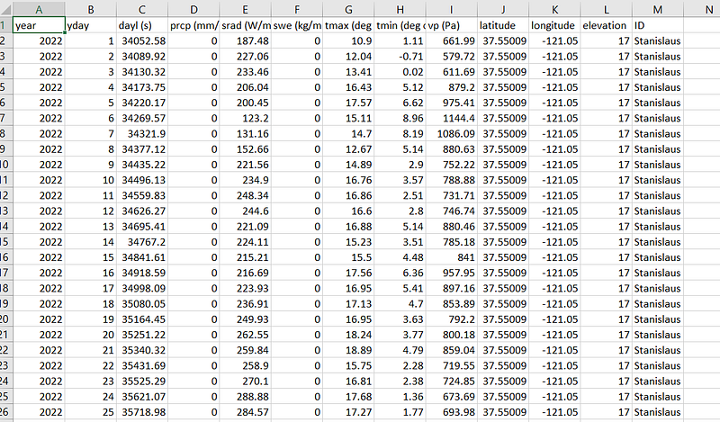
📊 Summary of the Table and Merging
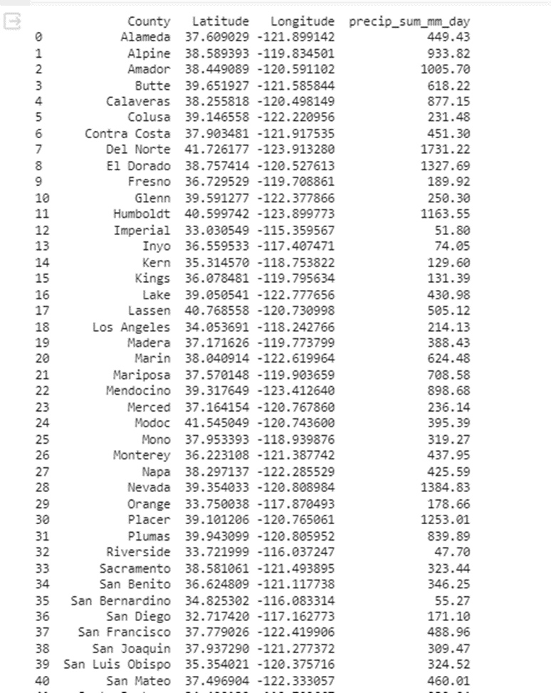
The exported table contains daily precipitation values for each county. However, our goal is to calculate the total precipitation for each county and append this information to the initial dataframe (county, latitude, and longitude). To do this, we make sure that the values in the ‘precip’ column are numeric. Then, we can use the “groupby” method in Python to get the sum of precipitation in 2022 for each county:
# String to numeric
county_daymet_dfs['precip'] = pd.to_numeric(county_daymet_dfs['prcp (mm/day)'], errors='coerce')

# Calculate the summation of 'precip' for each 'ID'
summary_county_daymet = county_daymet_dfs.groupby('ID')['precip'].sum().reset_index()
summary_county_daymet.columns = ['County', 'precip_sum_mm_day']

# Read the CSV file into a DataFrame
county_df = pd.read_csv('county_lat_long.csv')

# Merge the summary_county_daymet with county_df based on 'ID'
merged_county_daymet = pd.merge(county_df, summary_county_daymet, on='County', how='left')
print(merged_county_daymet)
The summary table will be:
🗺️ Create the Map based on the Precipitation Data
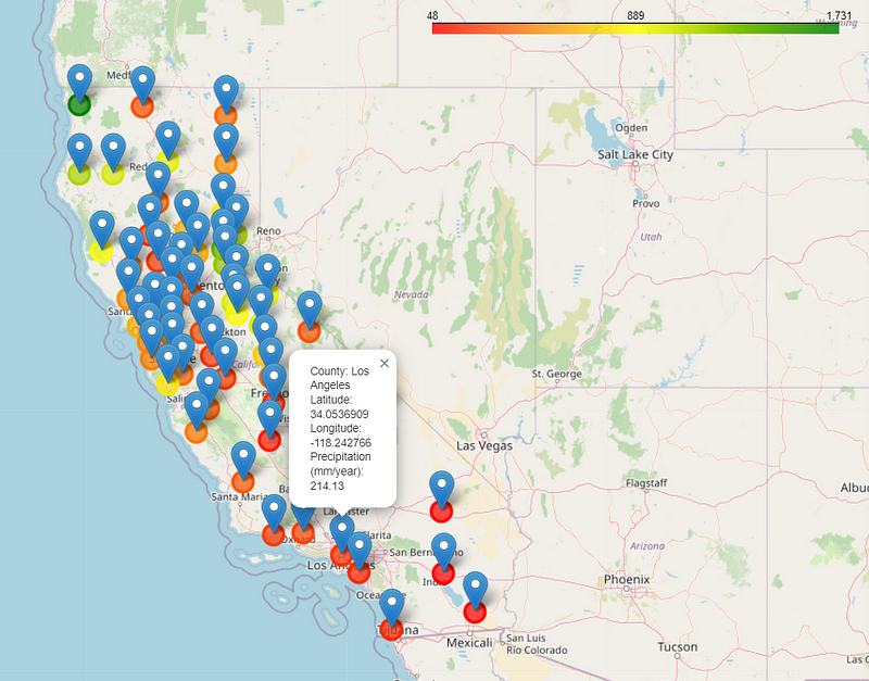
In this step, we will modify our code to show the values over the points that we displayed on the first map. To show those points with different colors (green for the wet points and red for the dry points), we create a color ramp and initialize the map:
from branca.colormap import LinearColormap

# Create a continuous color ramp
colormap = LinearColormap(colors=['Red', 'Yellow','green'], vmin=merged_county_daymet['precip_sum_mm_day'].min(), vmax=merged_county_daymet['precip_sum_mm_day'].max())

# Create a map centered around California
california_map = folium.Map(location=[36.7783, -119.4179], zoom_start=6)
Next, we create CircleMarkers to display the points using a circular symbol, then use the precipitation values to color them, and add colorized points to the initialized map:
# Add markers for each county with continuous color based on values
for index, row in merged_county_daymet.iterrows():
    folium.CircleMarker(location=[row["Latitude"], row["Longitude"]],
                        radius=10,
                        popup=f"{row['County']}: {row['precip_sum_mm_day']}",
                        color=colormap(row['precip_sum_mm_day']),
                        fill=True,
                        fill_color=colormap(row['precip_sum_mm_day']),
                        fill_opacity=0.7).add_to(california_map)


# Add the colormap to the map
california_map.add_child(colormap)

# Save the map to an HTML file or display it in any browser
california_map.save("california_counties_map_continuous_point.html")
By downloading and opening the map in your browser, you’ll see the cumulative precipitation values for each county:
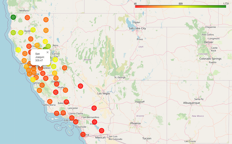
However, if you want to see these points along with the map icon shown in the first step, simply replicate the initial two steps to add the county points and then save the map as a new HTML file.
# Add markers for each county
for index, row in merged_county_daymet.iterrows():
    popup_text = f"County: {row['County']}<br>Latitude: {row['Latitude']}<br>Longitude: {row['Longitude']}<br>Precipitation (mm/year): {row['precip_sum_mm_day']}"
    folium.Marker(location=[row["Latitude"], row["Longitude"]],popup=popup_text).add_to(california_map)

# Save the map to an HTML file or display it in any browser
california_map.save("california_counties_map_continuous.html")
The final map will display colorized points with the map icon for each county. Similar to the initial map, you can zoom in, zoom out, and click on each point to view the total precipitation along with its coordinates:
📝 Conclusion
Understanding a tool that helps us visualize data in a way that effectively conveys the main message to the audience is crucial. The Folium library is one of the many tools available for this purpose. In this story, we used the Folium library to map the total precipitation of each county in California. While becoming familiar with all the commands and options may take some time, we showed that this library can generate shareable maps of geospatial datasets that users can easily open in their browsers. I hope you enjoyed reading this article, and feel free to stay in touch if you have any questions.
📚 References
Folium Documentation: https://python-visualization.github.io/folium/
Daymet: Monthly Climate Summaries on a 1-km Grid for North America, Version 4 R1 https://doi.org/10.3334/ORNLDAAC/2131
Thornton, P. E., R. Shrestha, M. Thornton, S.-C. Kao, Y. Wei, and B. E. Wilson. 2021. Gridded daily weather data for North America with comprehensive uncertainty quantification. Scientific Data 8. https://doi.org/10.1038/s41597-021-00973-0
Thornton, P.E., Running, S.W., White, M.A. 1997. Generating surfaces of daily meteorological variables over large regions of complex terrain. Journal of Hydrology 190: 214–251. https://doi.org/10.1016/S0022-1694(96)03128-9
- 📱 Connect with me on other platforms for more engaging content! LinkedIn, ResearchGate, Github, and Twitter.
Here is the relevant post available through this link:


