

How To Apply Gestalt Psychology Principles in Data Visualization
Gestalt principles are in the mind, not the eye
Aoccdrnig to rseearch at Cmabrigde Uinervtisy, it deosn’t mttaer in waht oredr the ltteers in a wrod are, the olny iprmoatnt tihng is taht the frist and lsat ltteer be at the rghit pclae. The rset can be a toatl mses and you can sitll raed it wouthit porbelm. Tihs is bcuseae the huamn mnid deos not raed ervey lteter by istlef, but the wrod as a wlohe. — Abeer Hasanin 2015–2016
Data visualization is not just about depicting data into understandable and good-looking charts. Becoming good in data visualization requires the acquisition of foundational knowledge. Understanding why specific data visualization techniques work better than others has psychological roots. Whether you are aware of it or not, you can apply various psychological principles every time you create a visualization.
Note: The number of Gestalt principles vary by literature. Here are the five that I found applicable to data visualization.
Gestalt is an influential human psychology theory, developed by German psychologists, Max Wertheimer (1880–1943), and his colleagues, Kurt Koffka (1886–1941) and Wolfgang Kohler (1887- 1967), in the early 20th century.
The theory deals with the details of how our brains create structure by default. It has a profound effect on the meaning of the information presented. The German word ‘gestalt’ means ‘unified whole’ in English and is generally associated with the idea that the whole is greater than the sum of its parts. You’ll probably be surprised to find that you intuitively know the principles of Gestalt, which makes them even more powerful.
- Law of Simplicity — Our eyes seek simplicity in complex shapes, preventing us from being overwhelmed by information overload.
- Law of Proximity — We perceive objects close to each other as belonging to a group.
- Law of Similarity — We seek similarities and differences and link similar items into a group.
- Law of Figure and Ground — We tend to segment our visual world into figure and ground. The figure is the object in the focus of our vision, and the ground is the background.
- Law of Focal Point — Whatever stands out visually will be given higher attention.
The picture you see is different than the image perceived by your mind. Gestalt principles apply to visual perception, and they detail how the brain creates structure by default. This is the reason you can read those structurally-misplaced letters at the beginning of this article as your brain is already familiar with the structure of every word used in that sentence.
Gestalt theory explains the pattern-seeking natural to human behavior with scientific validation that can be used by visual artists to develop imagery that communicates information in the most effective way. Designers do not create graphics and user experiences based solely on intuition and imagination. Whether they are aware of it themselves or not, most designers adhere to Gestalt principles.
Law of Simplicity
Simplicity is a state of mind. — Charles Wagner
Law of Simplicity is also known as the Law of Prägnanz. In the original German, Prägnanz means pithiness. Pithiness is the act of being concise and meaningful.
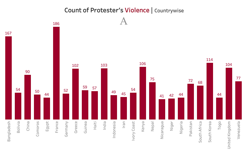
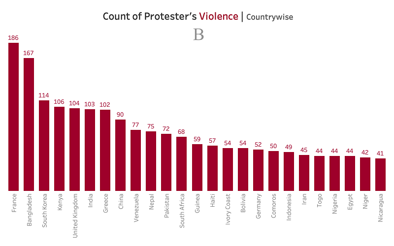
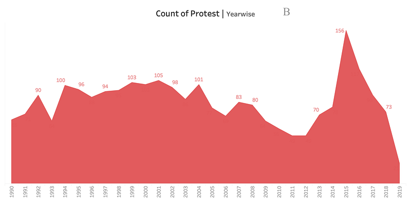
Which graph do you find easier to read: A or B?
There is more clarity in charts (B) where a sort order is applied.
The Law of Simplicity refers to the ability to perceive visual meaning with minimum cognitive effort. Therefore, this law is also known as the Law of Good Figure. Humans seek simplicity in complex shapes in order to avoid information overload. Simple charts are better for communicating data. They are easier to process and remember than visually-complex charts. Practitioners should embrace techniques like sorting items, removing the use of multi-color, simplifying or reducing jargon, which can ease the cognitive burden.
Law of Proximity
Proximity bred familiarity, and familiarity bred comfort. — Nicolas Sparks
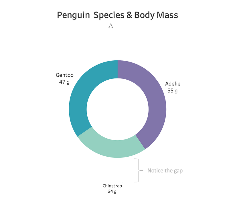
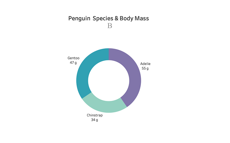
How many labels can you associate within the graph for A and B?
When the label is close to the graph element (here, Chinstrap 34 g), it is more readily identified as related (B).
When elements are positioned close to one another, they are seen as part of a group rather than when they are spaced farther apart. This is especially true when the elements are closer to each other than they are to any other elements. Visually-related elements are vital to encourage the viewer to scan the information given and understand it with as little work as possible. The Proximity Principle is used to convey relationships. Practitioners can help viewers structure information and better perceive meaning by organizing the space around each group.
Law of Similarity
Generally, people like people who are like themselves.― Joseph Deitch
In this principle, similar elements are visually grouped, regardless of their proximity to each other. Grouping can occur in both visual and auditory stimuli. Humans tend to seek homogeneity.
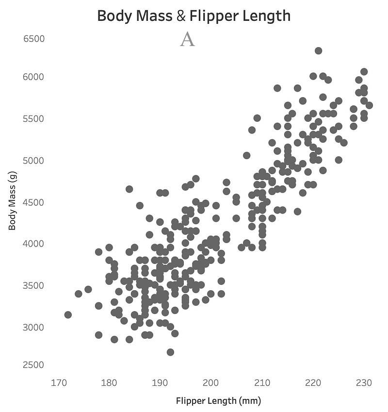
How many groups can you see in the dataviz below (A)?
Now, consider the dataviz below. How many groups do you see there?
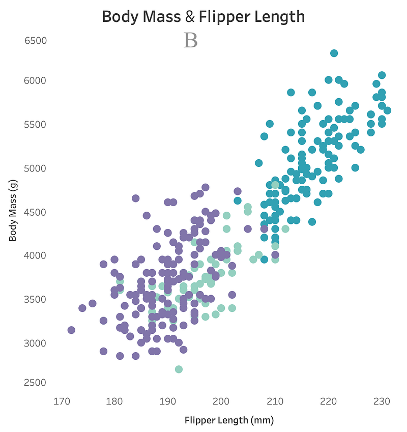
See, with the introduction of color, your mind now recognizes the different groups (for the normal-sighted). Practitioners can use similar characteristics and attributes (color, size, shape, etc.) to establish relationships between objects and to reinforce groupings.
Law of Figure and Ground
The Figure and Ground Principle describes the capacity to perceive the relationship between form and surrounding space to create meaning. A sense of wholeness or unity depends on how you perceive the relationship between an object and the area in which it is contained. The ‘figure’ is the focus element, while the ‘ground’ is the figure’s background.
The idea is that the eye will separate whole figures from their background to understand. It’s one of the first things people do when looking at any image. Humans cannot organize the information perceptually alone; the subject needs a particular contrast for viewers to acquire knowledge from the data.
Which chart do you find more readable, A or B?
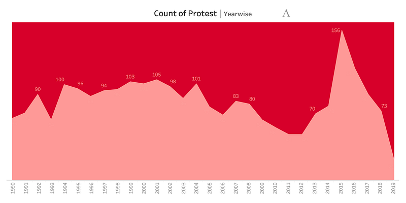
The low contrast between the figure (area graph) and background (sheet color) in chart A requires additional cognitive load. Changing/increasing the contrast (B) improves readability.
Figure and Ground relates to the capacity to switch from background to foreground to create wholeness. Some ways to accomplish this in dataviz work includes:
- Blurriness: Objects in the figure tend to be crisp and distinct, while those in the background are blurry.
- Size: Images that appear to be larger will be perceived as closer and part of the figure, while smaller ones will seem further away and part of the background.
- Contrast: The high contrast between objects can lead to the perception of figure and ground as it will be easier to distinguish between the two types of objects.
Consider Octavio Ocampo’s work as he has used this idea extensively.

You either see a couple or the tree depending on whether you see the dark color as a figure and the blue as ground or vice versa. The Figure and Ground Principle is often used in logo design. Practitioners should use this technique to help direct viewers to the visualization’s focus.
Law of Focal Point
Everyone’s time is limited. What matters most is to focus on what matters most.― Roy Bennett
The Focal Point principle states that whatever stands out visually will be given priority attention by the audience. In other words, elements that are different from their surroundings are more noticeable.
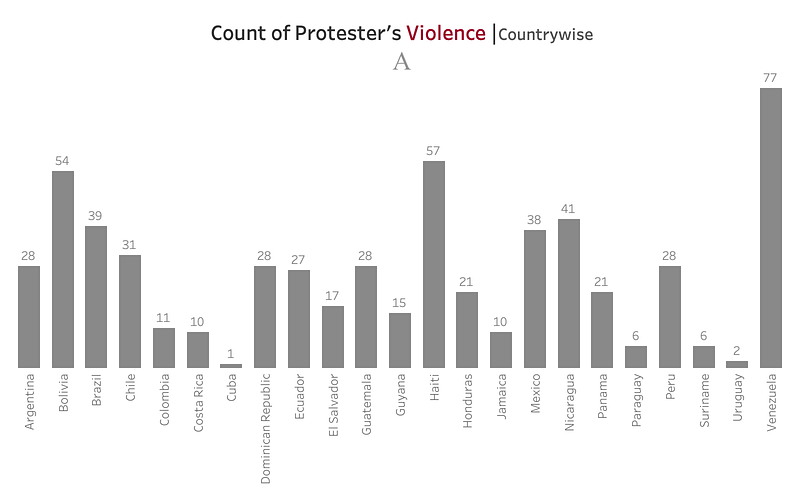
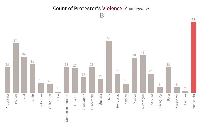
Where is your attention drawn for each A and B?
In B, your attention is likely drawn to Venezuela, as it is the focal point highlighted with color.
The law of Focal Point and the law of Similarity are closely related. To drive focus, the surrounding elements should be similar.
Data visualizers can guide the audience’s attention by being intentional with focal points. Practitioners can use techniques like highlighting and using unfamiliar shapes or colors from other chart elements to impose a focal point. And, you don’t have to limit yourself to just one focal point. However, different focal points will compete for viewer attention, so I suggest you keep things simple and limit yourself to one or two focal points in a single visual.

There is a famous saying: Gestalt Principles are in the Mind, Not the Eye. By understanding how people perceive charts and layouts, you can build psychologically-stable visuals that communicate information effectively.
The next time you see a viz, ask yourself: are any of the Gestalt principles applied here? Do they work alone, or are they being used in combination?
For more indepth study, click here for a Free ebook.
Mala Deep is a recent graduate of computer science from Kathmandu University. He is currently involved in data visualization and is fascinated by design psychology and human-computer interaction.
Recommend Readings
- Knowing These 5 HCI’s Principles Will Make Your Data Visualization Look Amazing
- Gestalt Psychology: Principles, Theory And Gestalt Therapy
- How to Use Powerful Gestalt Principles in Design (with Infographic)
- The History of Gestalt Psychology
- Little Known Ways to Make your Data Visualization Awesome


