
How to Add Media Queries to Your Dash Application Without CSS
Media queries are used to define different styles for different screen sizes, such as smartphones, tablets, desktops pc or even bigger screens like TVs. In this article, I will show you how you can add media queries to your Dash application without adding CSS files.
Why Should You Add Media Queries?
Responsive design
There are plenty of reasons why adding media queries to your application is useful. In my opinion, it is mandatory to add them to any application. Nowadays, everyone is using primarily their smartphone to quickly check something on a website. Everyone will leave it immediately if your layout is cluttered and the user can not use your application properly. The same applies to Dash applications. Whenever you know that you will have other users than yourself on the application it should be on your checklist to make your application mobile-friendly. At least for the screen size of a tablet. Imagine you developed a useful application and the customer wants to check it on their mobile phone if the user sees an application where everything is misaligned. It would be embarrassing.
What Are Media Queries?
Media queries allow you to apply CSS styles depending on the screen size or screen resolution. The following snippet shows an example of a media query.
@media screen and (max-width: 600px) {
  sidebar {
    display: none;
  }
}
The media query above will hide the content of the div with the Class Name sidebar when the browser width is 600px or less. This media query could be useful when you have a sidebar and you want to replace it with a burger menu when your client is using it on his smartphone. Just imagine that media queries are something like if else control structures. Only the syntax is different. That means you have to catch every screen size you want to support. The example above is not enough to make your application mobile-friendly.
What Do You Need for Media Queries in a Dash Application?
Dash Mantine Components
As mentioned above, we will add media queries without any extra CSS in our dash application. Therefore we will need the Dash Mantine Components package by Snehil Vijay. The MediaQuery component will help you to make your app responsive. You can install Dash Matine Components with the following command:
pip install dash-mantine-components
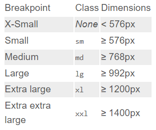
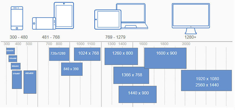
Breakpoints
You need to know which breakpoints are available and when to use which of them. The following two screenshots show you the available breakpoints and when to use which of them.
How Do I Add Media Queries to My Dash Application?
To illustrate how to add media queries to a dash application I will show you two examples. The first will change text depending on the screen size and the second will change the flex-direction. You can add a string, a single Dash component, or even a list of Dash components to the children of MediaQuery.
Example 1: Change text
dmc.MediaQuery(
    "A Really Long Brand Name",
    smallerThan="lg",
    styles={"display": "none"},
),
dmc.MediaQuery(
    "The short version of your brand name",
    largerThan="lg",
    styles={"display": "none"},
)
Example 2: Change flex-direction
dmc.MediaQuery(
    html.Div("your content"),
    smallerThan="lg",
    styles={"flex-direction": "column"},
),
dmc.MediaQuery(
    html.Div("your content"),
    largerThan="lg",
    styles={"flex-direction": "row"}
)
Now you can make your Dash application completely responsive to improve and optimize the user experience. As a reference, you can always have a look at the two screenshots above to check which property you need to choose for which screen size. Keep in mind that your largerThan and smallerThan should have a seamless flow. Otherwise, there will be screen sizes without any proper CSS.
Thanks for reading! Before you go, consider subscribing to my content and get all my articles in your inbox. You can subscribe here! You can also sign up for my newsletter to get extra free content delivered right to your inbox.


