
How to achieve clarity and focus in your designs
With strategic use of white space

So here we go again.
You are presenting the new prototypes to your client.
In your opinion, your mock-ups it’s something clean and breathing.
In opinion of your client, it`s «Euhh… too much empty space here. Can we compact a little bit?»
Let’s see what are the consequences of this «compacting» and why we do not have to use every empty pixel on the screen.
White space, or negative space, isn’t just ‘empty’ space. It’s quite an important element in design that sometimes shows us that the design is not coming from this decade but rather from the past one.
It's all about balance between what is there and what isn’t. The choice is hard sometimes.
What is the white space?
White space (or a negative space) it’s essentially the part of a page or screen that is left unmarked, the space between graphics, margins, gutters, columns and lines of type, or visuals that are not occupied by any elements.
The purpose of white space
Improve readability
Less visual clutter — easier to focus and digest the content. A block of text without any spacing, tabulation and images is harder to read than text with ample space around it.
Multiple studies showed that white space can slow down reading speed. So, the comprehension and focus of the user are significantly improved.
Ultimately, it’s not about how much you can fit on the page but how well the audience can absorb the information.
By isolating key elements using the white space around them, you draw attention to them, making your design’s focal points clear and compelling.
Creates balance
Everybody intuitively can recognize the old interface from the modern one. Just look at the spacing between the elements.
Interfaces from the beginning of the Internet era felt more like the 1000 pieces of a puzzle you are trying to organize.
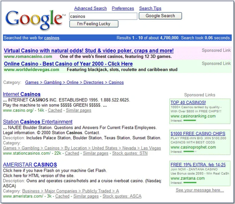
The white space helps to make the layout feel harmonious and less crowded, making the design more approachable and easier on the eyes.
Highlights important elements
Strategic use of white space can draw users' attention to key elements on the page.
You need to define what is the most important task they have to perform on the page.
What is their goal on this particular interface?
Try to answer the following questions:
- What is the first thing the user is looking to do on this page?
- What is the most important information he is looking for to complete the task?
When designing SaaS products, there are some additional questions I would ask:
- How does the design facilitate quick orientation for first-time visitors?
- What is the user’s expected knowledge level regarding the content or functionality of the page?
These questions are often neglected in the design of SaaS products, as the majority of users work on the tool daily, and sometimes, the design does not consider first-time users.
Moreover, it can help you to decide how much instructional content or guidance you need to add around key elements and how to organize it in an understandable layout.
Practical tips for implementing white space
Think about the content
Design your layout with the content in mind, allowing the white space to emerge naturally as you place and prioritize elements. The question of content hierarchy is very important here, but I will discuss it in the next articles.
Think in blocks
Visualize your design as blocks or chunks of content and use white space to separate and define these blocks clearly.
Start with too much white space
Often, white space is added to design when something looks a little too compressed — you add a bit of margin until things look better.
It's not a bad approach, but it leads to a design that is not actively bad. To achieve a great design, the elements usually need more white space. Try to start with too much white space and remove it until the design looks good.
Adjust and iterate
While, in most cases, white space makes the design cleaner and simpler, there are some cases when the design needs to be more compact.
For example, a dashboard where a lot of information needs to be displayed will have much busy design.
What works for one project may not work for another, so use the context, user feedback, and testing to adjust the white space in your design.
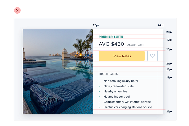
Maintain alignment
The main rule — be consistent. You can not juggle between 24px, 29px, and 32px, deciding every time how much space to keep between elements.
Establish your set of values in advance, align elements along a grid, and use consistent spacing between similar elements.
This will create a neat, organized appearance.
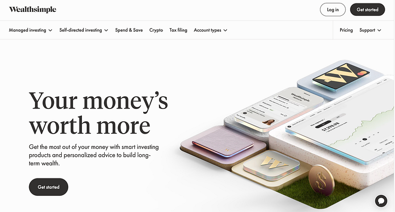
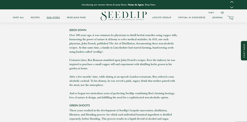
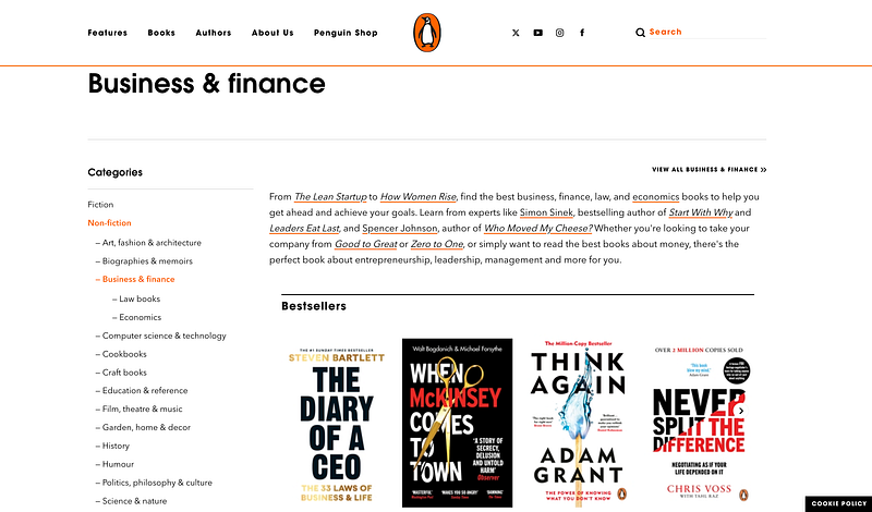
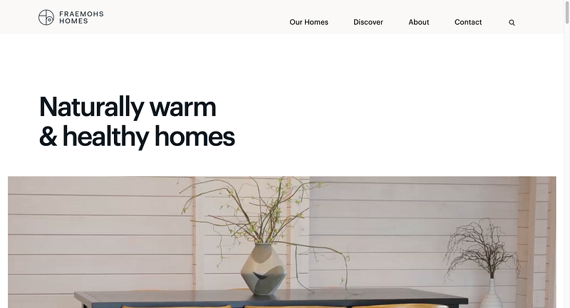
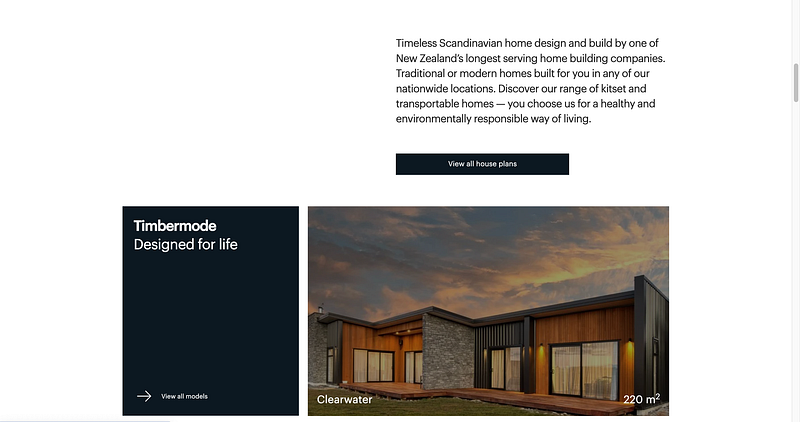
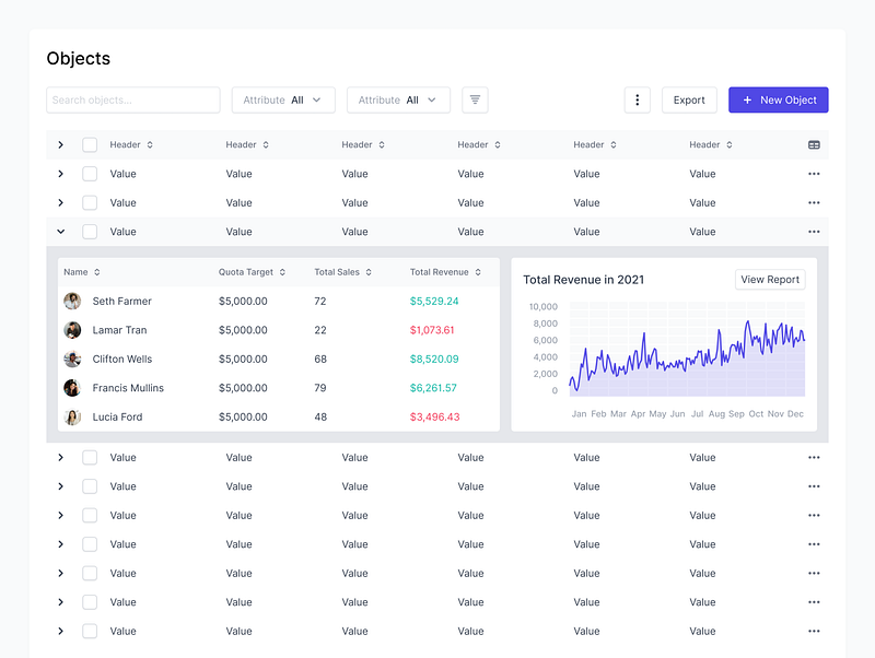
Some examples of sites with good use of white space
Just a few examples of the sites where the white space is used effectively
These websites leverage white space to create a clean, uncluttered layout that enhances readability and focuses the user’s attention on the most important elements.
Good design is invisible. Users might not always notice “great use of white space,” but they will feel the effects of a well-designed, clean, and intuitive site.
If you liked this article, please follow my profile so you don’t miss any upcoming articles!
🙋♀️ Have any questions or inquiries? Reach out to me at Linkedin & DM me


