
Data Visualization 101 — Charts
How the Right Chart Tells the Right Data Visualization Story
Using the right chart means the difference between data clarity and data confusion (1st part in a three part series)
“Having all the information in the world at our fingertips doesn’t make it easier to communicate: it makes it harder,” says Cole Nussbaumer Knaflic, a data storytelling author. She’s right. The main issue we have with data today isn’t a collection issue, it is a practical issue. With the enormous amount of data flowing through an average IT system, how can a business tell its most compelling data story. Thankfully, there are plenty of software tools out there to do just that, but users should be careful when putting chart or map or table to story.
Although there may be countless ways to skin the proverbial cat, there is usually one best way to present data visually. There are strong theories as to why a particular visual tool should be chosen and it all starts with the eye. Unlike computers, the human eye perceives information visually rather than as blocks of data. Hierarchies are ranked according to the way content is presented in a layout and affected by the following factors:
- Size
- Color
- Contrast
- Alignment
- Repetition
- Element placing and proximity
- Whitespace
- Style and texture
Larger elements, whether they are fonts, charts, or images, will attract more attention, especially when contrasted with smaller elements. As in nature, bright colors can pop out while drab colors blend into the background. Sharply contrasting colors will catch the eye more than slightly contrasting ones. These things should all be kept in mind when building a business intelligence (BI) dashboard, after all the main purpose of data visualization is to help businesses make better business decisions by providing them with the most relevant information about either their operation, their customers, or their products.
What Is Business intelligence?
For Domo, a cloud-based Analytics and BI platform, “Data visualization is a broad term for any visual representation of data. It can include formats like charts, graphs, or dashboards. The goal of data visualization is to make it easy to communicate insights like relationships, trends, and patterns found during data analysis to stakeholders regardless of their data expertise.”
BI dashboards give company employees the ability to ask their own questions about their company’s data without relying on IT. BI tools such as Business Objects, Qlik, Tableau, TIBCO’s Spotfire, Domo, and Visual Analytics have reusable metadata and semantic layers that let users navigate through available data sources, set and adjust predefined metrics, create hierarchies, and surface data into dashboards that make sense of complex data sets within.
BI interactive visualizations allow users to explore data visually via the manipulation of charts, images, and objects, with the color, brightness, size, shape, and motion of visual objects representing different aspects of a dataset. These can include pie, bar, and line charts, heat maps, treemaps, waterfall charts, geographic maps, and scatter plots, as well as other a whole host of other special-purpose visuals and graphs.
Many BI dashboards have strong analytics capabilities that allow users to leverage an embedded statistical functions library that can consume common analytics methods such as Predictive Model Markup Language (PMML) and R-based models in the metadata layer then surface the model and analytics results into a dashboard.
In many ways, BI tools are a response to the explosion of Big Data, which refers to the massive amount of unstructured information flooding through IT systems today. The sheer volume of this Big Data information makes it difficult for businesses to manage their data effectively, let alone sift through the data to find patterns and correlations between various variables that can help the business make better operational, customer, or marketing decisions.
BI and data visualization involves creating charts and graphs which illustrate data in a way that makes it easier for people to digest and understand. It helps businesses identify trends that can be used for planning out how things should be done in the future so that they can achieve a competitive advantage over businesses in their space.
At its core, BI can help businesses transform their data into actionable intelligence that produces insights by using it to tell a story. Data-driven storytelling is a powerful tool as it puts stats and metrics into a narrative that anyone inside or outside of an organization can grasp. The fact that 90% of information humans process enters the brain visually explains why data presented in a visual dashboard can be so convincing.
The promise of BI is to enable decision-makers throughout an organization to explore data, draw insights, and create meaningful conclusions to make better business decisions. Traditional BI solutions have delivered reliable, operational data tied to pre-defined, static reports, but today’s real-time, analytics BI provides self-service, on-the-fly, user-driven insight that businesses need to compete in today’s fast-paced, data-driven world.
This all sounds exciting — and it is — but the data message can get lost in the shuffle if it is not presented in the best possible data way. “The difference between the almost right word and the right word is really a large matter — it’s the difference between the lightning bug and the lightning,” Mark Twain once said. The difference between getting your point across and having it lost in a sea of confusing visual is simply the difference between selling a compelling data message and having it fall upon blind eyes.
Choosing the right data visualization chart type is imperative. Information that is displayed clearly on one type of chart can be lost or muddied on another. It is important to understand what type of information you want to convey and then choose a data visualization tool or chart that suits your task.
The four primary types of dashboards are:
- Strategic: A dashboard focused on monitoring long-term company strategies by analyzing and benchmarking a wide range of critical trend-based information.
- Operational: A BI tool for monitoring, measuring and managing processes, with a short or more immediate time scale.
- Analytical: These dashboards contain large streams of comprehensive data that allow analysts to drill down and extract insights that help operations.
- Tactical: These information-rich dashboards are best suited for mid-management and help in formulating growth strategies based on trends, strengths, and weaknesses across multiple departments.
Each dashboard should be designed for a particular set of users, with the specific aim of assisting the users in their business decision-making processes.
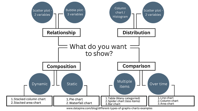
Asking the right questions is imperative when choosing the right type of visualization strategy or business goal. The most important step in the initial stages of developing a dashboard is stating the questions to be answered by the charts. With this in mind, we can effectively find the data required to answer it then create the charts that fit the data to be displayed. You can easily get lost in the process if you dive ahead into development without planning the necessary requirements. This can also lead to overcomplicating a simple process.
The four types of categories to use in a dashboard are:
- Relationship — Are you looking for any correlation between 2 or more measures? Relationship charts are useful for discovering a connection between values.
- Distribution — Are you trying to find the range of values within a group? Distribution charts let you visualize the shape of the data, as well as distinguish outliers in a chart.
- Composition — Do you want to show what values make up a dimension? Composition charts display the components that make up the whole dimension and emphasize which component take the biggest parts.
- Comparison — Are you comparing values or how they change in a period of time? Comparison charts help show the difference between categorical values, and how they change over time.
Pie Charts
A pie chart, also known as a circle chart, is a circular statistical graphic divided into slices to illustrate numerical proportion. Each slice’s arc length, central angle, and area are proportional to the quantity it represents. Pie charts are commonly used to show the percentage or proportion of a categorical data. They are effective for displaying data that are parts of a whole and are particularly helpful for comparing the sizes of the parts to each other and to the whole.
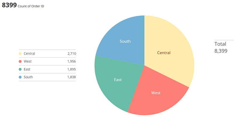
Pie charts rank low in precision because users often find it difficult to accurately assess the size of the pie slices. Although such charts can be instantly scanned and users will notice the biggest slice immediately, there is a scalability problem when the slices get too small. Often the slices become so small they can’t be easily differentiated from the other slices.
Line Charts
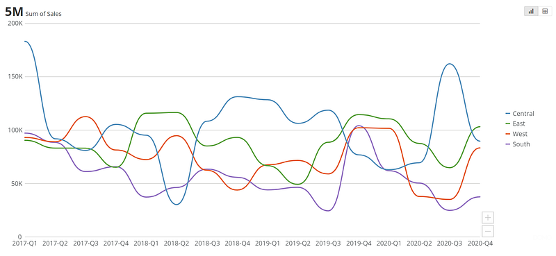
A line chart displays data points connected by line segments, often used to show trends in data over time or the comparison of two data sets. A basic type of chart common in many fields, line charts are great at displaying patterns of change across a continuum.
Clear, compact, and precise, they are common to most people, so they are easily understood at a quick glance. They are useful for visualizing trends, comparing data sets, and monitoring changes in data over time. They can display both single or multiple lines, allowing for comparisons between categories within the same field or predictions about future trends.
Forecasting Charts
A forecasting chart visualizes past data over a specific period and has a trendline that can include optional upper and lower bounds, highlighting a range of possible outcomes. It requires at least three columns of data, with one column representing the X coordinates on the chart, most often a timeline extending into the future, another column including Y coordinate values for the main trendline, and a third column requiring the Y coordinate values for the forecasted trendline. Additional columns of data can be used to show an upper and lower bound for the forecasted period.
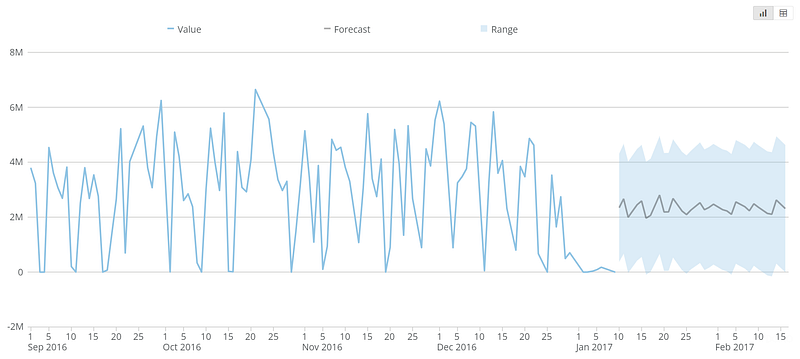
A forecasting chart is a critical data visualization tool for modern business intelligence, allowing businesses to see how past trends can inform the effect different business decisions can have on the company. It is often used in the context of sales processes, project completion, or other business activities.
Bubble Charts
A bubble chart is a type of chart that displays three dimensions of data. Each entity with its triplet of associated data is plotted as a disk that expresses two of the values through the disk’s X and Y location and the third through its size. They are used to compare and visualize relationships between three variables, with the size of the bubble representing the third variable.
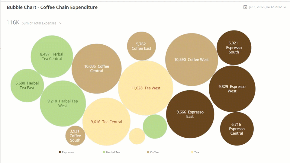
This type of chart is often used to show the relationships between different data points and is a variation of the scatter plot, where the data points are replaced with bubbles. Because they require a high level of mental effort to visualize and understand, bubble charts should be used sparingly. Due to their lack of precision and clarity, they are not commonly utilized, which means users are not too familiar with them.
Gantt Charts
Named after American mechanical engineer, Henry Gantt, a Gantt chart is a visual representation of a project schedule, commonly used in project management to illustrate the start and end dates of various elements of a project, such as tasks, activities, or events. It consists of a horizontal bar chart that lists the tasks to be performed on the vertical axis and time intervals on the horizontal axis. The width of the horizontal bars in the chart shows the duration of each activity, and the chart can also illustrate the dependency relationships between activities.
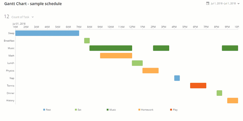
Gantt charts are useful for scheduling, managing, and monitoring specific tasks and resources in a project, and they provide a clear overview of the project timeline, including scheduled and completed work over a period of time.
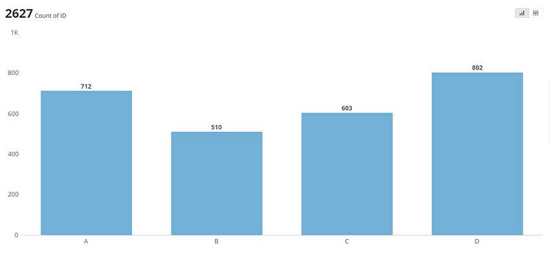
Bar Charts
A bar chart or bar graph presents categorical data in rectangular bars with heights and lengths proportional to the values they represent. The bars can be plotted vertically or horizontally. Bar Charts are helpful if you want to quickly compare items in the same category, for example, page views by country. These charts are easy to understand, clear and compact.
Area Charts
An area chart is a type of graph that combines a line chart and a bar chart to show changes in quantities over time. It is similar to a line graph, but the area below the line is colored in or shaded. The area chart is used to represent cumulated totals using numbers or percentages, and it is commonly used to compare two or more quantities. The area between the axis and the line is commonly emphasized with colors, textures, and hatchings.
These charts are best used when there is data expressed as a total, there are time periods to compare, the point of the chart is to communicate an overall trend, not individual values, and there are multiple data series with part-to-whole relationships or a cumulative series of values.
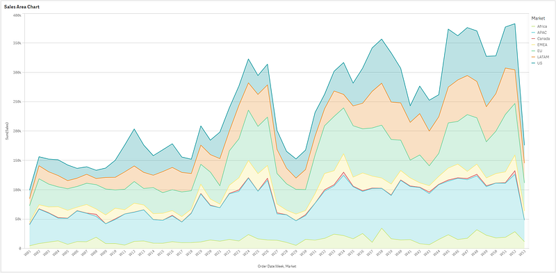
Area charts are visually appealing and can quickly catch the audience’s attention due to the area below the plotted line being filled in. They are commonly used to represent cumulated totals using numbers or percentages and to show trends over time among related attributes.
However, when there is a single series of values to plot, it is often the wrong choice to use an area chart. The better option is to choose just a bar chart or line chart, depending on what you want needs to be communicated about the data.
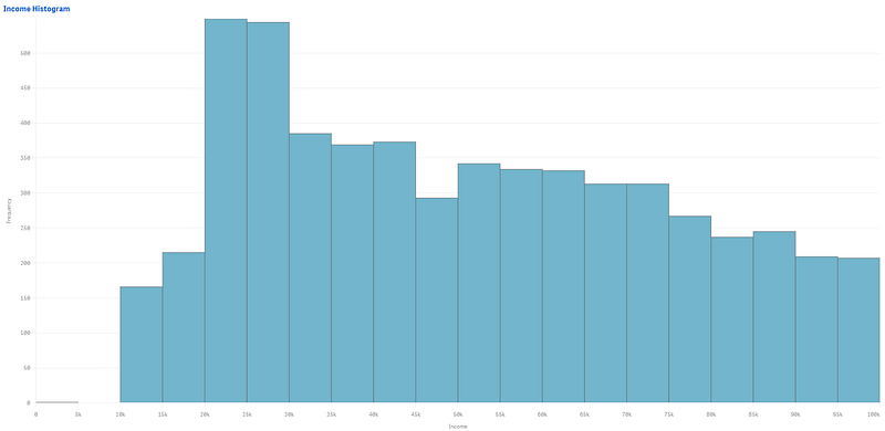
Histograms
A histogram is a graphical representation of the distribution of data, typically used to display the frequency of numerical data points within a specific range. It consists of a set of rectangles, adjacent to each other, where each bar represents a range of values called bins. The height of a rectangle represents the frequency of data points within that range, and the width of the rectangle represents the width of the bins. The histogram is similar in appearance to a bar chart but provides a mechanism for visualizing the data points within a continuous range of values.
Waterfall Charts
A waterfall chart is a form of data visualization that helps reveal the cumulative effect of sequentially introduced positive or negative values. It is a specific type of bar chart that reveals the story behind the net change in something’s value between two points. These intermediate values can either be time based or category based.
Waterfall charts are great at showing changes in revenue and/or profit between two time periods. A waterfall chart can reveal how a net value is arrived at through gains and losses over time or between actual and budgeted amounts. They are not just for finance, their non-business applications include tracking demographic and legal activity changes over time.
Funnel Charts
A funnel chart is a specialized chart type that demonstrates the flow of users or data through a business or process. The chart takes its name from its shape, which starts from a broad head and ends in a thin neck. Funnel charts are commonly used to show the number of users or data at each stage of the process, with the width of the funnel indicating the number of users or data at each stage.
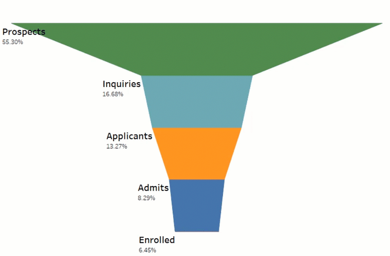
Funnel charts are useful for visualizing the progression of data or users through a process, such as a sales pipeline or website visitor trends. They can also be used to identify potential problem areas in an organization’s process. Funnel charts can be created using specialized software or even simple tools like Excel.
Spider Charts
As Jingwen Zheng explains in his Matplotlib Series 8: Radar chart, a spider chart, also known as a radar chart, “is a chart and/or plot that consists of a sequence of equi-angular spokes, called radii, with each spoke representing one of the variables. The data length of a spoke is proportional to the magnitude of the variable for the data point relative to the maximum magnitude of the variable across all data points. A line is drawn connecting the data values for each spoke. This gives the plot a star-like appearance and the origin of one of the popular names for this plot.”
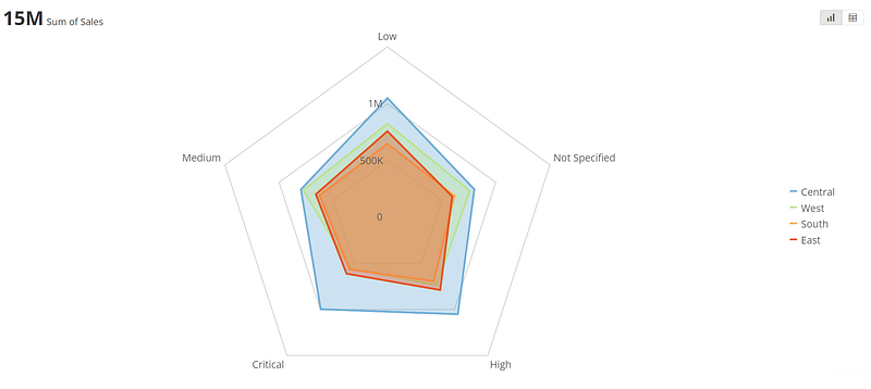
Spider charts are useful for comparing multiple quantitative variables on a polar grid and seeing which variables have similar values or if there are any outliers. They are best suited when exact values are not required, and the focus is on comparing one or more values based on a set of features or attributes. However, they can be hard to read and cluttered if there are too many variables or polygons. They are often used in fields such as statistics, business, and finance.
Spider charts are commonly used in HR to assess employee performance on specific criteria and identify areas of improvement and weaknesses. They can also be used for product development to analyze customer feedback and identify areas for improvement. Overall, they are visually engaging and can be used to represent complex information in a simple and easy-to-understand format.
Stacked Column Charts
A stacked column chart is a type of chart that displays data in a series of columns stacked on top of each other. It is an advanced cumulative bar/column chart where the data is divided into sub-amounts and shaded parts of the bar.
The chart is used to represent the total amount divided into sub-amounts and is called a stacked chart as data is represented in the form of data series stacked on top of one another. The chart is useful for comparing total values across categories and is designed to compare numerical values of a categorical variable.
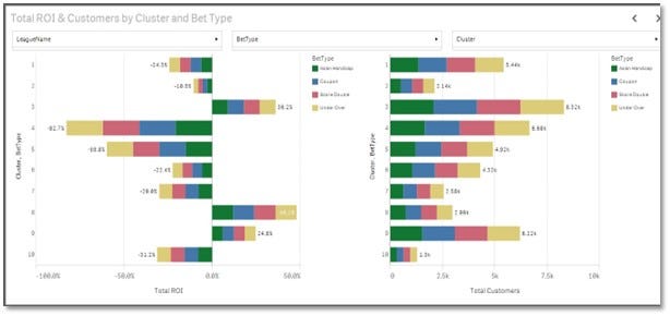
Stacked column charts are often used in business, marketing, and finance to show trends across a time period, spending vs. results, supply and demand, and other comparisons.
Sunburst Charts
A sunburst chart is a visual representation of hierarchical data structures, showing part-to-whole relationships in data. It consists of a series of concentric circles, where the innermost circle represents the top of the hierarchy, and each outer ring represents a deeper level in the hierarchy. The size of the segments in each ring represents the value or measure associated with that data point. The sunburst chart is similar to a pie chart but provides a mechanism for visualizing the data points within a continuous range of values and is more effective at showing how one ring is broken into its contributing pieces.
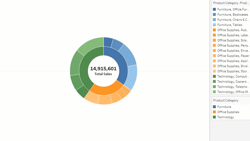
Sunburst charts are useful for displaying hierarchical data and can be customized to show the angle encoded as a measure and the color encoded as a dimension.
Sparklines
A sparkline is a very small line chart, typically drawn without axes or coordinates, that presents the general shape of a variation in some measurement, such as temperature or stock market price, in a simple and highly condensed way. They reveal trends in a series of values. They can also highlight maximum and minimum values.
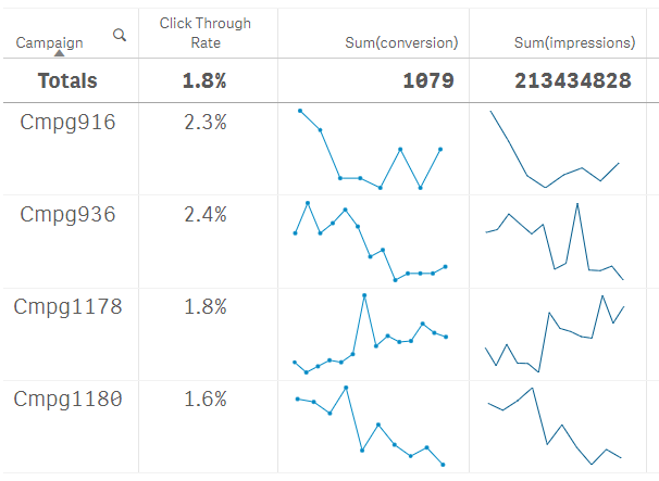
Sparklines usually don’t have a scale, which means individual values are difficult to differentiate. They work well when lots of metrics and trends need to be displayed. They are also rapidly scannable and very compact. They are often used in business, marketing, and finance to show trends across a time period, spending vs. results, supply and demand, as well as other comparisons.
Candlestick Charts
A candlestick chart is a type of price chart used in technical analysis that displays the high, low, open, and closing prices of a security for a specific period. According to Investopedia, they “originated from Japanese rice merchants and traders to track market prices and daily momentum.”
The chart consists of a series of candlesticks, where each candlestick represents a specific time period, and the body of the candlestick represents the opening and closing prices, while the wick or shadow represents the high and low prices. The color of the candlestick body indicates whether the closing price was higher or lower than the opening price.
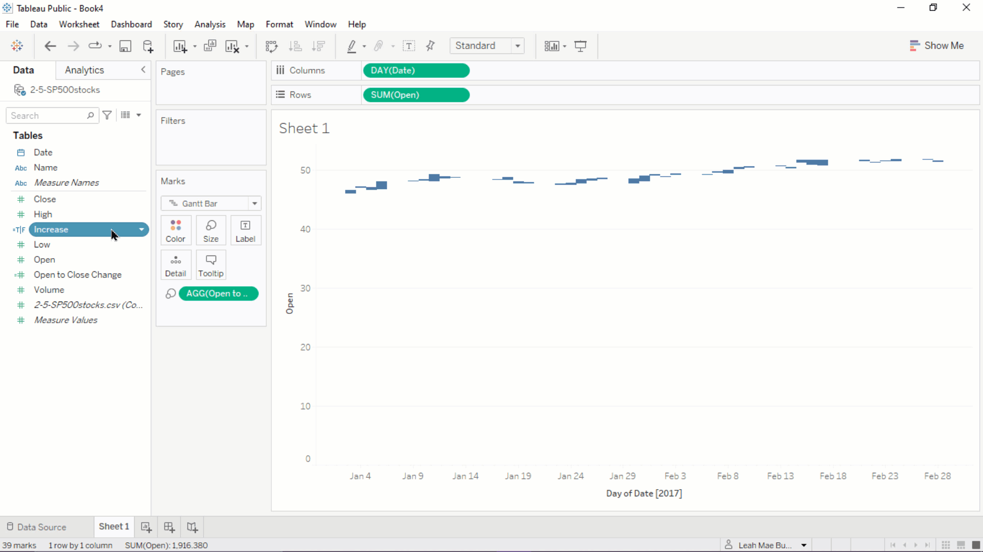
Candlestick charts are useful for identifying trends, patterns, and potential reversals in the market and are widely used in trading stocks, foreign exchange, commodities, and options.
Conclusion
When it comes to visualizing a business’s data, it’s imperative to understand both the data, where it’s coming from, and who will be viewing it. So many things go into the designing of a successful dashboard, including picking the right BI tool, choosing the most important KPIs, and selecting the right chart to surface the data into.
Business Intelligence is the collection, analysis, and interpretation of data to provide information to decision-makers who can use this intelligence to make data-driven decisions about the problems and challenges facing a company. BI involves gathering, storing, cleansing, and processing large amounts of data in order to extract meaningful insights from it in a visual way.
When designing a dashboard, it’s important to understand the nuances of charts. Creating a positive feedback loop is essential. By requesting regular input from users, designers can utilize feedback in the updates, both within the company and even with the BI software vendors who sold you the product in the first place. They are always interested in improving their products and usually open to feedback. We are in a world where information is at our fingertips, but all the data in the world will be useless if it’s not presented in a way the eyes can see it and the mind can fully understand it.
In the next two articles, I will explain how particular tables and maps can be used to best visualize your data.


