
POLITICS
How I Spent the Day After the Midterm Elections
Many thanks to Gen Z for your record turnout

It’s cold in Nevada, and my heat is on the blink. So what am I doing? I’m lying on my bed in my winter coat, studying interactive graphs. I highly recommend the pastime.
You can compare obesity, homicide, suicide, and opioid overdose rates between different countries. You can even add other countries to see where they fall along the continuums. Some charts have buttons you can slide through the years to note progress over time or its lack.
I will pull a couple, but I encourage you to look at more. You must visit the Our World in Data page to activate the interactive feature. There are worse ways to spend your day.
My Facebook feed is full of sonograms. And while I wish the expectant parents and their offspring well, I shudder at each birth announcement. I can’t help it. I worry about people.
My neighbor, a high school football announcer, proclaims the United States “the greatest country on the face of the Earth” over the loudspeaker before each game. But is it? By what measure?
A child born in the United States today has a life expectancy of 79.05 years. Do you think, as I once did, that the United States has one of the highest life expectancies in the world?
Nope, not even close. Thirty-nine other nations outscore us, with Hong Kong (85.16), Japan (84.91) and Macao (84.5) topping the list of 60 countries. The United States falls between Poland (79.11) and Estonia (79.04).
The reasons Americans die so soon, compared to other rich countries, include our high rates of obesity, homicides, opioid overdoses, suicides, road accidents, poverty, and economic inequality. You can read more about that here.
Take a look at the chart below. It plots health expenditure per capita, what people spend on health care, against life expectancy from 1970 through 2018. Notice that in the 1970s, the United States didn’t stand out from the other relatively wealthy countries.
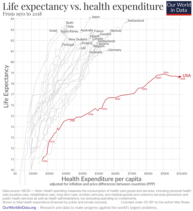
We now stick out like a sore, red thumb. Since the mid-1980s, our health spending has skyrocketed. But look what happened to our life expectancy. We went from the middle of the pack of peer nations to below average.
What happened? One theory is that other countries set healthcare prices and spending limits with government policies. Meanwhile, the United States relied on market forces, which have been less effective at reducing costs.
Another possible explanation is our lack of universal health insurance and lower spending on social safety net programs. Does this make you angry? It should. What is the function of government if not to promote the health and well-being of its citizenry?
Let’s look at infant mortality, the share of infants who don’t survive their first year of life. This is one of the graphs where you can add countries. I tried adding several but could not find another wealthy country with a higher infant mortality rate than the United States. If you can, please tell me in the comments.
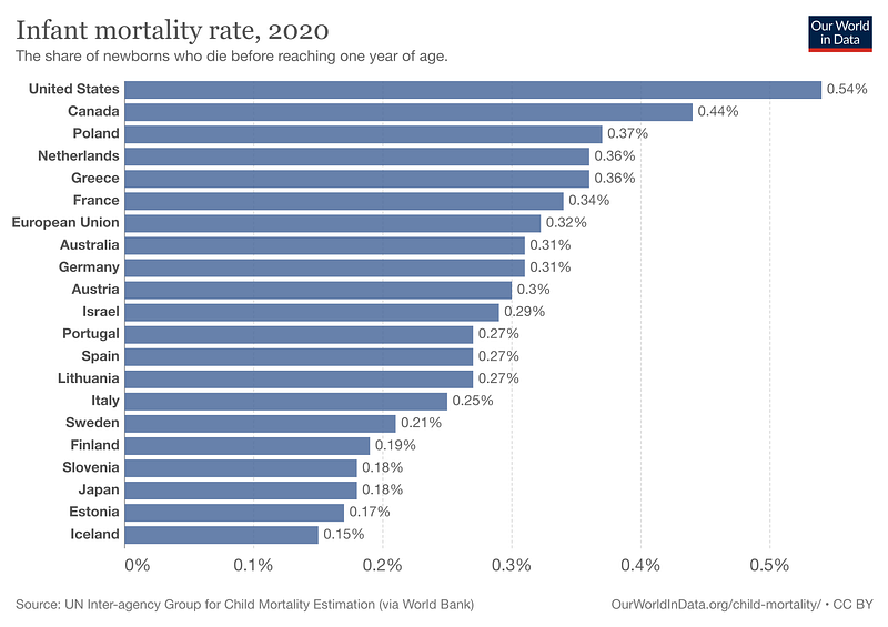
Elon would say there’s a little more here than meets the eye. Research shows the mortality rates for babies of well-off people in the U.S. and European countries are similar.
However, there is a massive gap between the mortality rates of infants born to poor people in the U.S. and Europe. Poor people in the United States have much higher infant mortality rates than poor Europeans.
Poor people in the United States lay on their beds in winter coats studying interactive graphs.
As the authors said,
“the observed higher US postneonatal mortality relative to Europe is due entirely, or almost entirely, to higher mortality among disadvantaged groups.”
We should all be angry enough about climate change to throw mashed potatoes anywhere they’ll stick. Tomato soup too. I once stood dead-set against the tactics of climate activist groups like Just Stop Oil.
Who throws food? Toddlers. And the activists targeted some of my favorite paintings with their glop. I decided to write about it in a Medium story. And another. Soon, something phenomenal happened. I changed my mind. Nobody changes their mind anymore.
When was the last time you changed your mind about anything of importance? I bet it’s been a while. Tell me in the comments. I’m interested.
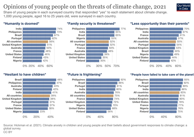
The graph below shows the opinions of young people on the threats of climate change. The respondents are aged 16–25, roughly the age of many of the climate activists, referred to by some as a “band of twenty-somethings.”
Understandably, young people in the Phillippines are the most alarmed, based on their answers to the survey questions.
In 2022, they ranked number one among the countries most affected by extreme weather events. People often refer to climate change as a “silent crisis,” but in the Phillippines, it’s shouting at the top of its lungs.
Around 20 tropical cyclones strike the Phillippines yearly, but they’re getting stronger. The respondents are living through droughts, storms, and rising sea levels while coming of age and trying to find their places in the world.
The U.S. just survived another midterm election, and largely thanks to our younger voters, the anticipated red wave turned out to be a pink mudpuddle. Those of us who want progressive solutions to climate change, healthcare, and other issues owe Gen Z a vote of confidence.
The results aren’t in yet, but they voted in record numbers. It’ll make a great interactive graph.