
How I learnt about color theories and made my best color palettes in one month
#7 — Seventh month of my challenge: 12 topics to learn in 12 months
As you may know if you read the previous articles, I am a designer and a developer with the imposter syndrome 😬, this is why I included design theories as part of my learning challenge and this is why this month in particular I decided to learn about the theories of colors.
I’ve been producing many designs and web designs during my career, especially these last months. Most of the times I make designs from projects that are just starting, the kind of project without any defined colors, brand and without a logo. This means I have to do everything from scratch. I used to choose colors from some palette websites such as Adobe Color. Sometimes I try to find by myself a few colors directly in Photoshop but to be honest, I never felt very confident 😐. That is why I wanted to learn more about theories of colors. I want to be able to understand them and to be able to find the right palette to build a website or a brand.
Right after the learning month about E-commerce, I started learning about colors on the 8th of October.
Preparation
- Finding a mentor Once again I chose Vera as my mentor. She was my colleague in my previous company, she is very talented and she was my mentor while learning about design and creativity.
- Defining the scope of the topic The scope of the topic is quite simple, I want to understand the theories behind colors, and how to build myself a color palette.
- Choosing a learning resource My learning resources for color theories are various: - The book “Interaction of Color — Albers Josef”, recommended by my mentor and many medium articles, about color interactions - A slideshow based on “How pictures work — Molly Bang”, recommended by my mentor, about shapes, colors, sizes and emotions created - Two articles coming from: https://learn-anything.xyz/design/colour-theory, about Color Theory Basics and Practical Color Theory for People Who Code - Other links from Google and articles from Wikipedia
- Defining a project My main goal is to design 3 color palettes and one of them will be used for my Portfolio that I want to rebuild in the future, after a few more learning challenges. My second goal is to build a tool to help finding good color palettes based on my learning and different from existing services.
Color theories
I started reading the book “Interaction of Color — Albers Josef” which is mainly about a professor experimenting how colors can look when put together, the feeling they can give, or about color illusions. It’s more about practicing before making theories 😊.
Even though the book is not fun at all it was quite interesting. But after reading it I was a bit frustrated that it didn’t really talk about making color palettes. That is why I started to google and to read some other articles. This brought me a complete perspective about colors, indeed I had to play and interact with colors to be able to understand them.
I divided the rest of the article into three parts. The first one is more about theory, you will find the most important things you should know about colors, the next part focus in practice, how to build a color palette, and in the last part I’ll finally show my creations and results.
Theory about colors. The Basics
Terminology
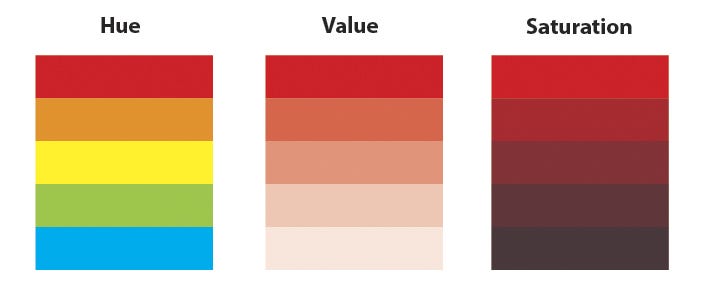
Let’s begging with the not so fun but very important part to be able to understand colors, the main terminology.
- Hue — the perceived value of a color, the color itself
- Saturation or Chroma — the overall intensity or brightness of a color
- Value — the lightness or darkness of a color
This illustration shows the meaning of these three words
Color systems
The color systems are the spaces that define a color. You can see below what are the main ones and how are they defining them.
- Munsell color system — hue, value (lightness), and chroma (color purity)
- Red Green Blue — RGB
- Cyan Yellow Magenta Key — CYMK
- Hue Saturation Value — HSV
- Hue Saturation Lightness — HSL
- Natural Color System — NCS
- CIE Lab
- CIE XYZ
Each system has 3 dimensions. Switching from one to another can be done by some mathematical calculations.
Here is an illustration of HSV and RGB in a 3D space.
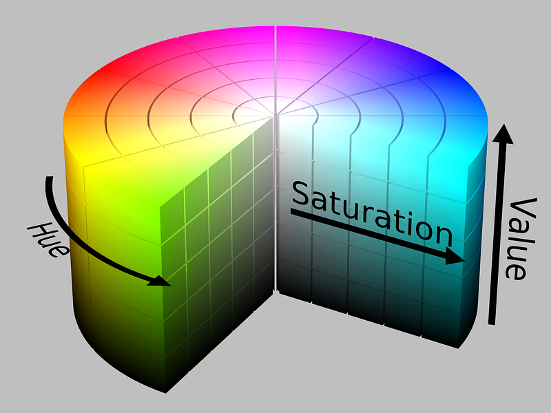
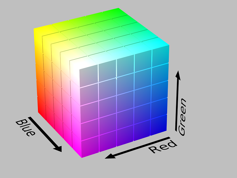
Even though with all the color systems you can create all the existing colors, depending on which one you use you can find different relations between colors, for example in HSV, if you only change the Hue, you will get colors with the same Saturation and Value, and it’s something you will not be able to do with the RGB model.
Meaning of colors
There is not only one truth about the meaning of colors. It can be very relative to each person and also to each culture, for example in in Hanunó’o a language from The Philippines there are only 4 words to describe colors. If you want to know more about colors and countries watch the video below.
That is why you have to be very careful with what I will share below, it’s just based on what the companies are using for their branding, and the values related to them, that are perceived by the customers.
Here are some examples of meaning coming from Color Theory Basics:
- Red — energy, power, vigor, leadership, courage, passion, activity, joy, danger, evil, anger, blood, highly visible
- Orange — cheerful, passion, pleasure, enthusiasm, fascination, creativity, fun, frivolous, flamboyant, crass, low Class
- Yellow — optimism, childish, freshness, law, education, arrogance, cowardice, illness, betrayal
- Green — wealth, money, calming, trees, ambition, endurance, healing, calm, generosity, natural, completion, protection, envy, jealousy, immaturity
- Blue — security, trustworthy, stability, loyalty, wisdom, trust, friendliness, preservation, courage, science, sadness, depression, cold, immoral, staid
- Purple — magic, mystery, spirituality, the sub-conscious, creativity, dignity, royalty, mourning, cruelty, arrogance, conceit
- Black — powerful, mysterious, elegance, sophistication, functionality, death, morbid, plague, aloof
Also, I found this in the book “Interactions of Colors” which is quite different from what we find usually in the web and it is also related to the meanings and feelings.
Interaction between colors
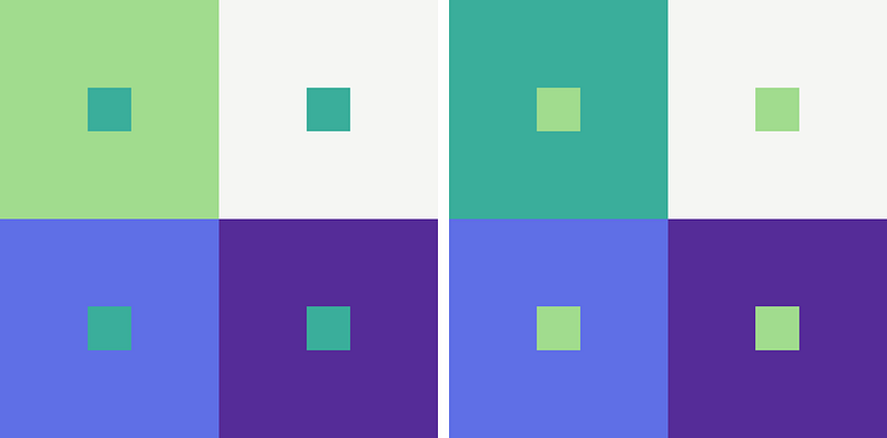
Did you know that 1 color could look like 2? or that 4 different colors could also look like 3 😜? They are illusions, some strange psychological effects, produced by our brain, which cannot distinguish well colors when they are used together with others, no matter if they have the same or different contrast.
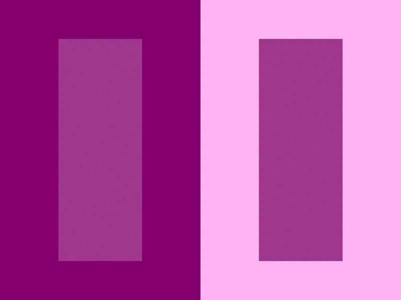
As you can see above, 1 color looks like 2 colors! Amazing.
To see more of these examples I recommend this article: https://blog.prototypr.io/11-optical-illusions-found-in-visual-design-295e7ae211b9 or you can also read “Interaction of Colors — Josef Albers”.
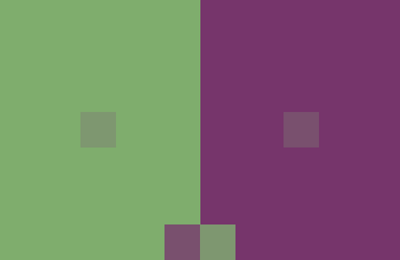
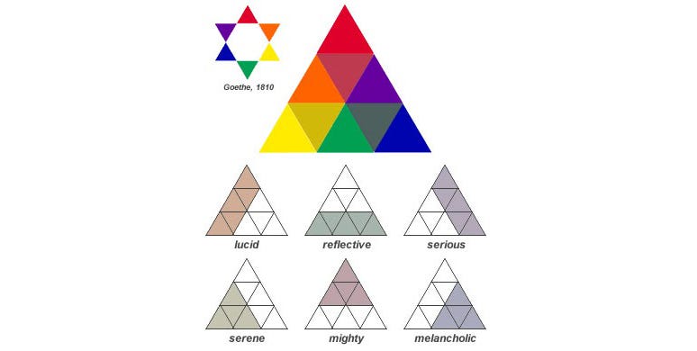
This is the kind of facts that you can read in “Interaction of colors”. The main takeaway is quite simple: the perception of colors is relative. One color doesn’t always feel the same. In order to see that, the author of the book and his students were making plates like those (or the one we saw at the beginning of the article) to play with colors and see how they interact.

Also it’s important to know that some colors, even the ones having the same level of value and saturation, are more prominent and will be more attractive to the eye. Here is the ordered list of them:
- Red (most prominent)
- Blue
- Green
- Orange
- Yellow (least prominent)
Now we have seen a bit of the theory of colors let’s see how to build the perfect color palette.
Practice. How to build the perfect color palette
There are two different approaches for building color palettes. The first is programmatically by using color schemes: you chose one color and a color scheme / algorithm will give you some others. The second is with the eye 👀, by practicing and trying ourselves to match colors together.
Let see how both can work and let’s build a palette creation process mixing both approaches.
Programmatically
All the color schemes start with one thing: the color wheel. In order to generate a palette of color, you select your main primary color from this wheel. Then you apply one of the rules we will see below to generate the others. To simplify, it will rotate the wheel from a set of predefined angles to find the other colors. For example add 180° and you will get the complementary color! You don’t have to think more it’s as simple as mathematics 🙌!
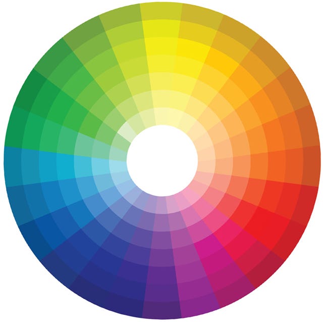
You can find a set of color schemes rules. Each of them will bring a different type of harmonies between colors, some quite easy to use in a website for example.
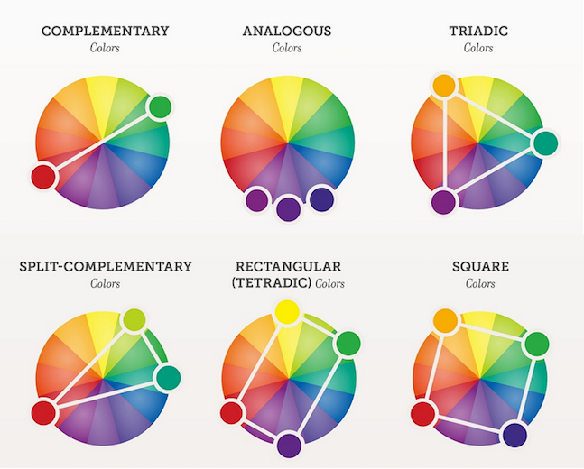
You have many other color schemes rules. There are many tools such as Adobe Color to generate your palette using similar rules.
Indeed it’s quite easy to generate palettes with this rules, but I don’t often find the perfect palette that I can use for a website with that. So let’s see the opposite approach without using automation at all.
By practicing
There are many reasons why the programmatic way is not always perfect. One of them is the interaction of colors, that they can look different when match with different ones. Another explanation is that some colors have more weight, they are more prominent as we have seen above. Finally, there is another reason: some colors are taking more space in the wheel while looking the same, it’s the color tolerance.
Good painting, good coloring, is comparable to good cooking. Even a good cooking recipe demands tasting and repeating tasting while it is being followed. And the best tasting still depends on a cook with taste — Josef Albers
That is why the other approach is by practicing. Just play with colors, until you find the perfect balance. Checking how each color of the palette match with the other, and thinking about how you will use these colors in practice.

Indeed finding the right colors just by practicing it’s not easy and requires a lot of experience, so in my opinion, the best solution is to combine both, using the algorithm and changing manually the colors that don’t fit.
Color palette creation process 📋
So here is the process I suggest and I applied, to start defining the brand and website color palette (from scratch) you can indeed skip the steps if you have already the primary color defined.
- List the adjective, values that describe your brand
- Find the color that matches the most these adjectives and values either from the list in the meaning or by finding an existing brand with similar values
- Using a tool like Adobe Color, try to find the first color, and apply different schemes rules
- Once you find something that you liked the most try it in another tool like Colors Interactor (that I built, you will understand why below) to see how the colors interact or Colormind or how it would like in a real website
- Check it in grayscale in photoshop to see how it would look like for color blind
- Define your primary, secondary and tertiary color, keeping in mind this rule, 60% of use for the primary, 30% for the secondary and 10% for the tertiary.
- Use achromatic colors for reading
Also, another way instead of doing step 1 to 3, inspired by my previous article How I learnt how to steal like an artist in a month, is to get inspiration from different websites’ palette colors, and then follow the process.
Useful tools
Here are a few useful tools that I listed:
- Adobe Color— To find palettes, to generate palettes and to share them
- Colormind — To generate AI based palettes and try them on a website template
- BrandColor — To get the colors of the most famous brand
- ColorHexa — To get color’s information
- TintUI — Color palettes from Google, Twitter, and others
- ColorHunt — Curated list of color palettes
- ColorLisa — Color palettes coming from master pieces
- Webcolourdata — Colors from websites
Some of them are good to get inspiration, some of them to generate new palettes, and others to get information about the colors themselves.
I also made a more complete organized list of interesting tools and links about colors here: https://github.com/sandoche/Colors-curated-links
Let’s build some tools and palettes
The tools
Before building my palettes I wanted to build a tool to help me to play with the colors, and see the relativity of colors on top of others as you could see in the first picture of the article. Also, playing with colors in Photoshop is a bit annoying, so that’s another reason why I decided to build this. I used Vue.JS, a framework that I wanted to learn, it gave me a quick overview of it. I named this tool ‘Color Interactor’ which is also open source 😀.
The second tool I made is a small script to generate colors programmatically based on the source code of this article Practical Color Theory for People Who Code. It was for me a way to also play with it.
The palettes
I first built two palettes using the tool I created. It was mostly to play with the colors, these two palettes don’t have any real use case … yet.
The third palette I decided to create is for my portfolio: www.sandoche.com that I want to rebuild after learning about design guidelines and building mine ** spoilers 🤐**.

I first listed the values of my portfolio:
- Simple
- Creative
- Technology
- Innovation
- Expertise
I found the following colors matching with those values (more or less): Orange (x2), Blue, Purple, Red, green.
Since my previous main color was blue I decided to just keep it as a primary color.
Then I checked the color palette of Airbnb, because I want to build a very simple website, as simple and minimalist as them, with a lot of whitespaces.
I decided to reuse their 3 last colors because they are the ones for the text and the background and change the first one with my blue. Then I used the two tools I made to find the secondary color and that’s it, so I made two alternatives.
Here are the results you have been waiting for!
The final results
Color palettes
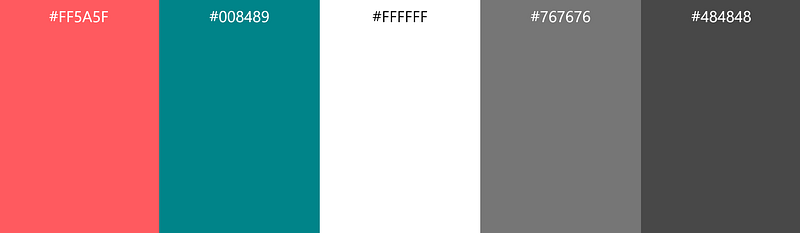
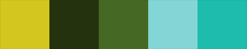
Here are the 4 palettes I created. Feel free to use them!


Colors interactor
Here is my tool to interact with color by generating color plates and random colors that look good: https://colors.learn.uno
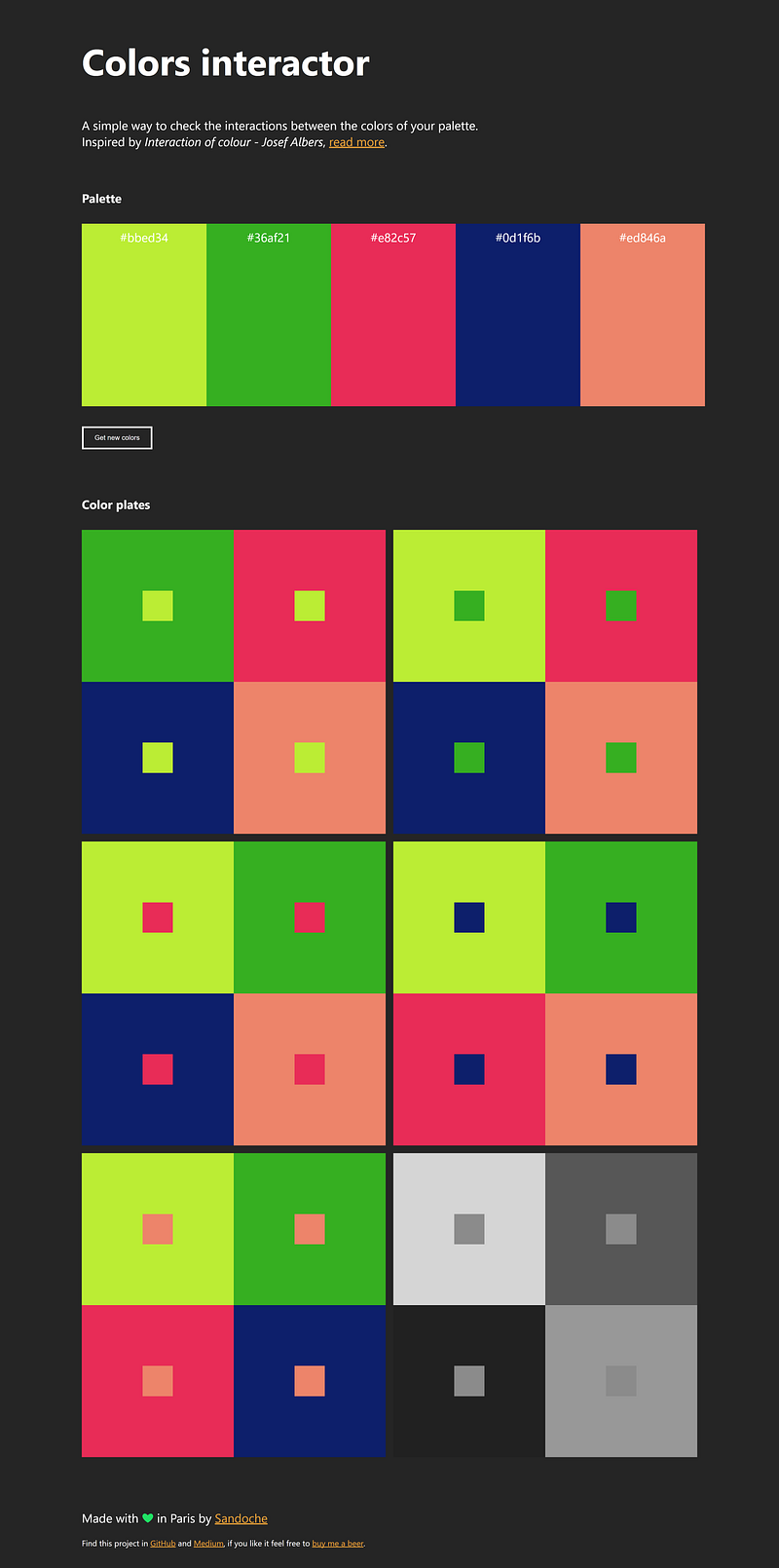
You can find the source here: https://github.com/sandoche/Colors-interactor-website
SASS Colors playground
Here is the SASS script https://codepen.io/sandoche/pen/KyzMZe that you can easily use to generate colors by changing the first color variable. It is coming from Practical Color Theory for People Who Code.
Feedback from this learning month
What went well
- Time scope — I finished the 4th of November
- Collaboration with my mentor
- I feel a lot more confident now when I choose colors
- Building ‘Colors interactor’ in a few hours with Vue.JS
What to improve
- Practice more while reading the book, I mostly practice after reading the book while reading the articles
- Build more color palettes to learn more by doing
If you liked this post, please click the clap 👏button below a few times to show your support! Also, feel free to comment and give any kind of feedback. Don’t forget to follow me!
Want to see more articles like this one ? Support me on Patreon 🙌