
Historical Analysis using Python: Investment Strategies as the Fed is Fighting Inflation

Inflation has recently worsened around the world, including in the U.S., and this has had a significant impact on households. The Fed is now tightening monetary policy to calm it down. Stock markets have fallen sharply since the beginning of the year and investors are bearish. In this article, we will analyze the relationship between inflation and the Federal Funds rate, followed by a detailed data analysis of how the worst inflation in the US peaked. We will then discuss investment strategies during times of inflation.
Throughout this article, you will learn
1. Basics of how to analyze time-series data
2. How to get financial data
3. Relationship between inflation rate and policy rate
4. Investment strategies under inflation
If you are interested in an analysis of inflation and deflation, you may also find the following articles interesting.
Dataset
1. US Business Cycle Expansions and Contractions
We will get business cycle data from NBER(National Bureau of Economic Research). For more information, please check here. We will download all available here.
business_cycle = pd.read_html(
    "https://www.nber.org/research/data/us-business-cycle-expansions-and-contractions")[0]
# save the data
business_cycle_file_path = f"{data_dir}/business_cycle.csv"
business_cycle.to_csv(business_cycle_file_path, index=False)
business_cycle = pd.read_csv(business_cycle_file_path, header=1)
business_cycle = business_cycle.iloc[1:].reset_index(drop=True)
business_cycle.head(3)
Let’s check the business cycle by drawing a diagram showing periods of recession in gray and periods of expansion in white.
cycle_list = []
for i in range(len(business_cycle)):
    row = business_cycle.iloc[i]
    peak_month = re.sub(r"\*", "", row["Peak Month"])
    peak = dt.datetime.strptime(f"{row['Peak Year']}{peak_month}", "%Y%B")
    trough_month = re.sub(r"\*", "", row["Trough Month"])
    trough = dt.datetime.strptime(f"{row['Trough Year']}{trough_month}", "%Y%B")
    cycle_list.append((peak, trough))
print(cycle_list[-3:])
fig, ax = plt.subplots(figsize=(20, 5))
for x in cycle_list:
    ax.axvspan(x[0], x[1], color="gray", alpha=0.3)
ax.get_yaxis().set_visible(False)
plt.show()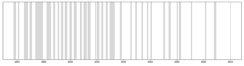
The period of economic expansion has tended to lengthen in recent years, while the period of recession has remained roughly around 17 months. For more information, please refer to my previous article.
This business cycle plot will be overlaid on subsequent plots.
2. CPI (Consumer Price Index)
Here we use data from the Consumer Price Index for All Urban Consumers: All Items (CPIAUCSL). This data is a price index of a basket of goods and services paid by urban consumers. Percent changes in the price index measure the inflation rate between any two time periods.
Again, all available data is downloaded here. Note that this CPI is seasonally adjusted.
Reference:
U.S. Bureau of Labor Statistics, Consumer Price Index for All Urban Consumers: All Items in U.S. City Average [CPIAUCSL], retrieved from FRED, Federal Reserve Bank of St. Louis; https://fred.stlouisfed.org/series/CPIAUCSL, May 12, 2022.
start = dt.datetime(1900, 1, 1)
end = dt.datetime(2022, 7, 6)
cpi = web.DataReader('CPIAUCSL', 'fred', start, end)
# save the data
file_path = f"{data_dir}/CPIAUCSL.csv"
cpi.to_csv(file_path)
cpi = pd.read_csv(file_path, index_col="DATE", parse_dates=True)
print(cpi.shape)
cpi.tail(3)
We will draw a time-series plot to see how CPI has changed.
This data has not yet been converted to a rate of change, so the curve is a gradual increase as shown below.
plt.figure(figsize=(10, 6))
plt.plot(cpi)
plt.grid(axis="y")
plt.xlabel("Date")
plt.ylabel("CPI")
plt.show()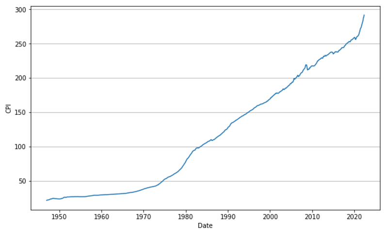
The CPI is usually converted to a rate of change since the most common inflation metric is the percent change from one year ago.
cpi_change = cpi / cpi.shift(12) * 100 - 100
plt.figure(figsize=(10, 6))
plt.plot(cpi_change)
plt.grid(axis="y")
plt.xlabel("Date")
plt.ylabel("CPI change(%)")
plt.show()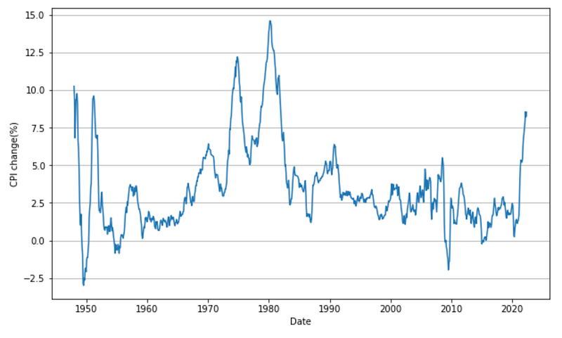
You can see at a glance that current inflation is at historically abysmal levels. Inflation is said to be at a moderate level of about 2%, but it is far above that level now.
There was another period of terrible inflation in the 1970s, and inflation remained high for a long period of time. Inflation finally peaked in the 1980s.
The Fed Chairman at that time was Paul Volcker. After he became Fed chairman in 1979, he calmed inflation by adopting a policy of targeting the Fed’s money supply, thereby protecting the Fed’s dignity and the credibility of the dollar.
3. Federal Funds Effective Rate
Federal funds are non-interest bearing reserve deposits made by U.S. banks with the Federal Reserve Bank. In the U.S., banks adjust the excess or deficiency of this fund daily, and the interest rate at which they do so is called the Federal Funds Rate. The Federal Open Market Committee (FOMC) meets eight times a year to set the Federal Funds target rate. The target rate is usually set higher when the economy is growing rapidly and lower when the economy is in recession.
Reference:
Board of Governors of the Federal Reserve System (US), Federal Funds Effective Rate [FEDFUNDS], retrieved from FRED, Federal Reserve Bank of St. Louis; https://fred.stlouisfed.org/series/FEDFUNDS, July 4, 2022.
ff_rate = web.DataReader('FEDFUNDS', 'fred', start, end)
# save the data
file_path = f"{data_dir}/FEDFUNDS.csv"
ff_rate.to_csv(file_path)
ff_rate = pd.read_csv(file_path, index_col="DATE", parse_dates=True)
print(ff_rate.shape)
ff_rate.tail(3)
We will draw a time-series plot to see how the FF rate has changed.
plt.figure(figsize=(10, 6))
plt.plot(ff_rate)
plt.grid(axis="y")
plt.xlabel("Date")
plt.ylabel("FF rate(%)")
plt.show()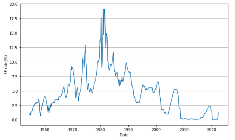
Since the Federal Funds Rate is expected to be correlated with the inflation rate, we plot it overlaid so that it can be compared.
plt.figure(figsize=(14, 6))
plt.plot(cpi_change, label="CPI")
plt.plot(ff_rate, label="FF Rate")
for x in cycle_list:
    plt.axvspan(x[0], x[1], color="gray", alpha=0.3)
plt.grid(axis="y")
plt.xlabel("Date")
plt.ylabel("Percent")
plt.xlim(ff_rate.index[0], ff_rate.index[-1])
plt.legend()
plt.show()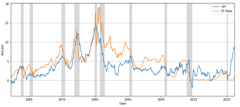
Interesting! When inflation (blue) is high, the Federal Funds Rate (orange) is also high. We also see that the Federal Funds Rate is often higher than the inflation rate. The Federal Funds Rate was almost 0% for the first time in 2009 and has remained low in recent years.
To make it easier to see which is higher, let’s plot the Federal Funds Rate minus the inflation rate.
df = ff_rate.join(cpi_change)
df["FFRate-CPI"] = df["FEDFUNDS"] - df["CPIAUCSL"]
fig, ax = plt.subplots(figsize=(14, 6))
ax.plot(df[["FFRate-CPI"]])
for x in cycle_list:
ax.axvspan(x[0], x[1], color="gray", alpha=0.3)
ax.grid(axis='y', linestyle='dotted', color='b')
ax.set_xlabel("Date")
ax.set_ylabel("FFRate - CPI")
ax.set_xlim(df.index[0], end)
ax.set_ylim(-10, 10)
plt.show()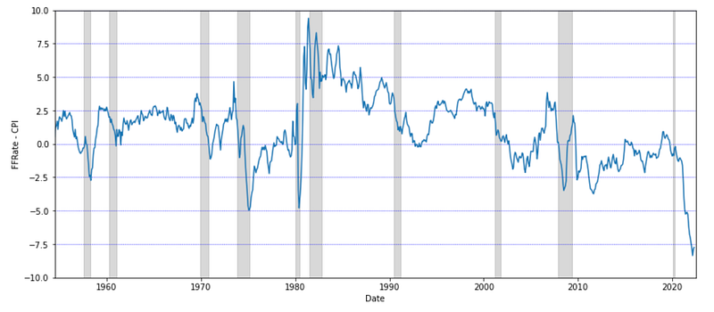
Interesting! We can see that until around 2000, the FF rate minus inflation was greater than zero for a long time, although it was sometimes negative. However, since the 2000s, it has been negative more often than not, and especially recently it has been at an all-time low. This indicates that the policy rate has been set far behind the inflation rate.
4. Unemployment Rate
The unemployment rate represents the number of unemployed as a percentage of the labor force.
Reference:
U.S. Bureau of Labor Statistics, Unemployment Rate [UNRATE], retrieved from FRED, Federal Reserve Bank of St. Louis; https://fred.stlouisfed.org/series/UNRATE, July 5, 2022.
unemployment_rate = web.DataReader('UNRATE', 'fred', start, end)
# save the data
file_path = f"{data_dir}/UNRATE.csv"
unemployment_rate.to_csv(file_path)
unemployment_rate = pd.read_csv(file_path, index_col="DATE", parse_dates=True)
print(unemployment_rate.shape)plt.figure(figsize=(10, 6))
plt.plot(unemployment_rate)
for x in cycle_list:
plt.axvspan(x[0], x[1], color="gray", alpha=0.3)
plt.grid(axis="y")
plt.xlabel("Date")
plt.ylabel("unemployment rate(%)")
plt.xlim(unemployment_rate.index[0], end)
plt.show()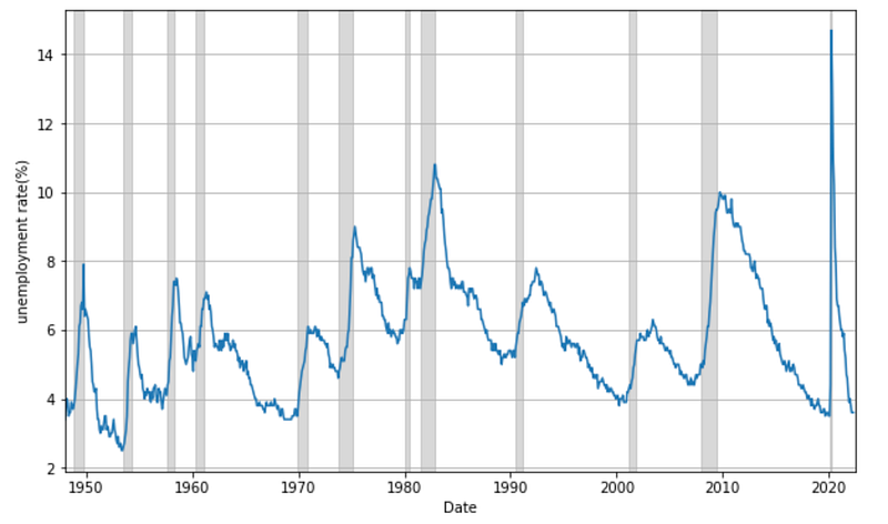
From the graph, we can see that the unemployment rate decreases during economic expansion and increases during recession. The current unemployment rate is 3.6%, which is very low.
Analysis of when U.S. inflation peaked out
We will analyze the behavior of the CPI, FF rate, and unemployment rate from 1979 to 1980 when U.S. inflation was at its worst.
plt.figure(figsize=(10, 6))
plt.plot(cpi_change, label="CPI", marker=".")
plt.plot(ff_rate, label="FF Rate", marker=".")
plt.plot(unemployment_rate, label="Unemployment Rate", marker=".")
for x in cycle_list:
    plt.axvspan(x[0], x[1], color="gray", alpha=0.3)
plt.grid(axis="y")
plt.xlabel("Date")
plt.ylabel("Percent")
plt.xlim(dt.datetime(1979, 8, 1), dt.datetime(1980, 8, 1))
plt.legend()
plt.show()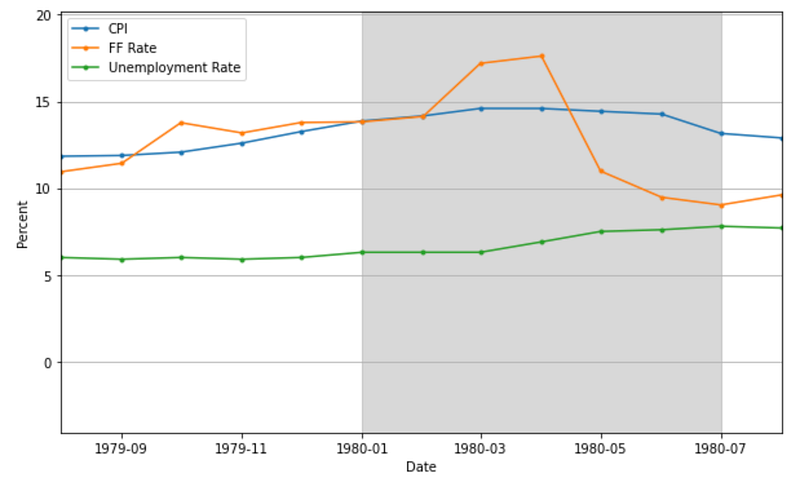
In March 1980, inflation was at its highest, at 14.59%. At this time, the FF rate was 2.6 percentage points higher than inflation, at 17.19%.
The following month, April 1980, the CPI remained high, and finally, in May, the CPI declined slightly (14.43%) and the FF rate fell sharply to 10.98%.
As for the FF rate, the FOMC on May 6, 1980, lowered the lower end of its range from 13% to 10.5%.
At this time the unemployment rate had begun to rise, from 6% in December 1979 to 6.9% in April 1980.
Note that there are other economic indicators to look at, but we have limited the number here.
When to buy stocks?
So when was the right time to buy stocks during this inflationary phase? We will obtain data on the S&P 500 at that time and discuss when to buy stocks, including the results of the previous section.
# get historical data of S&P500(^GSPC)
sp_500 = web.DataReader('^GSPC', 'yahoo', start, end)
print(sp_500.shape)
# save the data
sp500_file_path = f"{data_dir}/S&P500.csv"
sp_500.to_csv(sp500_file_path)
sp_500 = pd.read_csv(sp500_file_path, index_col="Date", parse_dates=True)plt.figure(figsize=(10, 6))
plt.plot(sp_500[["Close"]])
for x in cycle_list:
plt.axvspan(x[0], x[1], color="gray", alpha=0.3)
plt.scatter(dt.datetime(1980, 5, 6), sp_500.loc["1980-5-6","Close"], marker="x", color="red")
plt.title("S&P 500")
plt.xlabel("Date")
plt.ylabel("Price")
plt.xlim(dt.datetime(1979, 8, 1), dt.datetime(1980, 12, 1))
plt.ylim(0,150)
plt.show()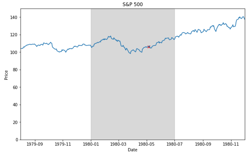
We can see that stock prices rose significantly after inflation peaked. To profit from this rise, you would need to buy stocks near March-May 1980. Ideally, you would buy at the lowest price on March 27, but it is impossible to buy at that bottom. So what should we look for to know where to buy?
There is a hint in the previous analysis. The Fed cuts the FF rate when economic indicators are deteriorating, and we all know the day the FOMC meets to make that decision. After a period of monetary tightening to keep inflation down, the FOMC finally cut the FF rate at its May 6, 1980 meeting. At that time, the S&P 500 closed at $106.25 (marked with a red x). It can be said that buying stocks when the monetary policy turned from tightening to easing allows you to buy at a price close to the bottom.
Conclusion
In this article, we have analyzed several indicators of when inflation peaked, which was the worst in the U.S. Although the economic indicators we have dealt with here are only a part of the story, I believe that an investment strategy in line with the Fed’s actions is one effective strategy. I hope that through this article you will gain a better understanding of how to process and plot time series data as well as investment strategies.
I usually post articles on tech-related topics, including machine learning and data analysis. If you are interested, please follow me so you don’t miss my latest articles. Thank you.