
Histograms with Plotly Express: Complete Guide
One dataset, over 60 charts, and all the parameters explained

A histogram is a special kind of bar chart showing the distribution of a variable(s). Plotly.Express allows creating several types of histograms from a dataset using a single function px.histogram(df, parameters). In this article, I’d like to explore all the parameters and how they influence the look and feel of the chart.
Plotly.Express is the higher-level API of the python Plotly library specially designed to work with the data frames. It creates interactive charts which you can zoom in and out, switch on and off parts of the graph and a tooltip with information appears when you hover over any element on the plot.
All the charts can be created using this notebook on the GitHub. Feel free to download, play, and update it.
Table of content
- Installation
- Dataset — used in examples
- Types of histogram
- Histogram using plotly Bar chart
- Parameters: color, barmode, nbins, histfunc, cumulative, barnorm, histnorm, category_orders, range_x and range_y, color_discrete_sequence, color_discrete_map, facet_col and facet_row, hover_name and hover_data, orientation, marginal, animation_Frame
Installation
Plotly.Express was introduced in the version 4.0.0 of the plotly library and you can easily install it using:
# pip
pip install plotly
# anaconda
conda install -c anaconda plotlyPlotly Express also requires pandas to be installed, otherwise, you will get this error when you try to import it.
[In]: import plotly.express as px
[Out]: ImportError: Plotly express requires pandas to be installed.
There are additional requirements if you want to use the plotly in Jupyter notebooks. For Jupyter Lab you need jupyterlab-plotly. In a regular notebook, I had to install nbformat (conda install -c anaconda nbformat)
The Dataset
Histogram is used anytime you want to overview a distribution:
- occurrences of error over time
- finished products for each shift
- statistical distribution — height, weight, age, prices, salaries, speed, time, temperature, cycle, delta ranges
Plotly’s histogram is easy to use not only for regular histograms but it’s easy to use it for the creation of some types of bar charts. You can recognize the histogram from the bar chart through the gaps — the histogram doesn’t have gaps between the bars.
I’ll use my favorite dataset about tourist arrivals to the countries worldwide and how much they spend on their vacation. The data were preprocessed into a long-form — each category Country Name, Region, Year is a column and each combination of these categories occupy a row showing two data-values number of visotors and receipts locals got from these tourists in USD. Data about tourists go from 1995–2018.

Plotly.Express can do miracles in case each category and each value is a column of the dataset. In the example I’ll use:
long_df— full dataset for 215 countries and years 95–2018yr2018— data for the year 2018spfrit— data about Spain, France, and Italy
Types of histogram
The most usual histogram displays a distribution of a numeric variable split into bins. In our case, the number of visitors in 2018 is spread between 0 and 89 322 000.
# import the libraries
import plotly.express as px
import pandas as pd
# create the simples histogram
px.histogram(yr2018, x="visitors")The simples histogram split 215 countries into 18 bins each covering 5 million visitors range. The first bin includes 157 countries which were visited by 0–4.9M tourists, seconds 17 countries which attracted 5–9.9M visitors and so on.

You have more options about how to create the bins, they can be based on a category (e.g. Region in our dataframe) or a date value which plotly split into bins containing several days, months or years.

You might have noticed that ranged and categorical histograms show count of countries which fall into the bin, but date histogram shows the number of visitors. You can specify what column is aggregated into the histogram using y — parameter. Because our dataset contains 215 countries each year, counting the rows would result in a flat histogram.

Parameters
Beside x and y plotly’s histograms have many other parameters which are described in the documentation — histogram. Let’s review them one by one, so that you get some idea how to include histogram into your next visualization.
Parameter: Color
Like all the other Plotly.Express chart, color parameter expects a column which contains some category and it will color values belonging to this category by a separate color.
fig = px.histogram(yr2018, x="visitors", nbins=10, color="Region", title="Visitors per region")
fig.show()
Parameter: Barmode
Because the histogram is actually a bar chart, you can set three types of bars:
stacked— values are stacked on top of one anothergrouped— shows histogram as a grouped bar chartoverlayed— displays the semi-transparent bars on the top of each other

The bars must be split by color so that barmode has any effect. In the example above we see, that every year Araba is visited by 0–5M tourists, but Turkey and Spain occupy higher bins.
If you’re interested in how tourism evolved in these countries over the years, you can quickly achieve it by changing x and y parameters.
fig = px.histogram(sptuar,
            x="years",
            y="visitors",
            color="Country Name",
            barmode="group",
            title=f"Visitors in Aruba, Spain, Turkey - {barmode}")
fig.update_layout(yaxis_title="Number of Visitors")
fig.update_xaxes(type='category')
fig.show()
Besides changing x and y I have also assigned the chart into a variable fig which allowed us to update the yaxis using fig.update_layout(yaxis_title="title axis") and more importantly, modify the year color not to be considered neither as int nor as date, but as a category which means every year has a separate bar fig.update_xaxes(type="category").
Plotly chart is stored as a dictionary in the background, which you can review by printing
fig.to_dict()
Parameter: nbins
If you use the categories, nbins parameter is ignored and plotly draws a bar for each category. But if your x is numerical or date type, plotly split your data into n number of bins. Documentation says:
nbins (int) — Positive integer. Sets the number of bins.
But in reality, the number of bins usually differs. I have tried to run my chart with different nbins with these results:
- nbins = 3–2 bins
- nbins = 5–5 bins
- nbins = 10–9 bins
- nbins = 20–18 bins

Even the example page about plotly histograms has nbins=20 resulting in 11 bins only. Though increasing the number usually leads to an increased number of bins. Plotly also determines where the bins start and end. For example, using years for binning can start the range in either 1990, 1994 or 1995.
- nbins = 3–3 bins (1990–1999, 2000–2009, 2010–2019)
- nbins = 5–5 bins (95–99, 00–04, 05–09, 10–14, 15–19)
- nbins = 10–5 bins (95–99, 00–04, 05–09, 10–14, 15–19)
- nbins = 20–13 bins (94–95, 96–97, 98–99, 00–01 …)
You have limited ability to influence the number and the ranges of the bins, but Plotly quickly evolves so this will most probably improve in the future versions.
To get the complete power over the bins, calculate them yourself and plot using plotly express bar chart as showed at the end of this article.
Parameter: histfunc
So far we have seen histogram counting and summing the values. Plotly’s histogram allows to aggregate values using 5 functions — count, sum, avg, min, max.

Of course, when we use ranged bins, then the avg yields the average of the bin, min its minimum and max the maximum, so the avg, min and max always form kind of raising stairs. In this case, it’s more interesting to apply a histogram to the categorical values, which technically creates a bar chart.

Parameter: Cumulative
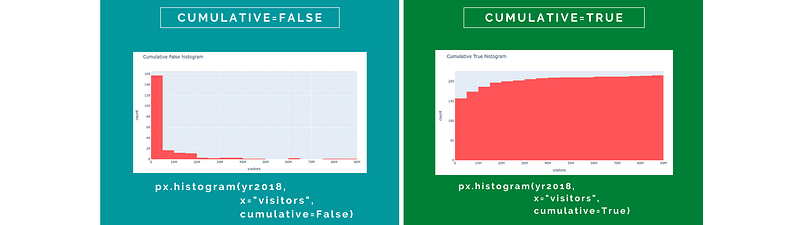
If the cumulative parameter is set to False, the histogram displays the frequency (sum, avg …) as it is, though if it’s True then each follow-up bar cumulates the values of all the preceding bars.
Parameter: barnorm
This parameter allows displaying either the exact values if barnorm is None or showing the percentage of each color-category. You can achieve that by setting barnorm to fraction or percent.

The last image on the right was modified adding a percent sign by fig.update_layout(yaxis={"ticksuffix":"%"}).
In case you apply barnorm on the grouped chart, the proportions remain the same, but the absolute values change to fractions or percentages:

The xaxis was formatted so that the labels are bigger using fig.update_layout(yaxis={"tickfont":{"size":18}}).
Parameter histnorm
Sum of barnorm percentages for one bin equals to 100% while histnorm reaches 100% once all the bars with the same color are summed up. It offer 5 options:
None— absolute value of the aggregate is displayedpercent— percentage (0–100%) of the total value in the binprobability— fraction (0–1) of the total in the bindensity— aggregate divided by total (the sum of all bar areas equals the total number of sample points)probability density— the output ofhistfuncfor a given bin is normalized such that it corresponds to the probability that a random event whose distribution is described by the output ofhistfuncwill fall into that bin (the sum of all bar areas equals 1)

I have explored the density and probability density from several perspectives, but there might be a bug because the values for cumulative and ordinary chart per bin differs.
Parameter category_orders
When you divide the chart by color you might be interested in defining the order of these colored categories. By default, the order is based on the appearance in the input dataframe which can be hard to control. Using category_order let you order the categories on the plot.
You must specify for which column you define the order (as a dictionary). It’s the column you used in the color parameter.
fig = px.histogram(spfrit,
      x="years",
      y="visitors",
      color="Country Name",
      barmode="group",
      title=f"Ordered Italy, Spain, France",
      category_orders={"Country Name":["Italy","Spain","France"]}
      )
fig.show()
Parameters range_x and range_y
These two parameters don’t change the chart’s ranges, but they zoom in the data based on the boundaries set. You can always unzoom using Plotly’s interactive menu.
fig = px.histogram(long_df,
                   x="years",
                   y="receipts",
                   range_x=["2009","2018"],
                   title="Yearly Histogram",
                  )
fig.show()
When you zoom in a lot, you can see that plotly thinks that the years are floats, because it will add labels like 2016.5. If you want to make sure that Plotly display years always as "2016" and never with decimal 2016.5 or months Jan 2016 use fig.update_xaxes(type='category'). That will hoverer change the histogram to a bar chart and gaps between the bins will appear.

Parameter color_discrete_sequence
The color_discrete_sequence parameter lets you influence the color of the bars. The simples histogram has all the bars having the same color, which you can change using:
px.histogram(df, x="column",
    color_discrete_sequence=["blue"])
Plotly expects a list as input, so you have to wrap your color into a list ["#00ff00"]. You can use either color name — blue, red, lightgrey and if you don’t guess the correct name, plotly’s error will provide the full list of colors accessible by name:
ValueError:
    Invalid value of type 'builtins.str' received for the 'color' property of histogram.marker
        Received value: 'lightgreene'

    The 'color' property is a color and may be specified as:
      - A hex string (e.g. '#ff0000')
      - An rgb/rgba string (e.g. 'rgb(255,0,0)')
      - An hsl/hsla string (e.g. 'hsl(0,100%,50%)')
      - An hsv/hsva string (e.g. 'hsv(0,100%,100%)')
      - A named CSS color:
            aliceblue, antiquewhite, aqua, aquamarine, azure,
            beige, bisque, black, blanchedalmond, blue, ...
You can also use hash string or rgb/rgba, hsl/hsla and hsv/hsva (google this term if they don’t right the bell). The last a stands for alpha which controls the opacity of the bar.
If you list more than one color for an un-split histogram where you don’t use the color parameter, only the first color in the list is applied. When you split the bars using color the tints you provide in the color_discrete_sequence will paint bars in each category. You can change the order or categories using the previous param — category_orders.

If you are not certain which colors to pick, but you want to have the colors which fit together, try some prebuild color sets which are part of plotly.
fig = px.histogram(...                      color_discrete_sequence=px.colors.qualitative.Pastel2,
...)
Parameter color_discrete_map
You can assign the colors using a dictionary as well. In that case you use the parameter color_discrete_map. The keys of this dict are the values in the column specified in color.
px.histogram(df, x="column",
color="Country Names",
color_discrete_map={
    "Spain":"lightgreen",
    "France":"rgba(0,0,0,100)",
    "Italy":"#FFFF00"}
)
There is also an option to use a column in the data frame which contains the names of the colors or their hash codes. In the case you use color="column with colors name" and color_discrete_map="identity". The downside of this approach is that you lose the interactive legend, because it doesn’t contain the names of the categories (e.g. Country Names) anymore, but the names of the colors.
# create a color column specifying color for each of the countriesspfrit["color"] = spfrit["Country Name"].map(
{"Spain":"red",
"France":"black",
"Italy":"orange"}
)# spfrit now contains:
# country_name year visitors color
# Spain 1995 32971000 red
# France 1995 60033000 black
# ...""" Parameter color_discrete_map using identity in case color contains real color names/hex codes """fig = px.histogram(spfrit,
x="year",
y="visitors",
color="color",
barmode="group",
title=f"Histnorm {histnorm} histogram",
category_orders={"Country Name":["Italy","Spain","France"]},
color_discrete_map="identity"
)
fig.show()
Parameters facet_col and facet_row
Sometimes you prefer to show the categories separately next to each other in the columns or on the top of each other in rows. facet_col and facet_row parameters are destined for this purpose.

Usually, you combine the facet_col or facet_row with a color parameter to differentiate the color of the bars in each row or column as well.
px.histogram(df,
  x="value column",
  color="column",
  facet_col="column")
If you have too many columns you can split them after every x-th column by parameter facet_col_wrap. The following example shows 9 categories split after 3 columns by facet_col_wrap=3
px.histogram(df, x="value column",
  color="column",
  facet_col="column",
  facet_col_wrap=n)
facet_col_wrap=3All the plots are connected so that when you zoom in or pan one of the graphs, all the others will change as well.
Rows don’t have facet_row_wrap argument, but you can adjust the spacing between the rows via facet_row_spacing.
px.histogram(df, x="value column",
  color="column",
  facet_row="column",
  facet_row_spacing=0.2)
Parameters hover_name and hover_data
Hover_name and hover_data influence the look of the tooltip. hover_name highlights the column on the top of the tooltip and hover_data allow to remove or add a column to the tooltip using
hover_data={
# to remove
"Column Name 1":False,
# to add
"Column Name 2":True
}These parameters always worked well in plotly, but in the case of histogram there’s some bug and hover_name doesn’t work at all while hover_data only works sometimes.
Parameter orientation
The histogram can be oriented horizontally or vertically. Orientation parameter has two values v and h but the orientation is rather influenced by x and y. Switch the order of x and y and you rotate the horizontal chart vertically.

If you need to reverse the order of the axes, so that the lowest numerical bin is on the top rather than the bottom, use:
fig.update_yaxes(autorange="reversed")The same applies in case you specify both x and y. By switching them you turn the horizontal plot into a vertical one and v.v.

On the picture above you can see that hover shows tooltips for all the categories. It’s because I’ve clicked on the Compare data on hover icon (second from the right) in the Plotly menu.
Parameter marginal
An interesting parameter I’d like to show you is the option to add a marginal subplot showing the detailed distribution of the variables. You can choose from 4 types of the marginal plot:
histogram— which is basically the same as the histogram below itrug— which shows exact spots of each data value within theviolin— doing the violin plot, estimating the probability density of the variablebox— box plot highlighting the median, first and third quartile

Marginal plots can be drawn even for more than one category. In such a case a separate marginal chart will be calculated. Note that in this case, you cannot use barmode="group".

Parameter Animation_Frame
The last parameter we will discuss today is another interactive feature of Plotly which let you animate the chart. Adding a single parameter animation_frame="years" turns the plot into an animation which can be started by the play and stop buttons or you can navigate to separate slides by clicking to the menu.
It’s often necessary to specify the range of the animated chart to avoid changes in the dimensions of the grid.
px.histogram(spfrit,
    y="Country Name",
    x="visitors",
    color="Country Name",
    barmode="group",
    # add the animation
    animation_frame="years",
    # anchor the ranges so that the chart doesn't change frame to frame

    range_x=[0,spfrit["visitors"].max()*1.1]
)
It can be used on the categorical column too.
px.histogram(long_df,
    x="years",
    y="visitors",
    color="Region",
    animation_frame="Region",
    color_discrete_sequence=px.colors.qualitative.Safe,
    range_y=[0,long_df.groupby(["Region","years"])["visitors"].sum().max()*1.1]
            )
Histogram using plotly Bar chart
As you have seen when we have discussed the nbins parameter Plotly is stubborn about binning the data. If you want to keep your freedom you can always bin the data yourself and plot a regular bar chart. Using pd.cut to bin the data, groupby to aggregate the values in the bin and passing the results to the px.bar(df, parameter) allow you to get the histogram of your own.
This way you have many more options. You can display the bins on the x-axis (5, 10] or you can display just the bordering number 10M, 20M etc. when you bin using pd.cut(df, bins=bins, labels=bins[1:]). You can add labels into or above the bars showing how many occurrences contain each bar. Using fig.update_layout(bargap=0) let you adjust the gap between the bars


Alternatively, you can bin the data by numpy’s np.histogram.
# bin with np.histogram
counts, bins = np.histogram(yr2018["visitors"], bins=bins)
# turn into data frame
df = pd.DataFrame({"bins":bins[1:], "counts":counts})# chart using Plotly.Express
fig = px.bar(df, x="bins", y="counts", text="counts")Conclusion
Plotly’s histograms are a quick way to picture a distribution of the data variable. Plotly Express histograms are also useful to draw many kinds of bar charts, aggregating data into categories or over time.
So far Plotly histograms however lack some features (which are available for other plotly charts), especially the option to add labels. The bins are not easy to modify and nbins parameter doesn’t always deliver the expected results. You can always do the calculations yourself and draw the results using px.bar().
Plotly is being regularly improved, so maybe these things will be updated soon and we might have an option to add an estimated distribution curve overlay too.
Now it’s your turn to explore the histograms. Download a dataset, for example, historical temperatures in cities around the world and study the distribution of temperatures in various regions.

If you liked this article, check other guidelines:
* Visualize error log with Plotly
* How to split data into test and train set
* Various pandas persistance methods
* Unzip all archives in a folder
Many graphics on this page were created using canva.com (affiliate link, when you click on it and purchase a product, you won't pay more, but I can receive a small reward; you can always write canva.com to your browser to avoid this). Canva offer some free templates and graphics too.All the charts can be run through the python script in this notebook — Histograms with Plotly on Github.


