
Here’s How to Make a Graph in Python (Glowscript, Actually)
I don’t know what you do, I know what I do and it’s physics stuff. So, in physics we make graphs — like all the time. Position vs. time, electric current vs. voltage, and even velocity vs. position. We pretty much love them. But you know, like a good love — not like crazy love. I mean, it’s just a graph.
Fine, but how do you make these? Let’s do it. How to make graphs in python.
Python, Glowscript, and Matplotlib
I’m going to use Glowscript. Yes, it’s still python — but it’s python with more. It’s actually an web-based version of VPython. This is actual python with a visual module. Oh, there is also another popular plotting module for python — matplotlib. That one is pretty good too, but I’m going to use Glowscript. Everything here should also work with VPython.
The great thing about Glowscript is that you don’t have to install anything on your computer. You can just go to glowscript.org and login with your Google account and get to coding. Also, there is trinket.io. This is another web-based python with Glowscript as an option. It’s pretty good.
Nothing I’m going to show you below is new. It’s all here in the Glowscript documentation. All the jokes ARE new — I added them.
My First Graph
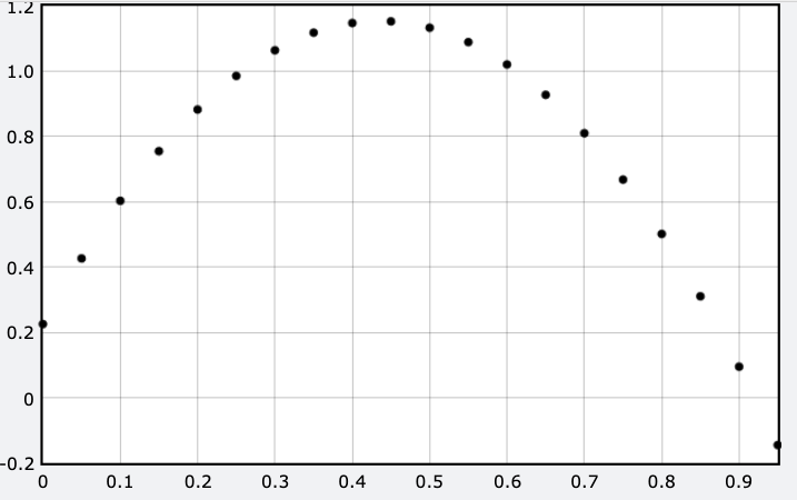
We need something to plot. How about a ball tossed up into the air? I’m going to use a basic numerical calculation to break this motion into small time steps. During each step, I can calculate the change in velocity (based on the acceleration) and then use that velocity to find the change in position. It seems too simple to work, but it works.
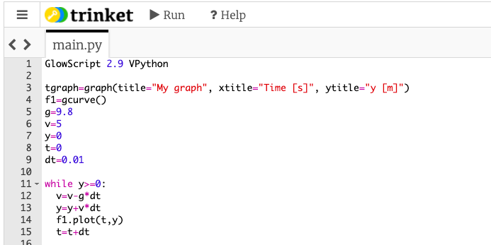
Here is the code (there is no graph).
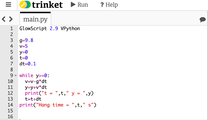
I’m not even going to show the output, just trust me it that it works. Now, here is the same calculation with a plot of position vs. time. Here is the actual code so you don’t have to retype this stuff.
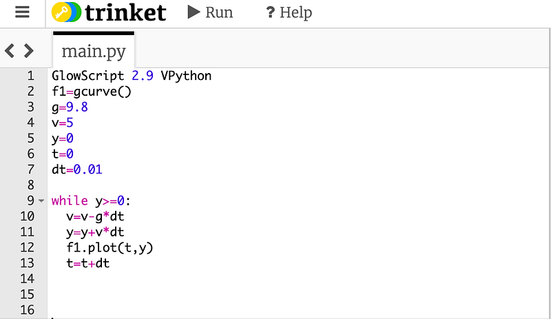
There’s really just two new lines (although I removed the print stuff). Line number 2 creates a graph calling a built in function gcurve() I gave it the name “f1”. Next is line 12 — f1.plot(t,y) this adds just one single data point to the graph with a horizontal coordinate equal to the value of “t” and a vertical coordinate equal to “y”. Yes, the name “f1” has to match the name in line 2.
When you run this, you get the following output.
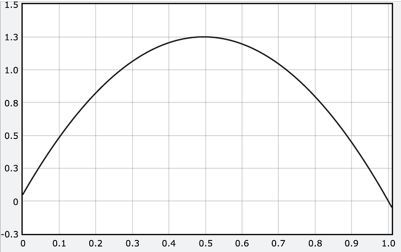
No, it’s not super pretty — but it is a graph. If you edit the code, then it’s YOUR graph. You should be happy. Oh, I really like calling my graphing functions things like “f1”, but you could use any name. Just make sure it’s the same name when you plot.
bob=gcurve()
jane=gcurve()bob.plot(x,y)
jane.plot(x,y)What if you don’t want a line? What if you like points instead? In that case, just make your graph function like this.
f1=gdots()f1.plot(x,y)Now you will get some points. I changed the time step so it looks better — but this is what you get.
Lovely.
Better Graphs
If you turned in the above graph with your physics lab report, I would take off points. Oh sure, it looks nice — but what is it? It needs labels and units for the horizontal and vertical axis. Let’s add those.
In order to make axis labels you need to add a “graph” to your code. Here, check this out.
I only added one line (now it’s line 3 above). You actually don’t have to give this object a name, but I always use tgraph for “the graph”. You can’t call it “graph” since that’s already a function. But in the graph() parameters, I gave it some titles. The stuff in quotes can be ANYTHING — but if you are turning in a lab report, you should probably use legit labels with units. Here is what this output looks like.
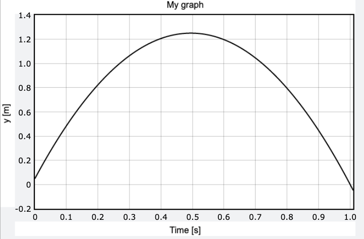
That’s good enough for a lab report. But wait. We can make it better. Here are some things you can do:
- Plot multiple functions on the same graph. Just make another
gcurveor something. - Change the color of the line. Here is how to make a function blue.
f1=gcurve(color=color.blue) - Give a function a label.
f1=gcurve(label=”no air resistance”) - Change the plot size.
tgraph=graph(title=”My graph”, xtitle=”Time [s]”, ytitle=”y [m]”, width=500, height=100)
I don’t know why you would want a graph with those dimensions — but you could do it.
Here is an example plot with more than one function.
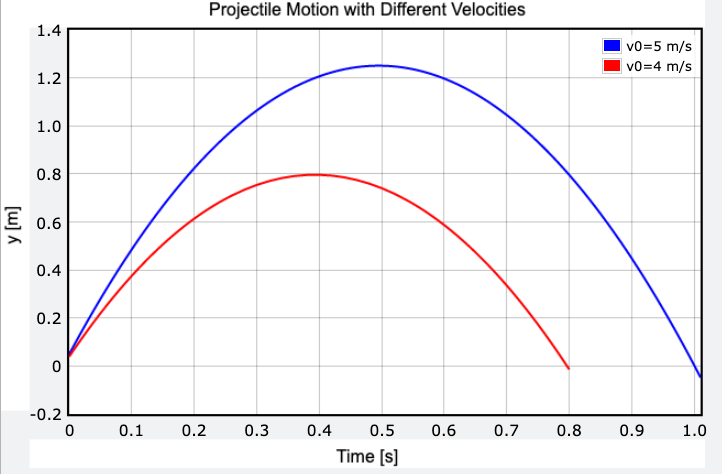
Pretty.
Plotly Graphs
You can pretty much get the graph you need with the stuff so far — but what about something cooler? You can actually make a graph using Plotly Chart Studio — an online graphing utility that makes super sweet looking charts and stuff.
All you need to do is to add this one thing to your “graph”.
tgraph=graph(title="Projectile Motion with Different Velocities", xtitle="Time [s]", ytitle="y [m]", fast=False)When you add fast=False, it takes a little bit longer to plot but you get something that looks like this.
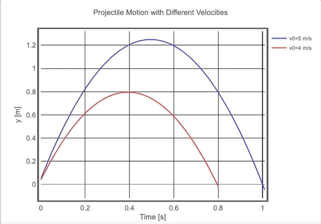
Now you can adjust the axes and scale and stuff. You can download this as an image OR you can switch over to plotly and edit the thing there.
In plotly, you can pretty much change:
- The grid lines
- Axis labels
- Colors of the lines
It’s really great.
Animated Graphs
We are now leaving the “territory of stuff Rhett knows” into the “land of things Rhett forgets”. It’s cool. We all forget how to make certain things and then we just google it. Hopefully, when I google this topic I find my own post. That would be nice.
For animated graph, I usually have two different things I want to do: make a dot move along a curve, or make the whole curve change. I’m going to start with the moving dot.
Just for a change, here is what this looks like (and then I will show you how to do it).
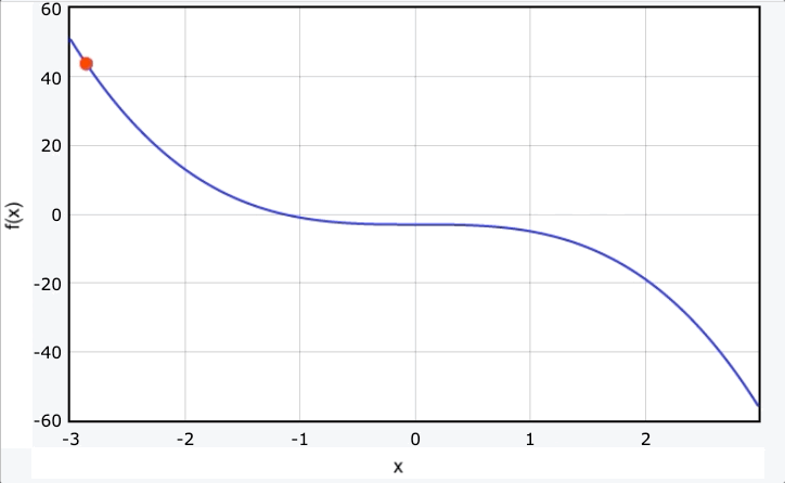
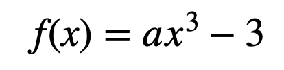
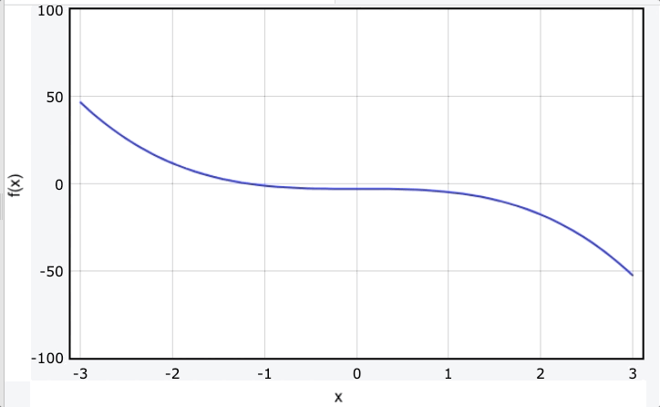
This shows the function (with a = -2):
Then the red dot just shows the location of the function for values of x from -3 to 3.
The first part of this animation (btw — I had to use something to screen capture it into a gif) is to make the plain graph (the blue curve). You already know how to do that.
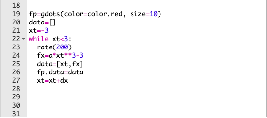
After that, you need code that looks like this.
Let’s go over this.
- 19: the moving dot is a
gdots()function. When I declare this (as the namefp) I can also set the color and the size. I made it a little bigger than the default size so that it shows up better. - 20: The key to this animation is a list. You need to have the data in a list, so this is the list — it starts off empty.
- 23: In Glowscript, animations need a “play rate”. This is what
rate(200)does. This says “don’t do any more than 200 loops per second”. If you change this value to 100, it will “play” at half the speed as 200. - 24: This just calculates the value of the function using the current x value.
- 25: Now, data is a list consisting of my x-value and my y-value. That’s all there is in the list. I didn’t add to a list, I rewrote the list. With this loop, it will only have two values in the list.
- 26: Plotting. Instead of using
fp.plot(xt,fx), it equal to the listdata.
So, every time you go through the loop, it just changes the fp object instead of adding another data point to it. Here is the code for that graph.
Now, let’s make the whole curve change. Check this out.
I love that. Here is the code (full code here).
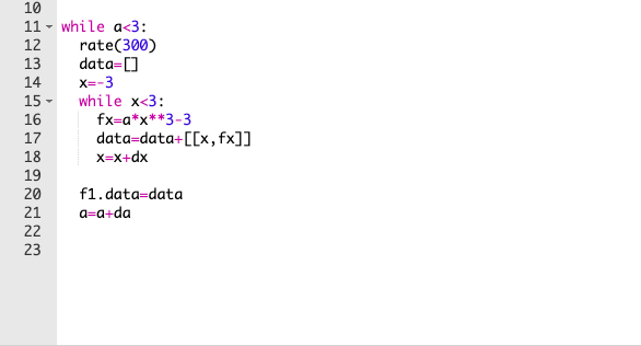
This is the same function as in the previous animation — but this time, I’m changing the constant “a” from -2 to 3. So, I have a loop in a loop (loop inception). Let me go over a few of these lines.
- 11: This bigger loop changes the value of a. Each time I restart the bigger loop, I have to reset
data=[]to clear the stuff that I’m going to plot. I also need to resetx = -3so that I can replot the function with the new value of a. - 15: This is the nested loop. It’s a loop that just plots the function. But there is one difference.
- 17: Instead of actually plotting the data, I just add it to the data list. This makes a huge list of all the values to plot — but doesn’t actually plot it. Until…
- 20: Yup, this plots the whole graph.
- 21: Now make the new value of “a” and repeat the whole process. This makes it “look” like it’s animated.
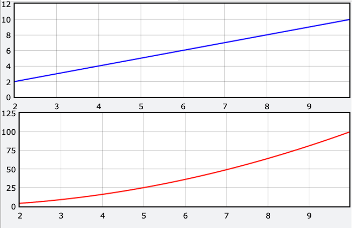
Update: Multiple Graphs
Let’s say you want TWO separate graphs at the same time. This is actually pretty easy, but I had forgotten how to do it — so I’m adding this for future Rhett (he’s going to forget again).
Really, the answer is to just make separate “graph” objects with different names. Here is an example.
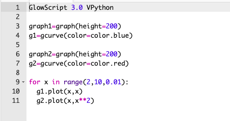
Here I have “graph1” with the curve g1 below it. In line 6, I make the second graph (graph2) with g2 below it. Oh, since you have two graphs, you might want to make them thinner so that they both fit. Here is the output.
OK, that’s enough graphing for now. You know just enough to be dangerous — so go out there and make some graphs. But be safe.


