avatarJohn Loewen, PhD

Free AI web copilot to create summaries, insights and extended knowledge, download it at here

5829

Abstract

all 50 states in our data frame.</p><p id="a873">For our next step, we want to provide a deeper story than just total EV stations (larger states, with more people, probably have more EV stations). We should provide our calculation based on something like number of cars, or population — let’s go with population for this tutorial (per capita).</p><p id="6322">Researching online, I found a site that has population estimates, here: <a href="https://www.census.gov/data/tables/time-series/demo/popest/2020s-state-total.html">https://www.census.gov/data/tables/time-series/demo/popest/2020s-state-total.html</a></p><p id="4851">After downloading, cleaning, simplifying and exporting the dataset, here arethe first 10 rows of the file <b><i>US_state_pop_2022.cs</i></b>v:</p><div id="5d52"><pre><span class="hljs-variable constant_">NAME</span>,<span class="hljs-number">2</span>-<span class="hljs-variable constant_">LETTER</span>,2022_POP <span class="hljs-title class_">Alabama</span>,<span class="hljs-variable constant_">AL</span>,<span class="hljs-number">5074296</span> <span class="hljs-title class_">Alaska</span>,<span class="hljs-variable constant_">AK</span>,<span class="hljs-number">733583</span> <span class="hljs-title class_">Arizona</span>,<span class="hljs-variable constant_">AZ</span>,<span class="hljs-number">7359197</span> <span class="hljs-title class_">Arkansas</span>,<span class="hljs-variable constant_">AR</span>,<span class="hljs-number">3045637</span> <span class="hljs-title class_">California</span>,<span class="hljs-variable constant_">CA</span>,<span class="hljs-number">39029342</span> <span class="hljs-title class_">Colorado</span>,<span class="hljs-variable constant_">CO</span>,<span class="hljs-number">5839926</span> <span class="hljs-title class_">Connecticut</span>,<span class="hljs-variable constant_">CT</span>,<span class="hljs-number">3626205</span> <span class="hljs-title class_">Delaware</span>,<span class="hljs-variable constant_">DE</span>,<span class="hljs-number">1018396</span> <span class="hljs-title class_">District</span> <span class="hljs-keyword">of</span> <span class="hljs-title class_">Columbia</span>,<span class="hljs-variable constant_">DC</span>,<span class="hljs-number">671803</span> <span class="hljs-title class_">Florida</span>,<span class="hljs-variable constant_">FL</span>,<span class="hljs-number">22244823</span> <span class="hljs-title class_">Georgia</span>,<span class="hljs-variable constant_">GA</span>,<span class="hljs-number">10912876</span></pre></div><p id="2ac8">Now that we have our data sets, we can get started with our Python Code!</p><h1 id="1b7a">Step 3: Processing the Data</h1><p id="a24e">We need to load and process both files before loading our map.</p><p id="ac79">Here’s the Python code for how we load them:</p><div id="16cb"><pre>ev_df = pd.read_csv(<span class="hljs-string">'EV_stations_2023.csv'</span>) pop_df = pd.read_csv(<span class="hljs-string">'US_state_pop_2022.csv'</span>)</pre></div><p id="3ca7">Each row in <code>EV_stations_2023.csv</code> corresponds to a charging station, with the 'State' column indicating its location. The <code>US_state_pop_2022.csv</code> file holds state populations, with '2-LETTER' representing the state and '2022_POP’ indicating the population.</p><p id="4642">First, we tally the number of EV stations in each state:</p><div id="4ecf"><pre>state_counts = ev_df[<span class="hljs-string">'State'</span>].value_counts().reset_index() state_counts.columns = [<span class="hljs-string">'2-LETTER'</span>, <span class="hljs-string">'Num_Stations'</span>] <span class="hljs-built_in">print</span>(state_counts.head())</pre></div><p id="140b">We can do a print() statement just to validate our code in our Python console (or comment out/remove it) Next, we merge this with our population data:</p><div id="d8ed"><pre>state_data = pd.merge(state_counts, pop_df, on=<span class="hljs-string">'2-LETTER'</span>)</pre></div><p id="e12b">Now, we calculate the number of EV stations per 100,000 residents for each state:</p><div id="15e5"><pre>state_data[<span class="hljs-string">'Stations_per_100k'</span>] = state_data[<span class="hljs-string">'Num_Stations'</span>] / state_data[<span class="hljs-string">'2022_pop'</span>] * <span class="hljs-number">100000</span></pre></div><p id="bb13">We have our ‘Stations_per_100k’ metric, which adjusts the raw station counts relative to the population size.</p><p id="775c">Super clean, super simple, super quick.</p><h1 id="15d1">Step 4: Creating the Map</h1><p id="f501">With our data prepared, we can now generate a choropleth (heat) map. Now you might be asking “what’s the difference between a heat map and a choropleth map?”. A choropleth map is basically a heat map, but using geographical boundaries. So you can say it’s a type of heat map.</p><p id="20f8">But back to our code… here’s the code for generating our map:</p><div id="4221"><pre>fig = px.choropleth(state_data, locations=<span class="hljs-string">'2-LETTER'</span>, color=<span class="hljs-string">'Stations_per_100k'</span>, locationmode=<span class="hljs-string">'USA-states'</span>, title=<span class="hljs-string">'US EV Charging Stations per 100,000 Residents'</span>, scope=<span class="hljs-string">'usa'</span>, color_continuous_scale=<span class="hljs-string">"Viridis"</span>)

fig.show()</pre></div><p id="e6de">We’re coloring each state based on the number of EV stations per 100,000 residents. The ‘Viridis’ color scale provides a visually pleasing and intuitive representation of our data.</p><p id="85ab">But to make it more relevant for our dataset, we can do some fine-tuning.</p><h1 id="8db8">Step 5: Fine-Tuning the Map</h1><h2 id

Options

="250f">Adjusting the Color Scale</h2><p id="3d5f">Let’s tweak the colors to resemble a traffic light for easier interpretation:</p><div id="73bb"><pre>fig = px.choropleth(state_data, locations=<span class="hljs-string">'2-LETTER'</span>, color=<span class="hljs-string">'Stations_per_100k'</span>, locationmode=<span class="hljs-string">'USA-states'</span>, title=<span class="hljs-string">'US EV Charging Stations per 100,000 Residents'</span>, scope=<span class="hljs-string">'usa'</span>, color_continuous_scale=[<span class="hljs-string">"red"</span>, <span class="hljs-string">"yellow"</span>, <span class="hljs-string">"green"</span>]) fig.show()</pre></div><p id="fe15">You can see in the above code that we’re using the property <b><i>color_continuous_scale </i></b>to set our choropleth map color scheme.</p><h2 id="e099">Enhancing the Color Bar</h2><p id="2e7d">For a final touch, let’s make the color bar (the “legend”) more interesting:</p><div id="a05b"><pre>fig.update_layout(coloraxis_colorbar=<span class="hljs-built_in">dict</span>( title=<span class="hljs-string">"EV Stations per 100k"</span>, x=<span class="hljs-number">1</span>, xanchor=<span class="hljs-string">"right"</span>, yanchor=<span class="hljs-string">"middle"</span>, y=<span class="hljs-number">0.5</span>, ticks=<span class="hljs-string">"outside"</span>, tickvals=state_data[<span class="hljs-string">'Stations_per_100k'</span>].quantile([<span class="hljs-number">.25</span>, <span class="hljs-number">.5</span>, <span class="hljs-number">.75</span>]).tolist(), ticktext=[<span class="hljs-string">"Few Stations"</span>, <span class="hljs-string">"Medium Stations"</span>, <span class="hljs-string">"Many Stations"</span>], lenmode=<span class="hljs-string">"pixels"</span>, <span class="hljs-built_in">len</span>=<span class="hljs-number">500</span>, )) fig.show()</pre></div><p id="0325">This script enhances the color bar. The parameter<code>tickvals</code> uses the 25th, 50th, and 75th percentiles of the station counts per 100k to mark the color bar, and <code>ticktext</code> provides custom labels for these markers.</p><p id="7f9c">The color bar is vertically centered and placed on the right (<code>x=1</code>, <code>xanchor="right"</code>, <code>yanchor="middle"</code>, <code>y=0.5</code>), with tick marks on the outside (<code>ticks="outside"</code>).</p><p id="fc3f">The legend length is set to 500 pixels (<code>lenmode="pixels"</code>, <code>len=500</code>).</p><p id="4c66">And voila:</p><figure id="92c9"><img src="https://cdn-images-1.readmedium.com/v2/resize:fit:800/1*yyd5EYgvzbSQUkhfiNghiw.png"><figcaption>EV stations available per capita by US State.</figcaption></figure><p id="d011">It doesn’t take a lot of code to put together meaningful data visualizations using Plotly. We can see the states that provide the most EV stations per capita — California, Colorado, Vermont, Massacheusetts, Maine.</p><p id="4b78">Now I showed this map to my wife and she mentioned that it makes more sense to reverse the color order — she said in heat maps that red means “go”, it’s where “the action is” (in her words). So we can easily do this by changing the one line in our code, in the <b><i>choropleth ()</i></b> function:</p><div id="0c3a"><pre>color_continuous_scale=[<span class="hljs-string">"red"</span>, <span class="hljs-string">"yellow"</span>, <span class="hljs-string">"green"</span>]</pre></div><p id="d82b">And the resulting map looks like so:</p><figure id="35af"><img src="https://cdn-images-1.readmedium.com/v2/resize:fit:800/1*mFerTeOQvHgarRk72OEYjw.png"><figcaption></figcaption></figure><p id="bddb">I then showed both maps to my daughter, and she said that the “green one is better than the red one, dad”.</p><p id="7036">I’m not going to argue with either of them.</p><p id="bf77">So choose the color scheme that works best for you.</p><h1 id="b096">In Summary…</h1><p id="a09e">And presto! With Python and Plotly, we’ve transformed two separate CSV files into an interactive choropleth map showing the number of EV charging stations per 100,000 residents across the U.S.</p><p id="450f">Taking advantage of Plotly interactivity, you can hover over each state for more information. As you can probably deduce, green is better in regards to the number of available EV stations based on population size.</p><p id="3479">This is all just a starting point as there are many visualization tweaks and changes you can make.</p><p id="46d8">Hope this was fun and informative!</p><p id="2138">Best of luck in your coding!</p><p id="1b22"><b>Before you go… </b><i>If you want to start writing on Medium yourself and earn money passively you only need a membership for $5 a month. If you sign up <a href="https://medium.com/@loewenj700/membership"><b>with my link</b></a>, you support me with a part of your membership fee without additional costs.</i></p><p id="a9f7"><i>If you’re interested<b>, <a href="https://medium.com/@loewenj700">here’s a link to more articles I’ve written</a>. </b>There’s articles on Python, Generative AI, Expat living, Marathon training, Travel, and more!</i></p><p id="e9ec"><i>More content at <a href="https://plainenglish.io/"><b>PlainEnglish.io</b></a>.</i></p><p id="609b"><i>Sign up for our <a href="http://newsletter.plainenglish.io/"><b>free weekly newsletter</b></a>. Follow us on <a href="https://twitter.com/inPlainEngHQ"><b>Twitter</b></a></i>, <a href="https://www.linkedin.com/company/inplainenglish/"><b><i>LinkedIn</i></b></a><i>, <a href="https://www.youtube.com/channel/UCtipWUghju290NWcn8jhyAw"><b>YouTube</b></a>, and <a href="https://discord.gg/GtDtUAvyhW"><b>Discord</b></a><b>.</b></i></p></article></body>

Heat Map Data Visualization Using Python Plotly: A Hands-on Example

Combining multiple data sets for Plotly heat map creation

Electric Vehicle (EV) charging stations available per capita by US State.

We can easily develop an interactive choropleth map (heat map) using Plotly, a useful and powerful Python data visualization library.

Curious to know which U.S. states are leading the charge in electric vehicle (EV) infrastructure?

From Python environment prep, to data sourcing, to map visualization, this step-by-step tutorial will guide you through the entire process.

Step 1: Preparing the Environment

Before we begin, make sure you have Plotly and Pandas installed in your Python environment. If you haven’t, the following command will set you up:

pip install pandas plotly

Next, import the necessary libraries (put this in your code):

import pandas as pd
import plotly.express as px

Step 2: Rustling Up the Data

For this exercise, we want to find the amount of “Electric Vehicle” (EV) charging stations there are per capita in each US state.

To do this, we first need a dataset with all of the EV locations in each state. The key is that we are able to count the total number of EV stations by state.

Next, we need a clean file of state population in order to implement the per-capita ranking.

So if we do the math together, we need two datasets for this task:

  • Dataset 1 — List of EV charging stations across the U.S. by statea
  • Dataset 2 — Current United States population by state.

To start with, we can find the data on Electric Vehicle sites in the USA here: https://afdc.energy.gov/data_download

On the site, you can select the parameters (alternative fuel stations, fuel type electric) and download the data set.

For the sake of this tutorial, as we are only going to state level, I am interested in ALL of the locations in a state (just the TOTAL count per state).

After cleaning, simplifying, and exporting to CSV, here are the first 10 rows of the file EV_stations_2023.csv:

Street Address,City,State,ZIP
11797 Truesdale St,Sun Valley,CA,91352
1394 S Sepulveda Blvd,Los Angeles,CA,90024
1201 S Figueroa St,Los Angeles,CA,90015
111 N Hope St,Los Angeles,CA,90012
6801 E 2nd St,Long Beach,CA,90803
161 N Island Ave,Wilmington,CA,90744
13201 Sepulveda Blvd,Sylmar,CA,91342
1630 N Main St,Los Angeles,CA,90012
2311 S Fairfax Ave,Los Angeles,CA,90016

It is the “State” field that we are most interested in. We just want to count every row that has EV locations in a particular state. So essentially, we should have totals for all 50 states in our data frame.

For our next step, we want to provide a deeper story than just total EV stations (larger states, with more people, probably have more EV stations). We should provide our calculation based on something like number of cars, or population — let’s go with population for this tutorial (per capita).

Researching online, I found a site that has population estimates, here: https://www.census.gov/data/tables/time-series/demo/popest/2020s-state-total.html

After downloading, cleaning, simplifying and exporting the dataset, here arethe first 10 rows of the file US_state_pop_2022.csv:

NAME,2-LETTER,2022_POP
Alabama,AL,5074296
Alaska,AK,733583
Arizona,AZ,7359197
Arkansas,AR,3045637
California,CA,39029342
Colorado,CO,5839926
Connecticut,CT,3626205
Delaware,DE,1018396
District of Columbia,DC,671803
Florida,FL,22244823
Georgia,GA,10912876

Now that we have our data sets, we can get started with our Python Code!

Step 3: Processing the Data

We need to load and process both files before loading our map.

Here’s the Python code for how we load them:

ev_df = pd.read_csv('EV_stations_2023.csv')
pop_df = pd.read_csv('US_state_pop_2022.csv')

Each row in EV_stations_2023.csv corresponds to a charging station, with the 'State' column indicating its location. The US_state_pop_2022.csv file holds state populations, with '2-LETTER' representing the state and '2022_POP’ indicating the population.

First, we tally the number of EV stations in each state:

state_counts = ev_df['State'].value_counts().reset_index()
state_counts.columns = ['2-LETTER', 'Num_Stations']
print(state_counts.head())

We can do a print() statement just to validate our code in our Python console (or comment out/remove it) Next, we merge this with our population data:

state_data = pd.merge(state_counts, pop_df, on='2-LETTER')

Now, we calculate the number of EV stations per 100,000 residents for each state:

state_data['Stations_per_100k'] = state_data['Num_Stations'] / state_data['2022_pop'] * 100000

We have our ‘Stations_per_100k’ metric, which adjusts the raw station counts relative to the population size.

Super clean, super simple, super quick.

Step 4: Creating the Map

With our data prepared, we can now generate a choropleth (heat) map. Now you might be asking “what’s the difference between a heat map and a choropleth map?”. A choropleth map is basically a heat map, but using geographical boundaries. So you can say it’s a type of heat map.

But back to our code… here’s the code for generating our map:

fig = px.choropleth(state_data, 
                    locations='2-LETTER', 
                    color='Stations_per_100k',
                    locationmode='USA-states',
                    title='US EV Charging Stations per 100,000 Residents',
                    scope='usa',
                    color_continuous_scale="Viridis")

fig.show()

We’re coloring each state based on the number of EV stations per 100,000 residents. The ‘Viridis’ color scale provides a visually pleasing and intuitive representation of our data.

But to make it more relevant for our dataset, we can do some fine-tuning.

Step 5: Fine-Tuning the Map

Adjusting the Color Scale

Let’s tweak the colors to resemble a traffic light for easier interpretation:

fig = px.choropleth(state_data, 
                    locations='2-LETTER', 
                    color='Stations_per_100k',
                    locationmode='USA-states',
                    title='US EV Charging Stations per 100,000 Residents',
                    scope='usa',
                    color_continuous_scale=["red", "yellow", "green"])
fig.show()

You can see in the above code that we’re using the property color_continuous_scale to set our choropleth map color scheme.

Enhancing the Color Bar

For a final touch, let’s make the color bar (the “legend”) more interesting:

fig.update_layout(coloraxis_colorbar=dict(
    title="EV Stations per 100k",
    x=1,
    xanchor="right",
    yanchor="middle",
    y=0.5,
    ticks="outside",
    tickvals=state_data['Stations_per_100k'].quantile([.25, .5, .75]).tolist(),
    ticktext=["Few Stations", "Medium Stations", "Many Stations"],
    lenmode="pixels", len=500,
))
fig.show()

This script enhances the color bar. The parametertickvals uses the 25th, 50th, and 75th percentiles of the station counts per 100k to mark the color bar, and ticktext provides custom labels for these markers.

The color bar is vertically centered and placed on the right (x=1, xanchor="right", yanchor="middle", y=0.5), with tick marks on the outside (ticks="outside").

The legend length is set to 500 pixels (lenmode="pixels", len=500).
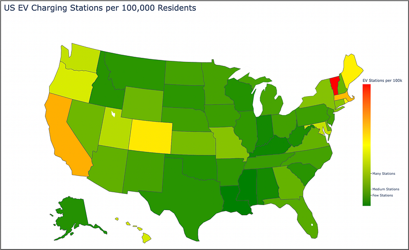
And voila:

EV stations available per capita by US State.

It doesn’t take a lot of code to put together meaningful data visualizations using Plotly. We can see the states that provide the most EV stations per capita — California, Colorado, Vermont, Massacheusetts, Maine.

Now I showed this map to my wife and she mentioned that it makes more sense to reverse the color order — she said in heat maps that red means “go”, it’s where “the action is” (in her words). So we can easily do this by changing the one line in our code, in the choropleth () function:

color_continuous_scale=["red", "yellow", "green"]

And the resulting map looks like so:

I then showed both maps to my daughter, and she said that the “green one is better than the red one, dad”.

I’m not going to argue with either of them.

So choose the color scheme that works best for you.

In Summary…

And presto! With Python and Plotly, we’ve transformed two separate CSV files into an interactive choropleth map showing the number of EV charging stations per 100,000 residents across the U.S.

Taking advantage of Plotly interactivity, you can hover over each state for more information. As you can probably deduce, green is better in regards to the number of available EV stations based on population size.

This is all just a starting point as there are many visualization tweaks and changes you can make.

Hope this was fun and informative!

Best of luck in your coding!

Before you go… If you want to start writing on Medium yourself and earn money passively you only need a membership for $5 a month. If you sign up with my link, you support me with a part of your membership fee without additional costs.

If you’re interested, here’s a link to more articles I’ve written. There’s articles on Python, Generative AI, Expat living, Marathon training, Travel, and more!

More content at PlainEnglish.io.

Sign up for our free weekly newsletter. Follow us on Twitter, LinkedIn, YouTube, and Discord.

Python
Plotly
Data Visualization
Programming
Maps
Recommended from ReadMedium