
Hamburger Menu Position: Left or Right Top Corner?
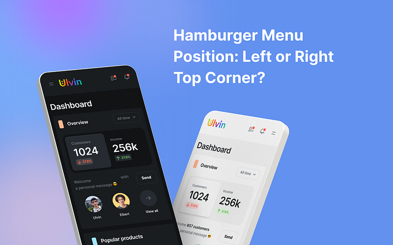
When you’re trying to decide where to put the hamburger menu, the big question is whether to place it in the upper right or left corner. The answer depends on the kind of system your app is made for:
For Android Apps:
If you’re making an app for Android, it’s best to follow the Material Design rules. Most Android users expect the hamburger menu to be on the left side of the screen. Changing this might confuse them.
For Apps on Different Systems:
If your app works on different systems, things can get a bit tricky. Placing the menu on the left side is good for people who read from left to right. But sometimes, the menu has less important stuff, so it could make sense to put it on the right. This is easier for right-handed people who use their thumb to navigate.
UX Research by AppEase team
There’s also an interesting test that AppEase did. They tried out both left and right menu positions to see which one people liked better. They discovered that when the menu was on the right side, people were 15% quicker at using it. This suggests that moving the menu there made navigation smoother. But it’s worth noting that people who are left-handed still prefer the menu on the left side.
Study statistics by UXPin
Now, let’s take a closer look at some facts and numbers to help us understand this exciting situation. According to a study done by UXPin, about 70% of mobile apps put their navigation menus in either the upper left or upper right corners of the screen. This makes sense because it’s where our eyes naturally go when we start using an app. However, it’s important to keep in mind that around 90% of people in the world are right-handed. This matters because it affects how easy it is to reach the menu using your thumb, especially if it’s on the right side.
NN Group findings
If we compare the two menu positions, another research group called the Nielsen Norman Group found that putting the hamburger menu on the right side tends to be more comfortable and user-friendly, especially for right-handed folks. This matches something called Fitts’s Law, which basically says that when things are bigger and closer to where we naturally move (like the right side for right-handed people), we can tap on them faster and more accurately.
Summary
All of these findings show that choosing where to put the menu isn’t a one-size-fits-all decision. Having it on the left is great for our reading habits while having it on the right makes it easier for most people to use with their thumb. By thinking about all of this, we can see that menu placement is pretty flexible. So, depending on your app and its users, you can decide which spot works best to make everyone’s experience comfortable and convenient.
And remember, you could also think about other choices. You might decide to get rid of the hamburger menu and use different ways to navigate, like putting buttons at the bottom of the screen on phones. Or on desktops, you could move less important links to the bottom of the page.
By thinking about all this, you can figure out where to put the menu so people can use your app easily.
Keep in touch
Do you find this article helpful? Then you can clap or Give a tip to motivate writing much more useful blogs 😇
Let’s be friends! You can connect with me on Linkedin and follow me on Instagram and don’t forget my Medium, Dribbble, Figma community, and Behance


