Graph Neural Networks(GNNs) for Anomaly Detection with Python

Graph Neural Networks (GNNs) are a type of deep learning model that can learn from graph-structured data, such as social networks, citation networks, or molecular graphs. Anomaly detection is the task of identifying patterns or instances that deviate significantly from normal behavior. GNNs can be used for anomaly detection on graphs by leveraging the graph attributes and/or structures to learn to score anomalies appropriately.
There are different types of graph anomalies, such as node, edge, subgraph, or whole graph anomalies, and different types of graphs, such as static or dynamic graphs. Depending on the type of graph and anomaly, different GNN architectures and techniques can be applied, such as graph autoencoders, graph convolutional networks, graph attention networks, or graph generative models.
What are GNNs?
- They are a special type of neural network designed to handle graph data, where nodes represent entities and edges represent relationships between them.
- Unlike traditional neural networks, GNNs can process information flowing across these connections, capturing the inherent structure of the graph.
What are the anomalies in graphs?
- Deviations from the expected patterns in a graph’s structure or node/edge attributes.
- Examples include fraudulent transactions in a financial network, malfunctioning sensors in an industrial control system, or suspicious activity in a social network.
Node Level Anomaly:
A node-level anomaly is a type of graph anomaly that occurs when a node has abnormal attributes or connections compared to the rest of the nodes in the graph. For example, a node with unusually high or low degrees, or a node with different feature values than its neighbors, can be considered as a node-level anomaly. Node-level anomaly detection is the task of finding such nodes from graph-structured data.
Types of Node-level Anomalies:
- Structural anomalies: Deviations from the expected network structure, like nodes with unusually high or low degrees (number of connections).
- Attribute anomalies: Node features differ significantly from their neighbors, like a user with unexpectedly high activity on a social network compared to their usual patterns.
- Community anomalies: Nodes belonging to communities with unusual characteristics, like a group of users suddenly engaging in coordinated suspicious activity.
Edge Level Anomaly:
An edge-level anomaly is a type of graph anomaly that occurs when an edge has abnormal attributes or connections compared to the rest of the edges in the graph. For example, an edge with unusually high or low weight, or an edge that connects two nodes that are dissimilar or distant, can be considered as an edge-level anomaly. Edge-level anomaly detection is the task of finding such edges from graph-structured data.
Types of Edge-level Anomalies:
- Unexpected interactions: Edges appearing between nodes that typically wouldn’t connect, like unexpected financial transactions between seemingly unrelated entities.
- Changes in edge strength: Deviations in the strength of connections compared to the norm, like a sudden surge in communication between individuals in a social network who rarely interacted before.
- Community-level edge anomalies: Unusual patterns of connections within specific communities, suggesting coordinated suspicious activity or changes in communication dynamics.
Sub-graph Level Anomaly:
A sub-graph level anomaly is a type of graph anomaly that occurs when a small portion of the graph, known as a sub-graph, shows anomalous behavior compared to the other portions of the graph. For example, a sub-graph with unusually dense or sparse connections, or a sub-graph with different feature distributions than its surroundings, can be considered as a sub-graph level anomaly. Sub-graph level anomaly detection is the task of finding such sub-graphs from graph-structured data.
Types of Sub-graph Level Anomaly:
- Density anomalies: Subgraphs with significantly higher or lower density (number of connections within the subgraph) compared to other parts of the graph. This could indicate isolated communities, tightly knit groups, or fragmented structures.
- Motif anomalies: Subgraphs that lack or have an excess of specific recurring patterns of connections (motifs) compared to the expected occurrence. This might suggest missing interactions, unexpected collaborations, or unusual communication flows.
- Connectivity anomalies: Subgraphs with unusual connectivity patterns, such as star-shaped structures, chains, or cycles, deviating from the typical network structure. This could signify centralized groups, cascading influences, or cyclical dependencies.
Why GNNs for anomaly detection?
- They excel at learning complex relationships within graphs, crucial for understanding anomalies that often manifest subtly in the context of neighboring nodes and edges.
- They can handle diverse graph types, making them adaptable to various domains like social networks, biological networks, and financial networks.
- They can be trained in both supervised (labeled data) and unsupervised (unlabeled data) settings, offering flexibility depending on data availability.
Current landscape and challenges:
- Recent years have seen a surge in GNN-based anomaly detection methods, each with its strengths and weaknesses.
Some key challenges include:
- Defining “normal” behavior in complex systems, especially with limited labeled data.
- Ensuring efficient and scalable GNN architectures for large graphs.
- Interpreting and explaining detected anomalies for better user understanding.
Detecting Anomalies using Heterogeneous GNNs in Python:
import torch
!pip install -q torch-scatter~=2.1.0 torch-sparse~=0.6.16 torch-cluster~=1.6.0 torch-spline-conv~=1.2.1 torch-geometric==2.2.0 -f https://data.pyg.org/whl/torch-{torch.__version__}.html

torch.manual_seed(0)
torch.cuda.manual_seed(0)
torch.cuda.manual_seed_all(0)
torch.backends.cudnn.deterministic = True
torch.backends.cudnn.benchmark = False
from io import BytesIO
from urllib.request import urlopen
from zipfile import ZipFile
url = 'https://www.hs-coburg.de/fileadmin/hscoburg/WISENT-CIDDS-001.zip'
with urlopen(url) as zurl:
with ZipFile(BytesIO(zurl.read())) as zfile:
zfile.extractall('.')Importing Libraries:
- The code imports libraries for various tasks: numerical computations, data manipulation, visualization, machine learning, and graph neural networks.
- It suggests a focus on machine learning with graph data, likely using a graph neural network architecture.
import numpy as np
import pandas as pd
pd.set_option('display.max_columns', 100)
import itertools
import matplotlib.pyplot as plt

from sklearn.model_selection import train_test_split
from sklearn.preprocessing import PowerTransformer
from sklearn.metrics import f1_score, classification_report, confusion_matrix

from torch_geometric.loader import DataLoader
from torch_geometric.data import HeteroData
from torch.nn import functional as F
from torch.optim import Adam
from torch import nn
import torch
Import Dataset:
The code reads a CSV file named “CIDDS-001-internal-week1.csv” located in the directory “CIDDS-001/traffic/OpenStack” and stores the contents in a pandas DataFrame named df.
df = pd.read_csv("CIDDS-001/traffic/OpenStack/CIDDS-001-internal-week1.csv")
df = df.drop(columns=['Src Pt', 'Dst Pt', 'Flows', 'Tos', 'class', 'attackID', 'attackDescription'])
df['attackType'] = df['attackType'].replace('---', 'benign')
df['Date first seen'] = pd.to_datetime(df['Date first seen'])
df
Dataset Visualization:
This code snippet appears to be written in Python and utilizes libraries like pandas and matplotlib.pyplot for data manipulation and visualization.
Let’s break down the code step by step:
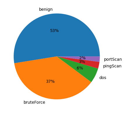
count_labels = df['attackType'].value_counts() / len(df) * 100: This line calculates the percentage distribution of each unique value in the 'attack type' column of the DataFramedf. It first uses thevalue_counts()function to count the occurrences of each unique value, then divide it by the total number of rows in the DataFrame (len(df)) and multiplies by 100 to get the percentage.print(count_labels): This line prints out the calculated percentage distribution of attack types.plt.pie(count_labels[:3], labels=df['attackType'].unique()[:3], autopct='%.0f%%'): This line creates a pie chart using matplotlib.pyplot. It takes the first three elementscount_labelsas the sizes of the pie slices, the unique values of the 'attack type' column (only the first three due to[:3]) as labels, and formats the autopilot parameter to display percentages with no decimal places.plt.show(): This line displays the pie chart.
count_labels = df['attackType'].value_counts() / len(df) * 100
print(count_labels)
plt.pie(count_labels[:3], labels=df['attackType'].unique()[:3], autopct='%.0f%%')
plt.show()df['weekday'] = df['Date first seen'].dt.weekday
df = pd.get_dummies(df, columns=['weekday']).rename(columns = {'weekday_0': 'Monday',
'weekday_1': 'Tuesday',
'weekday_2': 'Wednesday',
'weekday_3': 'Thursday',
'weekday_4': 'Friday',
'weekday_5': 'Saturday',
'weekday_6': 'Sunday',
})
df['daytime'] = (df['Date first seen'].dt.second +df['Date first seen'].dt.minute*60 + df['Date first seen'].dt.hour*60*60)/(24*60*60)def one_hot_flags(input):
return [1 if char1 == char2 else 0 for char1, char2 in zip('APRSF', input[1:])]
df = df.reset_index(drop=True)
ohe_flags = one_hot_flags(df['Flags'].to_numpy())
ohe_flags = df['Flags'].apply(one_hot_flags).to_list()
df[['ACK', 'PSH', 'RST', 'SYN', 'FIN']] = pd.DataFrame(ohe_flags, columns=['ACK', 'PSH', 'RST', 'SYN', 'FIN'])
df = df.drop(columns=['Date first seen', 'Flags'])
dftemp = pd.DataFrame()
temp['SrcIP'] = df['Src IP Addr'].astype(str)
temp['SrcIP'][~temp['SrcIP'].str.contains('\d{1,3}\.', regex=True)] = '0.0.0.0'
temp = temp['SrcIP'].str.split('.', expand=True).rename(columns = {2: 'ipsrc3', 3: 'ipsrc4'}).astype(int)[['ipsrc3', 'ipsrc4']]
temp['ipsrc'] = temp['ipsrc3'].apply(lambda x: format(x, "b").zfill(8)) + temp['ipsrc4'].apply(lambda x: format(x, "b").zfill(8))
df = df.join(temp['ipsrc'].str.split('', expand=True)
.drop(columns=[0, 17])
.rename(columns=dict(enumerate([f'ipsrc_{i}' for i in range(17)])))
.astype('int32'))
df.head(5)temp = pd.DataFrame()
temp['DstIP'] = df['Dst IP Addr'].astype(str)
temp['DstIP'][~temp['DstIP'].str.contains('\d{1,3}\.', regex=True)] = '0.0.0.0'
temp = temp['DstIP'].str.split('.', expand=True).rename(columns = {2: 'ipdst3', 3: 'ipdst4'}).astype(int)[['ipdst3', 'ipdst4']]
temp['ipdst'] = temp['ipdst3'].apply(lambda x: format(x, "b").zfill(8)) \
+ temp['ipdst4'].apply(lambda x: format(x, "b").zfill(8))
df = df.join(temp['ipdst'].str.split('', expand=True)
.drop(columns=[0, 17])
.rename(columns=dict(enumerate([f'ipdst_{i}' for i in range(17)])))
.astype('int32'))
df.head(5)
m_index = df[pd.to_numeric(df['Bytes'], errors='coerce').isnull() == True].index
df['Bytes'].loc[m_index] = df['Bytes'].loc[m_index].apply(lambda x: 10e6 * float(x.strip().split()[0]))
df['Bytes'] = pd.to_numeric(df['Bytes'], errors='coerce', downcast='integer')df = pd.get_dummies(df, prefix='', prefix_sep='', columns=['Proto', 'attackType'])
df.head(5)Splitting the Dataset:
This code efficiently splits the original dataset into training, validation, and testing sets while ensuring that the distribution of classes remains consistent across the splits, which is crucial for building and evaluating machine learning models.
labels = ['benign', 'bruteForce', 'dos', 'pingScan', 'portScan']
df_train, df_test = train_test_split(df, random_state=0, test_size=0.2, stratify=df[labels])
df_val, df_test = train_test_split(df_test, random_state=0, test_size=0.5, stratify=df_test[labels])
Feature scaling:
This code ensures that the features Duration, Packets, and Bytes in all three sets (training, validation, and testing) are scaled using the same transformation parameters learned from the training set. This maintains consistency in the scaling across different subsets of the data, which is important for model training and evaluation.
scaler = PowerTransformer()
df_train[['Duration', 'Packets', 'Bytes']] = scaler.fit_transform(df_train[['Duration', 'Packets', 'Bytes']])
df_val[['Duration', 'Packets', 'Bytes']] = scaler.transform(df_val[['Duration', 'Packets', 'Bytes']])
df_test[['Duration', 'Packets', 'Bytes']] = scaler.transform(df_test[['Duration', 'Packets', 'Bytes']])
df_train[df_train['benign'] == 1]
Implementing a heterogeneous GNN:
The code prepares the data in a format suitable for graph-based machine-learning tasks and organizes it into batches using DataLoader objects, making it ready for training and evaluation.
BATCH_SIZE = 16
features_host = [f'ipsrc_{i}' for i in range(1, 17)] + [f'ipdst_{i}' for i in range(1, 17)]
features_flow = ['daytime', 'Monday', 'Tuesday', 'Wednesday', 'Thursday', 'Friday', 'Duration', 'Packets', 'Bytes', 'ACK', 'PSH', 'RST', 'SYN', 'FIN', 'ICMP ', 'IGMP ', 'TCP  ', 'UDP  ']

def get_connections(ip_map, src_ip, dst_ip):
    src1 = [ip_map[ip] for ip in src_ip]
    src2 = [ip_map[ip] for ip in dst_ip]
    src = np.column_stack((src1, src2)).flatten()
    dst = list(range(len(src_ip)))
    dst = np.column_stack((dst, dst)).flatten()

    return torch.Tensor([src, dst]).int(), torch.Tensor([dst, src]).int()

def create_dataloader(df, subgraph_size=1024):
    data = []
    n_subgraphs = len(df) // subgraph_size
    for i in range(1, n_subgraphs+1):
        subgraph = df[(i-1)*subgraph_size:i*subgraph_size]
        src_ip = subgraph['Src IP Addr'].to_numpy()
        dst_ip = subgraph['Dst IP Addr'].to_numpy()

        ip_map = {ip:index for index, ip in enumerate(np.unique(np.append(src_ip, dst_ip)))}
        host_to_flow, flow_to_host = get_connections(ip_map, src_ip, dst_ip)

        batch = HeteroData()
        batch['host'].x = torch.Tensor(subgraph[features_host].to_numpy()).float()
        batch['flow'].x = torch.Tensor(subgraph[features_flow].to_numpy()).float()
        batch['flow'].y = torch.Tensor(subgraph[labels].to_numpy()).float()
        batch['host','flow'].edge_index = host_to_flow
        batch['flow','host'].edge_index = flow_to_host
        data.append(batch)

    return DataLoader(data, batch_size=BATCH_SIZE)

train_loader = create_dataloader(df_train)
val_loader = create_dataloader(df_val)
test_loader = create_dataloader(df_test)
PyTorch module for a Heterogeneous Graph Neural Network (HeteroGNN):
The code defines a PyTorch module for a Heterogeneous Graph Neural Network (HeteroGNN) using the torch_geometric library. The HeteroGNN class inherits from torch.nn.Module and consists of graph convolutional layers and a linear output layer.
The constructor (__init__ method) initializes the HeteroGNN object with parameters such as the dimensionality of hidden layers (dim_h), the dimensionality of the output layer (dim_out), and the number of graph convolutional layers (num_layers).
Within the constructor, it initializes an empty list to store the graph convolutional layers and then iterates over the specified number of layers, creating and appending graph convolutional layers to the list.
Each graph's convolutional layer is an HeteroConv object, representing a convolutional operation on a heterogeneous graph. It takes a dictionary specifying the edge types and the corresponding convolutional operation.
The forward method defines the forward pass of the neural network. It takes dictionaries of node features (x_dict) and edge indices (edge_index_dict) as input. For each convolutional layer, it applies the convolutional operation to the node features, followed by a Leaky ReLU activation function. Finally, it passes the node features through a linear layer to obtain the final output.
from torch_geometric.nn import Linear, HeteroConv, SAGEConv, GATConv

class HeteroGNN(torch.nn.Module):
    def __init__(self, dim_h, dim_out, num_layers):
        super().__init__()

        self.convs = torch.nn.ModuleList()
        for _ in range(num_layers):
            conv = HeteroConv({
                ('host', 'to', 'flow'): SAGEConv((-1,-1), dim_h, add_self_loops=False),
                ('flow', 'to', 'host'): SAGEConv((-1,-1), dim_h, add_self_loops=False),
            }, aggr='sum')
            self.convs.append(conv)

        self.lin = Linear(dim_h, dim_out)

    def forward(self, x_dict, edge_index_dict):
        for conv in self.convs:
            x_dict = conv(x_dict, edge_index_dict)
            x_dict = {key: F.leaky_relu(x) for key, x in x_dict.items()}
        return self.lin(x_dict['flow'])
Training:
device = torch.device('cuda' if torch.cuda.is_available() else 'cpu')
model = HeteroGNN(dim_h=64, dim_out=5, num_layers=3).to(device)
optimizer = Adam(model.parameters(), lr=0.001)

@torch.no_grad()
def test(loader):
    model.eval()
    y_pred = []
    y_true = []
    n_subgraphs = 0
    total_loss = 0

    for batch in loader:
        batch.to(device)
        out = model(batch.x_dict, batch.edge_index_dict)
        loss = F.cross_entropy(out, batch['flow'].y.float())
        y_pred.append(out.argmax(dim=1))
        y_true.append(batch['flow'].y.argmax(dim=1))
        n_subgraphs += BATCH_SIZE
        total_loss += float(loss) * BATCH_SIZE

    y_pred = torch.cat(y_pred).cpu()
    y_true = torch.cat(y_true).cpu()
    f1score = f1_score(y_true, y_pred, average='macro')

    return total_loss/n_subgraphs, f1score, y_pred, y_true


model.train()
for epoch in range(101):
    n_subgraphs = 0
    total_loss = 0

    for batch in train_loader:
        optimizer.zero_grad()
        batch.to(device)
        out = model(batch.x_dict, batch.edge_index_dict)
        loss = F.cross_entropy(out, batch['flow'].y.float())
        loss.backward()
        optimizer.step()

        n_subgraphs += BATCH_SIZE
        total_loss += float(loss) * BATCH_SIZE

    if epoch % 10 == 0:
        val_loss, f1score, _, _ = test(val_loader)
        print(f'Epoch {epoch} | Loss: {total_loss/n_subgraphs:.4f} | Val loss: {val_loss:.4f} | Val F1-score: {f1score:.4f}')
Results of Model:
_, _, y_pred, y_true = test(test_loader)

print(classification_report(y_true, y_pred, target_names=labels, digits=4))
Output:
precision    recall  f1-score   support

      benign     0.9999    0.9999    0.9999    700791
  bruteForce     0.9691    0.9691    0.9691       162
         dos     1.0000    1.0000    1.0000    125164
    pingScan     0.9503    0.9673    0.9587       336
    portScan     0.9940    0.9960    0.9950     18347

    accuracy                         0.9998    844800
   macro avg     0.9827    0.9864    0.9845    844800
weighted avg     0.9998    0.9998    0.9998    844800
The code snippet seems to be aimed at creating a data frame to compare predicted and true labels from a model’s predictions, and then visualizing the distribution of incorrect predictions using a pie chart.
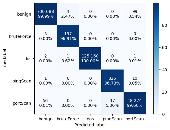
Confusion Matrix:
The code generates and visualizes a confusion matrix, depicting the performance of a classification algorithm by comparing predicted labels (y_pred) against true labels (y_true). It first computes the confusion matrix and then normalizes it to display percentages of correct classifications for each class. Using Matplotlib, it visualizes the normalized confusion matrix as an image with a blue color map and adds a color bar for reference. The x-axis and y-axis are labeled with the predicted and true labels, respectively. Text annotations within each cell of the matrix indicate both the count of instances and the percentage of correct classifications, with colors denoting whether the count is above or below the mean count in the respective row. This visualization offers a comprehensive overview of classification performance, facilitating detailed analysis and interpretation.