
GPT-4 Code Interpreter: Your Magic Wand for Instant Python Data Visuals
A case study example with UN population projection data
The GPT-4 Python Code Interpreter, is turning heads in the world of data science for its ability to instantly generate data visualization code AND display the results.
Code Interpreter allows users to upload a data file (for example, a CSV file), that may then be cleaned, loaded into a data frame, and immediately visualized (as a chart/map)— all within the ChatGPT prompt window.
This tool is definitely ground-breaking, a game changer, whatever cliche you want to use to highlight its terrific abilities.
It allows data scientists to easily load their dataset, then ask whatever data analysis question they would like answered.
How does it work?? Glad you asked! Let’s look at a case study (using UN population projection data) on how you can make this tool work for you.
But before we get started, let’s make sure you have Code Interpreter enabled.
Enabling Code Interpreter
The first thing we need to do is to turn on Code Interpreter in our settings. In the lower left-hand corner of your ChatGPT prompt window, beside your profile picture and name, there is a 3-dot icon (…). Click on this, and then click “Settings”. You will see a window like this:

Click “Beta Features” and then make sure you click and toggle “Code Interpreter” to ON. By default, it is off.

Now you are ready to go!
Open up a new chat, and you should see something new… a little ‘+’ Icon that allows you to add a file.

Which file do we load? Let’s look at the data set next…
The Data Set
For this exercise, we will be using a newly updated dataset from the UN Department of Economic and Social Affairs website (HERE).
Click on the “Probabilistic Projections” and then “Population Percentage”. The file downloads as an xlsx with multiple worksheets. I selected the “Median” worksheet, deleted the first 16 rows of un-needed descriptions, and then converted the xlsx file to a CSV file.
I gave it the name “pp_median_by_age.csv”.
This particular dataset includes population growth projections for all countries from now (2023) all the way to the end of the century (2100).
The first step in any data analysis task is to load and process the data. Here, we’ll show how you can prompt a code interpreter to perform this task.
First, we can click on the ‘+’ icon and load the file to be used:
Then we can prompt Code Interpreter to get the data ready for us.
Step 1: Load and Process the Data
Prompt to Code Interpreter: Load the data from the pp_median_country.csv file and filter the data to include only rows for individual countries in Asia. Convert the ‘Year’, ‘15–59’, ‘60+’, and ‘80+’ columns to integers or floats as appropriate.
Created by Code Interpreter:
We start by loading the data from the CSV file and filtering it to include only rows for individual countries. We then convert the ‘Year’, ‘15–59’, ‘60+’, and ‘80+’ columns to integers or floats as appropriate. This prepares our data for further analysis and visualization.
# Load the data
data = pd.read_csv('pp_median_country.csv')
# Filter data to include only rows for individual countries
data_countries = data[data['Type'] == 'Country/Area']
# Convert the 'Year', '15-59', '60+', and '80+' columns to integers or floats
data_countries['Year'] = data_countries['Year'].astype(int)
data_countries['15-59'] = data_countries['15-59'].astype(float)
data_countries['60+'] = data_countries['60+'].astype(float)
data_countries['80+'] = data_countries['80+'].astype(float)
Step 2: Create A Bar Chart
For our first visual, let’s create a bar chart to visualize the average population percentages for the ‘60+’ age group in Asia for the years 2023, 2050, and 2100.
Prompt to Code Interpreter: Please create and display bar charts that show the average population percentages for the ‘60+’ age group in 2023, 2050, and 2100 across all countries in Asia Use the ‘YlGrBu’ color theme.
Created by Code Interpreter:
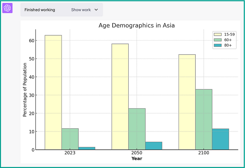
Boom, there it is! Just like that!
With this chart, the demographic shift in Asia’s population becomes pretty clear. This chart enables us to compare the average population percentages for different age groups (‘15–59’, ‘60+’, and ‘80+’) across three key years: 2023, 2050, and 2100.
The clear increase in the ‘60+’ and ‘80+’ age groups and the corresponding decrease in the ‘15–59’ age group underline the aging trend in Asia. The comparison across years showcases how this trend is expected to evolve over the course of the century.
If we click on “Show Work”, we can see the code created. Let’s step through the code and describe what it’s doing:
import matplotlib.pyplot as plt
import numpy as np

# Define the years we are interested in
years = [2023, 2050, 2100]
# Prepare the data for the bar chart
data_bars = data_asia[data_asia['Year'].isin(years)]
data_bars = data_bars.groupby(['Year'])['15-59', '60+', '80+'].mean().reset_index()
In this first part, we’re filtering our dataset to include only the years 2023, 2050, and 2100.
We then group the data by ‘Year’ and calculate the mean for the age groups ‘15–59’, ‘60+’ and ‘80+’. This gives us the average percentages for these age groups in the selected years.
# Create the bar chart
barWidth = 0.25
bars1 = data_bars['15-59']
bars2 = data_bars['60+']
bars3 = data_bars['80+']
r1 = np.arange(len(bars1))
r2 = [x + barWidth for x in r1]
r3 = [x + barWidth for x in r2]
plt.bar(r1, bars1, color='#ffffcc', width=barWidth, edgecolor='grey', label='15-59')
plt.bar(r2, bars2, color='#a1dab4', width=barWidth, edgecolor='grey', label='60+')
plt.bar(r3, bars3, color='#41b6c4', width=barWidth, edgecolor='grey', label='80+')
Here, we are defining the bar widths and creating three sets of bars (one for each age group). The np.arange(len(bars1)) generates a list of evenly spaced values which we use as the x-coordinates for the bar plots.
We then create three bar plots with different colors for each age group. The color='#ffffcc', color='#a1dab4', and color='#41b6c4' are used to match the color scheme for our maps (in the section, below).
# Add xticks on the middle of the group bars
plt.xlabel('Year', fontweight='bold')
plt.xticks([r + barWidth for r in range(len(bars1))], ['2023', '2050', '2100'])
plt.ylabel('Percentage of Population')
plt.title('Age Demographics in Asia')
plt.legend()

# Show the plot
plt.show()
In this section, we’re adding labels, a title, and a legend to our plot.
The plt.xlabel and plt.ylabel functions are used to set the labels for the x and y axes respectively. plt.xticks sets the x-axis tick values, which are the locations along the x-axis where the tick marks appear. plt.title sets the title of the plot and plt.legend adds a legend to the plot. The plt.show() function is used to display the plot.
Now that we have an awesome bar chart, a new question arises: Which countries, specifically, will show the most dramatic increases in their aging populations?
Let’s find out by going to a more granular level — by country.
A choropleth (heat) map is a great way to visualize this question.
Step 3: Create A Choropleth Map
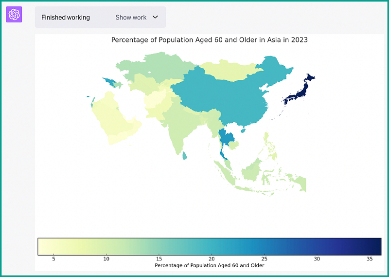
Next, we can visualize our data set using choropleth maps for the years 2023, 2050, and 2100.
Let’s focus in one one age group demographic (60+) to see the changes that are predicted to occur for the rest of this century.
Prompt to Code Interpreter: Please create choropleth maps to visualize the average population percentages for the ‘60+’ age group in 2023, 2050, and 2100 across all countries in Asia Use the ‘YlGrBu’ color theme.
Created by Code Interpreter:
Code Interpreter displays all 3 maps, as shown below:
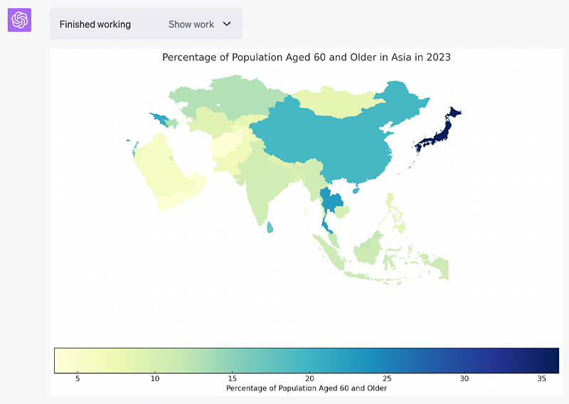
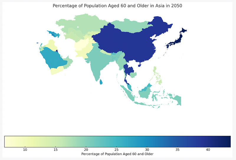
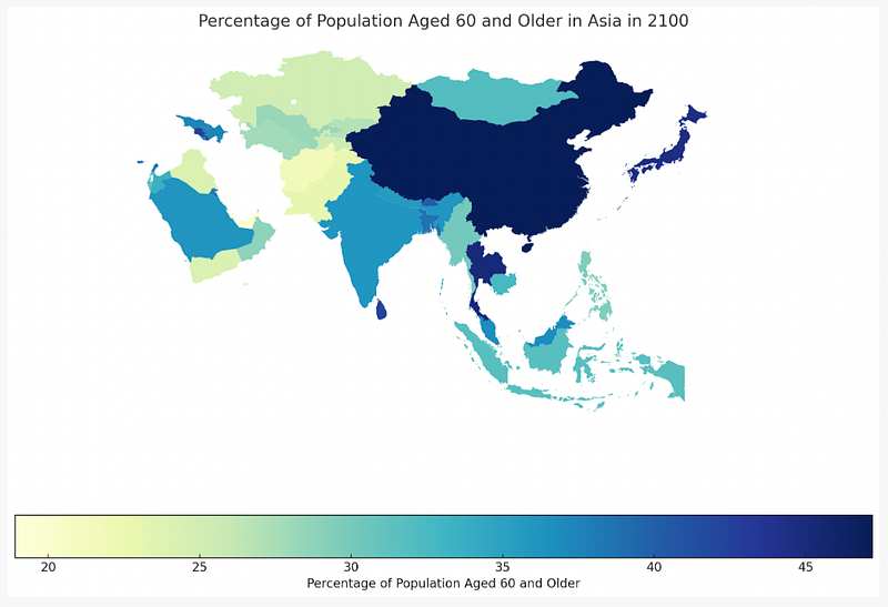
Super slick — Code Interpreter peels off three maps in a row, bam, bam, bam!
These 3 choropleth maps provide a visual representation of the changing age demographics in Asia over the years. The color intensity represents the percentage of the population aged 60 and older, allowing us to see the demographic shift over time.
You can clearly see which countries are projected to have the most dramatic changes — for example, China and Thailand.
And again, we can click on “Show Work” and the full snippet of Python code is available. Let’s step through it:
import geopandas as gpd
import matplotlib.pyplot as plt

# Load the GeoJSON file
countries = gpd.read_file('countries.geojson')
First, we load the GeoJSON file using the Geopandas library. This file contains the geographic boundaries of the countries.
Next, we filter the data for each of the years 2023, 2050, and 2100
# Filter the data for the specific year and convert the '60+' column to a numeric type
# Merge the filtered data with the geographic data
# Convert the merged data to a GeoPandas object
# Create the choropleth map for the specific year
# Remove axis and Display the map
for year in [2023, 2050, 2100]:
    data_year = data_asia[data_asia['Year'] == year]
    data_year['60+'] = pd.to_numeric(data_year['60+'])
    data_year_countries = pd.merge(data_year, countries, left_on='ISO3 Alpha-code', right_on='ISO_A3')
    gdf_year = gpd.GeoDataFrame(data_year_countries)
    fig, ax = plt.subplots(1, 1, figsize=(15, 10))
    gdf_year.plot(column='60+', ax=ax, legend=True, cmap='YlGnBu',
                  legend_kwds={'label': "Percentage of Population Aged 60 and Older", 'orientation': "horizontal"})
    plt.title(f'Percentage of Population Aged 60 and Older in Asia in {year}')
    ax.axis('off')
    plt.show()
In this loop, we’re converting the ‘60+’ column to a numeric type for plotting. We then merge the filtered data with the geographic data using the ‘ISO3 Alpha-code’ from our dataset and the ‘ISO_A3’ from the GeoJSON file as the matching keys.
Next, we convert the merged DataFrame into a GeoDataFrame, which is a data structure designed for handling geographic data. We then create a choropleth map for the specific year by plotting the ‘60+’ column on the map.
The cmap='YlGnBu' argument specifies the color palette for the map. We also add a legend and a title to the map.
The ax.axis('off') function is used to remove the axis. Finally, we display the map using plt.show().
And that’s it! That’s all there is to it. Load a data file (and a geoJSON file if you are wanting to create a map), and GPT-4 Code Interpreter does the rest!
In Summary…
The GPT-4 Code Interpreter is a supremely awesome tool for data analysis and visualization. Particularly in an investigatory capacity.
It is worth noting that it is not all rainbows and butterflies with the Code Interpreter. The tool is still in beta, which means there are some hiccups and issues that you may come across. For example, it can lose its place, and lose access to the file that it is working with, requiring a reload. It cannot maintain state from conversation to conversation. And if it does lose it’s place, it can get stuck in a loop, requiring a step-back prompt to get it back on track.
But as an exploration tool, to quickly ask questions of your data, and immediately see the visual results — it is truly awesome.
Give it a go, and I guarantee you will find case study examples within your data sets that are worth exploring with Code Interpreter.
Good luck with your data explorations!
Before you go… If you want to start writing on Medium yourself and earn money passively, you only need a membership for $5 a month. If you sign up with my link, you support me with a part of your membership fee without additional costs.
If you’re interested, here’s a link to more articles I’ve written. There are articles on Python, Generative AI, Expat living, Marathon training, Travel, and more!