
Good Designer vs. Bad Designer: How Choices Shape UI/UX Excellence
In the digital age, design plays a pivotal role in shaping user experiences. Good designers create intuitive, accessible, and visually appealing interfaces that meet user needs. On the flip side, bad designers often neglect user requirements, prioritizing trends or personal preferences, which leads to frustration and inefficiency.
This article explores the differences between good and bad designers with practical examples, helping you recognize what makes a great user-centric design.
1. Empathy for Users
A good designer begins with empathy — understanding user pain points, behaviors, and needs. They gather insights through research, interviews, and usability testing.
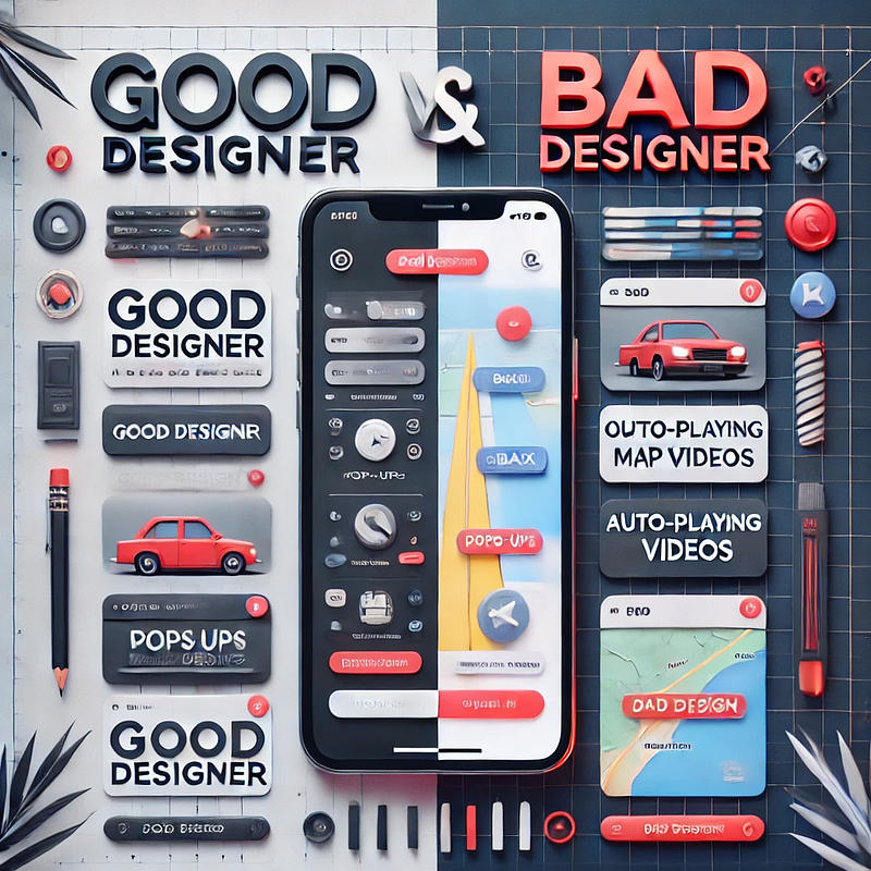
Example of a Good Designer: A designer creating a travel app prioritizes features like offline mode for maps, enabling users to navigate seamlessly in areas with poor connectivity.
Example of a Bad Designer: Adding a feature to auto-play videos on the same travel app, distracting users who just want quick navigation tools.
2. Usability Over Complexity
Good design focuses on simplicity and usability. A good designer ensures that the interface is intuitive and guides users through their journey seamlessly.
Good Design Practice: A clean and consistent navigation system with clear labels like “Home,” “Profile,” and “Settings” ensures users find what they need quickly.
Bad Design Practice: Overloading the navigation bar with too many options, leading to confusion and a cluttered interface.
3. Accessibility and Inclusivity
A good designer ensures accessibility for all users, including those with disabilities, by adhering to standards like WCAG (Web Content Accessibility Guidelines).
Good Designer Example: Adding options like adjustable text size, high-contrast modes, and screen-reader compatibility to a news app.
Bad Designer Example: Using low-contrast text or tiny touch targets, making the app unusable for visually impaired or elderly users.
4. Iterative Design Process
Good designers embrace feedback and use iterative processes to refine their work. They prototype, test, and adjust based on user feedback.
Good Design Practice: A food delivery app testing their order flow with real users, leading to improvements like a clearer progress bar and better placement of the checkout button.
Bad Design Practice: Ignoring user feedback and sticking rigidly to initial designs, even when they lead to user complaints.
5. Functionality Meets Aesthetics
Good designers strike a balance between form and function, ensuring designs are visually appealing without compromising usability.
Good Design Practice: A weather app with a sleek design, using icons and colors to represent weather conditions while keeping the forecast clear.
Bad Design Practice: A weather app filled with excessive animations and artistic fonts, making it hard to read quickly.
The gap between good and bad design is often the result of the designer’s approach to user needs, functionality, and adaptability. A good designer is user-centric, iterative, and intentional, creating designs that resonate and simplify experiences. In contrast, a bad designer prioritizes aesthetics or personal preferences, leading to subpar interfaces.
Good design isn’t just about creating something beautiful — it’s about making something that works beautifully for the user.


