
Fundamentals of iconography in user interface design (UI)
Communicating diverse concepts with good symbols
Iconography refers to the use of symbols to communicate specific ideas, whether simple or complex concepts. Icons are in many ways, writing on images. When used correctly, they could add functionality to our designs, speeding up user interactions by being immediately recognizable, as the human brain processes icons 60,000 times faster than text.
Because the users read less and less and the regular permanence of a website is only a few seconds, it is a usability point to capture attention as soon as possible, facilitating calls to action or any feedback from the system in a fast way. But, good icons could also add personality and joy to the interface.

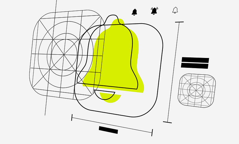
To create a successful icon set, we need a grid. Grids are essential tools in iconography. It’s a systematic arrangement of lines that helps structure the design elements within a defined space. In iconography, grids are used to provide consistency, alignment, scalability, and balance among the visual elements of the icons.
Grid maintains a sense of order, making it easier for users to recognize patterns and associations among related icons. For designers it provides a structured starting point, reducing the effort required to create icons. This is important because the grid acts as a guide, helping us to focus on the details and ensuring overall coherence.
Having established this, six principles must be taken into account to create a correct iconography:
Clarity
Keeping icons simple and clear will make them more recognizable. Cluttered or overly complex details can be confusing and uncomfortable to look at. It is necessary to design the most direct and synthesized representation of the concept that the icon represents.

Icons are small so intricate details may be lost, so we need to focus on essential elements that convey the intended meaning without unnecessary complexity. During the design process, it would be necessary to put the icon at 100% zoom to ensure it remains recognizable and legible.
It is also important that each icon has a unique and easily distinguishable form. Avoid creating icons that look too similar, as this can lead to confusion and hard thinking for the user. A distinct shape for each helps users differentiate between icons at a glance.
Consistency
The consistency in the visual language is memorable. Also, consistency helps users quickly understand the meaning of icons. Use a unified color palette, stroke thickness, and visual style to create a cohesive set of icons. As The Icon Handbook by Jon Hickshis defines, this will help in establishing a visual identity and ensure a cohesive user experience.
Let’s expand on these three popular forms of iconography:
Colored: Color iconography can provide personality and dynamism, but depending on their cognitive load, they cannot be as small in size as in the case of solid or outlined icons.
Solid: These are faster to recognize than outlines unless their distinctive features are subtle and do not project far enough from the edges. Solids are more recognizable when the internal space is narrow.
Outlined: For these to be easily recognizable, their feature must stand out from the edges of the symbol. Outline icons are more recognizable when their negative space is large.
In all cases, we must use the grid to provide a framework for maintaining consistency across a set of icons. Using consistent structure helps ensure that they share a cohesive visual language, making them more aesthetically pleasing and harmonious when displayed together.
Scalability
Scalable icons add readability and fast recognition. Icons should look clean and remain recognizable at different sizes, but we can consider creating different versions of the same icon when they need to be very small or very large, being no longer accessible to the user.
Scalability is understood as the ability of a system to adapt and respond as it changes significantly. As for icon adaptation, the different interface situations mean that the icons may not have a fixed size, may not maintain the same stroke, or may have to change from outlined to filled. Depending on the device and its function, it will be required to have certain characteristics that must modify our icon.
Just in terms of size, we need to keep this idea: the larger the icon can be, the more detail it can have. On the other hand, if our icons need to be really small, they should contain as little detail as possible, to make them more readable.
Universalism
Universal concepts through the use of symbols offer a global understanding. For example, a magnifying glass for search or a gear for settings are widely recognized symbols. Consider cultural implications to ensure the iconography resonates with a diverse audience.
It’s important to choose metaphors that align with common users’ mental models. For instance, a floppy disk may still represent “save” even though the physical object is outdated. Avoid using metaphors that may be confusing, elaborate, or outdated for your user persona.
Color
The color contrast defines the shape of the icon. Colors can convey meaning, but make sure the colors are accessible and work well in different contexts. Consider creating icons in a monochromatic or limited color palette for consistency, but color can be a good option if we know how to manipulate it.
Ensure that the icon has sufficient contrast against its background. This helps in making the icon stand out and enhances its visibility. Choose colors with a clear and meaningful association with the represented concept or action. Red might signify urgency or danger, while green could represent success or approval. The cultural and contextual factors must be considered when assigning meanings to colors.
It would be relevant also to limit the number of colors used in an icon to maintain minimalism and avoid visual clutter. A single icon with too many colors can distract and lose clarity, especially in smaller sizes.
Negative Space
Negative space improves icon clarity and readability. Ensure that the negative space contributes to the overall form and meaning of the icon. This will balance positive and negative space to maintain visual harmony and add smartness to the UI.

As we know, negative space is the empty or unused space around and between objects in a design. In iconography, negative space plays a crucial role in shaping the overall visual perception and clarity of icons. By leaving more space around a critical element, you can emphasize its importance and make it stand out.
The space around and between the positive elements can form shapes that enhance the overall recognizability of the icon. It’s not just about what’s there but also about what’s not there, so we can prevent the icon from feeling too heavy or crowded. It allows the viewer’s eyes to move smoothly across the icon.
Identity
Icon identity establishes a cohesive visual language. In branding, icons could be designed to align with the overall brand identity, as consistency in color, style, and visual elements helps reinforce brand recognition. Icons become an integral part of how users perceive and interact with a brand.

This language includes the use of unique shapes, colors, and stylistic elements that become synonymous with a particular brand, product, or service. And if we want to talk about UX, a strong identity in iconography leads to improved recognition and recall.
Icons became one of the most enduring methods of communication that humans have ever created, as well as one of the main elements in an interface. But it is often an iterative process. It requires being open to refining and adjusting based on user feedback, changing design trends, or evolving requirements. Remember that iconography is a language, and its effectiveness depends on how well it communicates with your users. Regularly reassess your iconography in the context of your overall design system and stay open to improving over time.
Thank you for reading.
References:
- The Icon Handbook by Jon Hicksby
- Icon Design: Graphic Icons in Computer Interface Design by Steve Caplin
This article was Part 5/6 of the series UI Fundamentals
Other parts here:


