
Fundamentals of color in user interface design (UI)
Simple rules to get a professional color scheme.
Color is a sensory impression that the eyes perceive from the light, translating in a diverse form of concepts and emotions. For artists, its correct manipulation has been of great importance, so it has been theorized in many ways and with different methods throughout history.
Painting, printing, photography, graphic design and interface design use color theory to evoke specific ideas and concepts, taking advantage of the non-verbal capacity of color as opposed to other slower forms of communication.
In interface design, color psychology is used to influence the perceptions a user may have, from reinforcing brand recognition to generating more clicks on the purchase button. Other important results, such as improved usability, can also be the result of good color mastery.
In this article I write about six considerations that I regularly use for color selection when I design an interface.
Link
Specific colors are linked to certain emotions, but not always. Since we are born our eyes learn about the colors of the real world, with time the memory associates these colors with certain experiences and elements. This familiarity can give the user some context about the goal of the interface.

This, of course, is not an absolute, since human perception of reality is very different and cannot be generalized in all its forms. The German artist Joseph Albers in his methodical book, Interaction of Color, points out that the main strong characteristic of color is the relativity. Red in the west countries may represent danger and evil, but in China it means happiness, joy and celebration. Despite this, he also states that certain colors are perceived by a large number of people in the same way, such as the green color related to ecology or pink as a sign of femininity.
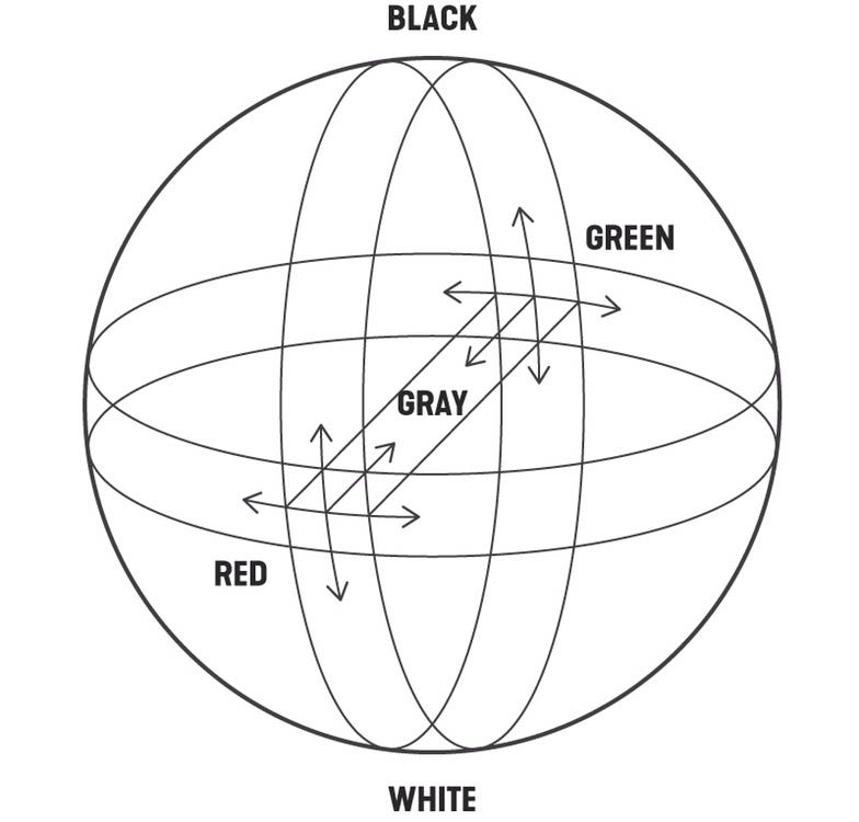
Harmony
Harmonious colors give a logical sense to the elements. There are many ways to create color harmonies. One of them is through the use of analogous colors, which are the colors that are close to each other in the color wheel.
Why are analogous colors attractive? Because this is color behavior that comes from nature. The sunset displeases the sky from orange to purple, the sea can change from blue to turquoise, the rainbow includes all seven colors in a harmonious transition. We can conclude then that sight finds a natural delight in analogous colors.
It is advisable to maintain this color range only between warm or cold, since the temperature also generates a considerable harmony. It is also possible to play with the saturation and brightness in these colors to create depth in the use of analogues. It all depends on the effect you want to create and the content that the interface displays.
Contrast
Color contrast gives dynamism to the interface. Another form of color harmony is achieved through the use of complements, which are those that face each other in the color wheel. With the use of complementary color elements, you can create an effect of contrast and dynamism in the design.

Among the benefits of contrasting colors, there is the effect of energy and movement that can be given to the interface, as well as the intensification of some relevant point to which we want the user to pay attention. It is not easy to create harmony with these colors as their misuse could create visual chaos and being unpleasant to the eye. Proportion is the key.
To know more about color contrast I recommend the book by the Swiss Johannes Itten, The Art of Color, where he exposes the theory of the seven types of contrast: hue, temperature, light-dark, complementary, saturation, simultaneous and quantitative. Whatever type of color contrast we choose, it should be maintained throughout the web/app pages for design consistency.
Scale
Color scales reduce the cognitive load. Maintaining the hue but modifying the lightning at different levels helps to separate the elements without overloading the composition.

Color scales in UI design are also influenced by nature, not only in elements such as the leaves of trees, the sky or the ocean, but also in the volumetry of objects and shadows. The human eye perceives many variations of the same color depending on lighting, depth and even texture. It is not surprise that the people expect UI colors like they know it in the real world.
We can say that the goal of working with color scales is to avoid adding a new color or tone that the brain must process and understand unnecessarily. The easier and faster an interface design is to understand, the more delight it will produce for the user.
Proportion
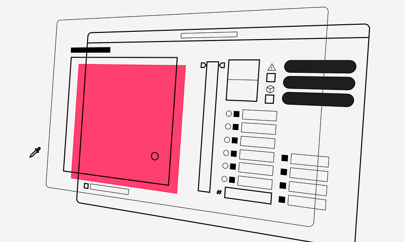
Defining a color proportion balances the composition. Having colors with more and less presence gives clarity in the style and avoids unnecessary color conflicts.

The color hierarchy is important to define an atmosphere and at the same time, a predominant color in the composition that supports all the elements of the web. In the current trend of UI design, white is the favorite color, as it keeps the interface clean, highlights the interaction color and improves readability. However, if you want to create a more immersive and artistic effect on a specific page, choosing a more saturated color works really well.
Interaction
The interaction color must be clear in its execution and consistent in the interface. Calls to action must have sufficient contrast with respect to the background and sufficient visual weight with respect to other components so that the user can identify them effortlessly.

However, the interaction color is not always characterized by being the most saturated or brightest, but rather by being the one that stands out from the other elements on the screen, either by its tone, shape, size or contrast. Therefore, the effectiveness of an interaction color will be measured by the speed with which the user identifies the areas of interaction and executes a task with less thought.
Secondary calls to action, on the other hand, weigh less and coexist visually closer to the information elements. In our example of the Nike application, the configuration and sound buttons indicate that these are interactions due to the shape but not to the color. This hierarchy of buttons is important so that the user can give a natural order to the elements and avoid the bad practice of having more than one primary call to action per screen.
In conclusion, color is the great influencer of things, affects the perception of its environment and directly influences other colors and even itself. Although the in-depth study of its theory can improve our mastery of design, the process of creating a professional color scheme depends largely on our visual experience and perception of the real world. Let’s start training our eyes for it.
Thanks for reading.
References:
- Interaction of Color by Josef Albers
- The Art of Color by Johannes Itten
This article was the Part 2/6 of the series UI Fundamentals
The other parts here:


