
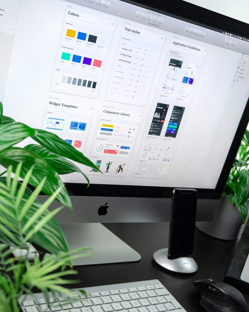
UI Design : Inspiring Design Systems in 2024
In the world of UX/UI design, whether you are a freelancer or an employee, one element remains crucial: the design system. This concept, far more than just a collection of components and guidelines, forms the foundation for the coherence and effectiveness of any design project. As a UX/UI designer for two and a half years, I have closely observed the significant impact of design systems on various projects, whether as a student, an employee, or a freelancer.
Design systems provide a structure that allows easy navigation through the complexity of design projects. For a freelancer, they act as a compass, guiding the creation of harmonious and consistent designs. In a company, they ensure essential uniformity, enabling diverse teams to work together. It is this versatility and ability to transcend work contexts that make design systems so indispensable.
In this article, I will introduce you to five design systems that have made their mark in the field of UX/UI design. Each of them offers valuable lessons, whether you are a UX/UI designer, web designer, product designer, or even a curious developer. We will explore Polaris by Shopify, Engie’s design system (a French company), Atlassian Design, Audi Design, and Microsoft’s Fluent 2. Get ready to dive into a world where efficiency meets creativity.
Polaris Shopify: The North Star of E-commerce Design
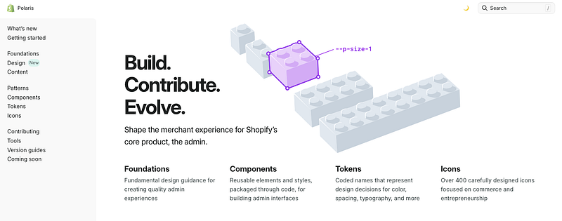
Polaris, Shopify’s design system, stands as a beacon in the turbulent world of e-commerce. This system goes beyond providing components and guidelines; it embodies a user-centered philosophy, a crucial aspect for any e-commerce site. Polaris focuses on simplifying and enhancing the interaction between merchants and their customers, a approach I have appreciated and applied in my own design projects.
One of Polaris’s strengths lies in its ability to provide clear guidelines and practical resources for creating a seamless and intuitive user experience. Whether through its color choices, typography, or interaction principles, Polaris demonstrates a deep understanding of user needs in the e-commerce sector. I personally found their guidelines on navigation and information structure particularly enlightening, allowing me to refine my e-commerce designs with greater precision.
Polaris is more than just a set of rules; it serves as an inspiration for designers looking to create memorable user experiences in the online commerce world. By drawing inspiration from Polaris, I have been able to develop designs that not only meet user expectations but exceed them, creating smooth and enjoyable customer journeys.
Engie Design: Fluidity and Adaptability in Energy
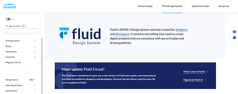
Engie’s design system, a French company, perfectly illustrates the importance of fluidity and adaptability in design systems. Named the “Fluid Design System,” it reflects Engie’s values and ambitions in the energy sector, an area where complexity and change are constant. What I particularly admire about Engie’s design system is its ability to unify a wide range of products and services under a consistent and dynamic visual identity.
Engie’s modular and flexible approach in its design system is a source of inspiration for any designer aiming to create systems that can adapt to constantly evolving contexts and needs. Their smart use of grids, typography, and colors, while remaining faithful to the brand image, allows for great creative freedom while maintaining reassuring uniformity. In my own projects, I have often referred to their way of integrating diverse design elements while maintaining overall harmony.
Engie Design is an excellent example of how a design system can not only meet the requirements of a specific sector but also inspire innovation and creativity. As a designer, drawing inspiration from such a system helps understand how to balance consistency and flexibility, a constant challenge in our field.
Atlassian Design: “Collaboration and Clarity in Project Management”
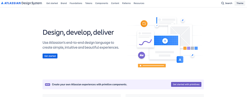
Atlassian Design stands out for its focus on collaboration and clarity, essential elements in project management. Their design system, used for tools like Jira and Confluence, is a model of simplicity and efficiency, facilitating communication and productivity within teams. My personal experience with their products has highlighted the importance of intuitive and collaborative design, where each element serves a specific purpose and enhances the user experience.
Atlassian’s design system is built around clear principles that promote immediate understanding and smooth navigation. This is reflected in their judicious use of space, colors, and typography, which guide the user without overwhelming them. As a designer, I have found that their interface design choices strike an excellent balance between aesthetics and functionality, a balance I strive to replicate in my own creations.
Atlassian illustrates how a design system can be both simple and powerful, emphasizing ease of use and collaboration. These principles are particularly relevant for designers and developers working on projects involving multiple stakeholders where clarity is paramount. Drawing inspiration from Atlassian means learning to create designs that make users’ lives easier while promoting collaboration and efficiency.
Audi Design: Elegance and Innovation in Automotive
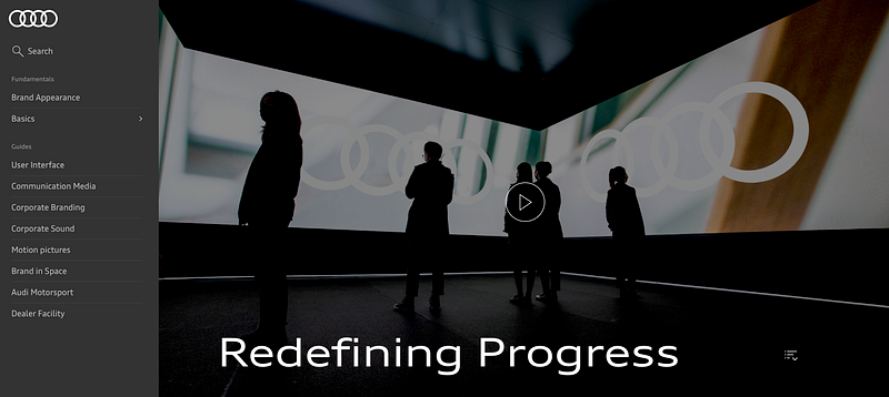
Audi’s design system, a giant in the German automotive industry, embodies elegance and innovation. What stands out in Audi’s design system is its ability to combine sophistication and functionality, reflecting the brand’s values. In my own design practice, I have often been inspired by their approach, which combines refined aesthetics with cutting-edge engineering.
The most remarkable aspect of Audi’s design system is its fusion of traditional aesthetics with modern and futuristic elements. This results in designs that are both timeless and avant-garde, a goal that many designers, including myself, strive to achieve. Whether in color selection, typography, or user interactions, each component of Audi’s design system is designed to reflect quality and innovation.
This design system is a source of inspiration for designers looking to blend tradition and modernity in their creations. By taking a cue from Audi, we can learn to create designs that not only respect a brand’s heritage but also push it towards new horizons. This is a valuable lesson in a world where design must constantly evolve while remaining rooted in fundamental values.
Fluent 2 Microsoft: Universality in Diversity
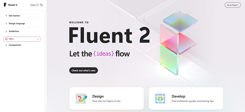
Fluent 2, hailing from the Microsoft stable, embodies the idea that design can be universal while embracing the diversity of needs and contexts. This design system stands out for its ability to provide a versatile toolkit that can be adapted to a multitude of situations. My own experience with Fluent 2 has shown how essential it is to design systems that embrace the diversity of the audience.
One of the most interesting aspects of Fluent 2 is its flexibility, allowing designers to create interfaces that cater to users worldwide. Whether you are working on a mobile application, a web interface, or a user experience for software products, Fluent 2 offers resources and principles to guide the design process. Microsoft’s approach prioritizes clarity, simplicity, and accessibility, values that resonate strongly in the world of design.
Fluent 2 teaches us to embrace cultural, linguistic, and technological diversity in our designs. As a designer, this is a valuable lesson for creating inclusive user experiences that transcend borders and barriers. By drawing inspiration from Fluent 2, we can contribute to shaping a digital world where everyone feels at home.
By exploring these five inspiring design systems, we have discovered the crucial importance of these systems in the world of UX/UI design. Whether you are an experienced designer, an aspiring web designer, or even a curious developer, the learning and inspiration from these systems can shape your professional journey.
Whether you are a freelancer, an employee, or working for a French or international company, design systems are powerful tools
Don’t hesitate to clap 👏 if you enjoyed this article and subscribe; I share a new story every day. ✍🏻
You can also follow me on Threads, Youtube, or Instagram, where I regularly post content. 📹
Lastly, if you’re interested in receiving free and personalized tips, simply join my newsletter. 📩